Food to Live: organic food packaging design
A design that has it all


packaging types
product types
package weight

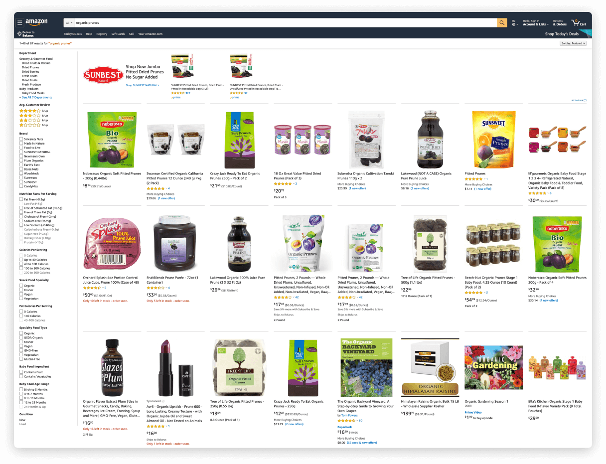
A food packaging design that would stand out from the crowd on major ecommerce platforms like Amazon
A big thing to do was to work through various packaging prototypes, and keep them vibrant and catchy.
A big thing to do was to work through various packaging prototypes, and keep them vibrant and catchy.
Task
Food to Live is a US family business that for three generations has been working to provide its worldwide consumers with healthy & eco-friendly products for a balanced diet. The company offers a broad range of top-quality organic foods such as dried fruits, nuts, seeds, spices, and legumes.
The client


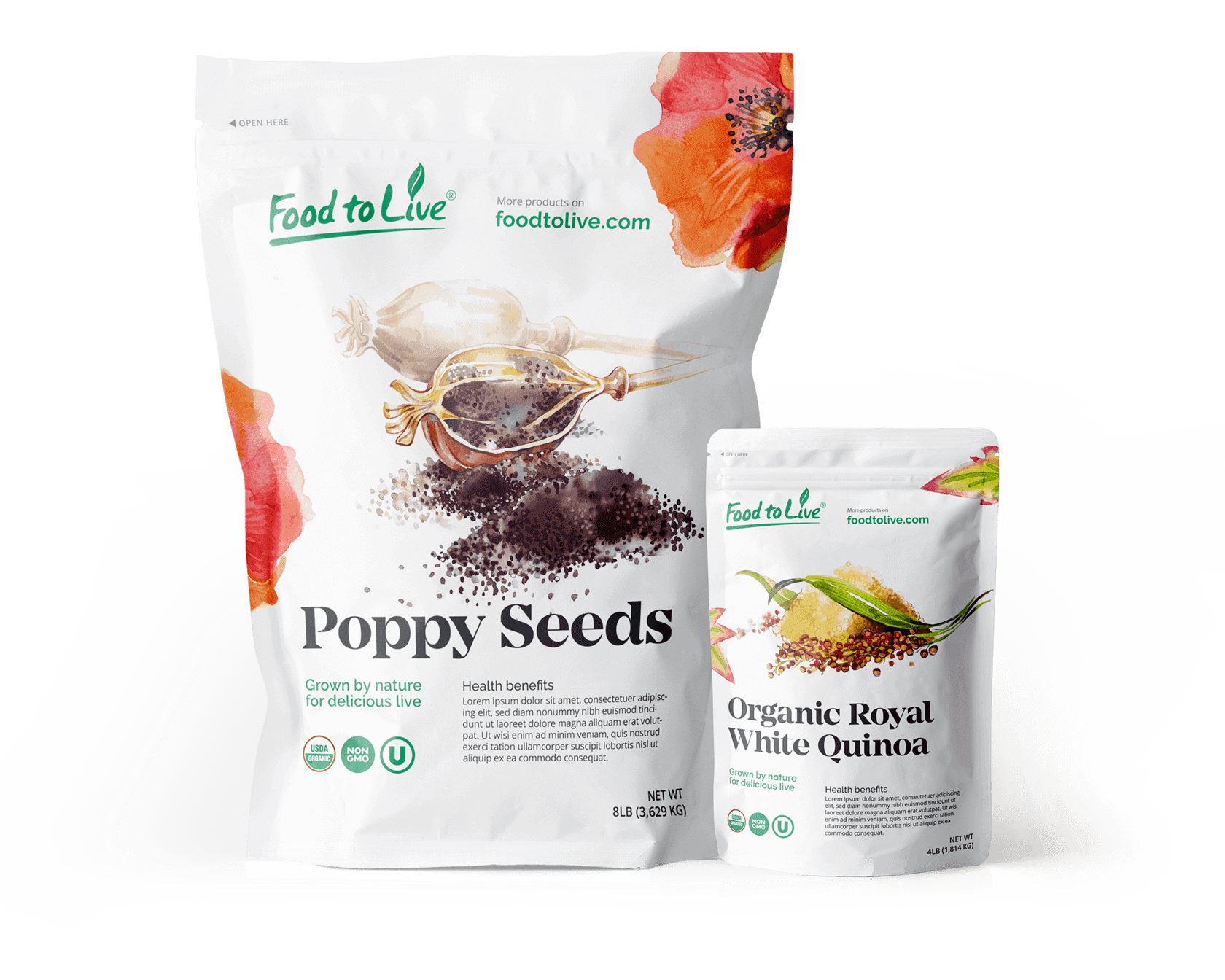
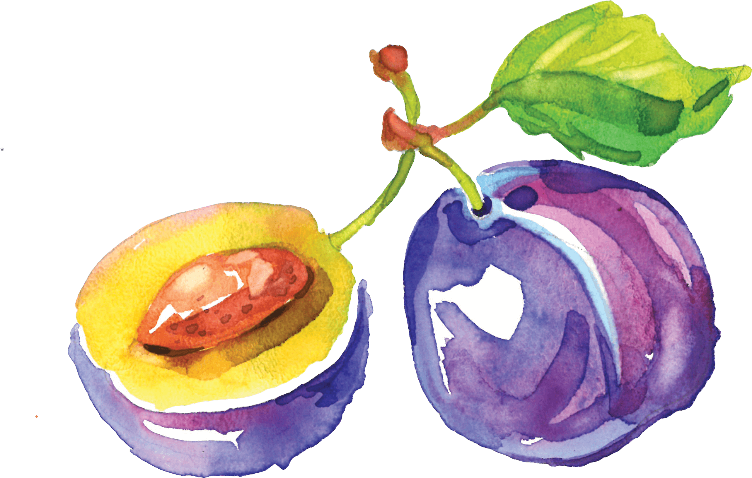
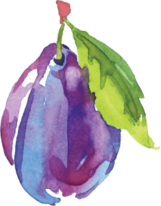
Lightness, water, shades and natural components — watercolors seamlessly blend into the Food to Live concept. As a perfect technique to visually convey brand identity and values, watercolors quickly got the thumbs-up from the client.
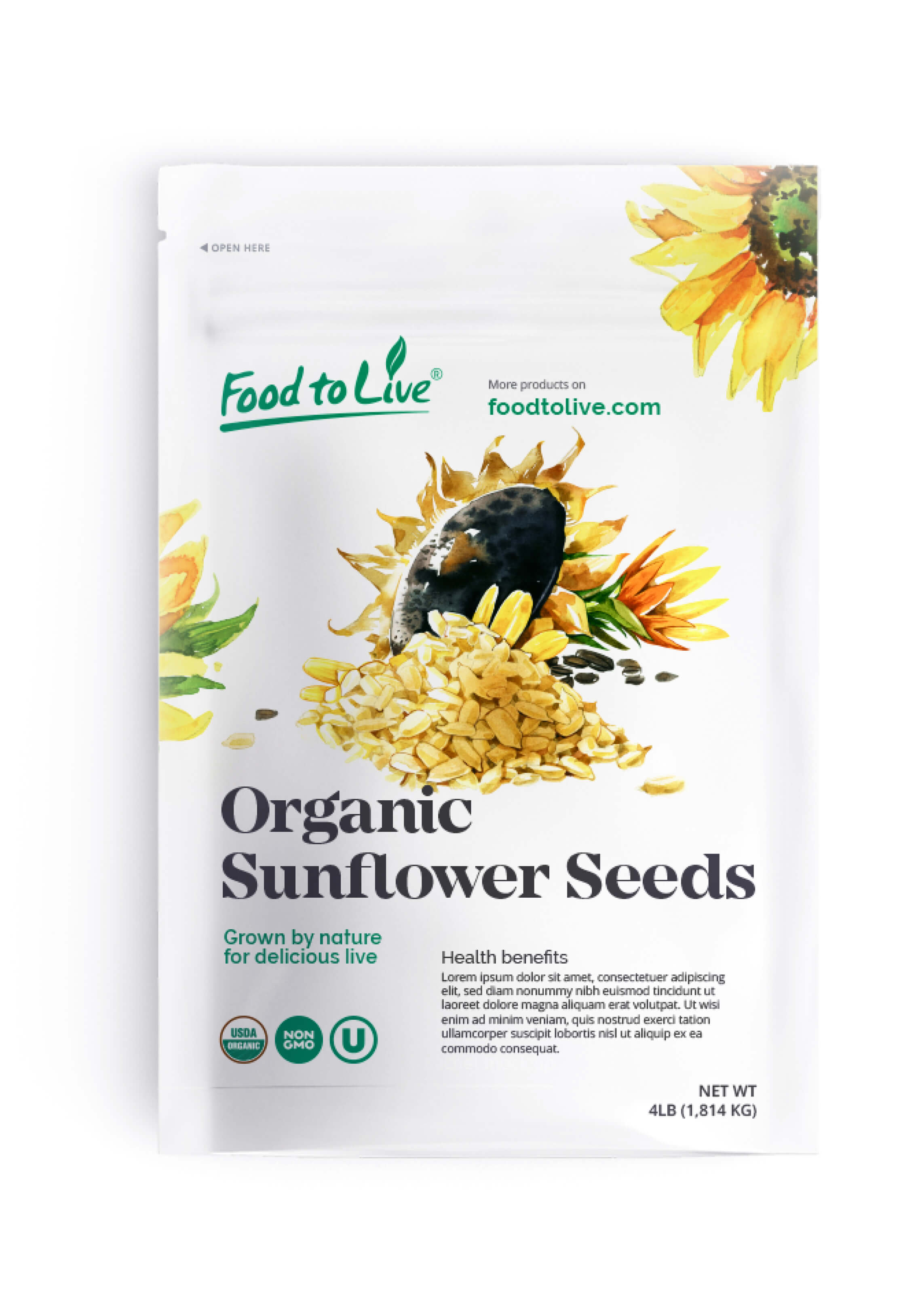
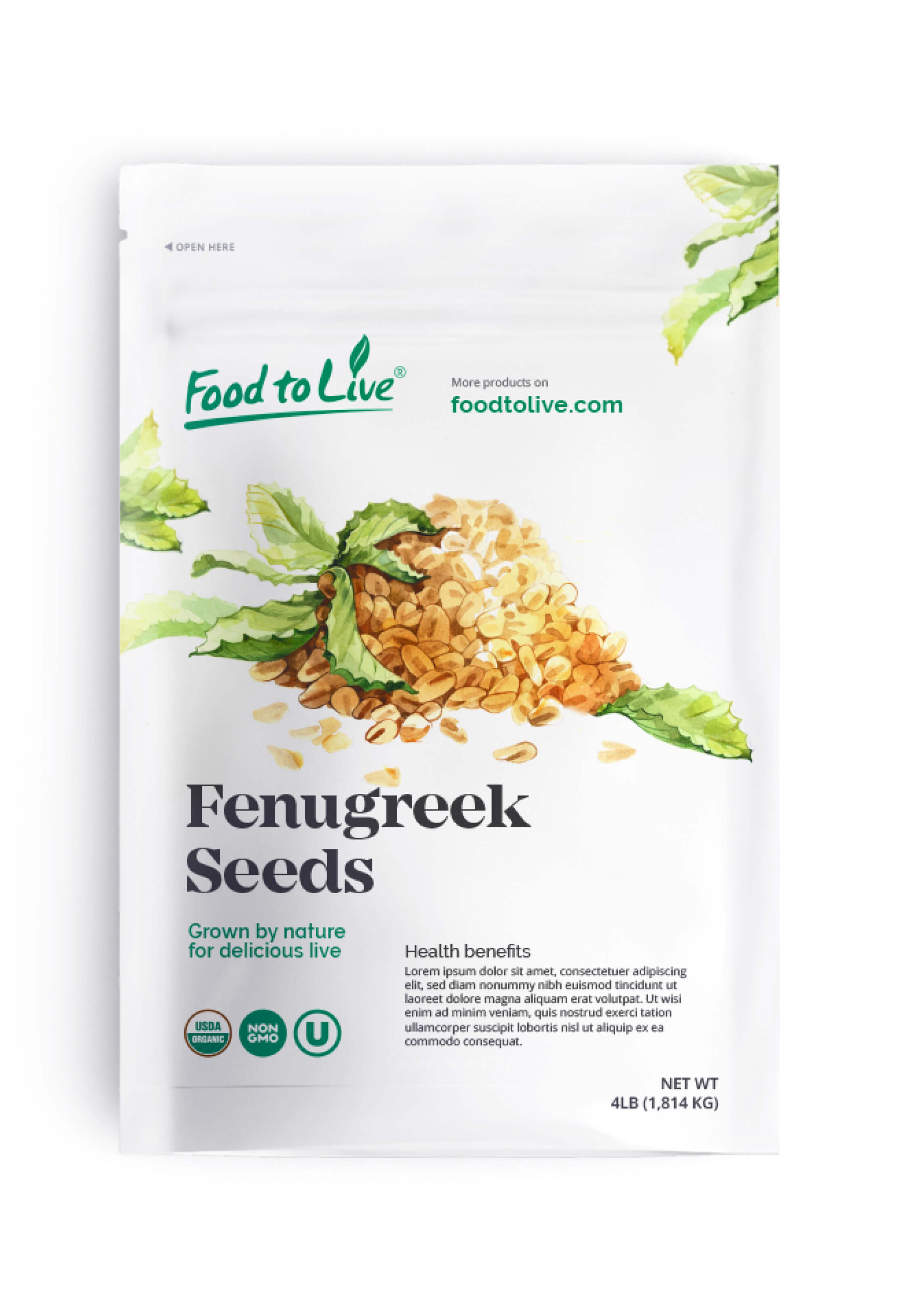
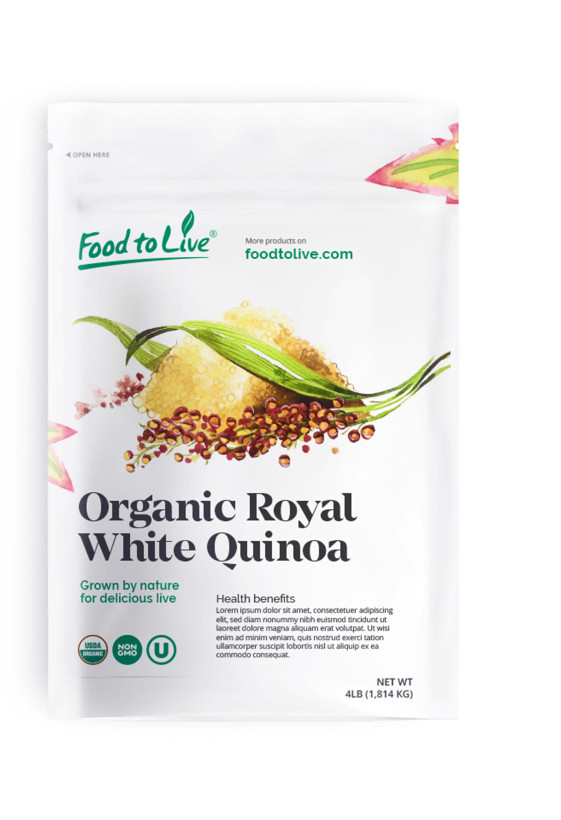
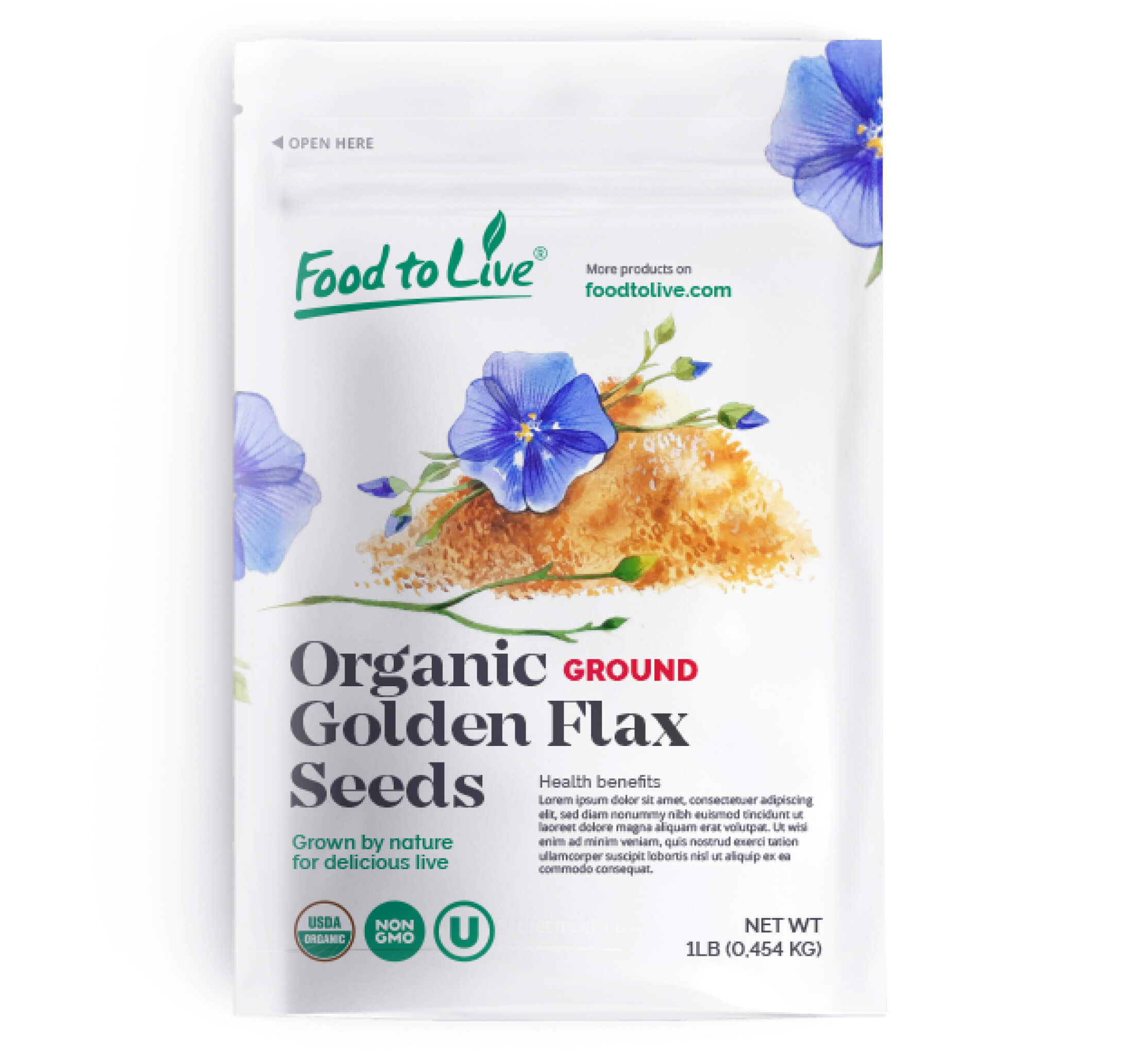
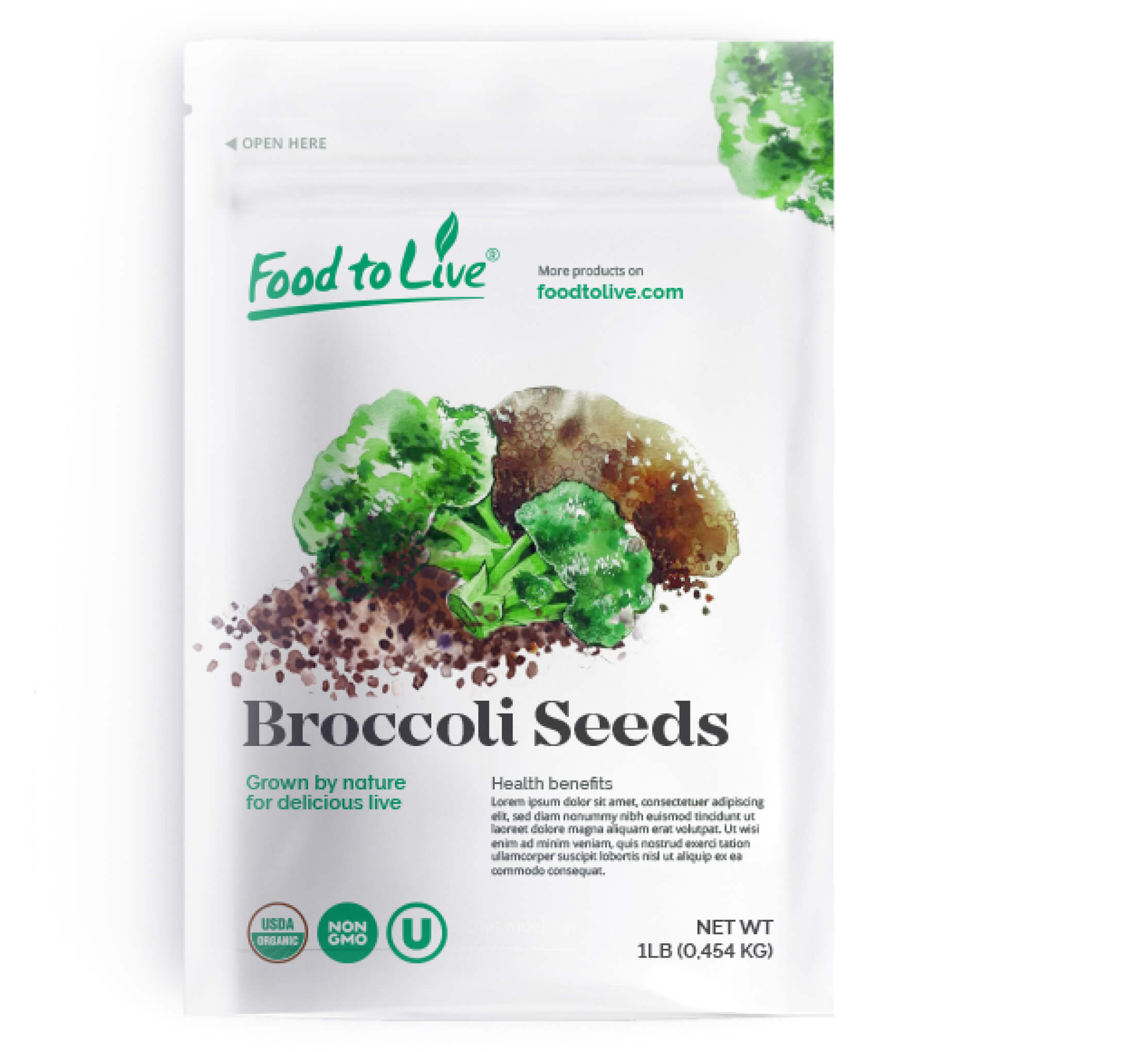
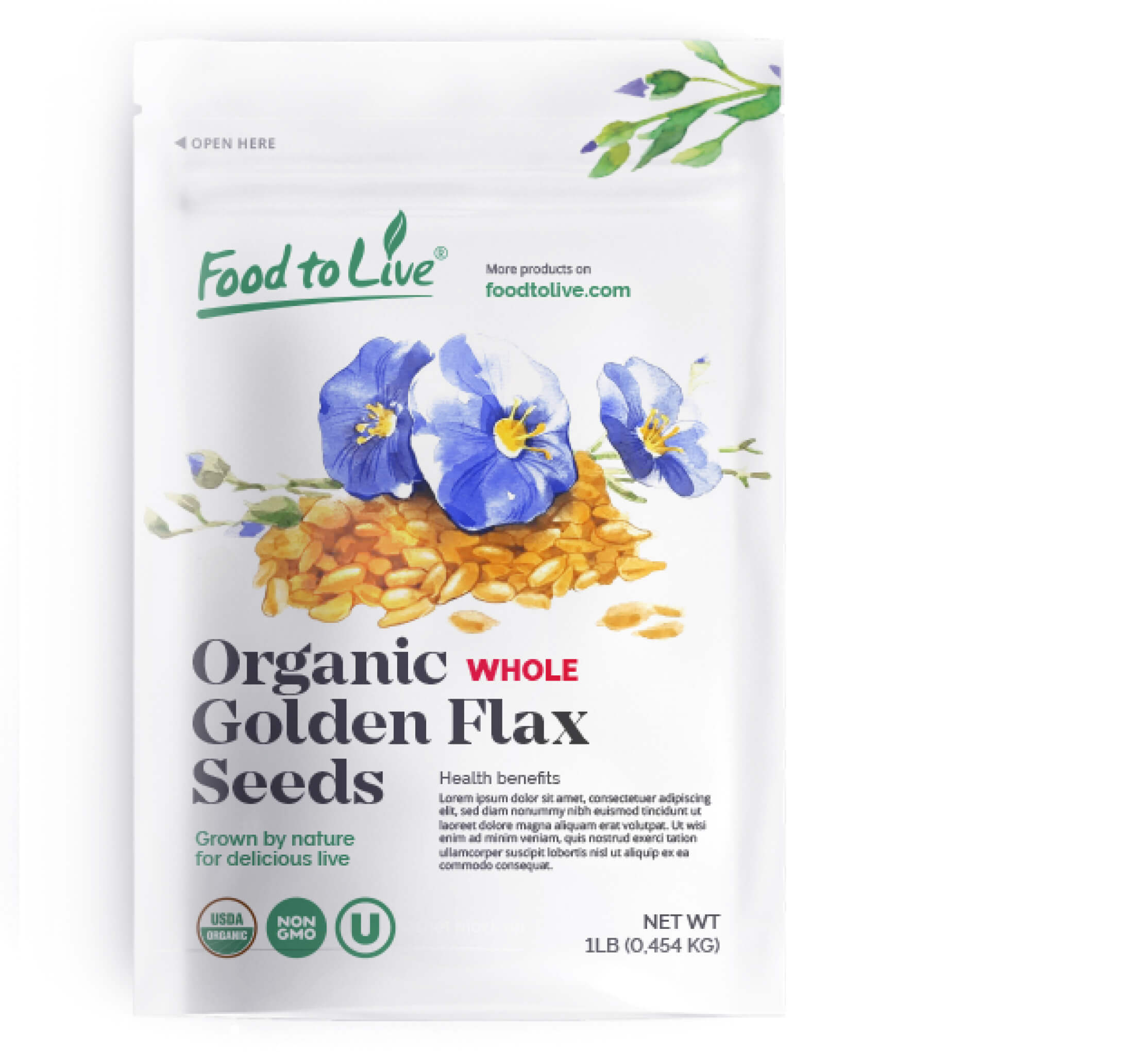


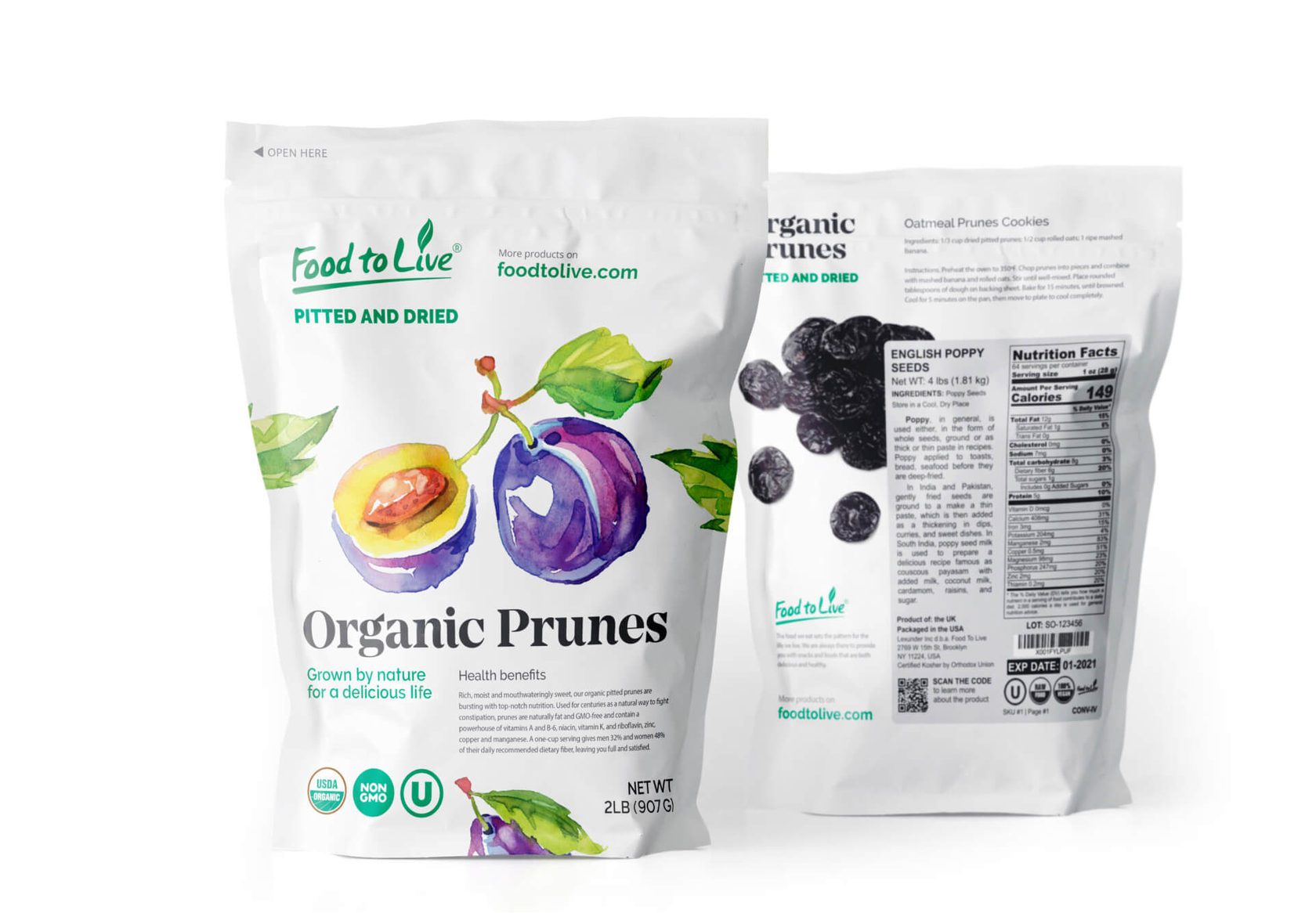

The old design felt very much like a set of random elements that were a bit out of tune with each other, causing the products to be overshadowed by competitors and overlooked by online shoppers. At the Right Studio, we chose to take a consistency-based approach and keep the design simple, rearrange the structure and overlay the imagery on a plain white background instead.
Consistency and structure
Old packaging
Testing the solution
We test the designs in real world settings to see how well they will stand out to customers.


The typographic contrast
So we wanted a font to balance the airiness and calmness of the watercolors. "Mirador" was the perfect option: it's a powerful neoclassical high contrast wedge font that works ideally with the pictures.
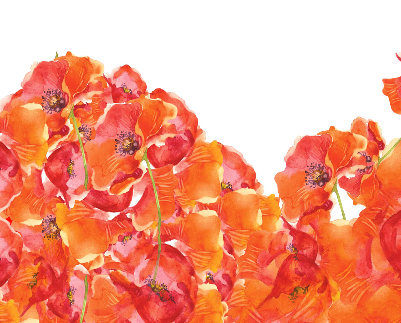
An "offline" pattern
If in future the company decides to launch a physical, brick & mortar store or set up an exhibition stand, it can use the pattern that can be applied well beyond the product package and organically extends the core design.
Finally, we neatly get the mockups ready and send them to the client for printing.
Finally, we neatly get the mockups ready and send them to the client for printing.
Let’s talk about business
Your request will immediately go to the sales department. One of the managers will answer you in order to discuss details. It takes up to half an hour during working hours
The Corporative Site of Bayer CropScience Consortium
Next project
The Corporative Site of Bayer CropScience Consortium
We have developed a regional site with useful information for farmers and finalized corporative guidelines
