How to apply for a job in a designer way
Hiring a designer is complicated work. Wasting a lot of time on filtering out, nights of analyzing resumes and responses, and hours of interviews afterwards. Let me share with you how a designer should apply for a vacancy in an appropriate way so that the person on the other side of the screen doesn’t feel sick.
Inside the article one will find neither revelation nor checklist, according to which one can check the resume and the response — that’s it, having got a dream job. The principles I mention here are basic hygiene for any designer. A designer always needs to think like a designer.
Consider search context
From the door handle to the job search, it’s all about UX. In interfaces, a designer builds CJM and takes into account the situation in which people look and press buttons: they’re focused, staring at the screen idly, switching among tabs or doing everything at the same time in ‘Achtung’ mode. There’re the same principles in the response to the vacancy.
If a person will be engaged in UX design professionally, then they must keep in mind that their actions are the UX research of the employer. In fact, a designer creates a relationship with the person who is in charge of the selection of candidates. In order to do that, this person must take into account the situation in which the search takes place, and act further depending on this.
If a UX/UI designer candidate doesn’t understand the difference between search processes, then it isn’t clear how this designer will cope with a more difficult task.
Do it with care
Every employer is a user in your response to work. Employers are users in the responses. It should be convenient for them to do their target action — to find and select a person who will help solve issues.
We usually ask candidates to respond to simplyhired.com. It’s comfortable for us because this is a long-term job. People stay on the platform, update information about work and experience. If you put them in a separate folder or add them to your favorites, they won’t get lost at all. For instance, we’ll refuse now, but we’ll return and offer a job in the future. There is always a history of communication with the candidate. Most likely, some candidates will be crazy a little because of the platform, but they will still come if they want to work. This is also a filter.
But sometimes designers still write to the mail, because ‘A personal letter is cooler, more targeted and in general, I know the art director via 4 handshakes!’. But such responses work worse: they’re easier to lose and harder to process, especially with active search.
You get to the letters at last, already exhausted and beaten by all these words and briefcases. Therefore, you want real care from letters: after all, you don’t just write via mail. But often when analyzing emails, two questions arise: ‘And this is written by a UX/UI designer?’ as well as ‘What should I do about it now?’.
Stories about poor portfolio submission, 700 MB .rar archives and an offer to download via Torrent are true. Instead of care respect, letters often contain a summary with a picture or PDF. And it’s good if there are some more links in the body of the letter.
Let’s have a look at how many steps it takes to just open a designer’s portfolio from a PDF resume:
6 days of work, if you spend 5 minutes on each candidate. And this is an open position with less than a hundred responses.
If you deal with every letter like this, you can go mad. We’re not a corporation and we don’t have a special person named Thank-you-we-call you back. So, Victoria, my assistant, and Alex, our young art director, are responsible for the initial filtering and qualification of designers. I get an already filtered list of candidates and appoint and hold interviews. Guys, thanks that I’m alive.
So, when companies ask for something in a vacancy, it means it’s significant. But even if the vacancy says: ‘Don’t do it like this, but do it like that,’ it doesn’t help in any way. In the end, this is what comes up:
Don’t embellish
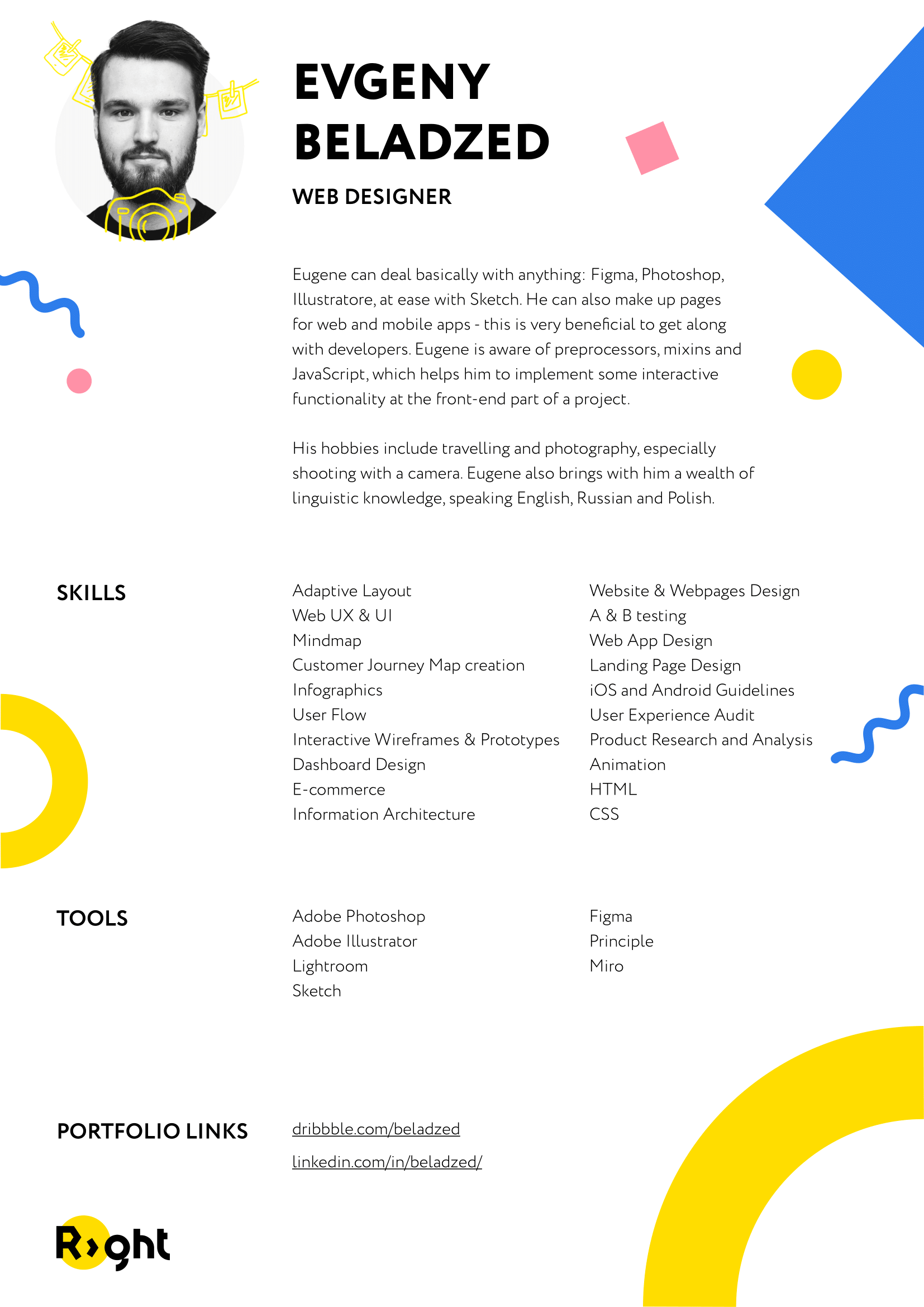
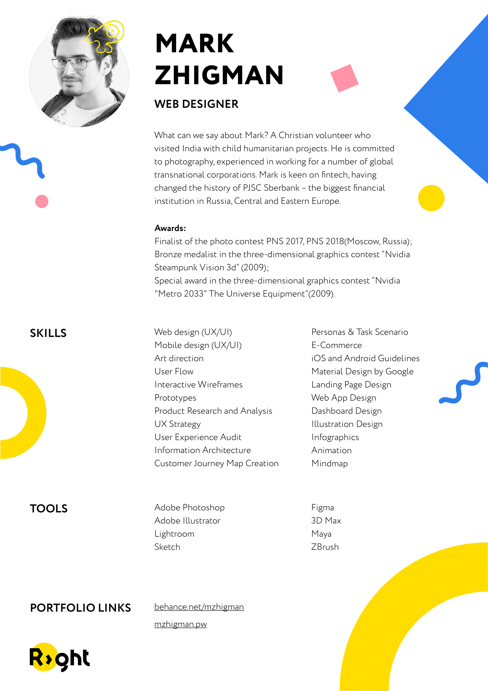
This point follows from the previous one. Beautiful resumes in the form of PDF to the mail — a bone in the throat. There is nothing wrong with them, but context is as important as understanding the search process. I would divide it into two cases: when people are looking for full-time work and project work.
In the process of selecting designers for the studio, such resumes are inconvenient. It’s difficult to immediately check the necessary skills in them, quickly go to the portfolio and simply not lose them in the mail. Even if the design is impossible to forget, then such a resume will be easily buried under a layer of letters in the mail.
Show your portfolio at once
The most important thing for a designer is the result, in other words, a portfolio. This is how designers show what they can do. So, the selection for designers is simple: you open the portfolio, look at projects and classify. But sometimes finding a link is a quest after a story about the difficult everyday life of a designer and stupid clients. Such letters usually go unanswered.
We aren’t an editorial office that deals with readers’ letters. In the design field, selection is primarily based on professional grounds, so you need to understand immediately if the candidate thinks in a designer way or not. Simple way: ‘there is the link — look what I did.’ After that, it’s clear if there is a point to continue the conversation. Especially when it comes to recruiting middle or senior.
The most important thing for a designer is the result. He shows what he can do. So, the important thing should be up
Write on business
When a designer isn’t lazy and writes a personal text, it’s great. This is an indicator that a person got acquainted with the company: who we are, what we do and how.
A sincere and personal letter is great, but there are guys who go overboard and spill everything they can. But you won’t read all this: it’s not interesting. And we can even roll in stories.
If a designer spams with an impersonal mailing list for all vacancies, it means that the designer doesn’t care where to work.
No need for long stripes
The letter from the designer should be easily read in one glance. In this case, those who write concisely win: read diagonally, found a portfolio, and took a look.
A paragraph is the optimal amount of text that helps to trigger excitement. The designer must understand how to give all the interesting information to the person who sees it for the first time.
Do not write stories about difficult life
When people start complaining about the company they work for in the first paragraph, or say they’re looking for a better life, please, this is not for us. Such candidates don’t pass an easy test for adequacy.
We’re looking for those who will solve issues with us. We also want to live together happily constantly, but along with tasks.
Don’t duplicate your skills
No need to describe your skills: it can be found in the resume. But some points can be clarified. For instance, you know how to combine all the pages of one fig-file into one or you know how to work with variables in Illustrator.
Don’t bury yourself with phrases about incompetence
‘I know that I won’t suit you’, ‘I’m ready to work for food’, ‘I don’t apply for a vacancy, but suddenly you need an intern’ — then why are you writing at all? Give the opportunity to assess you normally: attach a portfolio, write a story about yourself, and everything will become clear.
No need to write once again that you can’t do anything, life is senseless, and the parrot is dead
For example, let’s look at not the worst and not the best response to a vacancy. There is no personal information. Request to the author: don’t get offended, please!
These emails don’t work very well. Of course, first of all, a portfolio, and then a text, but a candidate’s soft skills are sometimes more important than hard ones.
Here is an example of a good letter. Hello, Slava!
Nice, appropriate and delicate. Even three years after this letter, I want to talk with the author and find out what else interesting he has got.
If a designer can’t think like a designer when looking for a job, then it’s not a designer at all
is the main idea of the article.
You can find a recommendation not to be too creative in the responses somewhere else. But this is a story for later: we must keep the secret and not publish an article about it for another six months.


