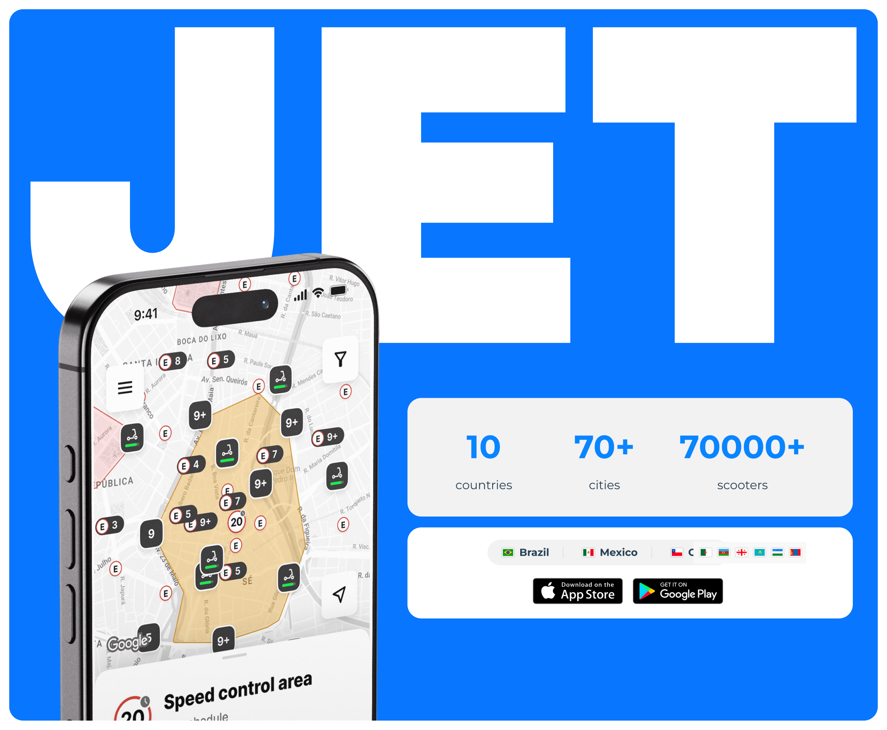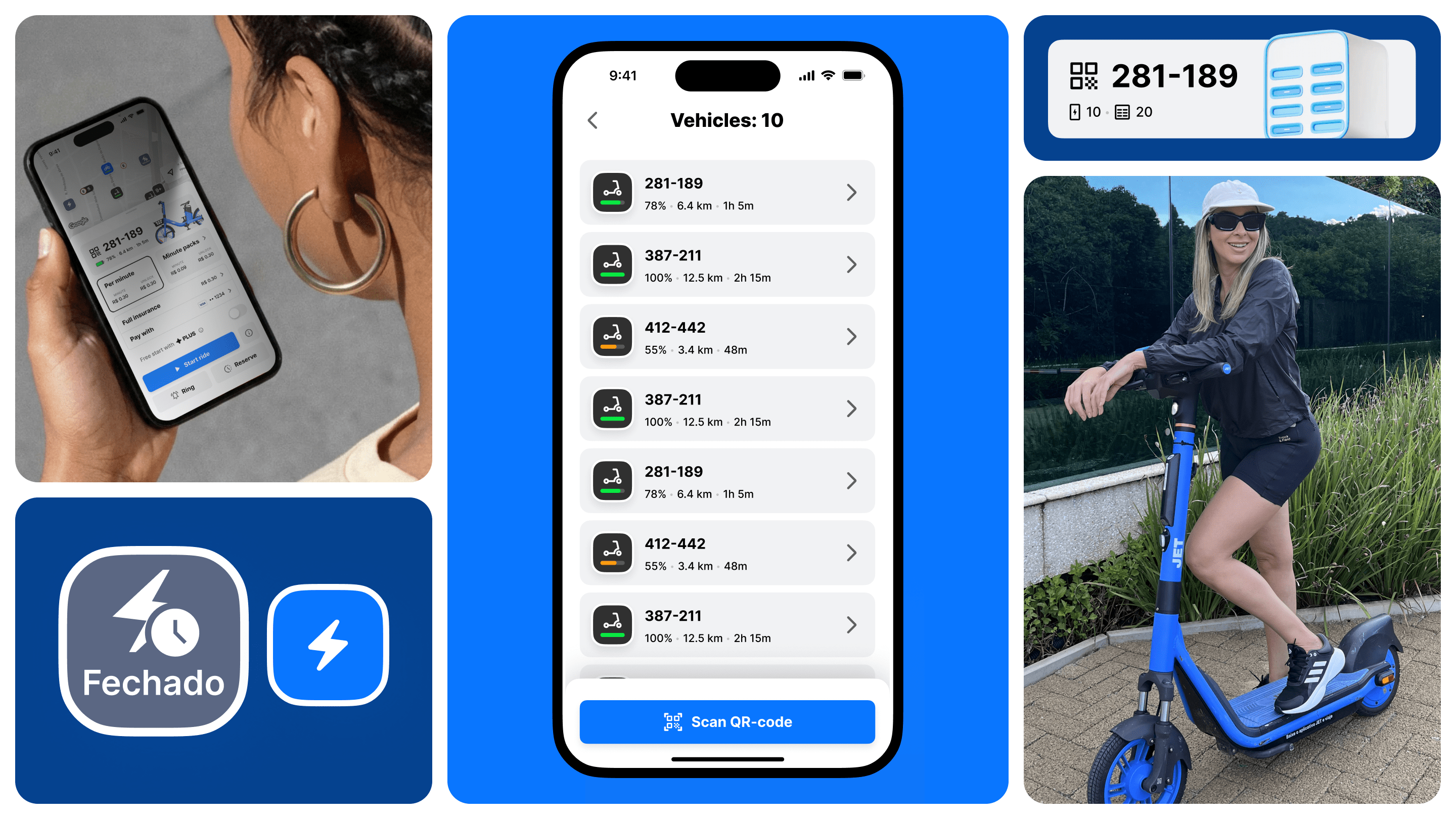
Jet LATAM is a scooter and bike-sharing service that entered the Latin American market using an existing franchised mobile app, but with its own vision for the product’s development.
Update the existing app in line with the new conditions by improving the user experience, redesigning key scenarios and laying the groundwork for the service’s future development.
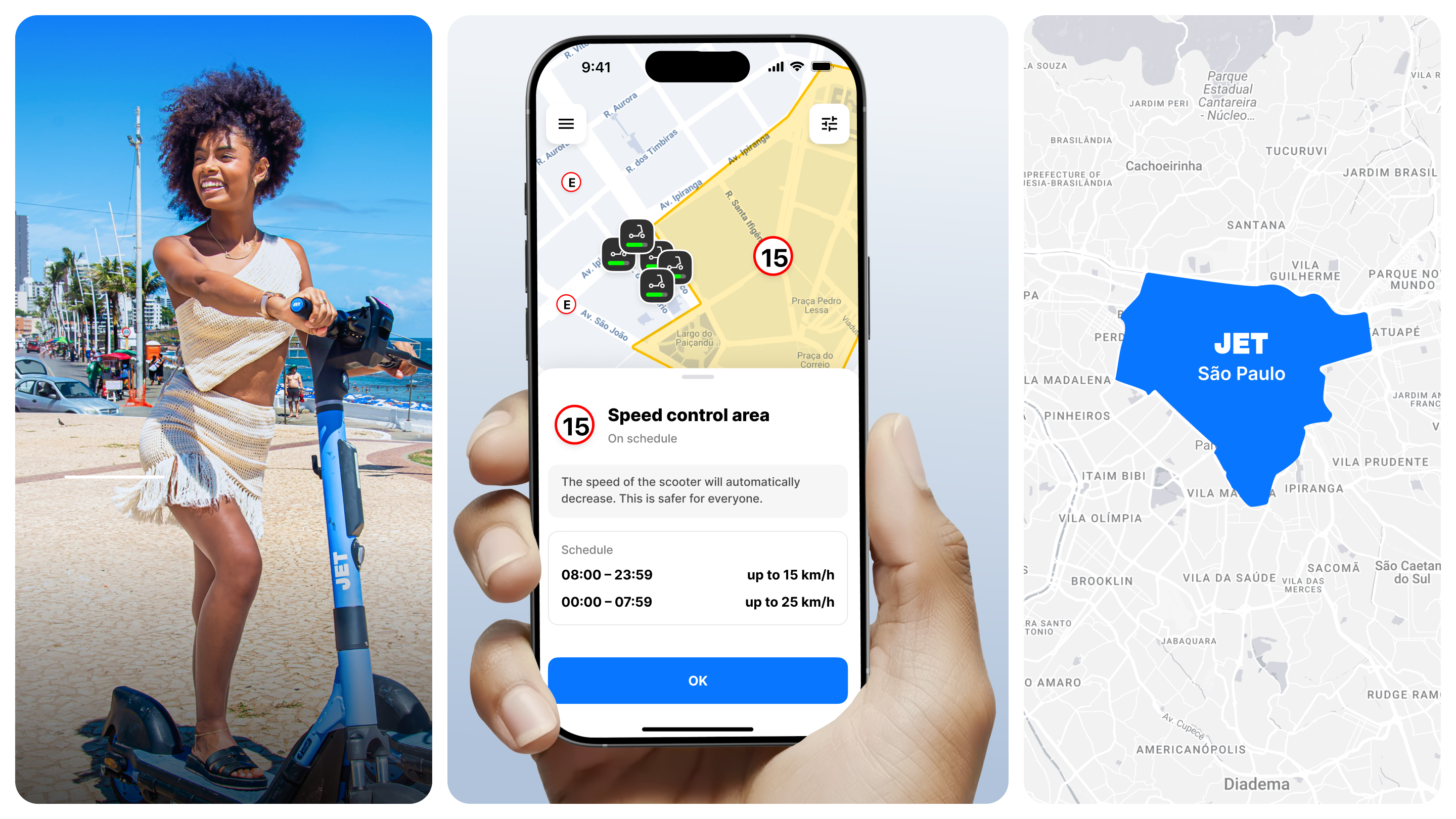
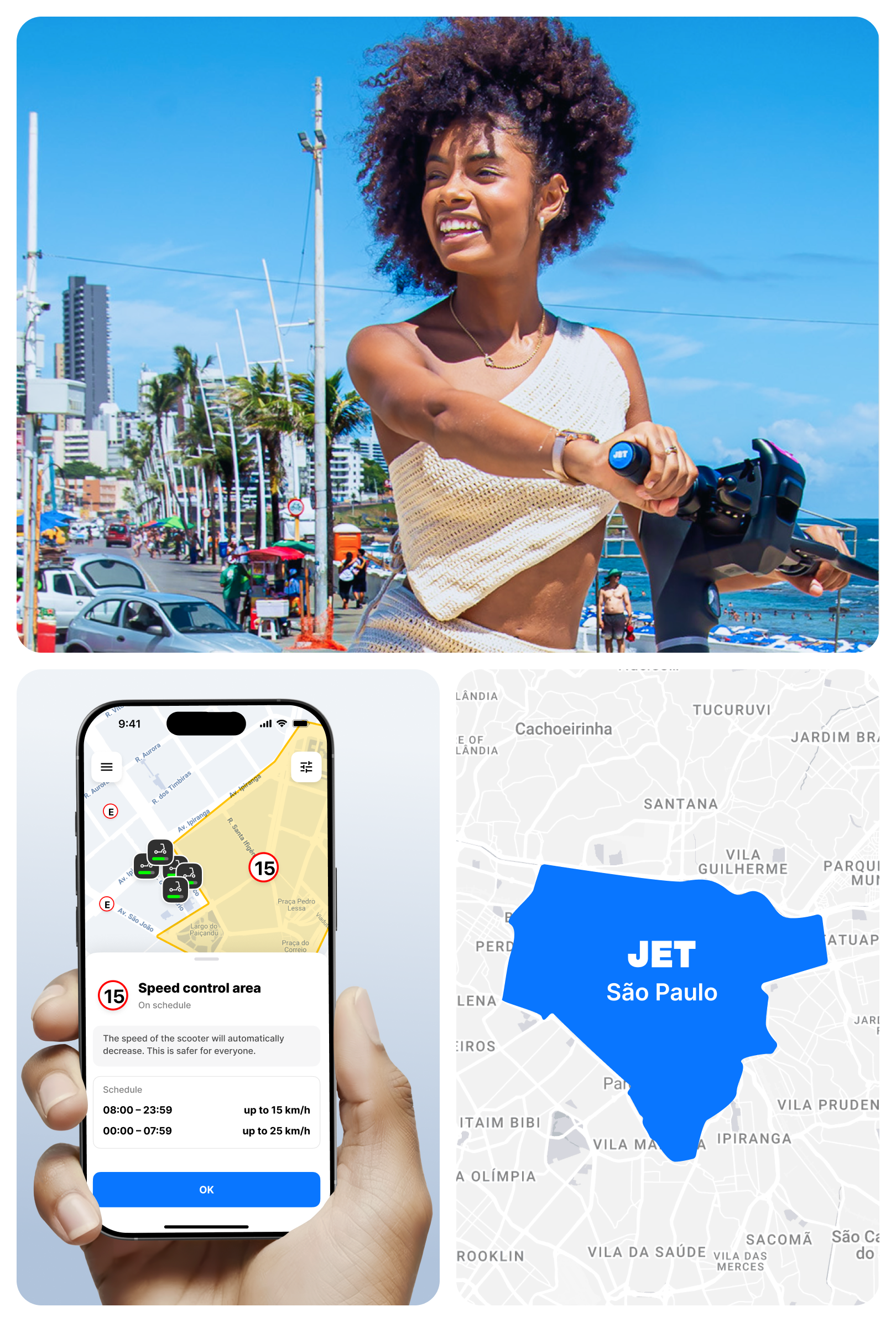
Scooters, bicycles, powerbanks
Jet LATAM was created as a unified ecosystem for urban mobility. Today, the app includes scooter, bicycle, and powerbank rentals, but it was clear from the start that the product would constantly expand. That’s why we designed not a set of separate screens, but a scalable system capable of supporting new services without losing usability.

Reconceptualising the product and establishing its identity
Instead of developing from scratch, we transformed an already working product. The franchise app, created for the CIS market, needed to be turned into an independent service for Latin America. The Right Studio team aimed to preserve successful solutions, get rid of accumulated limitations, and rebuild the user experience. All this, taking into account local specifics.
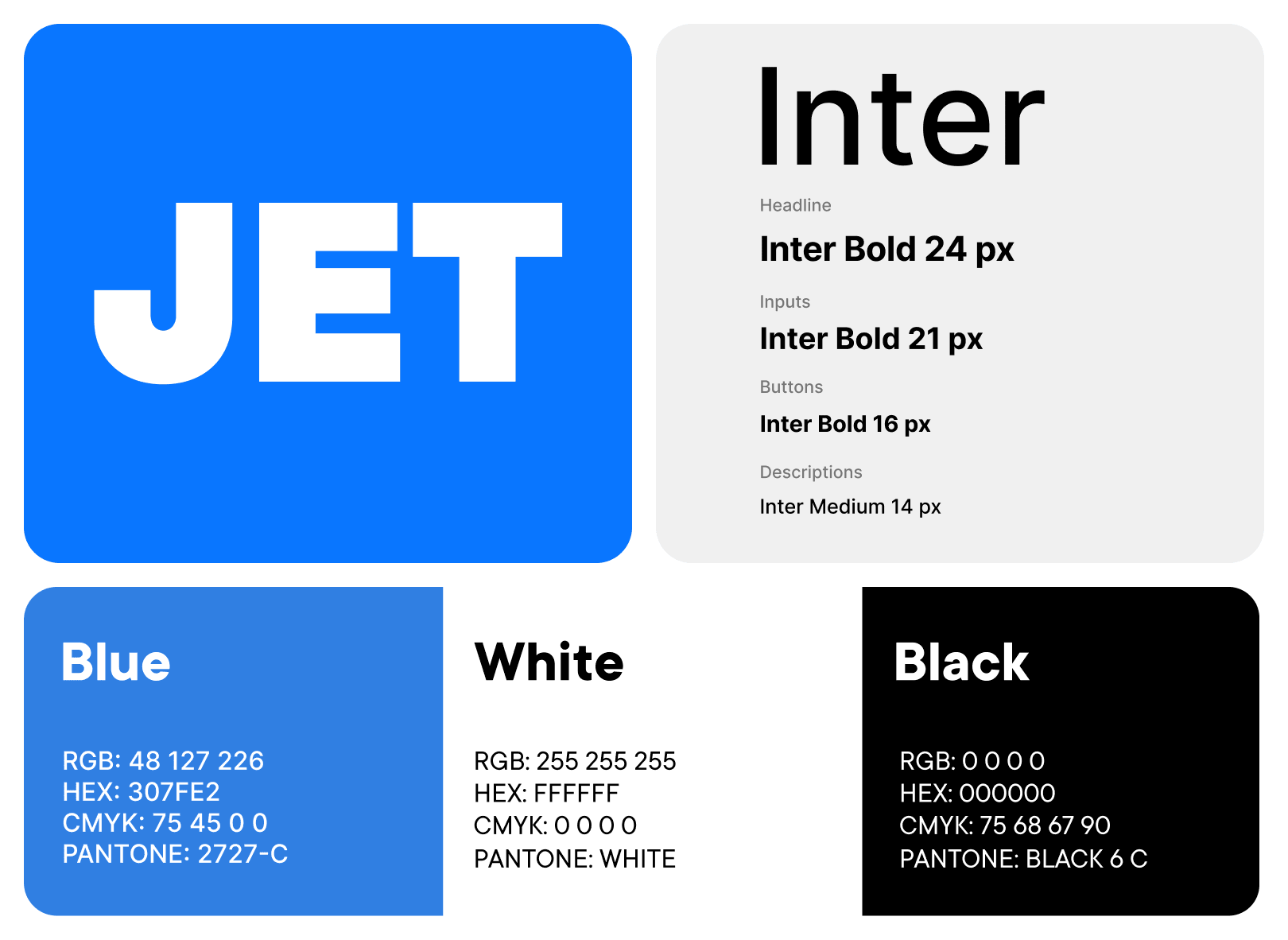
Before starting the UX rework, we updated the app’s visual language. It became the first step in forming Jet’s independent brand identity and redesigning the mobile app.

Researching
Work on the application began with in-depth research. The Right team analyzed dozens of mobile solutions for sharing services, banking services, and other digital products, both European and local in Latin America.
We looked for the best user practices: we analyzed differences in identification, authorization, and payment scenarios in different countries to combine the most successful solutions into a single application, equally convenient for locals and tourists.
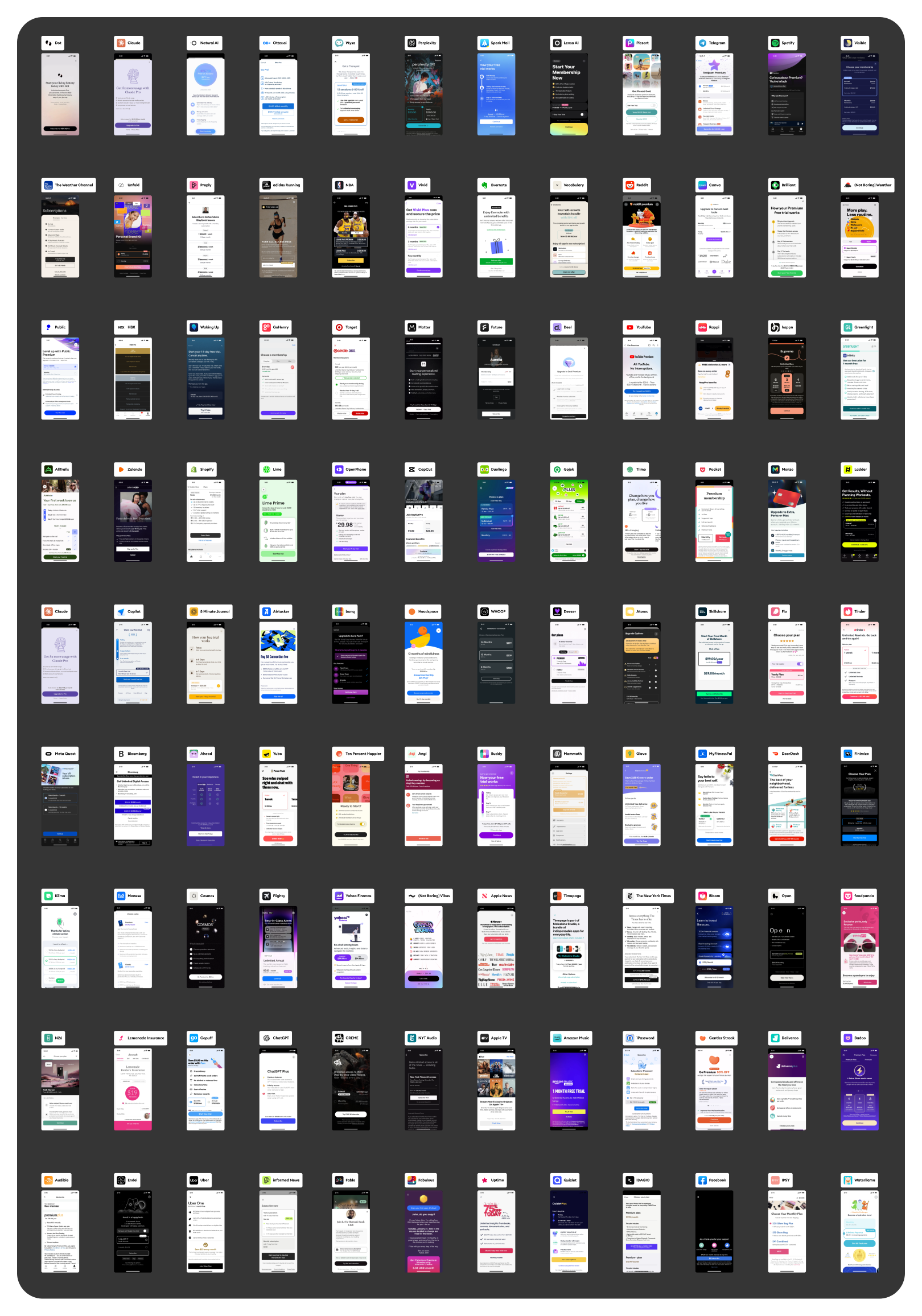
As a result of the research, we identified several key market features that directly influenced the product architecture, user scenarios, and visual solutions.
Local specifics
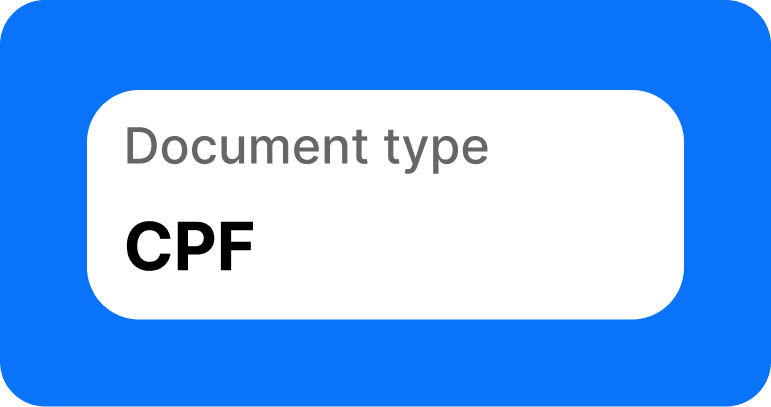
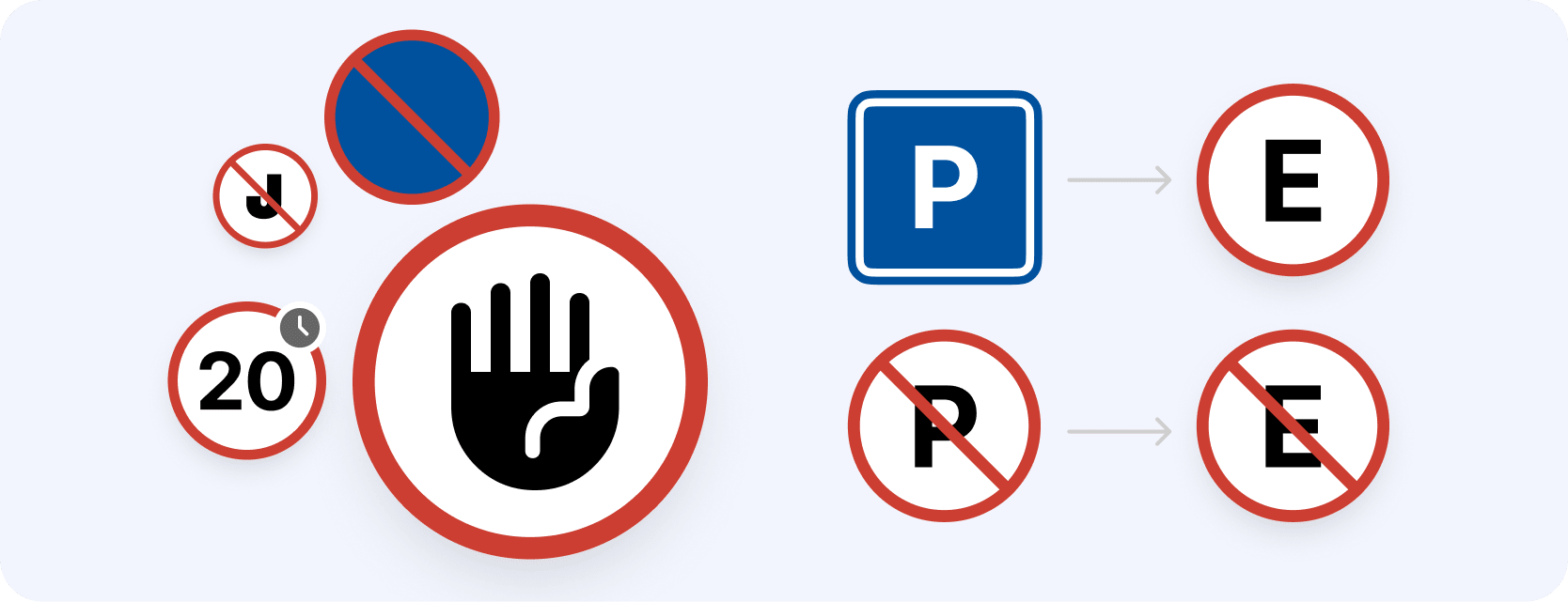
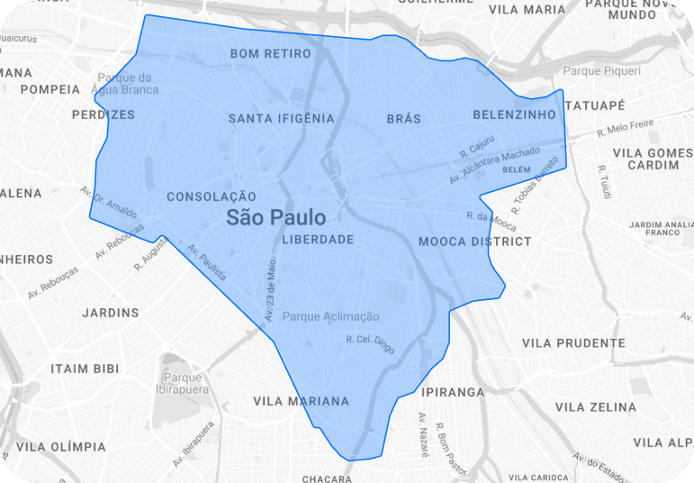
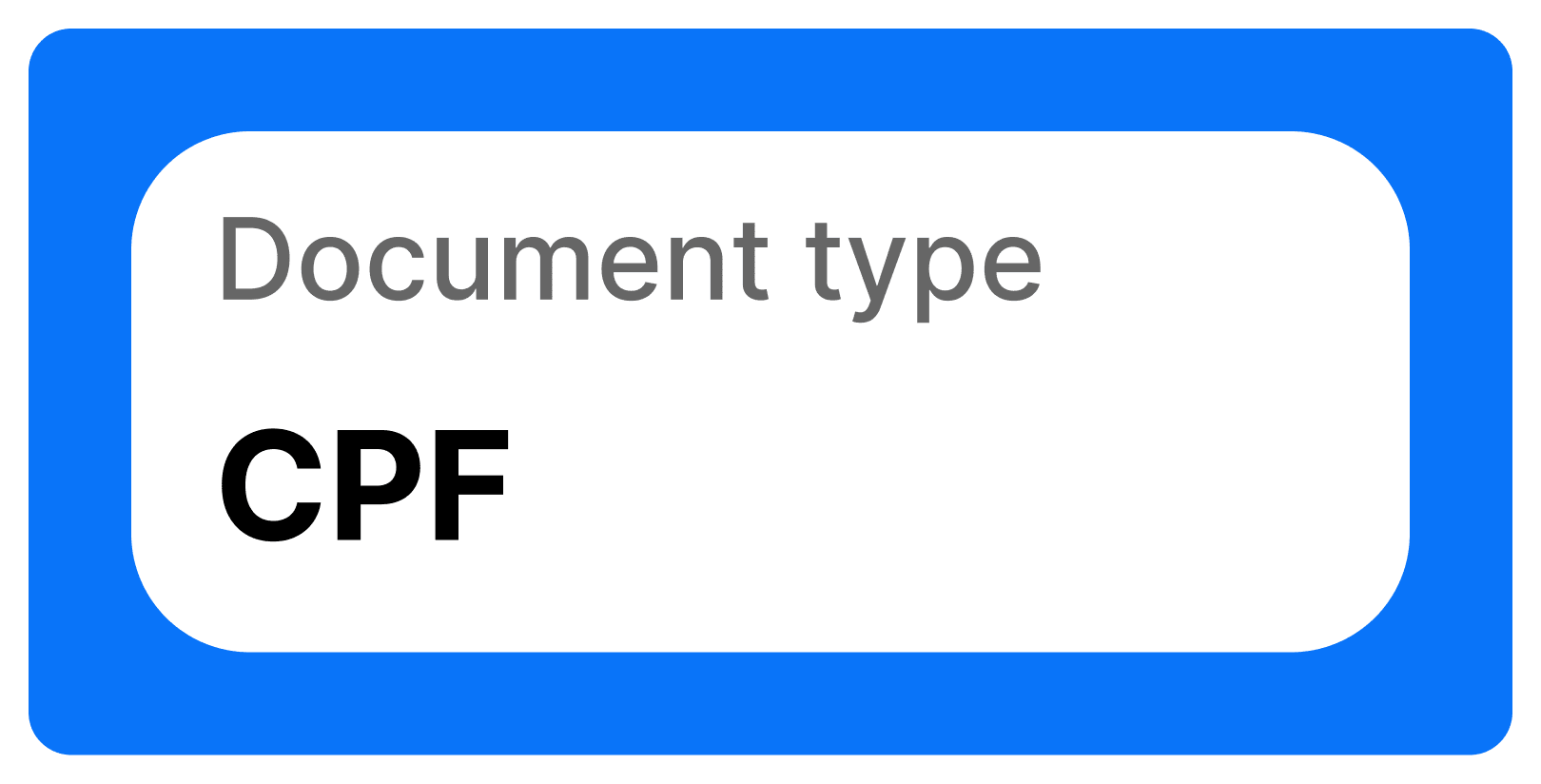
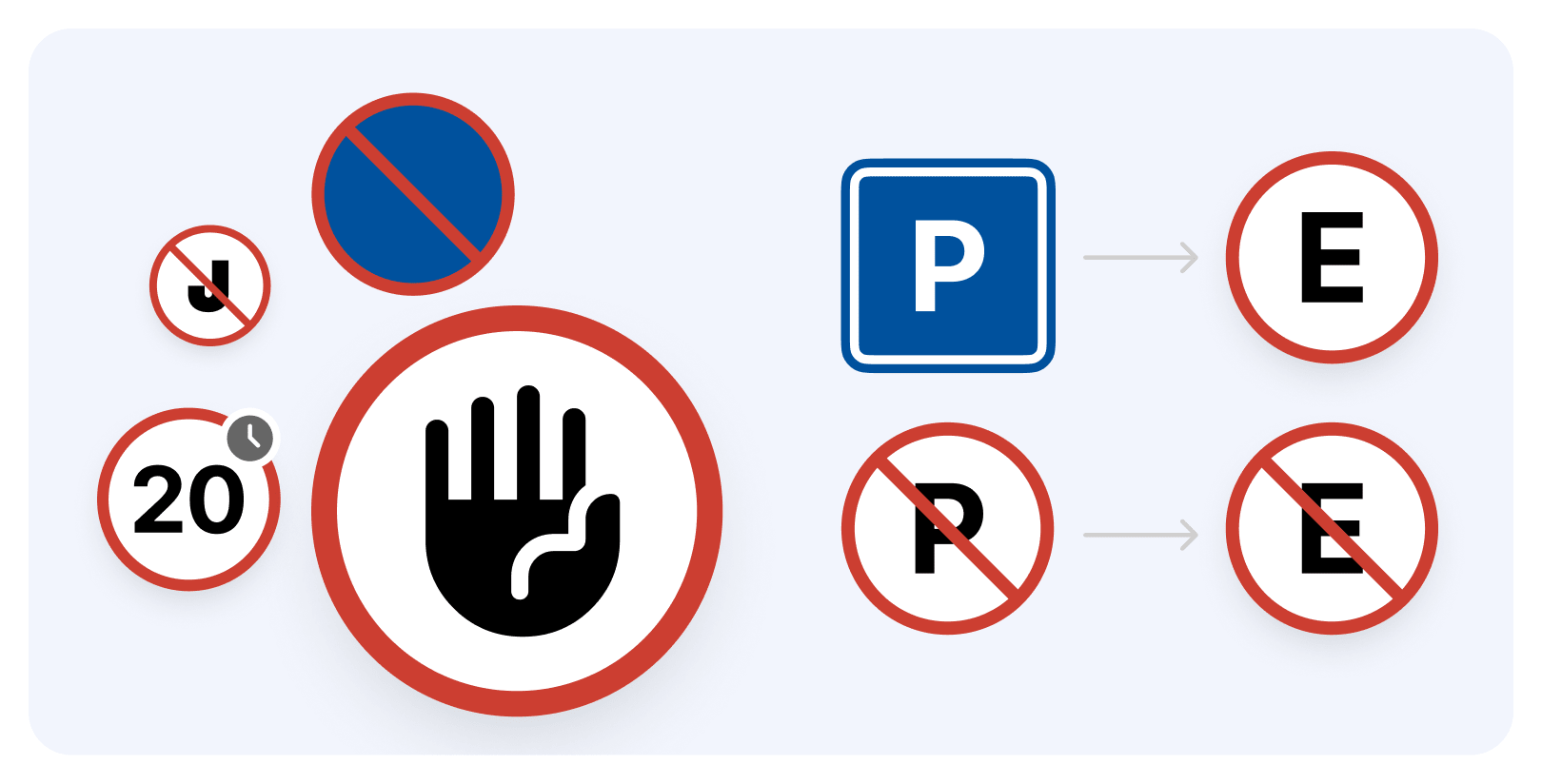
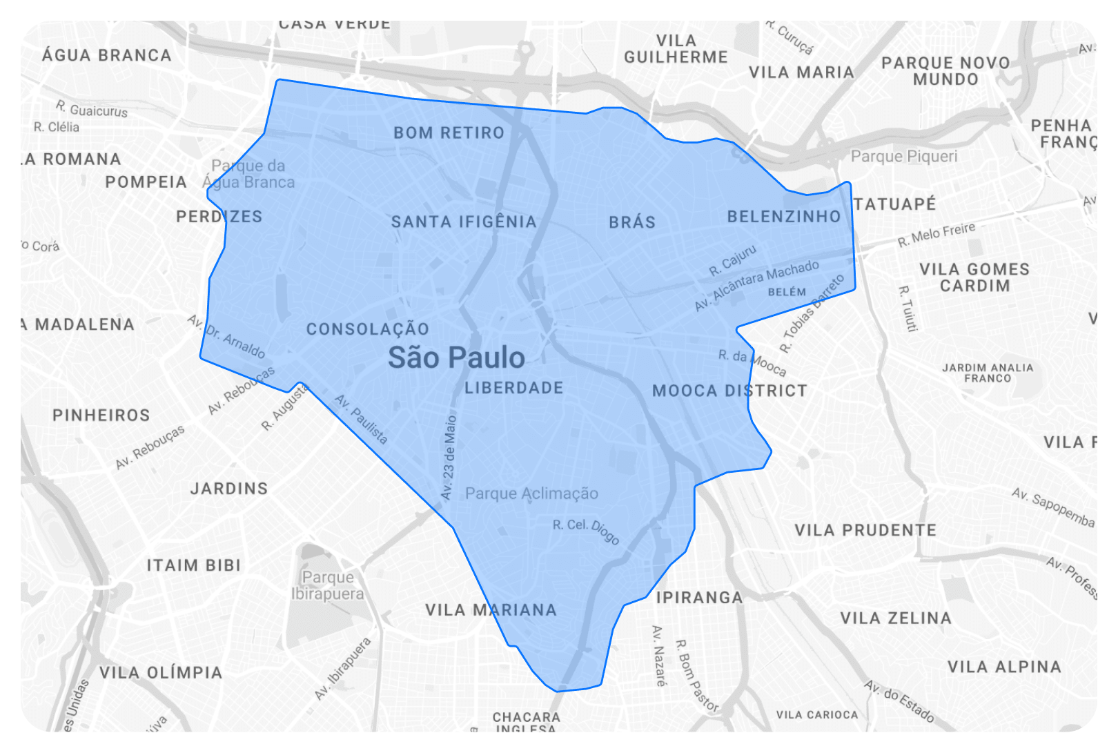
The local context turned out to be much broader than just interface translation. During design, we considered legal requirements, user habits, and environmental features that directly affect the usability of the application.





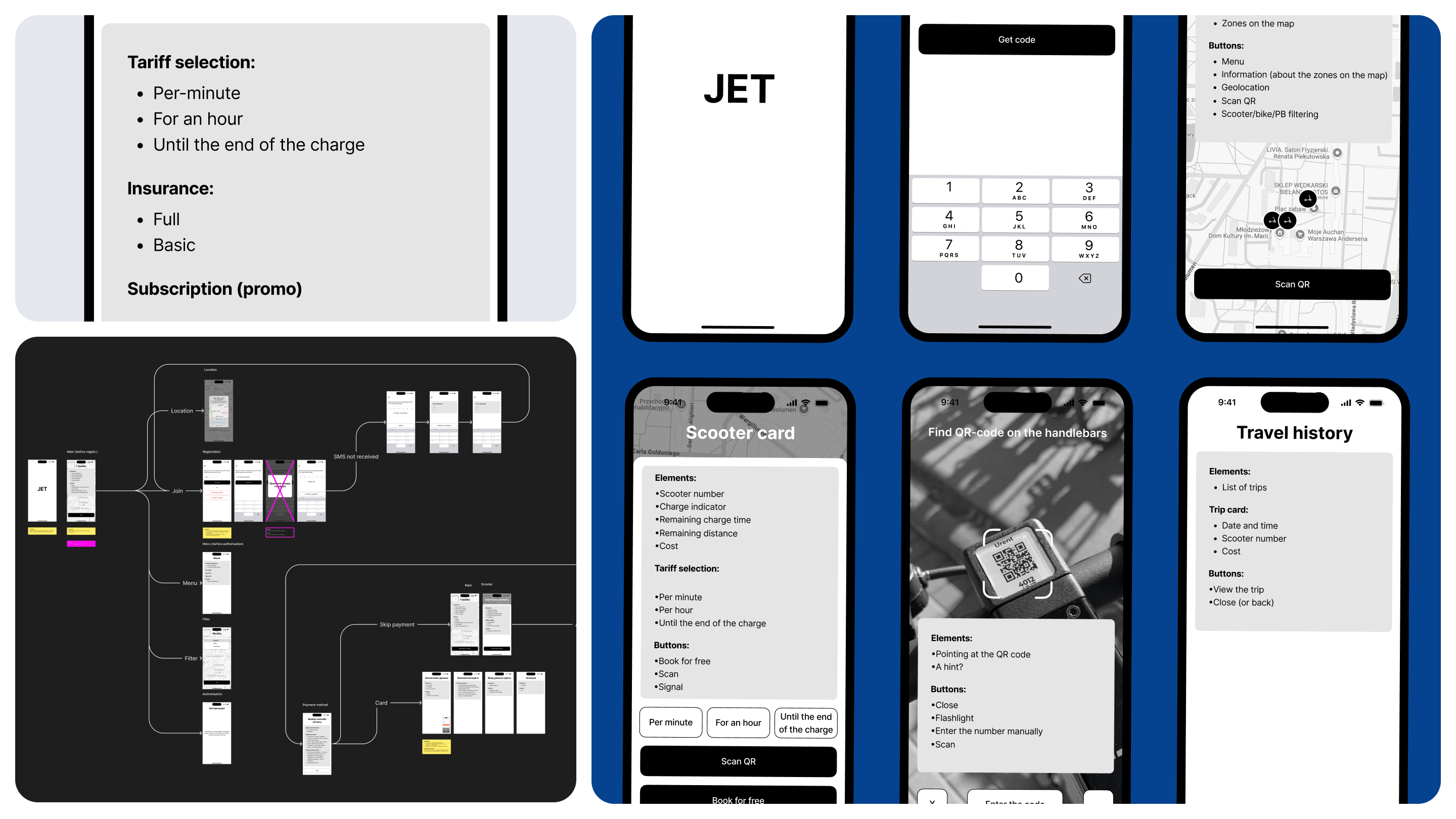
Lo-fi prototypes
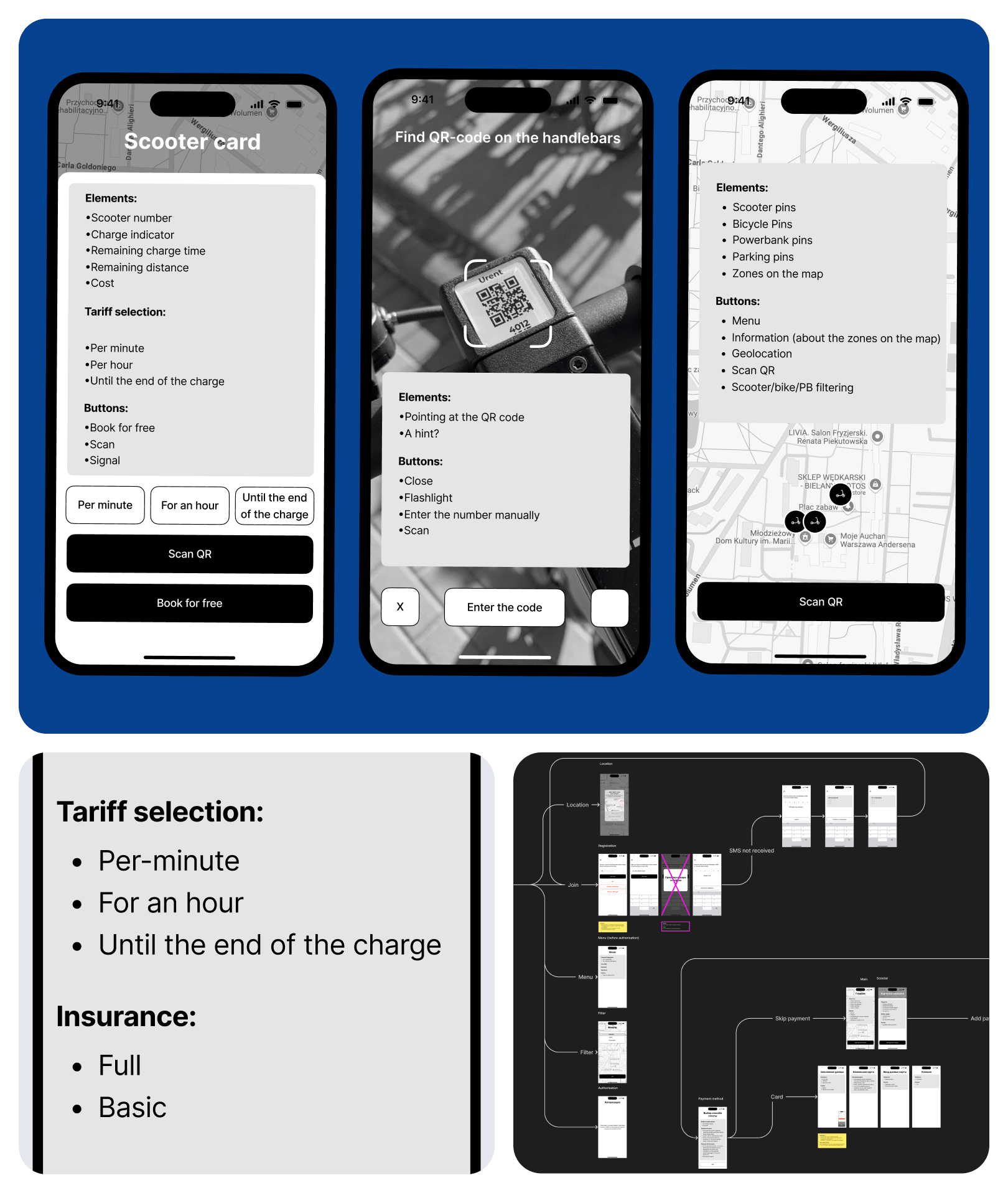
After extensive research, we moved on to developing low-fi prototypes and refining user scenarios. At this stage, we formed the architecture of the future product and showed how the franchise application transforms into a standalone service. We outlined which specific scenarios would change, what features would appear, and how they would work.
Our low-detail, but logically developed prototypes were sufficient for developers to start implementing the product logic even before the final design was ready, and to proactively check controversial scenarios with lawyers.
Icons and UI-kit
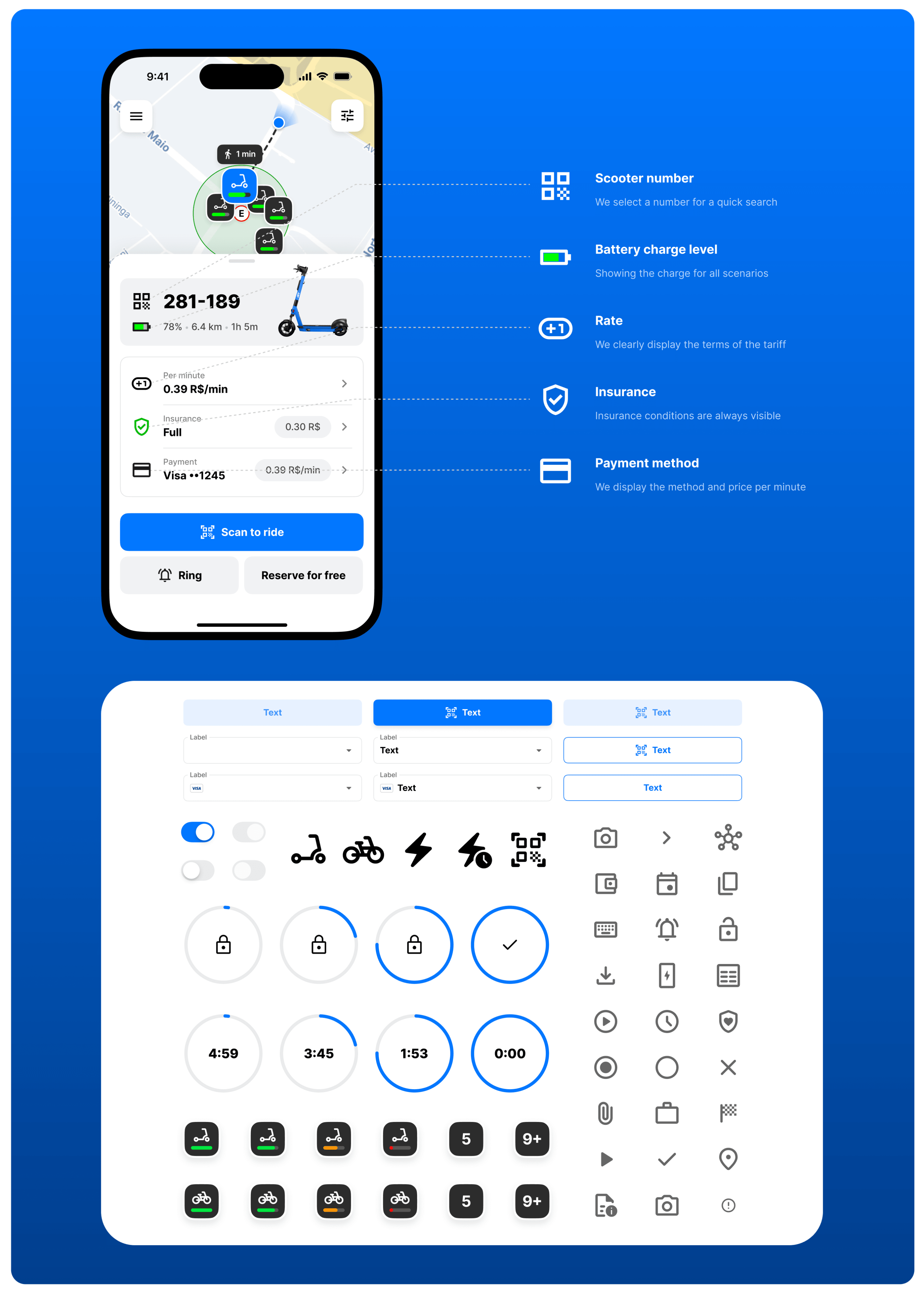
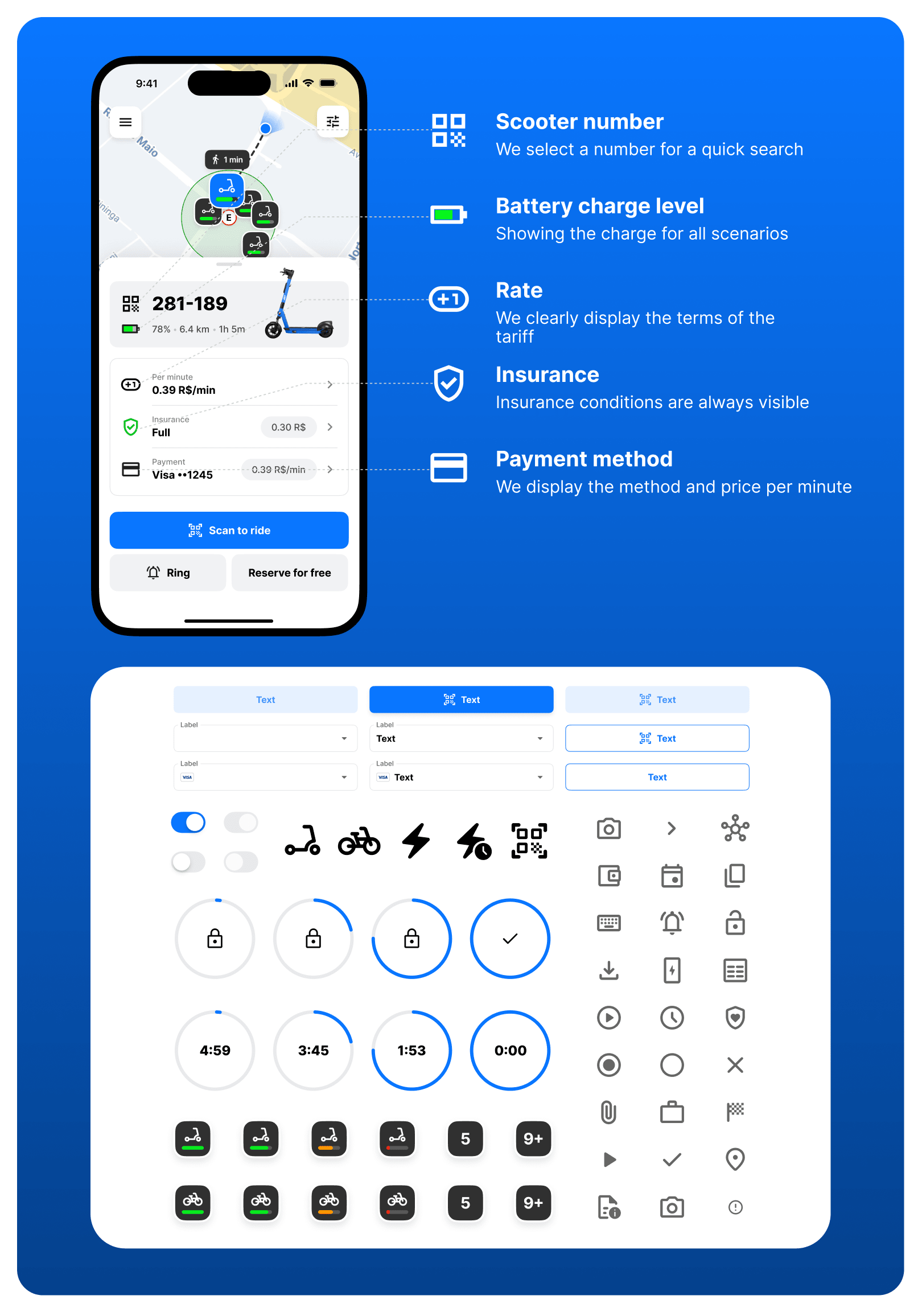
During the design process, we created a flexible UI kit designed for the service’s growth. Thanks to a unified system of components and icons, the application was ready for the appearance of new products. A little later, with minimal adjustments, it was localized for a new region in a short period.
Map customization
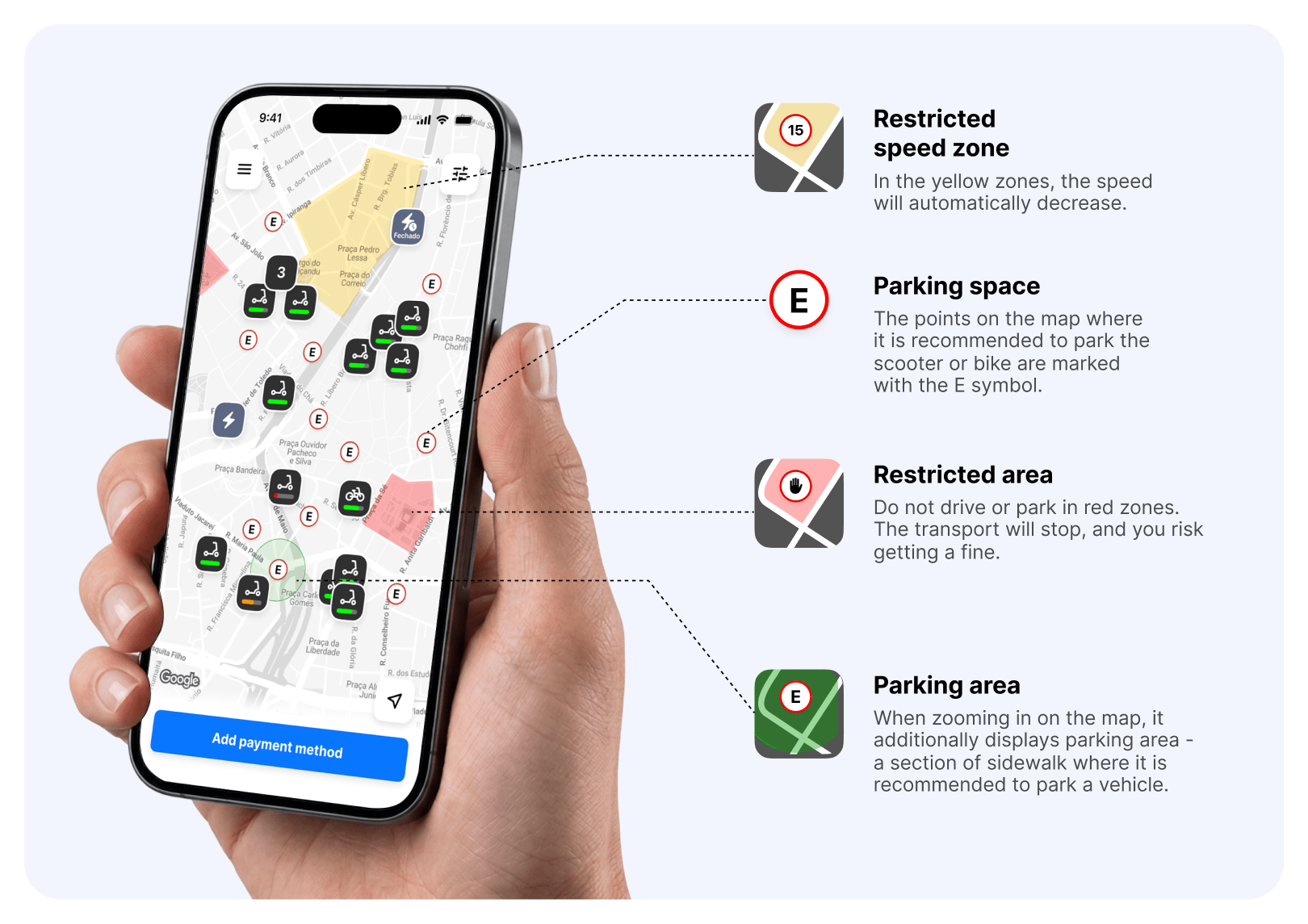
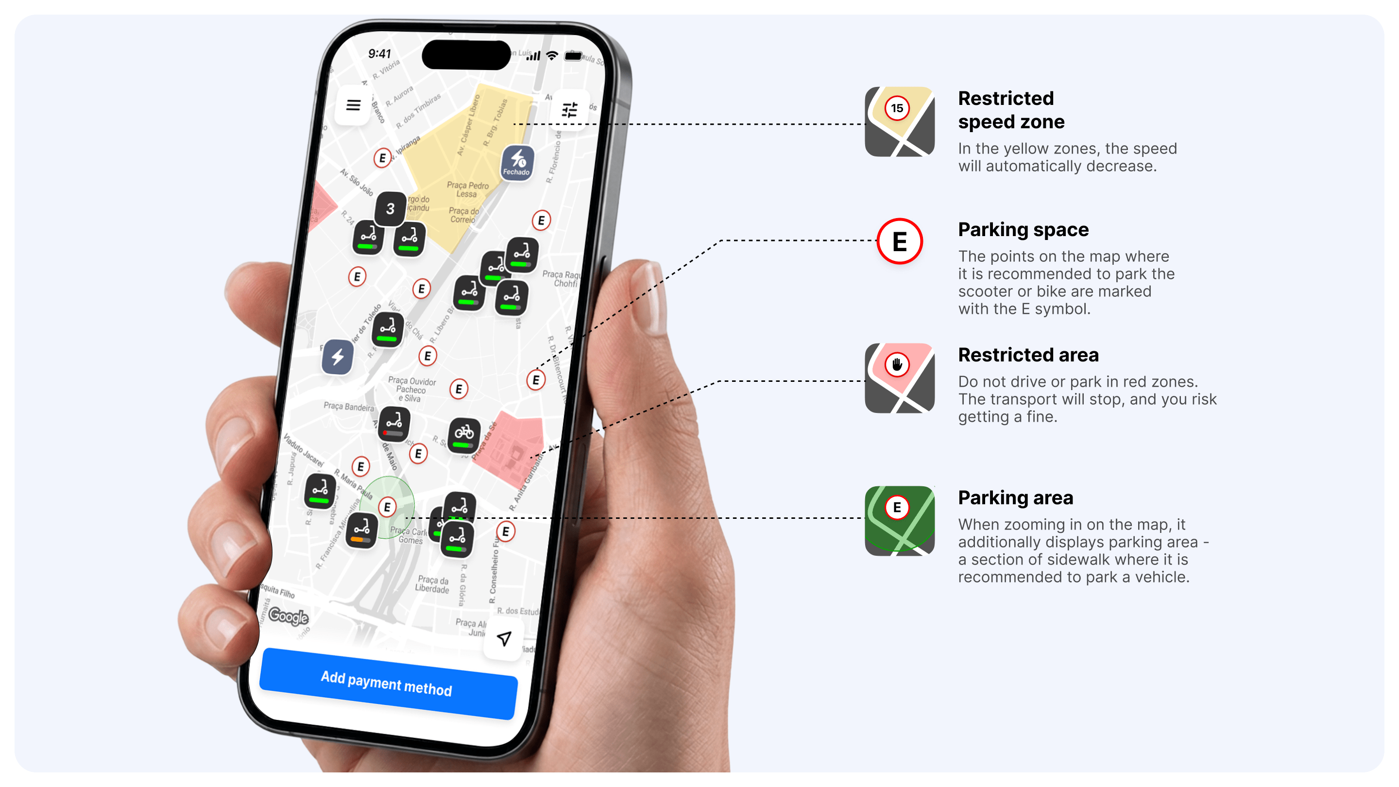
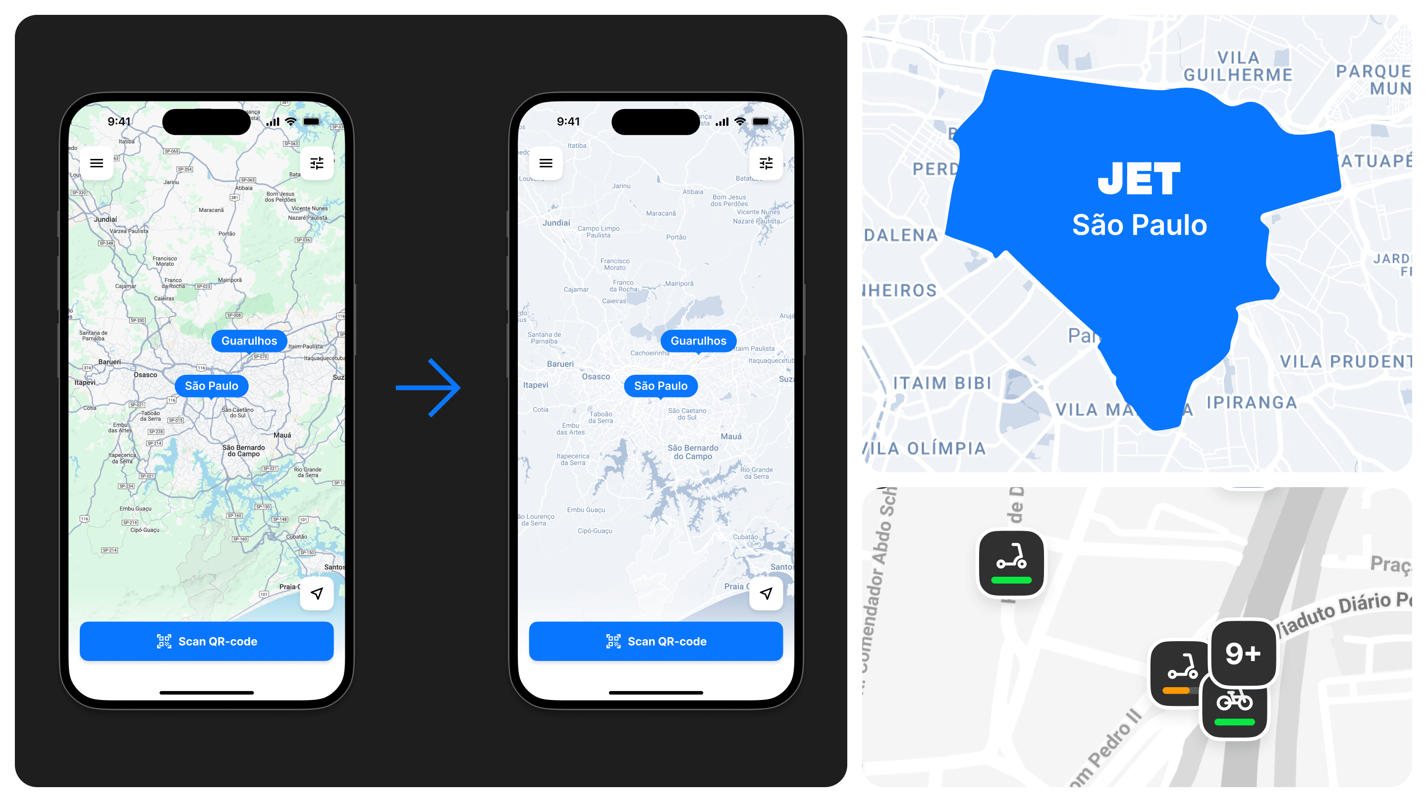
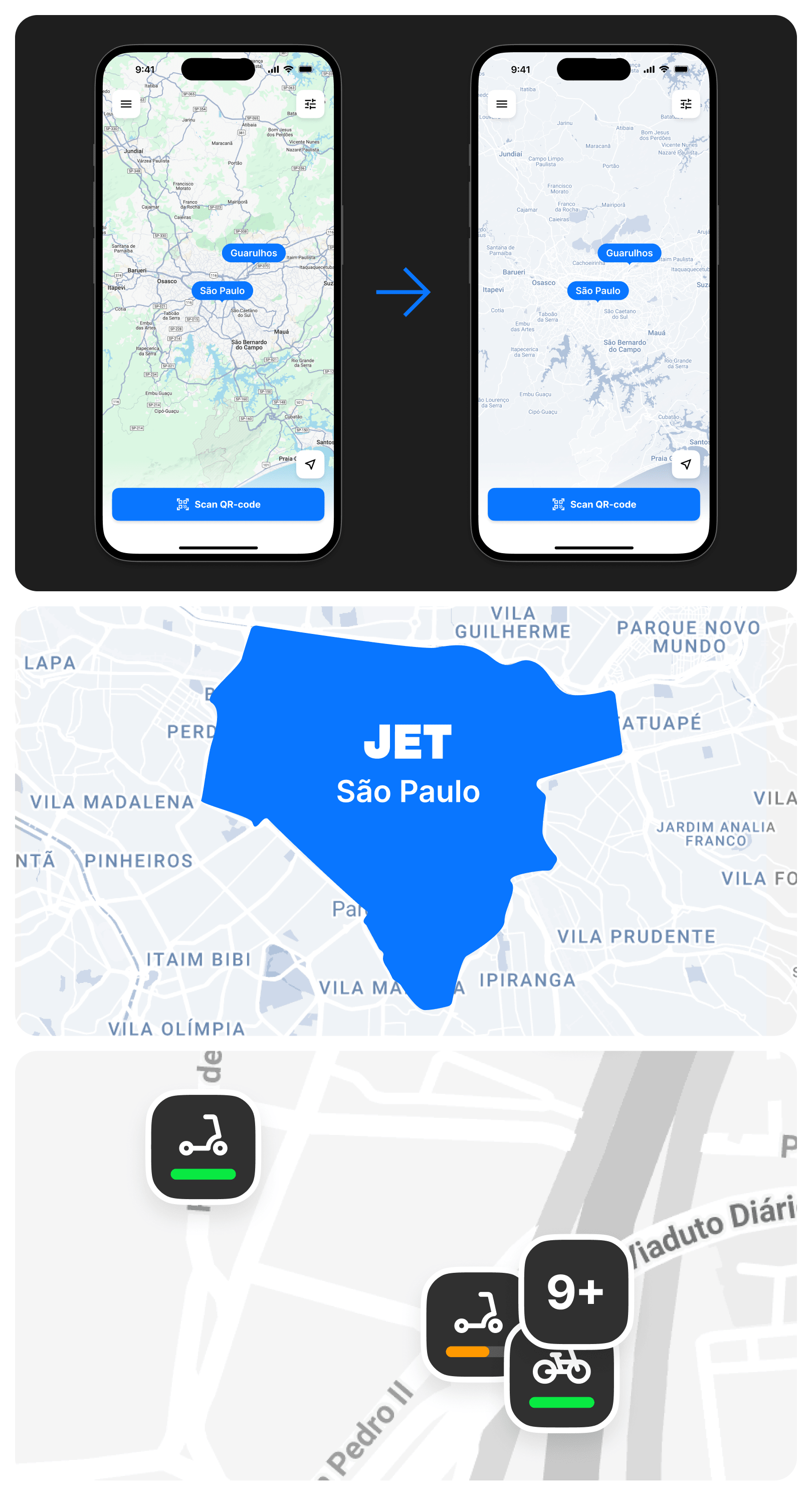
Instead of creating a mapping solution from scratch, we tested various customization options for existing maps with the developers. Ultimately, the most flexible and scalable approach was adopted. Then, we configured the colors, layers, and map elements so that they seamlessly integrated into the interface and could be easily adapted as the product expanded.
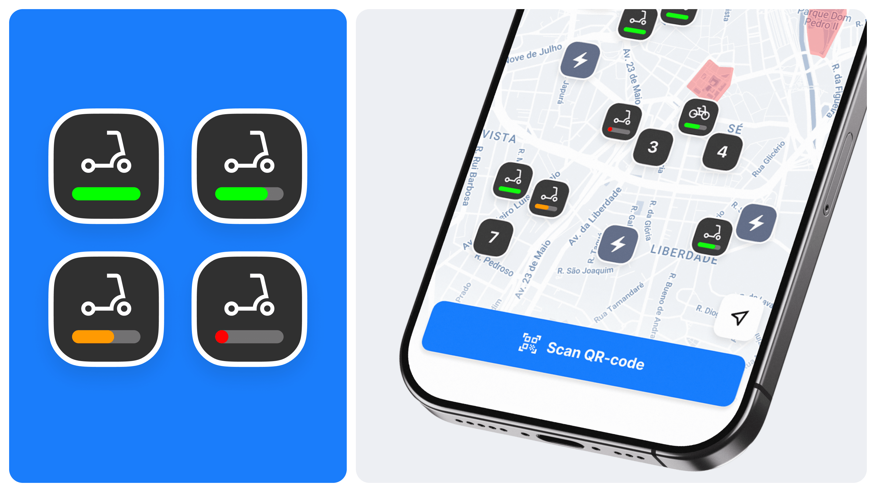
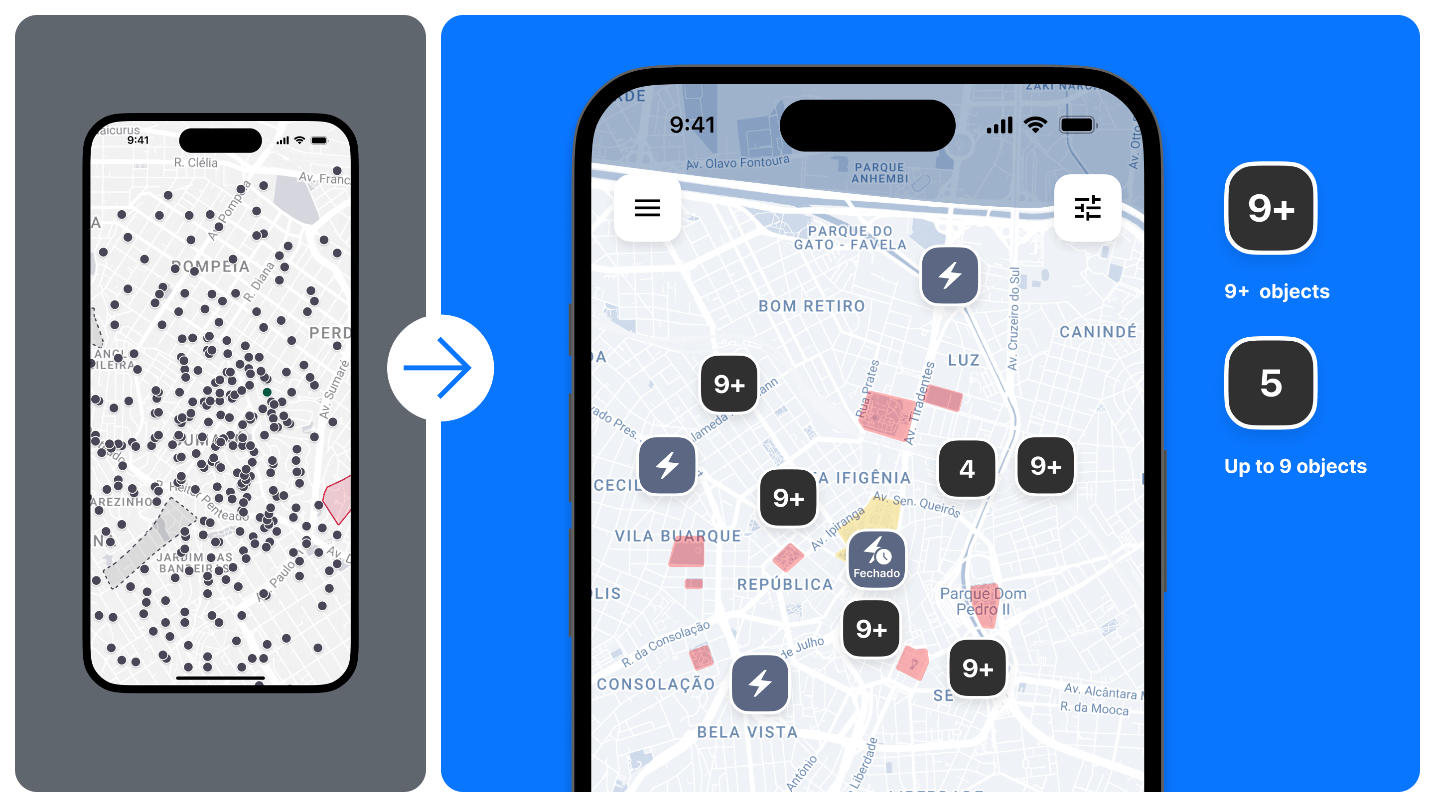
Displaying charge level and object grouping
One of the common problems with sharing services is an overloaded map without a convenient filtering system. To solve this, we implemented object clustering, adding clear differentiation, and also displayed the charge level directly on the map.
As a result, the user can navigate a large number of devices faster, easily find the right type of transport, and use parallel rentals.
Booking, registration, payment
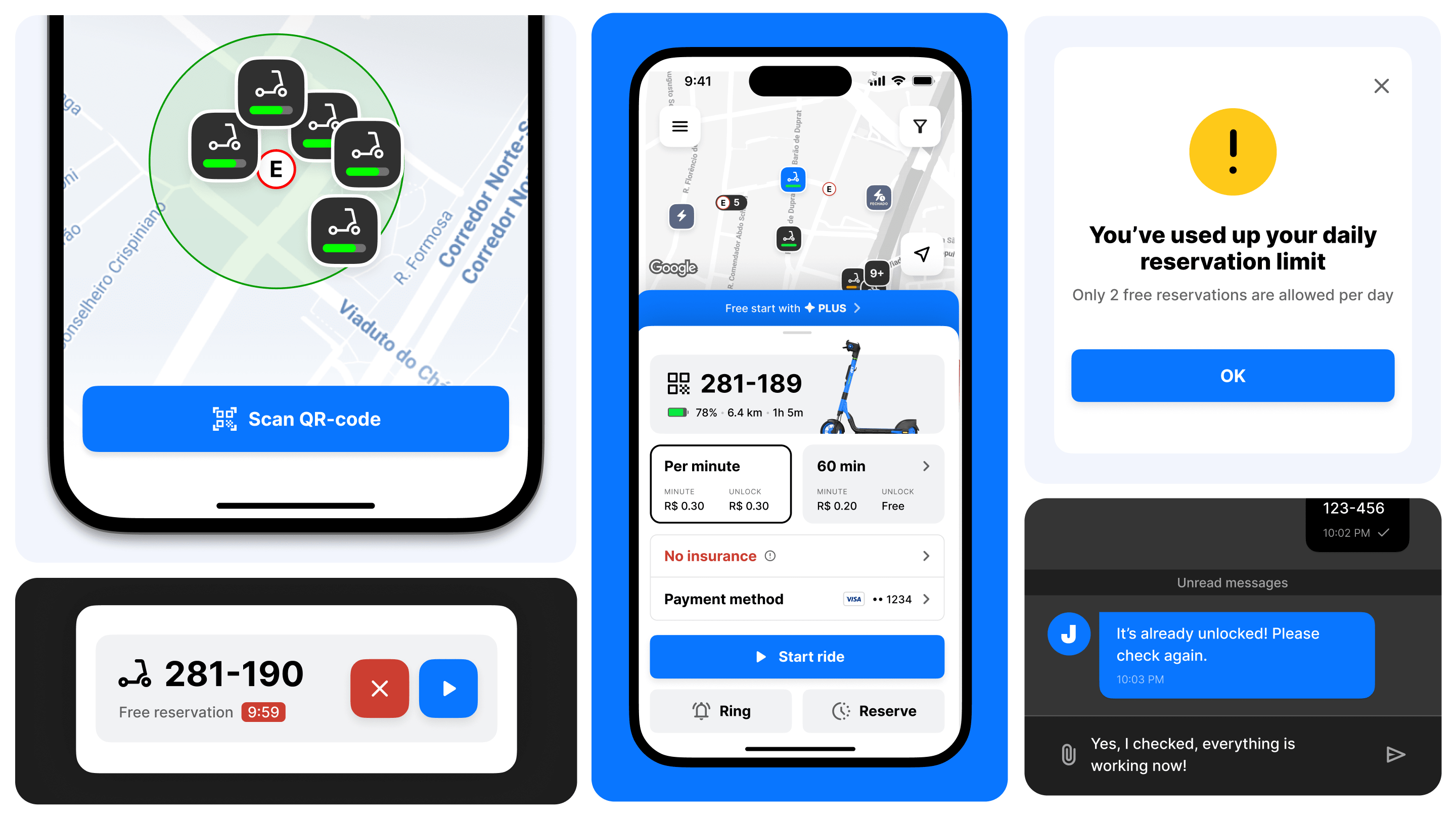
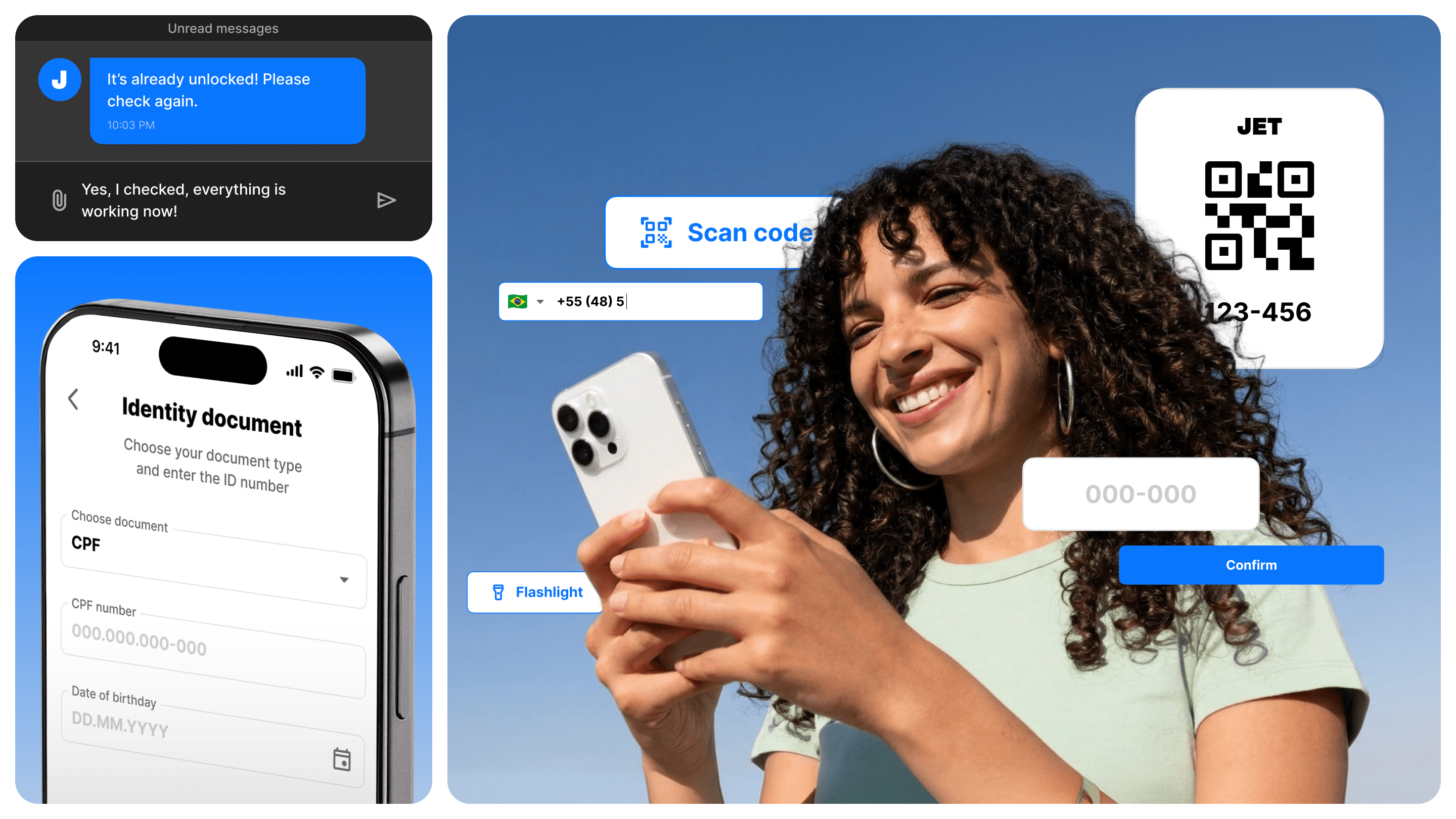
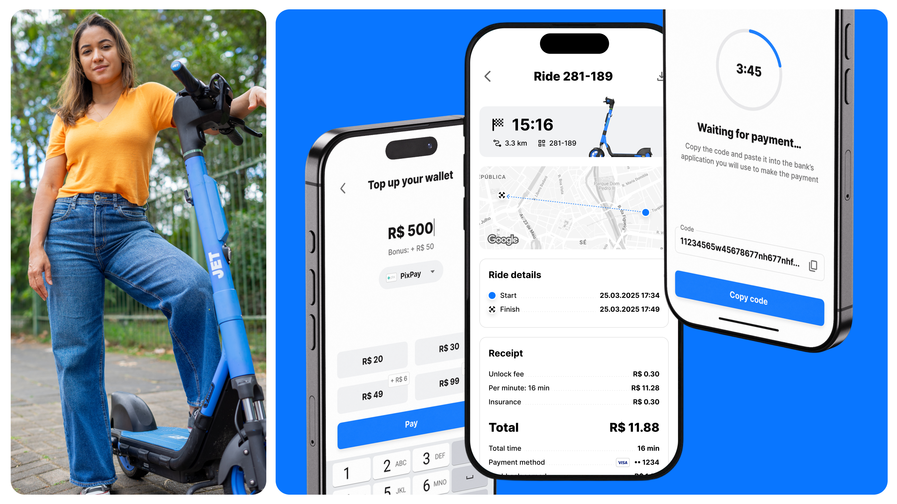
We completely rethought key user scenarios — from the registration process to trip payment. In Brazil, using CPF involves about 6–7 steps and hours, sometimes even days, of waiting for verification. My team and I at Jet reduced and simplified this path to 3–4 steps with instant registration. A separate identification scenario was provided for tourists.
In parallel, we added a booking system and integrated the local payment system Pix so that the rental process aligns with the habits of Latin American users.
Tariffs
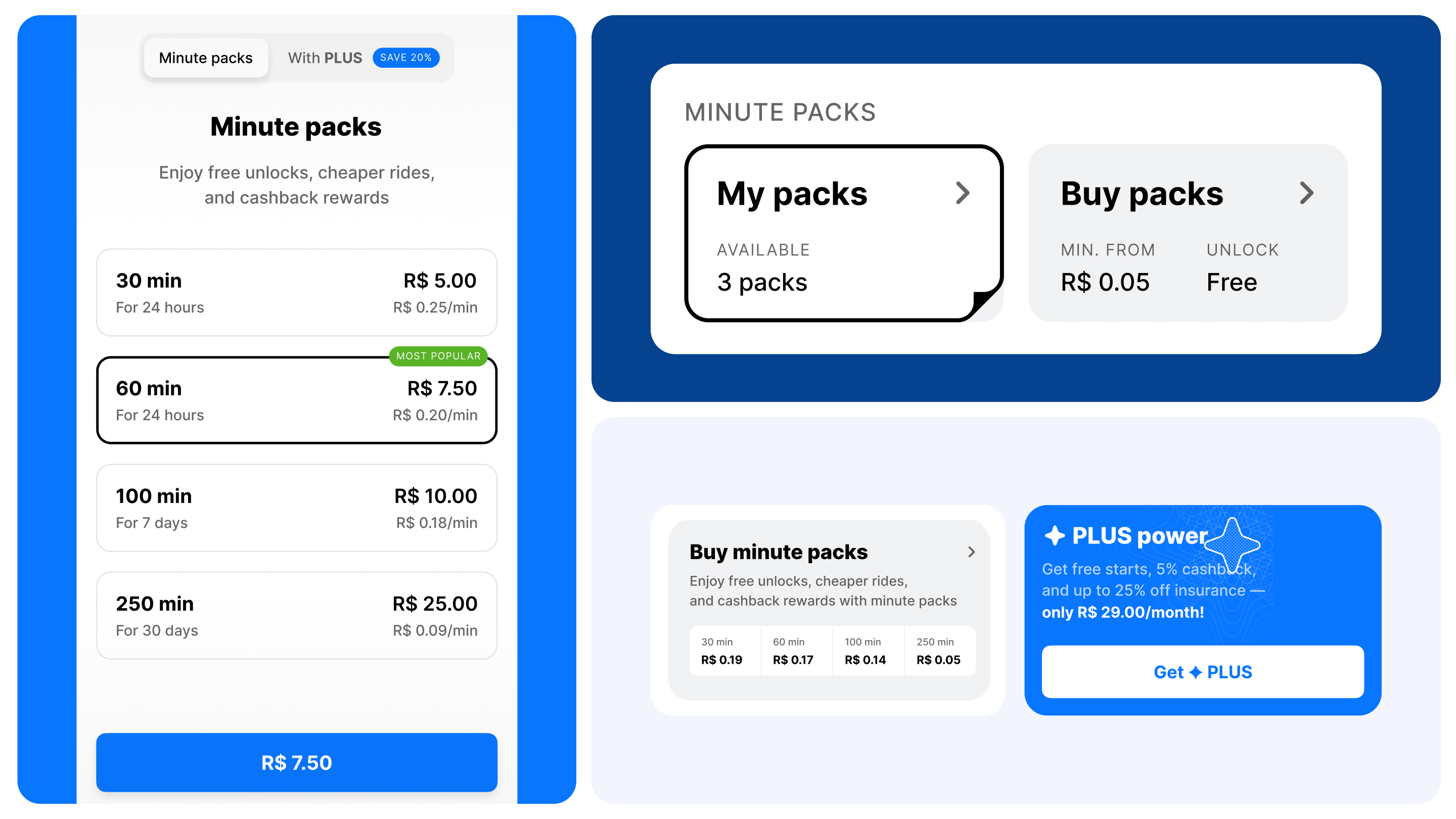
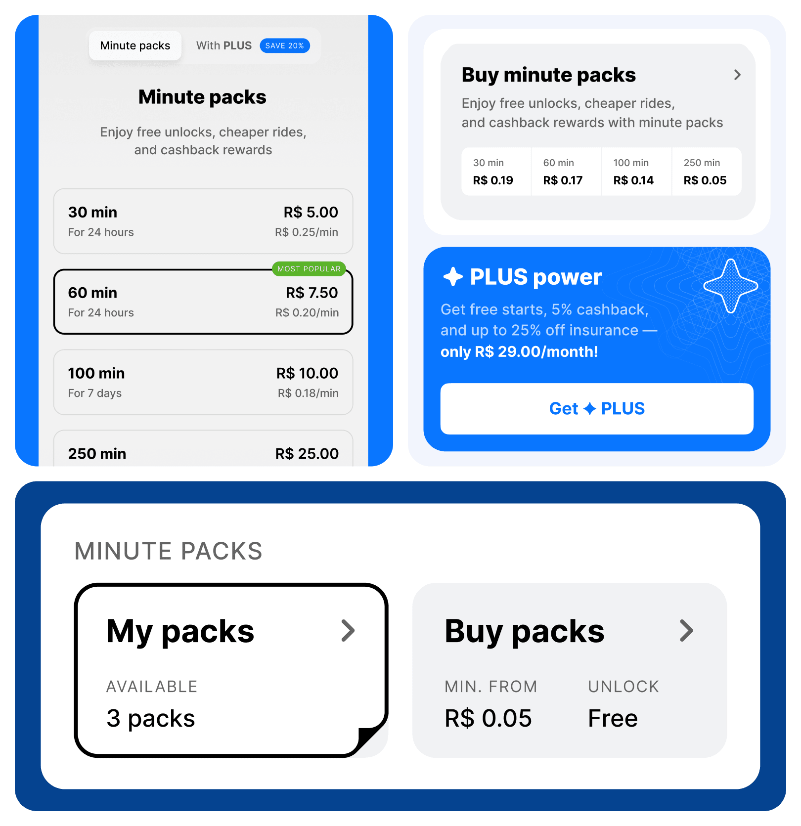
In the old app, the tariff system was practically non-existent, so we designed it from scratch. We thought through subscription and single-trip options, fund withdrawal scenarios, and booking and completion rules. Additionally, our team developed user scenarios for shared rides and gift subscriptions.
We paid special attention to edge cases: these are the situations where errors most often occur, affecting the user experience.
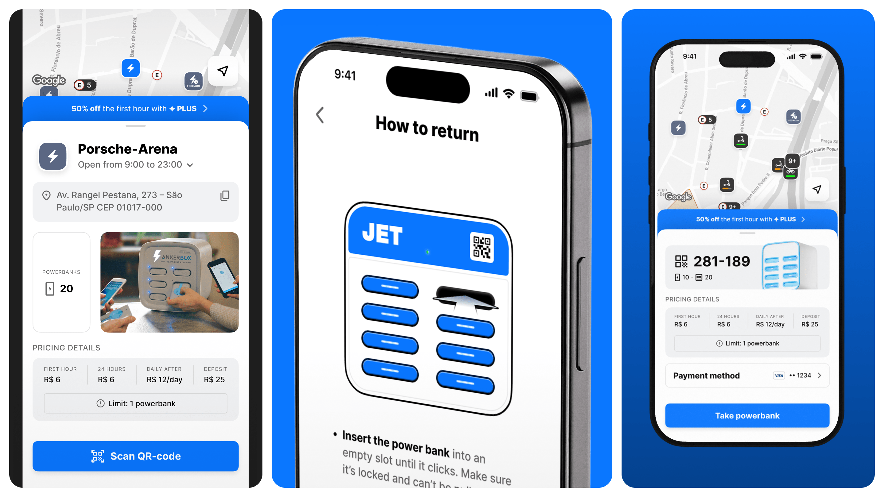
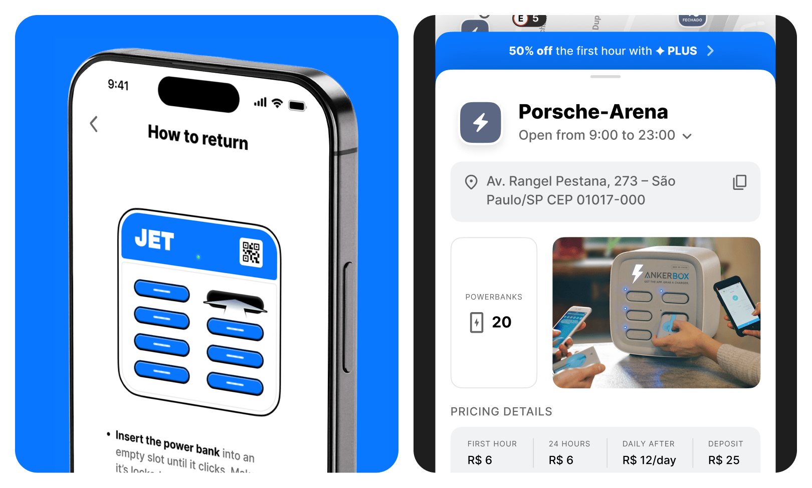
Simple powerbank return
Among the first on the market, we devised a convenient power bank return scenario that protects both the business and its users.
A common problem with similar services was erroneous charges: upon returning the device, due to incorrect system recording, the rental was considered incomplete, and the power bank was automatically considered purchased by the user.
We redesigned the interface and product logic to eliminate such situations. Now, the user clearly understands whether the rental has been successfully completed, and the cost of the power bank is charged only upon its actual non-return. This approach has reduced the number of disputes and made the service rules more transparent.
Result
From a franchise app to a scalable product
As a result, the client received a complete redesign of the app for iOS and Android with a focus on the Latin American market: onboarding via CPF, a map with a custom theme, a tariff and payment system via Pix, scenarios for scooters and power banks, and a UI kit with room for future products.
Along the way, we touched upon identity elements: updated Jet’s brand color, established principles for working with typography, icons, and communication tone in the interface.
Project growth
Currently, the product has been successfully launched in Latin America. The flexible design system from Right Studio has already made it possible to adapt the application for other localizations with minimal effort. This gives Jet a foundation for further scaling and allows it to confidently plan launches in new territories.