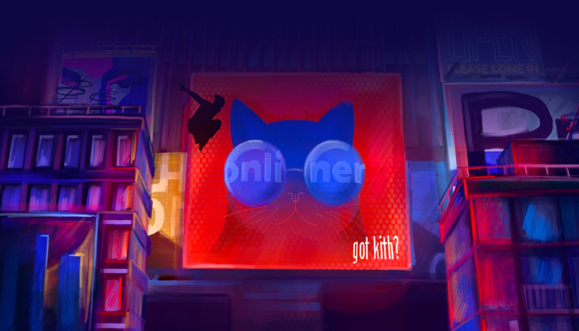
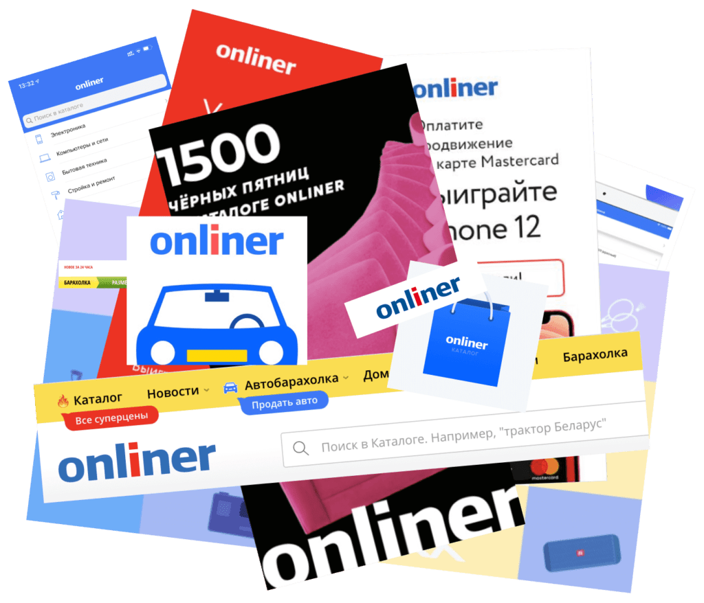
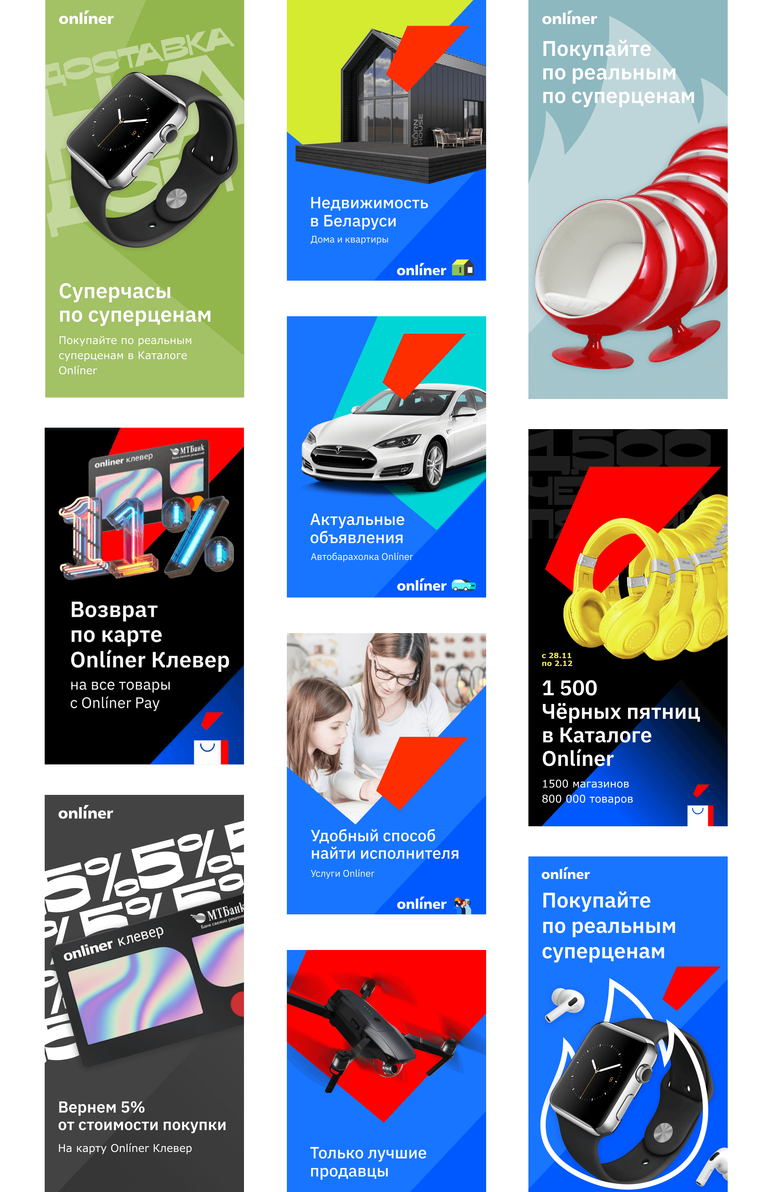
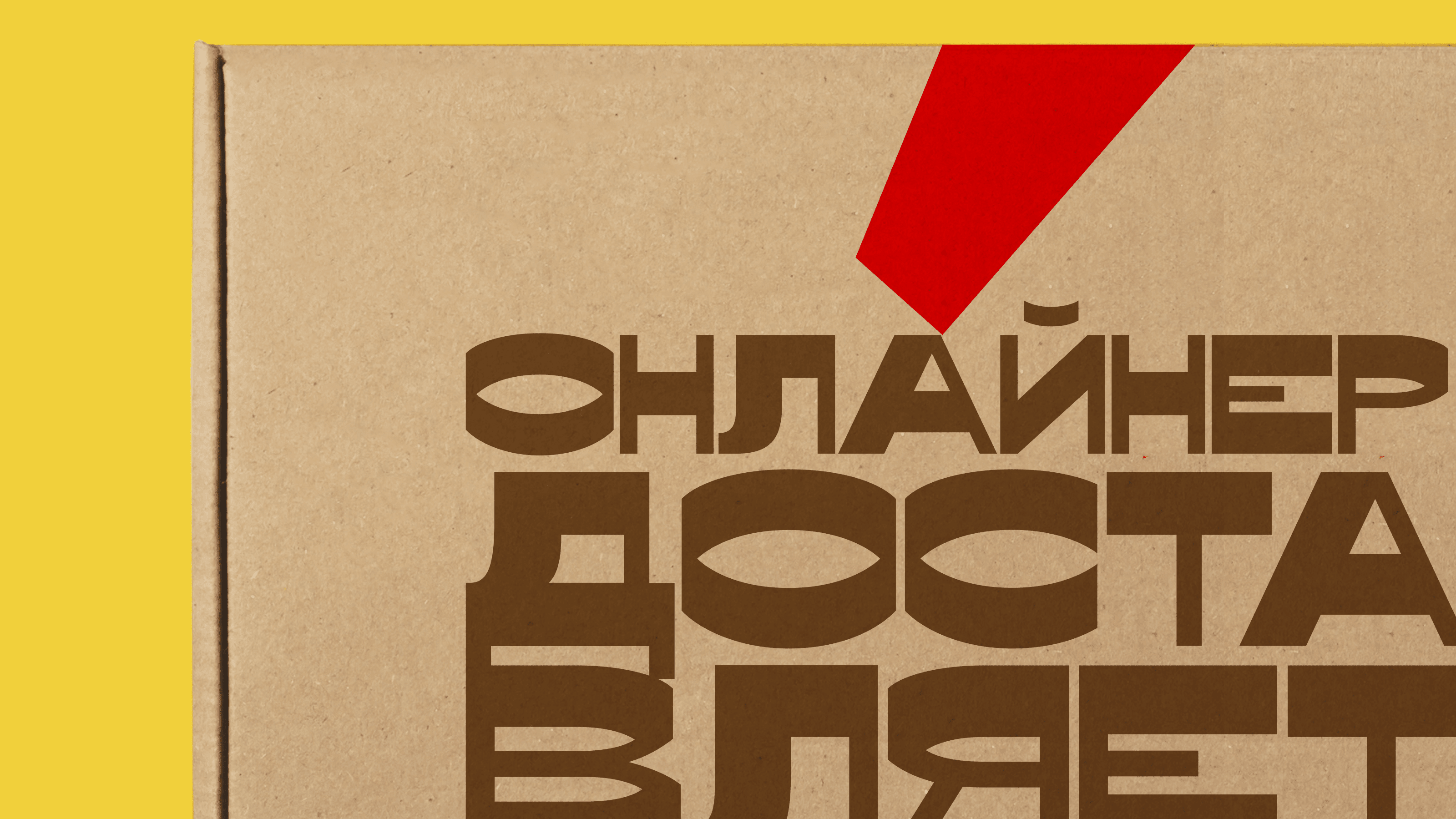
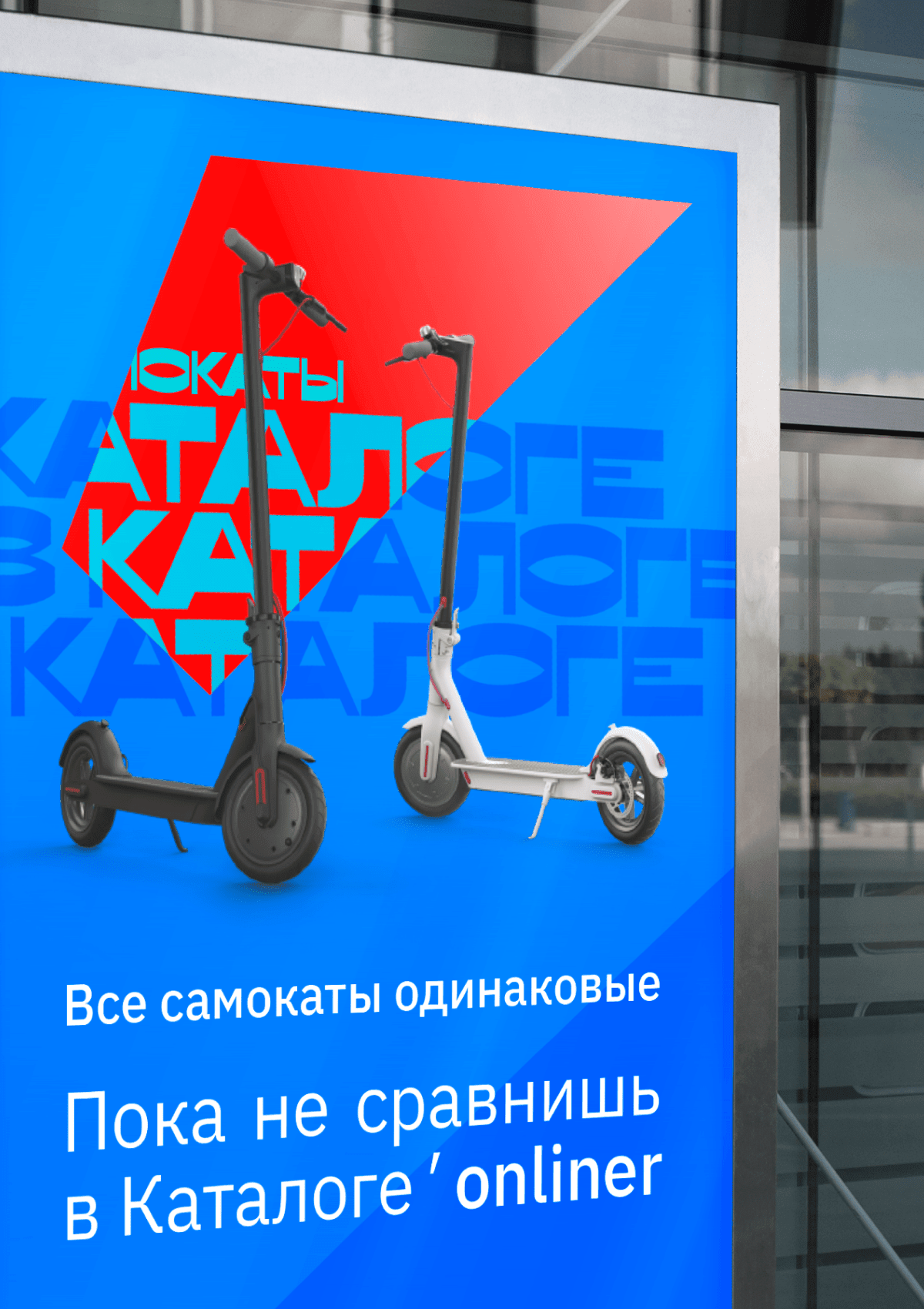
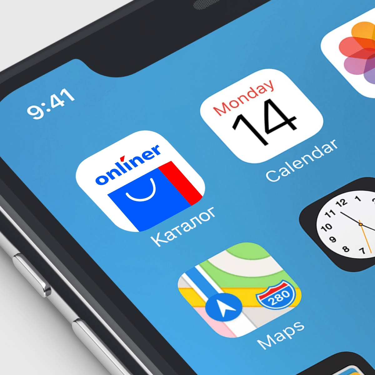
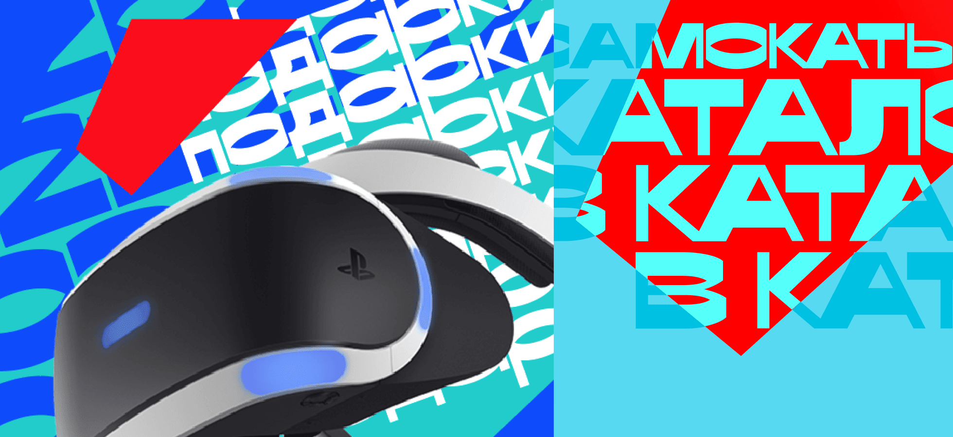
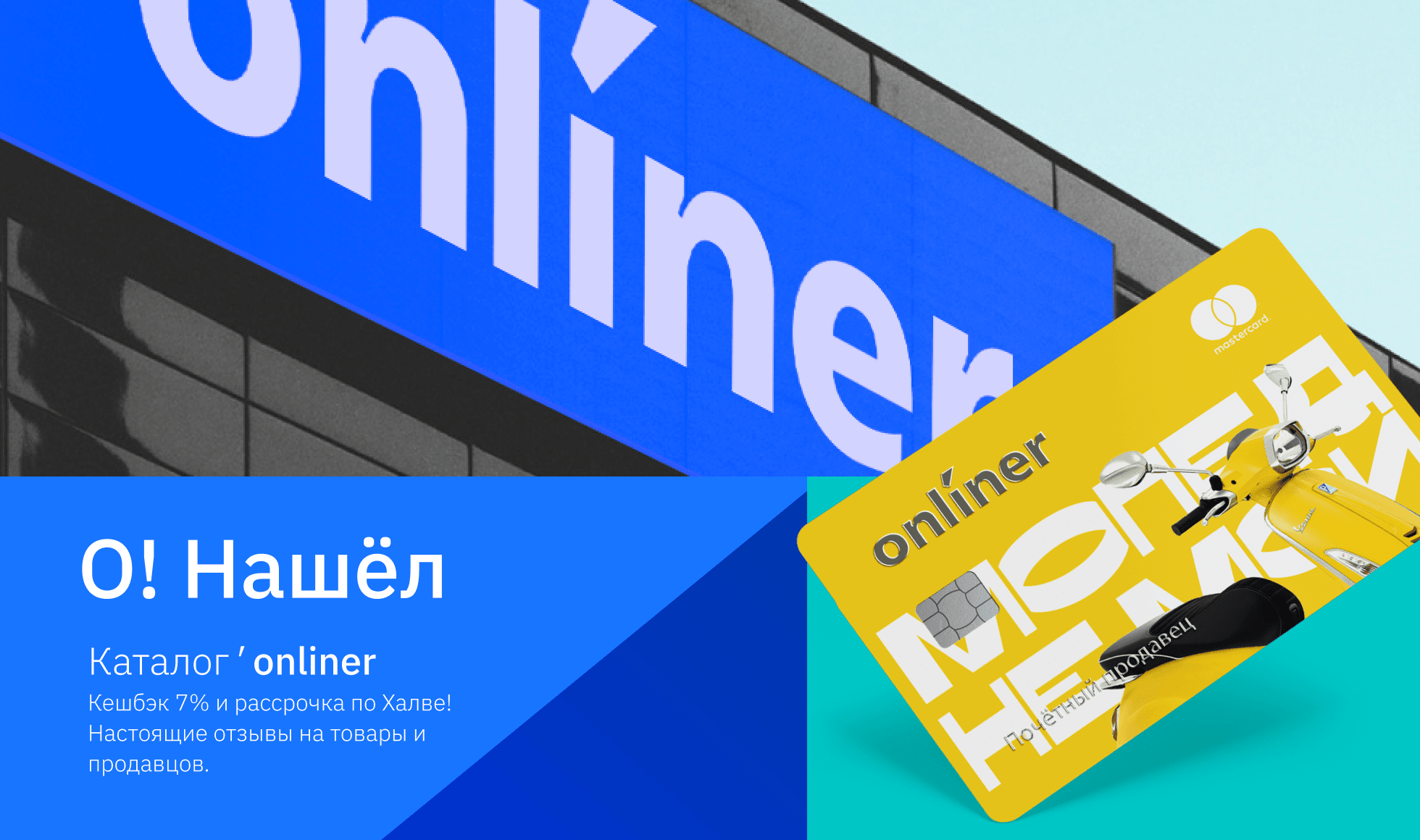
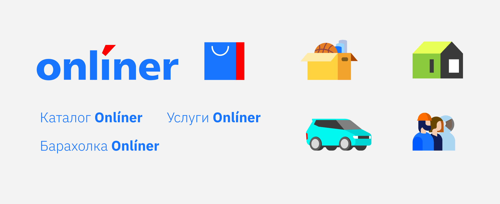
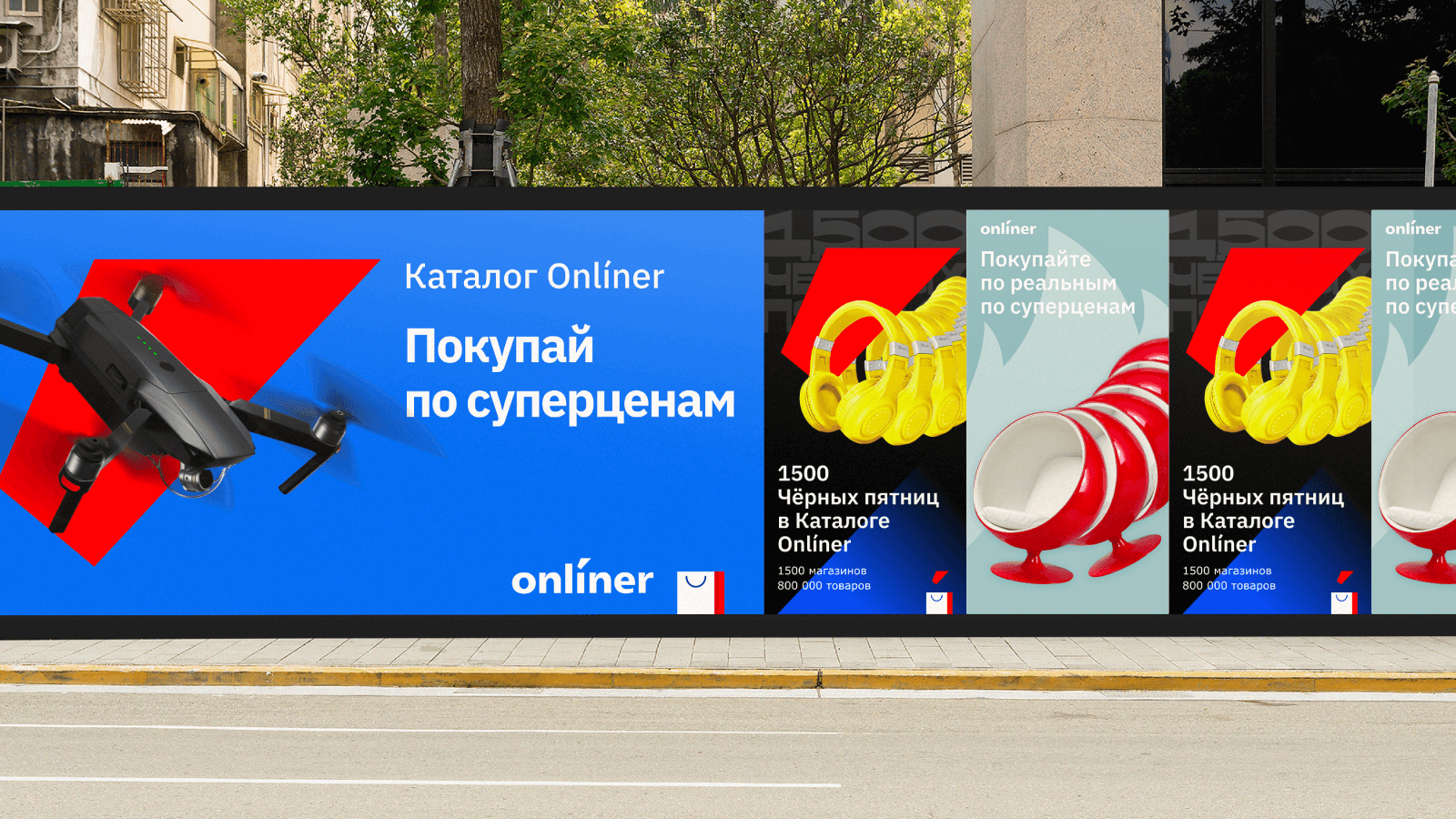
Rebranding of Onliner ecosystem
We’ve infringed on the most sacred thing and survived


Similar projects
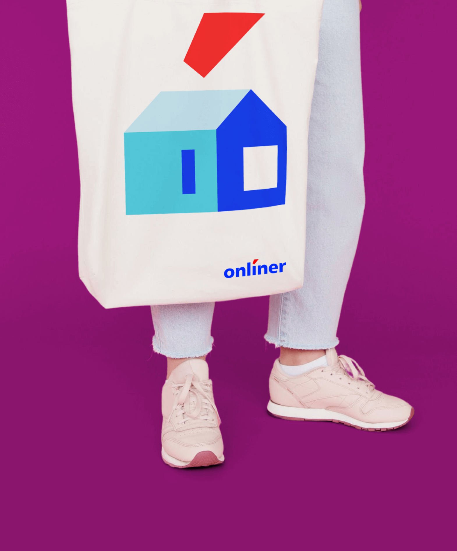
Identity of the Real Estate Site Realt.by

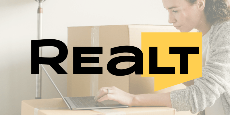
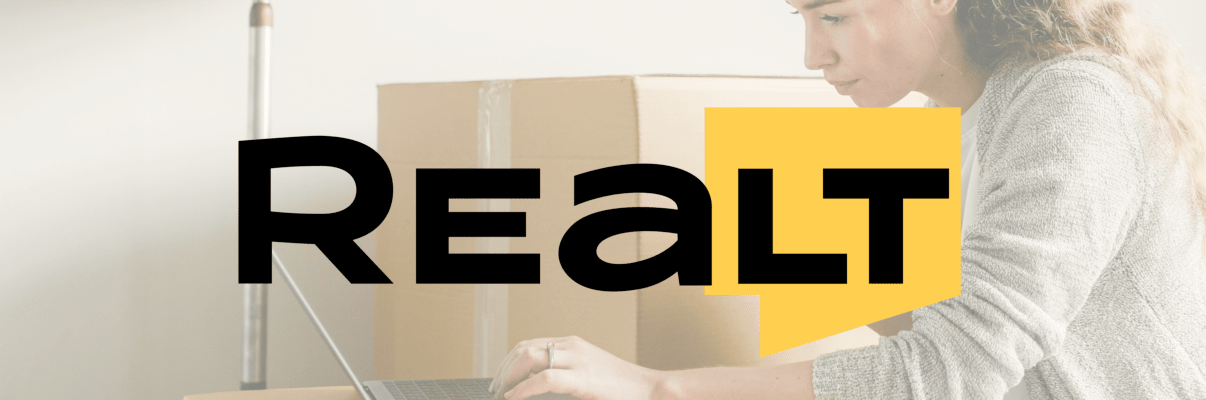
Identity of the Real Estate Site Realt.by
We humanized the brand and made it cosy & friendly
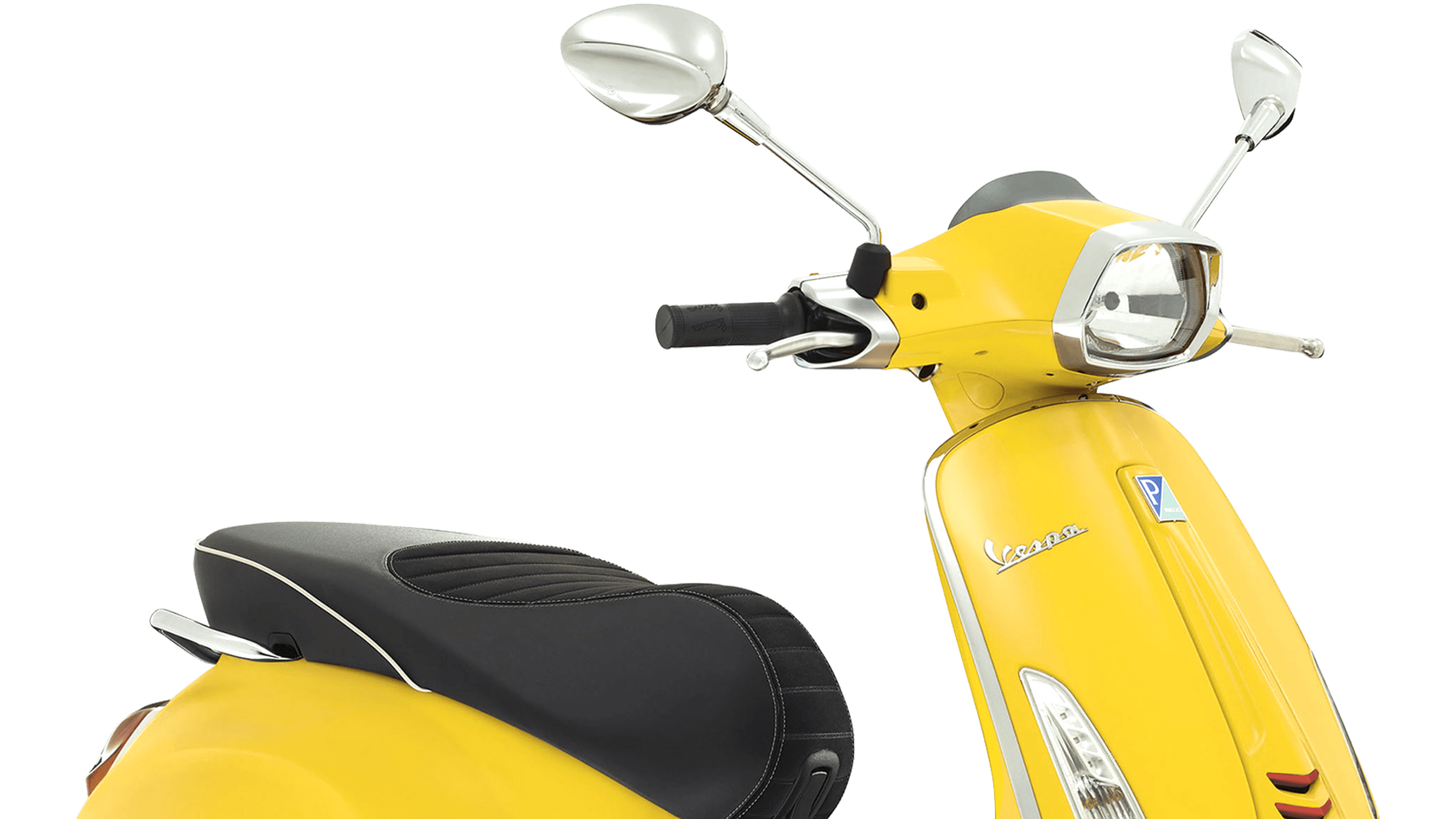
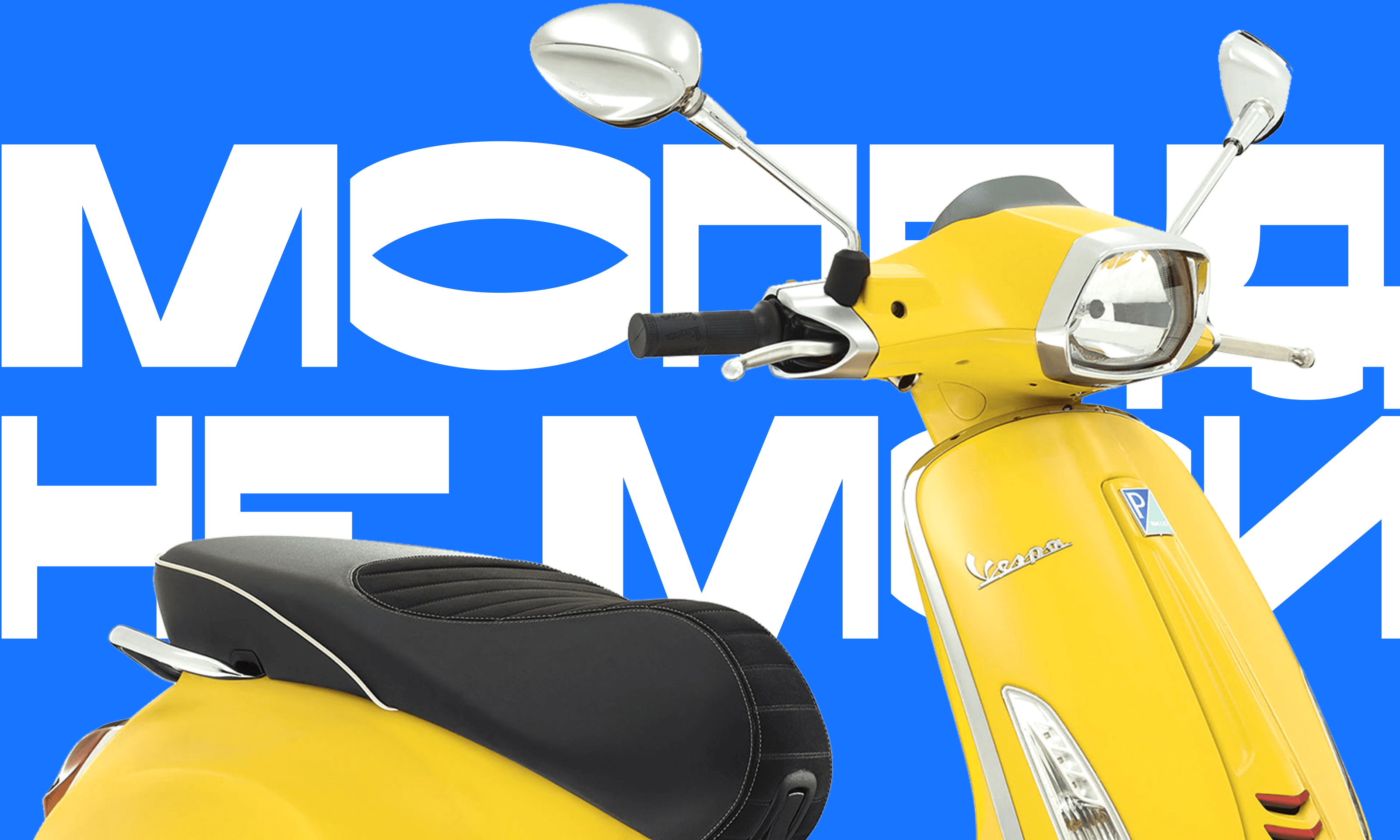
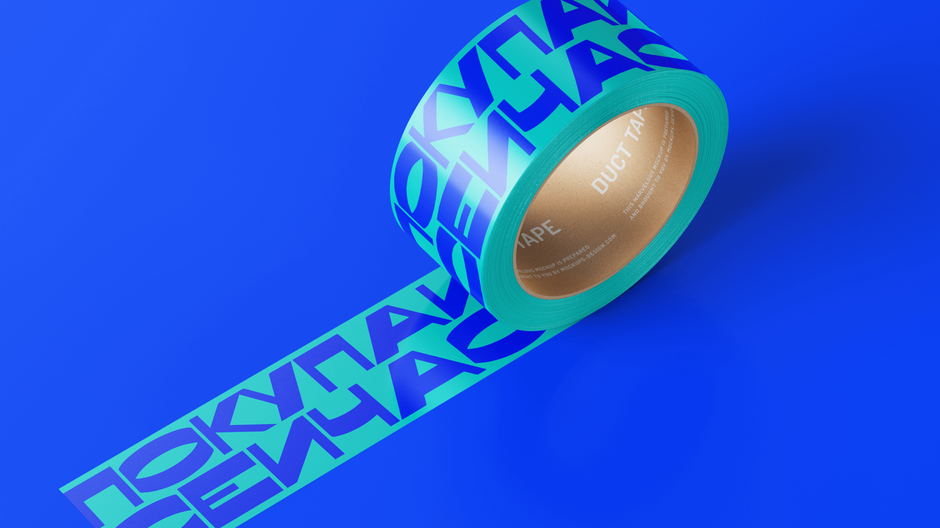
The identity of the automobile site Av.by
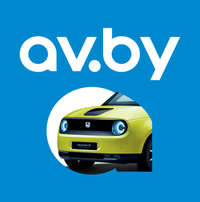
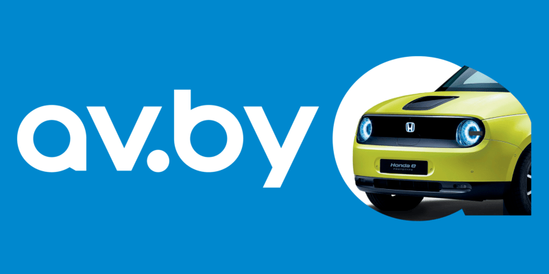
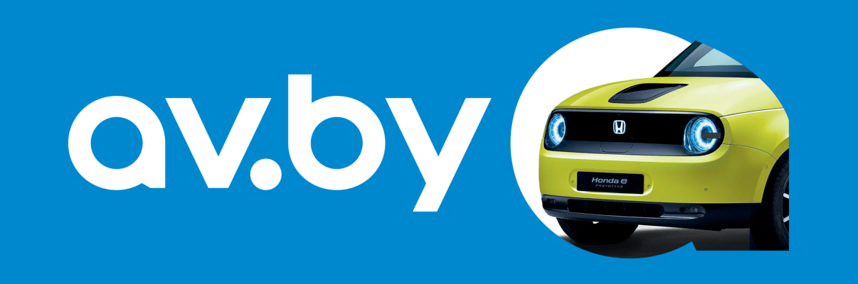
The identity of the automobile site Av.by
We’ve designed the logo that will move any car
Let’s talk about business
Your request will immediately go to the sales department. One of the managers will answer you in order to discuss details. It takes up to half an hour during working hours
