Identity of the Real Estate Site Realt.by

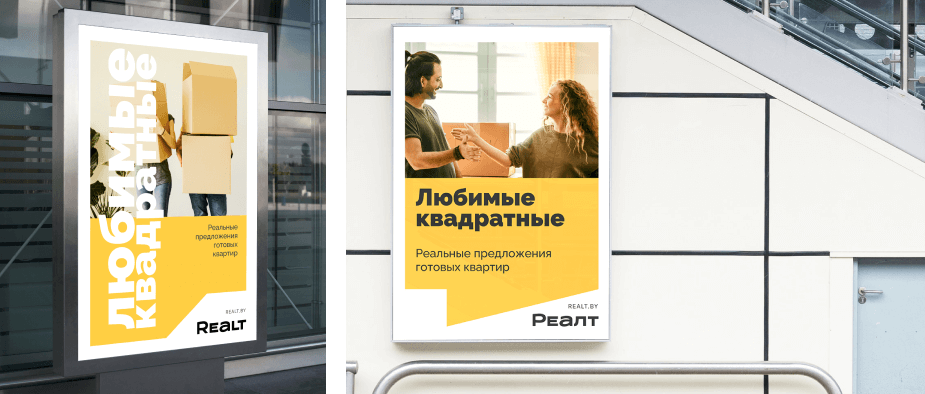
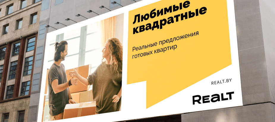
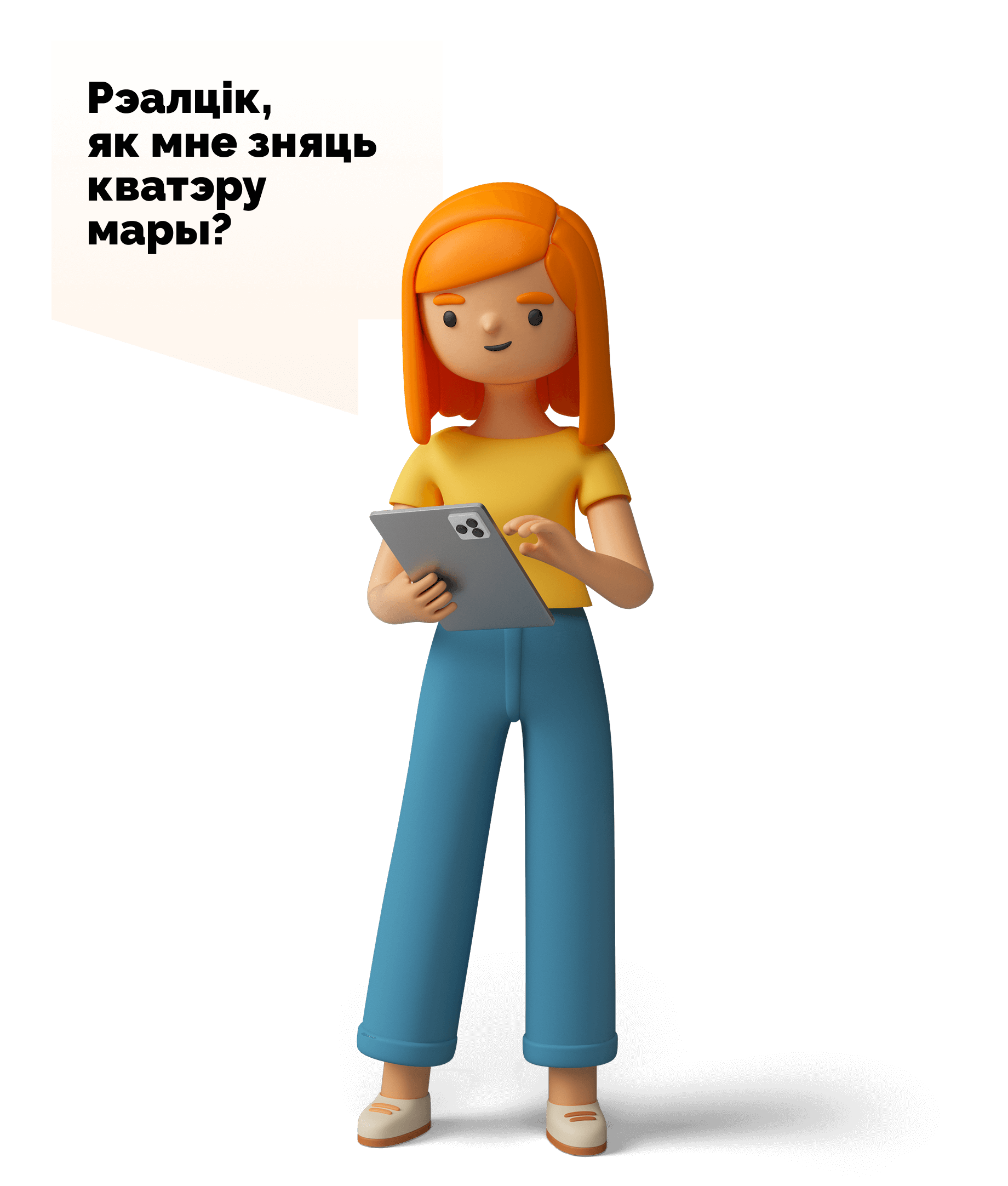
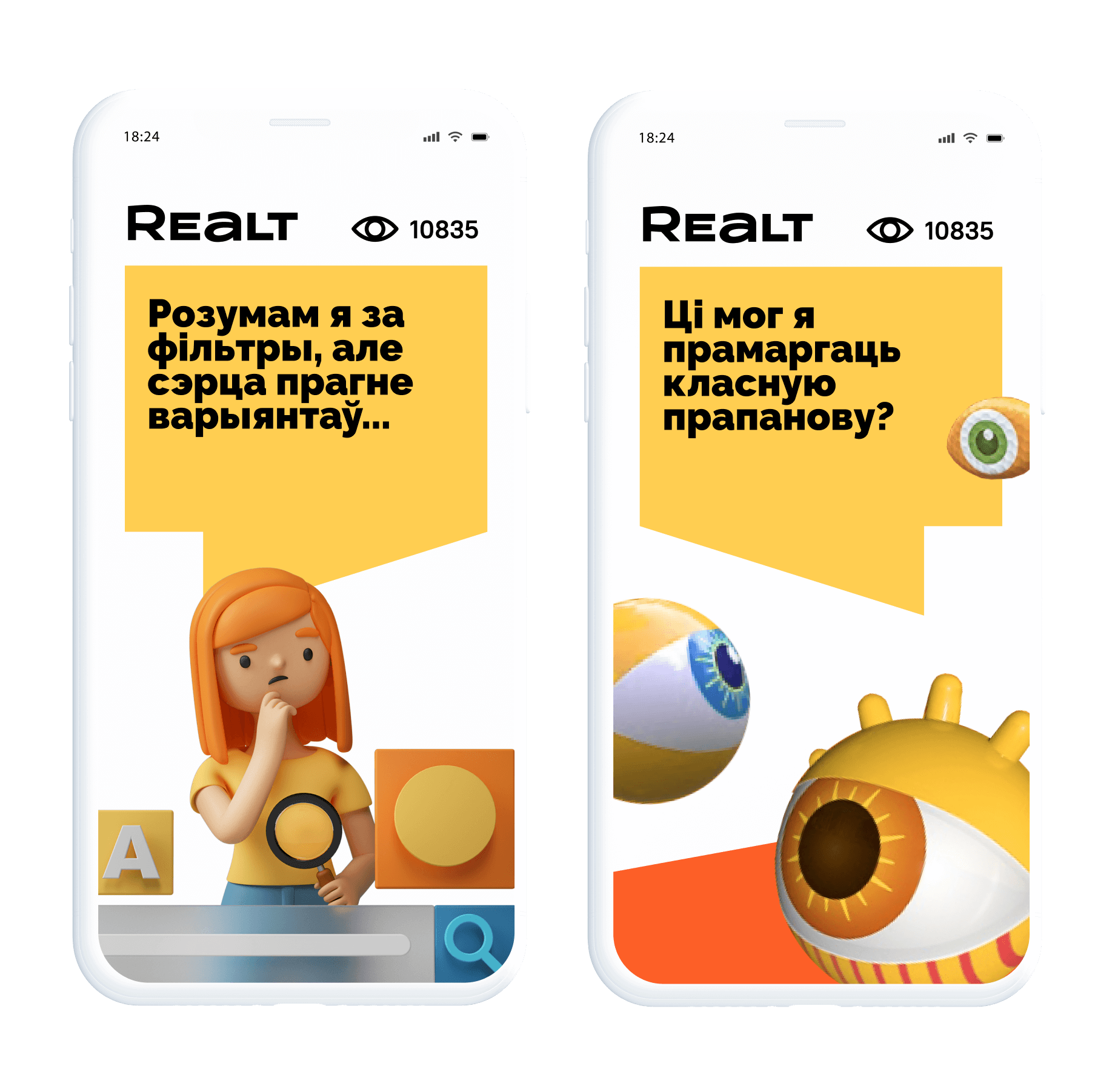
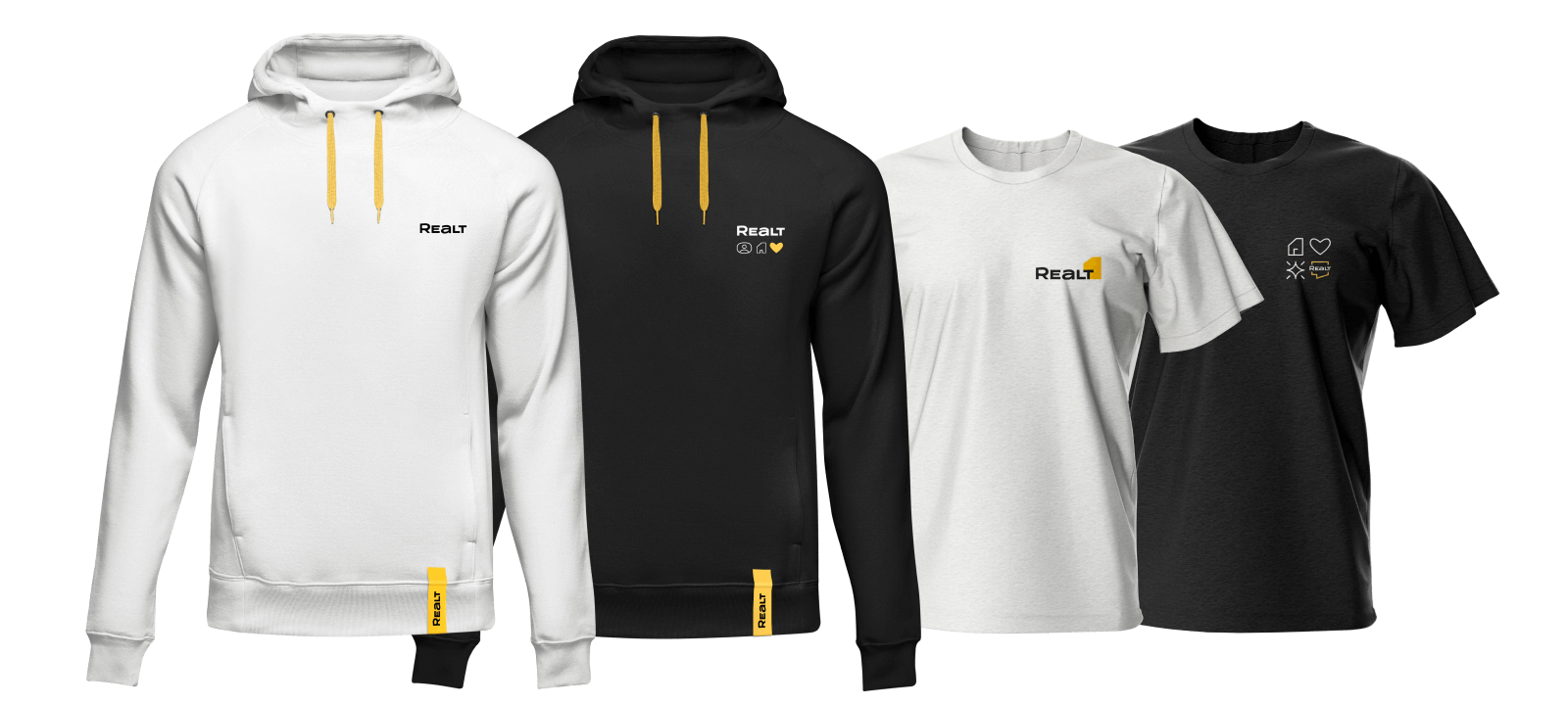
We humanized the brand and made it cosy & friendly

Realt.by

The largest marketplace for buying and renting apartments in Belarus.

Goals

To modernize the out-of-date identity. To create the image making you feel that Realt is the best real estate agent’s marketplace for both market experts and people who dream about their own apartments.
Home is not only about walls and layout.
Home means the whole person’s life: family, comfort, care and love. It is about finding the place where your dreams come true.

The basis is a brand-code of Realt.by

The Realt.by team came to us with a well-developed brand platform including their mission, visions, values and features. The platform helped to focus on the main things and not to lose the values of the company that were created over many years.

Mission

To make real estate market simple and understandable. To make dreams about home come true

Values

  1. User care
  2. Permanent development
  3. Expertise 360
  4. Work in team
  5. Reliability
  6. Happiness and fun

Style

  1. Clear&Easy
  2. Friendly
  3. Bright
  4. Innovative
  5. Modern

The logo is more humane

Giving up ‘when Queen Anne was alive’ logo. We create a new language depending on the contrast of strict forms and man-made letters.
How it was
How it became

Colors became calmer

Dreams about home are real. They are reflected in the color palette: the focus shifts from an orange color to a pleasant yellow one. It looks like a warm light in the window.

Colors became calmer

Dreams about home are real. They are reflected in the color palette: the focus shifts from an orange color to a pleasant yellow one. It looks like a warm light in the window.
The Realt.by also helps to analyze the real estate market. In order to emphasize it, the palette is balanced with more neutral and soft color shades.

There are no logo signs depicting houses

A house metaphor is undoubtedly a cliché at the real estate market. We decided not to use a millionth house sign in order to find a new idea in the sphere of sign design.
Houses, houses, houses …
Instead of this, we do visual research: how people interact with space, what home means to them and how all this works.
Every apartment, house or office has a layout. It develops in an amazing way and turns into an expressive graphic element. It helps to link the brand with the real estate in people’s minds. It happens without a brute-force approach.
Thanks to the variety of graphic elements, it is possible to create numerous combinations of logo, icons and avatars for social networks.

Find everything just in one system

The corporate identity is based on a graphic approach with the layout. Depending on the context, it is transformed into a bubble, an icon, a template for images or a foundation for creating a grid in various media.
It does not matter how you change the layout because Realt is that it is

The grid for outside and digital ads

Clear typography and style-forming element. Easy recognition. That is why it is not necessary to place a logo on the billboard.

3D characters for communication

We add friendly characters so that they can communicate with users, for example, in the help sections or in the tutorials. In such a way, boring ‘The deal must be safe’ becomes very exciting and stands out among others.

Icons for the site and mobile app

The flexibility of the logo is going on. We create a graphic system of guidelines and reference lines for easy design.

Merch for every day

We do not turn the team into promoters. We create such brand clothes that make you want to show off. Such clothes are comfortable to wear both in the office and at home.
Let’s talk about business

Your request will immediately go to the sales department. One of the managers will answer you in order to discuss details. It takes up to half an hour during working hours

Rebranding of Onliner ecosystem
Next project Rebranding of Onliner ecosystem

We’ve infringed on the most sacred thing and survived
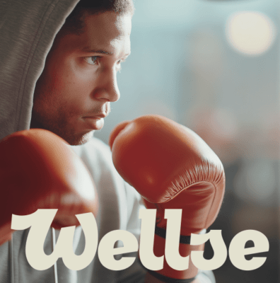
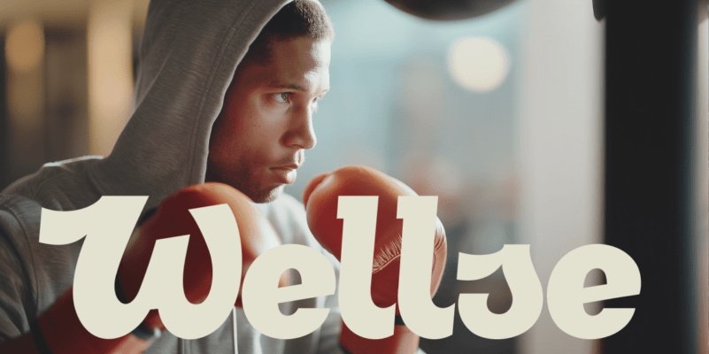