The first secret of the perfect case
Analyzing the most common mistake of editors, due to which cases are written in vain and don’t fulfill their purpose — to attract customers and sell products.

On our interface cases in the battle with the editor-in-chief, more than one editor fell down. One of the reasons is that the editor, out of habit, writes a case according to the same principles as the article. I’ll tell you how the approach ruins the case and how it should be done right.
Don’t confuse a case with an article
Article
- can be read,
- the main focus is on the text,
- pictures complement and reinforce the text,
- the text is like an instruction.
Case
- can be viewed,
- the focus is on visual storytelling,
- the text complements and reinforces the visual narrative,
- visibility plays the role of instruction.
The ideal case is an infographic/comic/storyboard. But not an article
It’s also necessary to understand the context apart from visual differences.
Inside the article — benefit for the reader
The reader is aware of this and therefore is more willing to make an effort to read the material and get something useful.
(Despite this, you still need to be a caring author and make the material easy and enjoyable for reading.)
Inside the case — focus on the result of the studio’s work
Demonstration how the company can work. The studio sells its services with the help of cases, which means it can’t require the reader to read thoughtfully and work with a pencil to comprehend the design intent.
With the help of a visual story, it’s necessary to simplify the life of the reader (it means a potential client) and convey the desired idea so that they don’t even rack their brain.
A handful of pictures collected in one place doesn’t become a case
The case is a meaningful visual story about design solutions and business benefits. Illustrations should be subordinate to the visual narrative, drawing the reader’s attention to what is needed.
Only a picture may not be enough to make your design decision obvious to the client. You need to manage attention and create a story.
If there’re a lot of pictures in the material, but there’s no meaningfulness and attention management, this isn’t a case
Let’s look into a few examples of visual storytelling — both within the framework of the whole case, and its individual sections.
Case Planes Live
We have redesigned the Planes Live aircraft tracking app. The goal is to tell about design solutions in the case, in particular, how search works now and why it’s cool.
First approach. We do it with text:
We’ve made a search with predictive input, which predicts the users’ intent and, based on a few characters entered, offers them suitable results with the names of airports and cities. This allows travellers to find information with a single search field, without thinking and without complicating their navigation path between different entities: airports, planes and cities. The system understands everything, and after two printed characters it gives a relevant result, and after three it almost completely guesses the user’s request. The search simplifies navigation, saves time and makes the information presentation system clear and understandable: flight, airport and airline can no longer be confused, even if only two letters are entered.
It’s described great, but doesn’t work: it’s very difficult, it’s easier not to read or deal with it. Go further and call the designer:
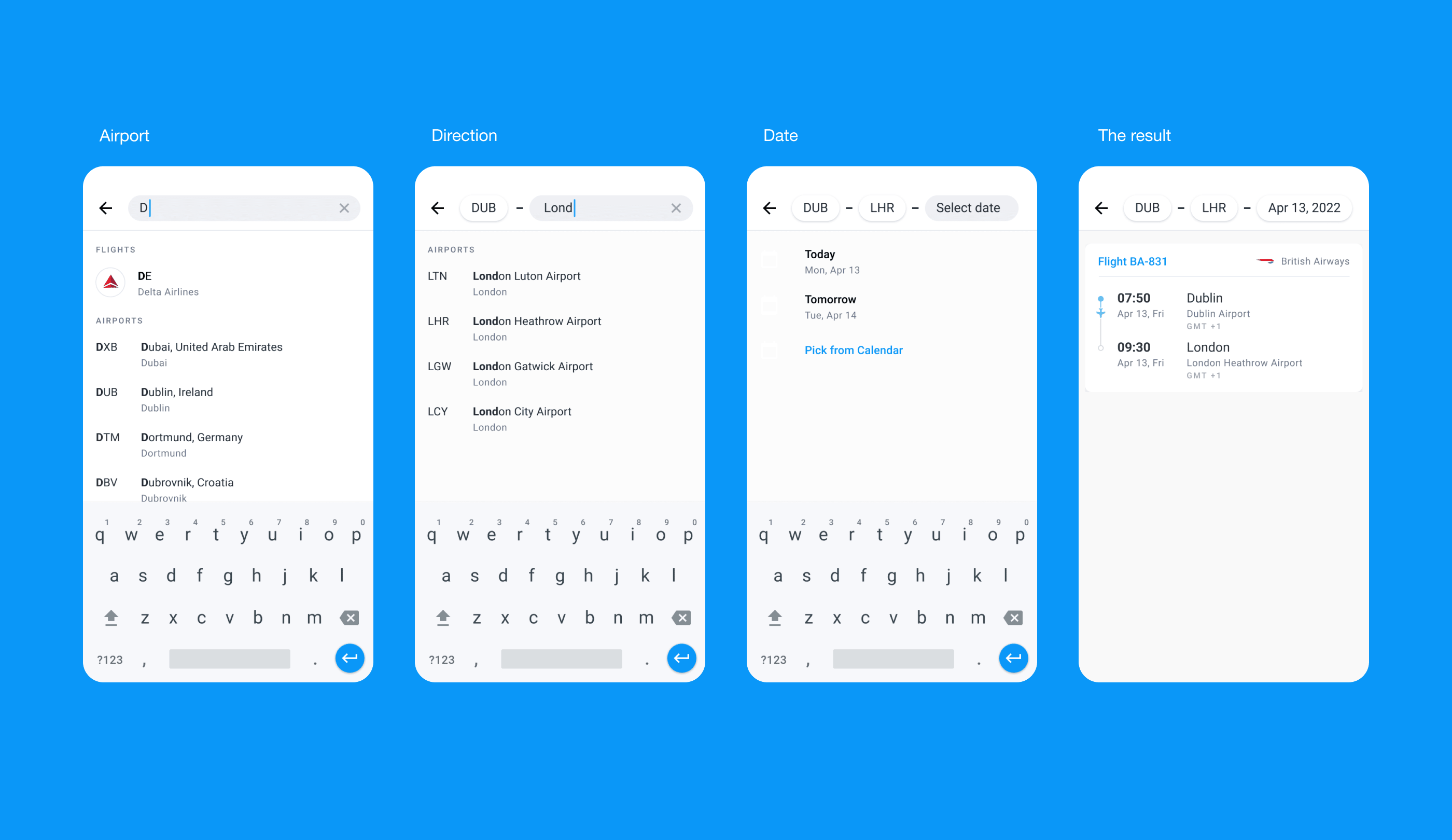
It can be seen that the screens are different, but the changes are minor. Different issuance states are shown, but there’s no narration. We can only hope that the readers will be sitting, scratching their heads and going into it. Spoiler: they won’t.
Next approach. We remove the battery of screenshots and cut off unnecessary stuff.

The way is right. Now we’re improving it. We manage attention: we crop, remove unnecessary stuff, draw readers’ attention to the animation and thus create the desirable story.
The video shows solutions for different data formats and automatic prompts clearly and, at the right moment, returns to the context of the case in an emotional way. We go further.
Case Channel 4
I adore Pentagram cases. I don’t even need to rack my brain and read something. I look and understand that this is branding for Channel 4, which produces various content: from cartoons to crime.
Pentagram united all channels into one system and affected all possible points of communication: outdoors, Tik Tok, mobile applications, wallpapers, TV apps. Text is minimal here. And at the same time, everything is clear to me.
Please, pay attention to how one illustration shows the dynamic transition logic between scenes.
Instead of writing a lot of text about the structure and diversity of content — a stereometric projection that helps the brand to enter spatial forms, go beyond the standard set of identities and explain the dynamism and diversity of the television series.
Another example. How to show with one picture and without words that other areas are easily integrated into branding? Here you are.

Case Instacart
Instacart — food delivery service, and branding for it from Wolff Olins agency.
Everything is clear at once: the scale of the solution is visible, but at the same time, there’s no absurdity and complicated text. Instead, there’s a visual narrative in each picture.

Moral of this story
↑ A case written according to the principle of visual storytelling doesn’t require much effort from the reader: they don’t need to consider it for a long time, sit with a magnifying glass, read and guess. So, you’re more likely to be noticed by a potential client and enter into a dialogue with him.
When writing a case, keep in mind: should I show this idea and not tell it? Manage attention, show pictures and be caring editors and designers.