An online platform for car-secured loans. The service enables you to obtain financing quickly while still being able to use your car.
The task
To create a brand platform, visual identity, and communication system.
The financial market is oversaturated with identical promises: ’fast,’ ’reliable,’ ’no paperwork.’ At the same time, most players talk to the client in the language of formalities, assessments, and restrictions. We were tasked with creating a brand that:
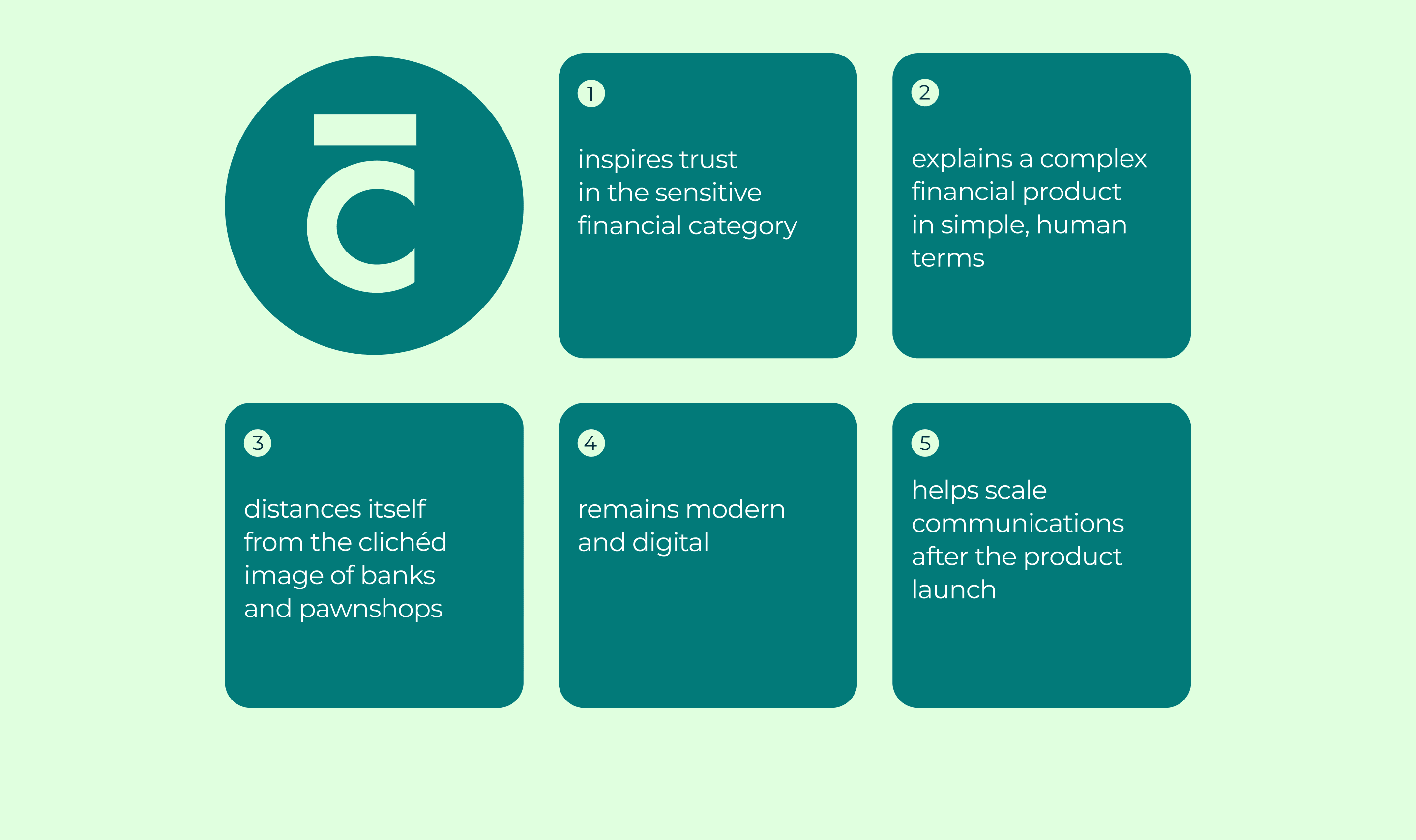
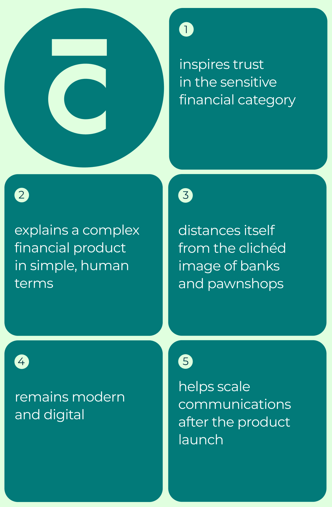
- builds trust in a sensitive financial category;
- distinguishes itself from the clichéd image of banks and pawnshops;
- remains modern and digital;
- talks about a complex financial product simply and humanely;
- helps scale communications after the product launch.
Not just another loan service
Research showed that Carfin’s audience is looking not so much for a profitable loan as for an opportunity to quickly solve a financial problem without another rejection or biased attitude. For these people, it’s important not only to get money but also to feel that they are perceived as human beings, not as a set of formal criteria.
Core meaning
We formulated the key idea of the brand:
Carfin helps when a person needs a solution, not another check.
The brand is built on the principles of financial inclusivity: without judgment, with clear terms, respectful attitude, and a sense of control over the situation.
For the client, the car is no longer just property, but freedom of movement, independence, and the ability to move forward.
Logo
We developed several identity concepts and, together with the client’s team, chose a direction that best conveyed the brand’s character.
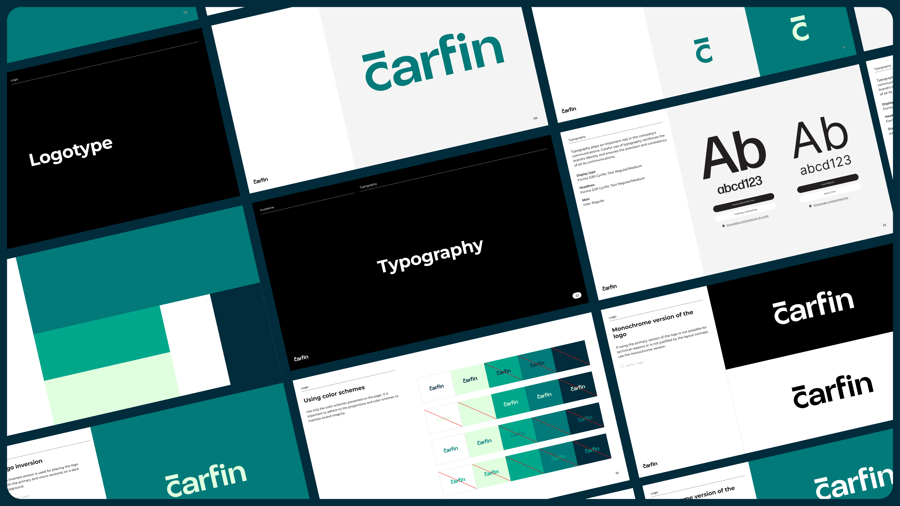
The logo features a concise typographic foundation with an emphasis on the service’s digital nature and the company’s financial expertise.
It works equally well in interfaces, communications, and compact formats, maintaining recognizability and a sense of reliability.
Brand Visual Language
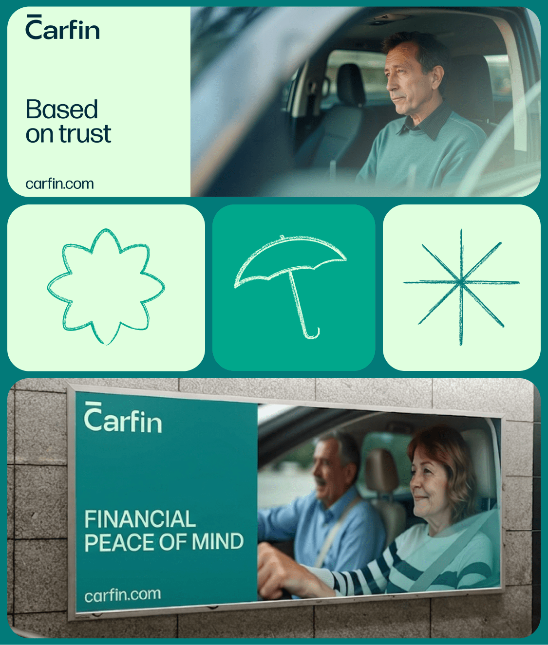
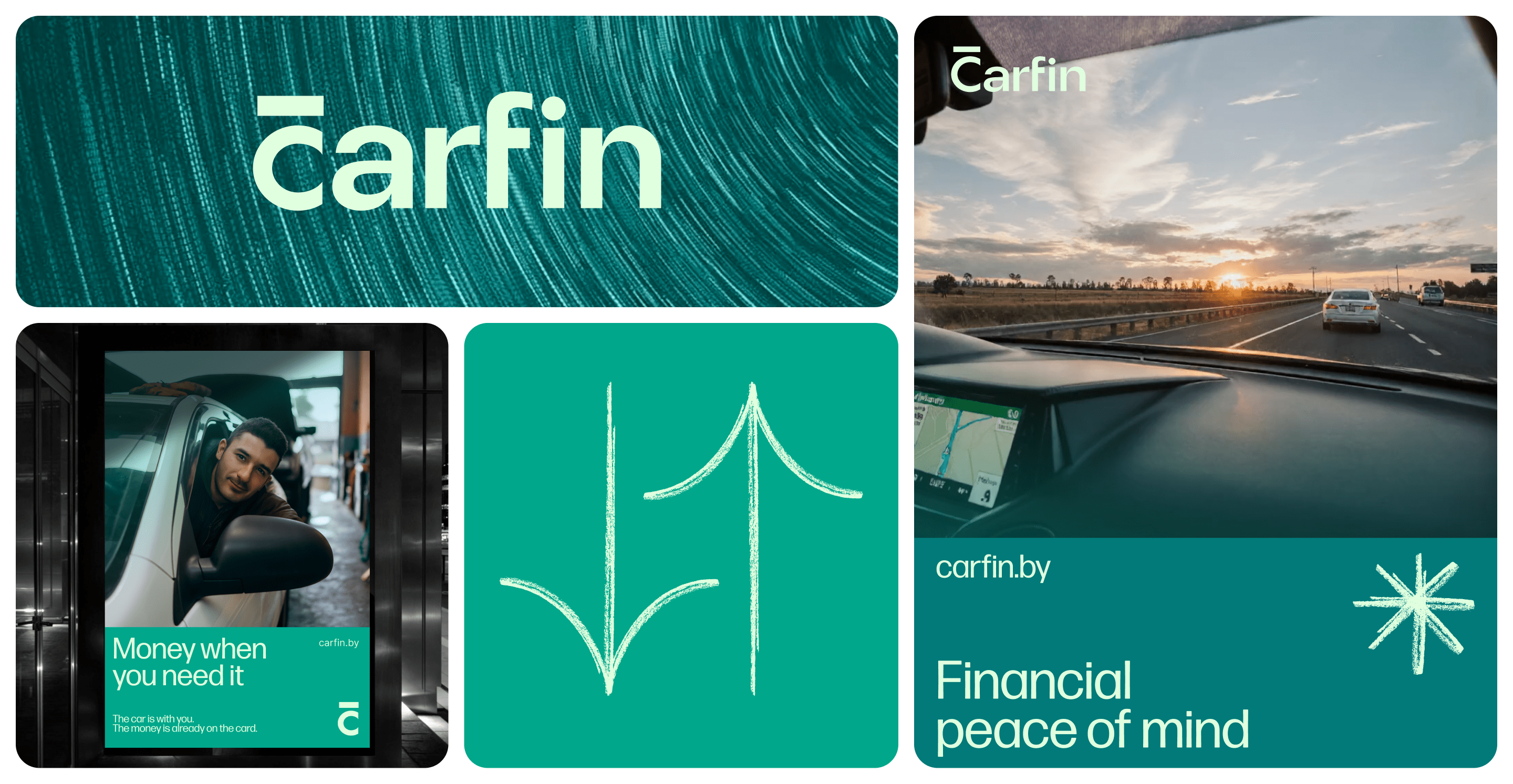
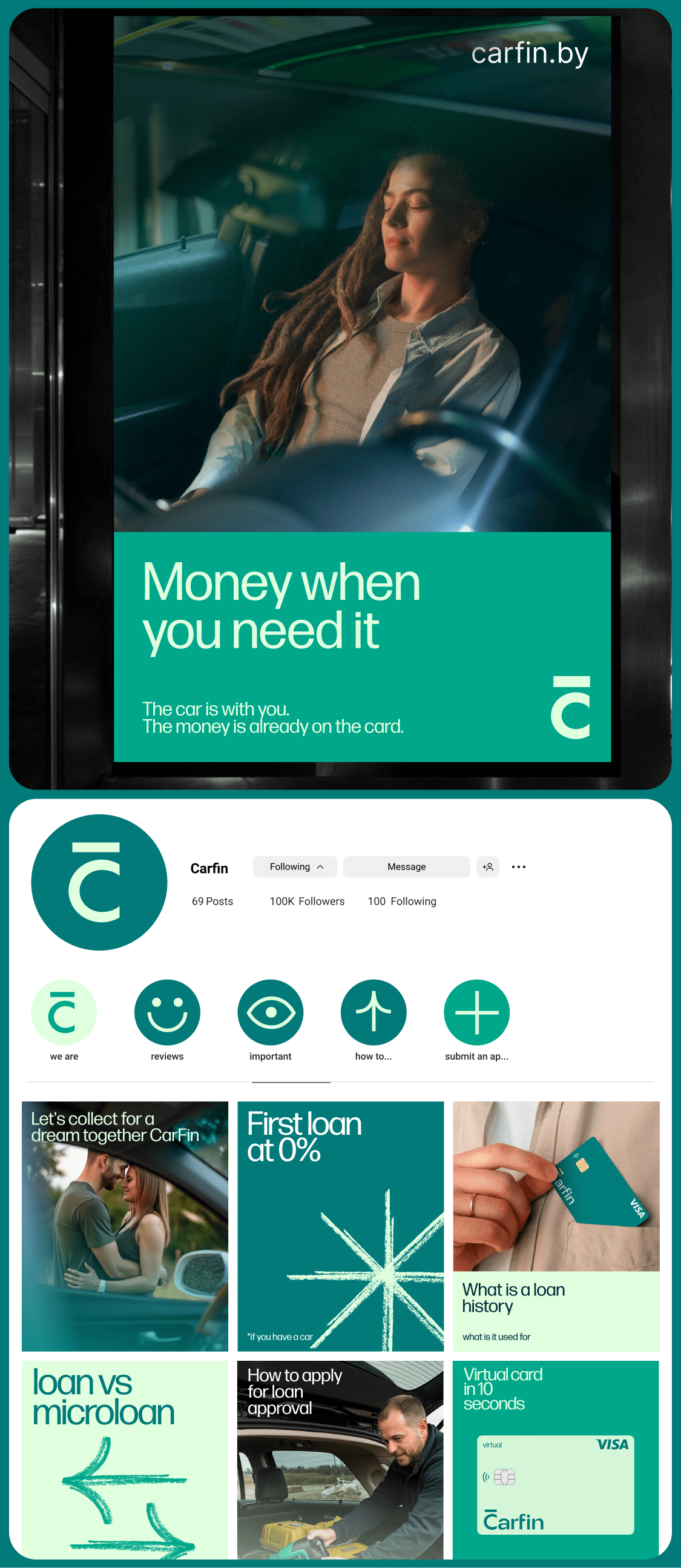
It was important for us to move away from the typical aesthetic of microfinance services—aggressive colors, alarming messages, and visual pressure.
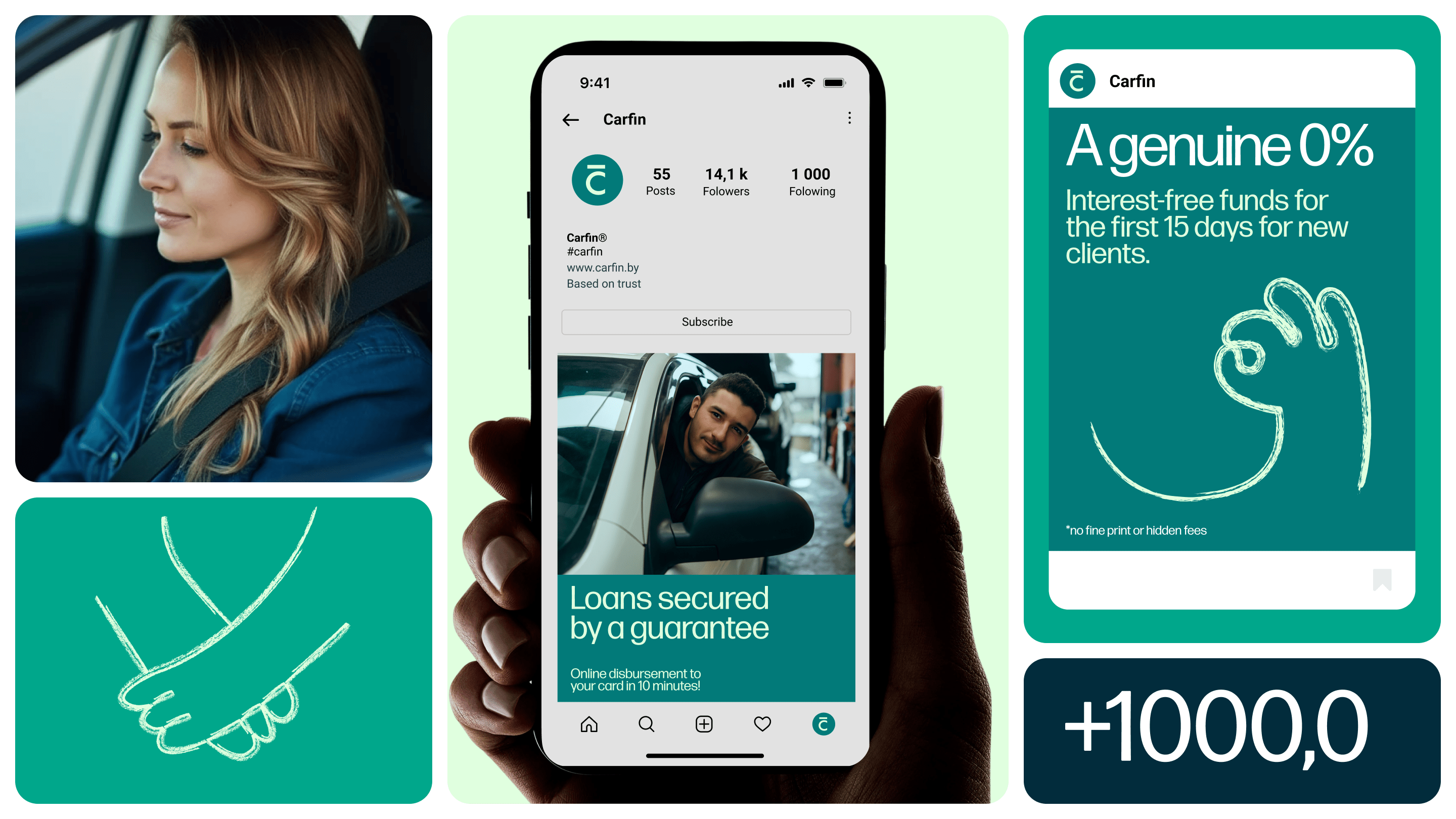
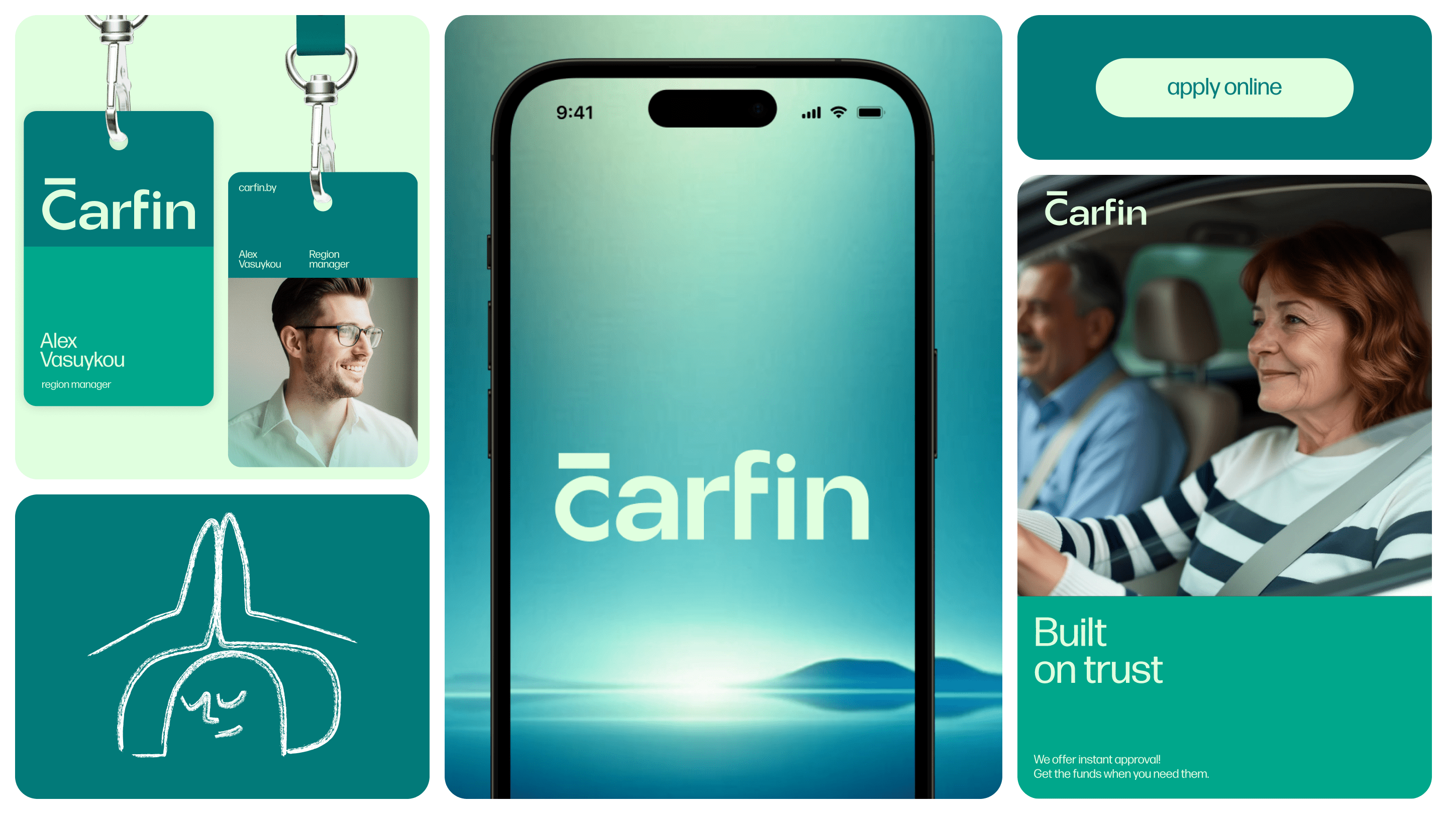
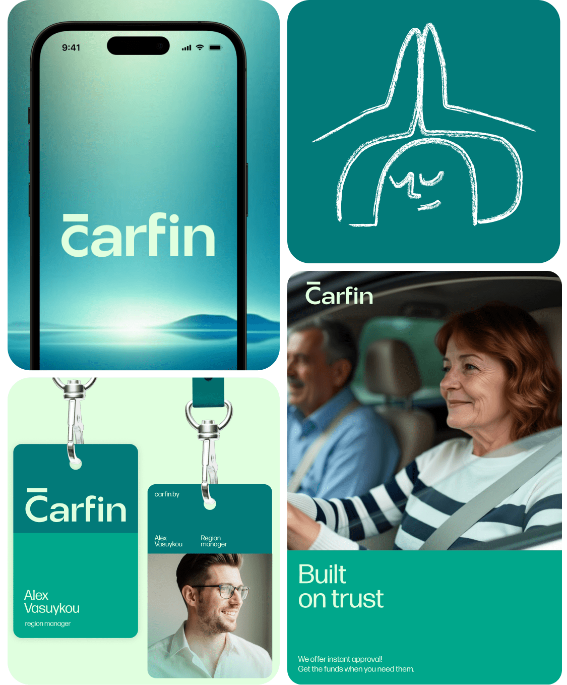
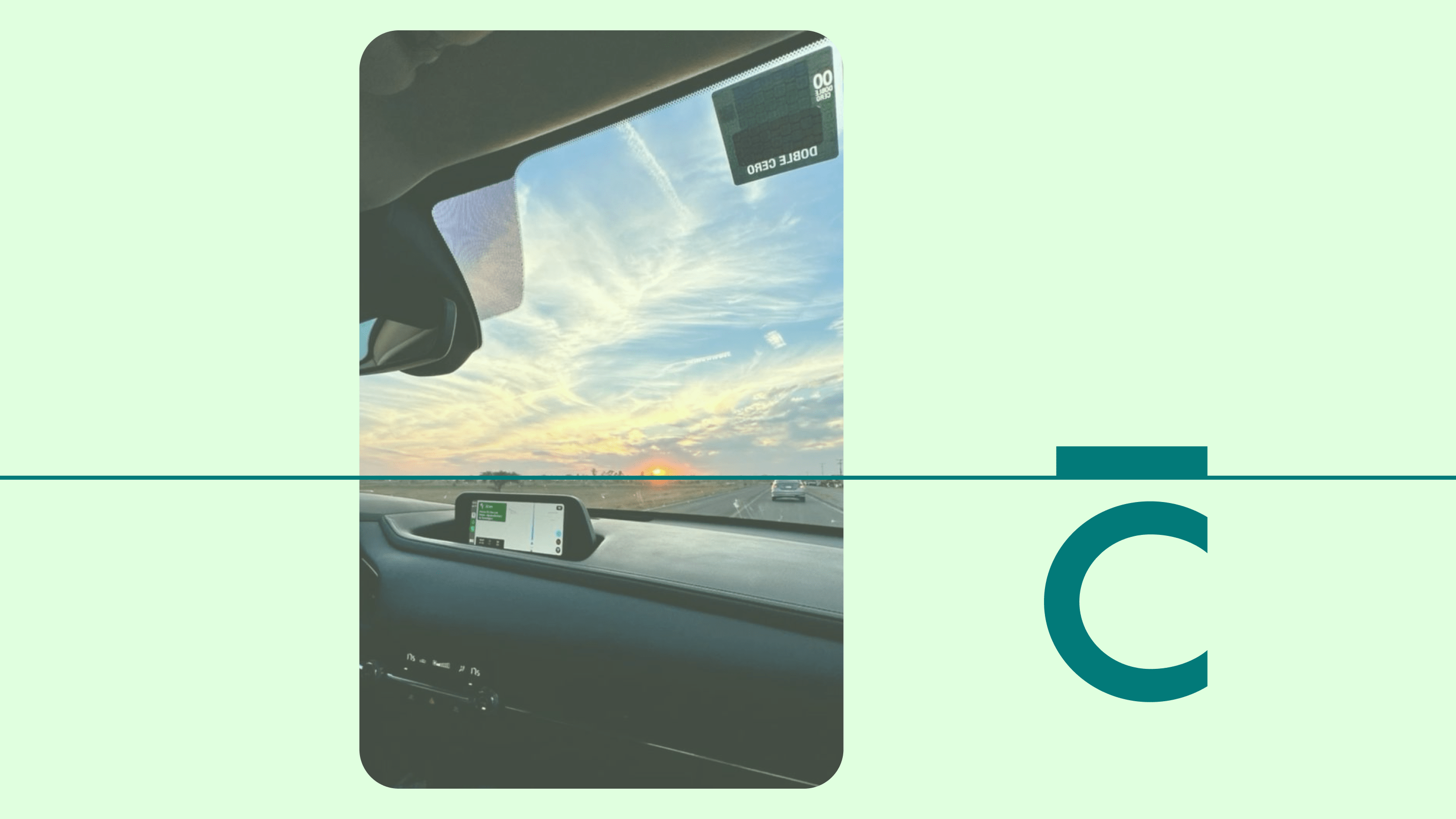
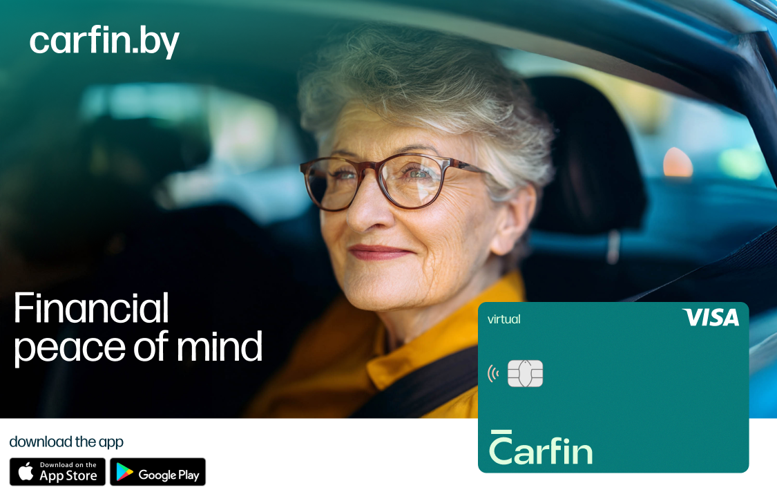
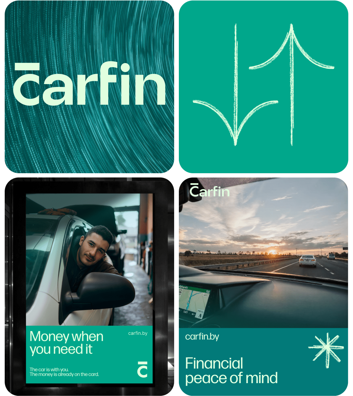
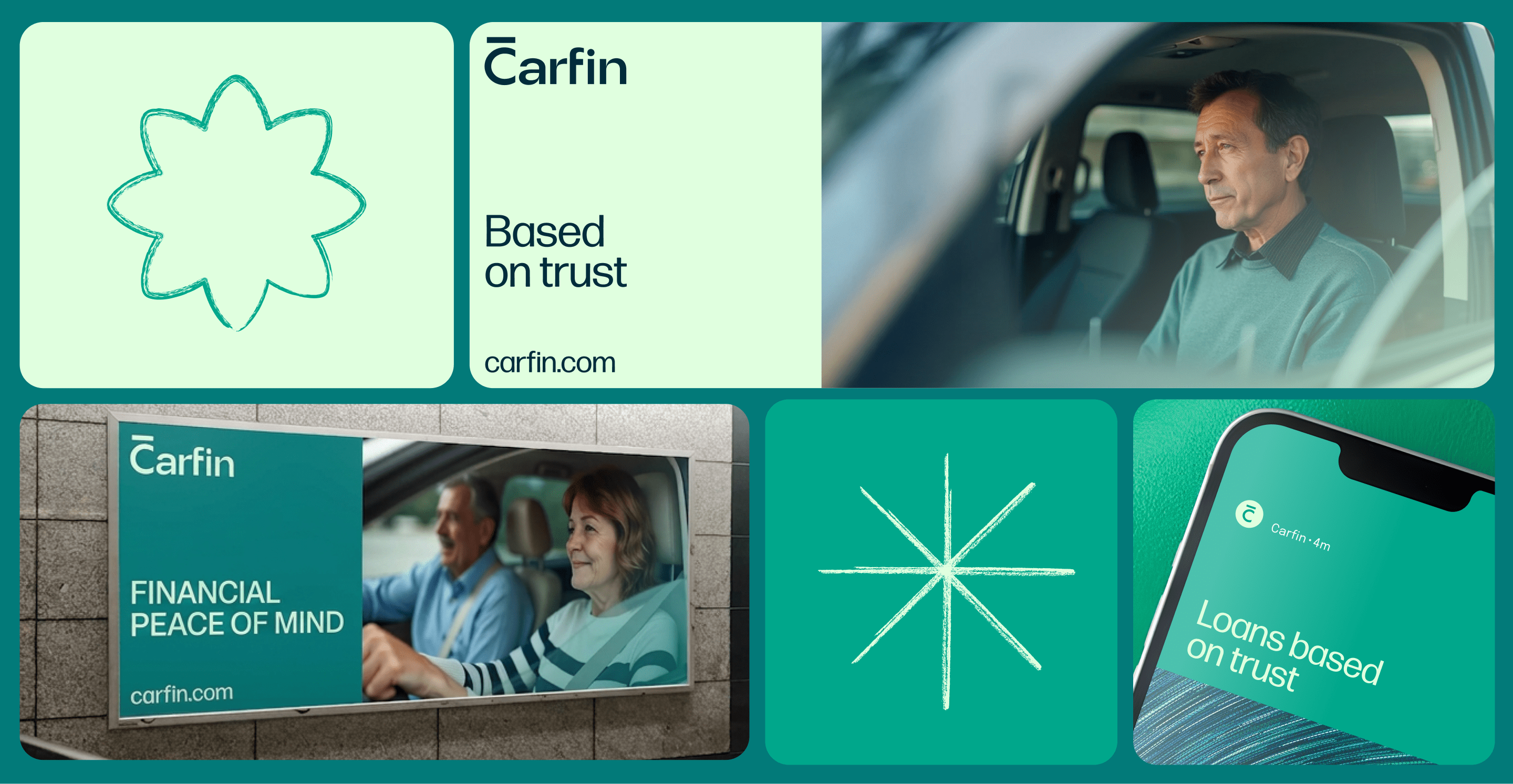
The identity needed to be perceived as modern, understandable, and human. Therefore, the graphic system is based on the ideas of light, movement, and navigation. The graphic elements resemble light streams and movement paths, creating the impression that the brand helps find a way out and move forward.

Communication System
Based on the platform and identity, we developed a system for brand application:
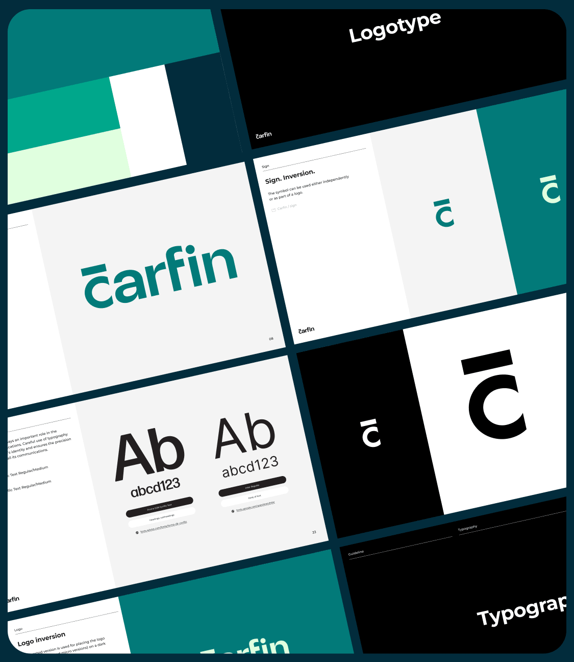
- a logo book and rules for using the brand style;
- principles of visual communications;
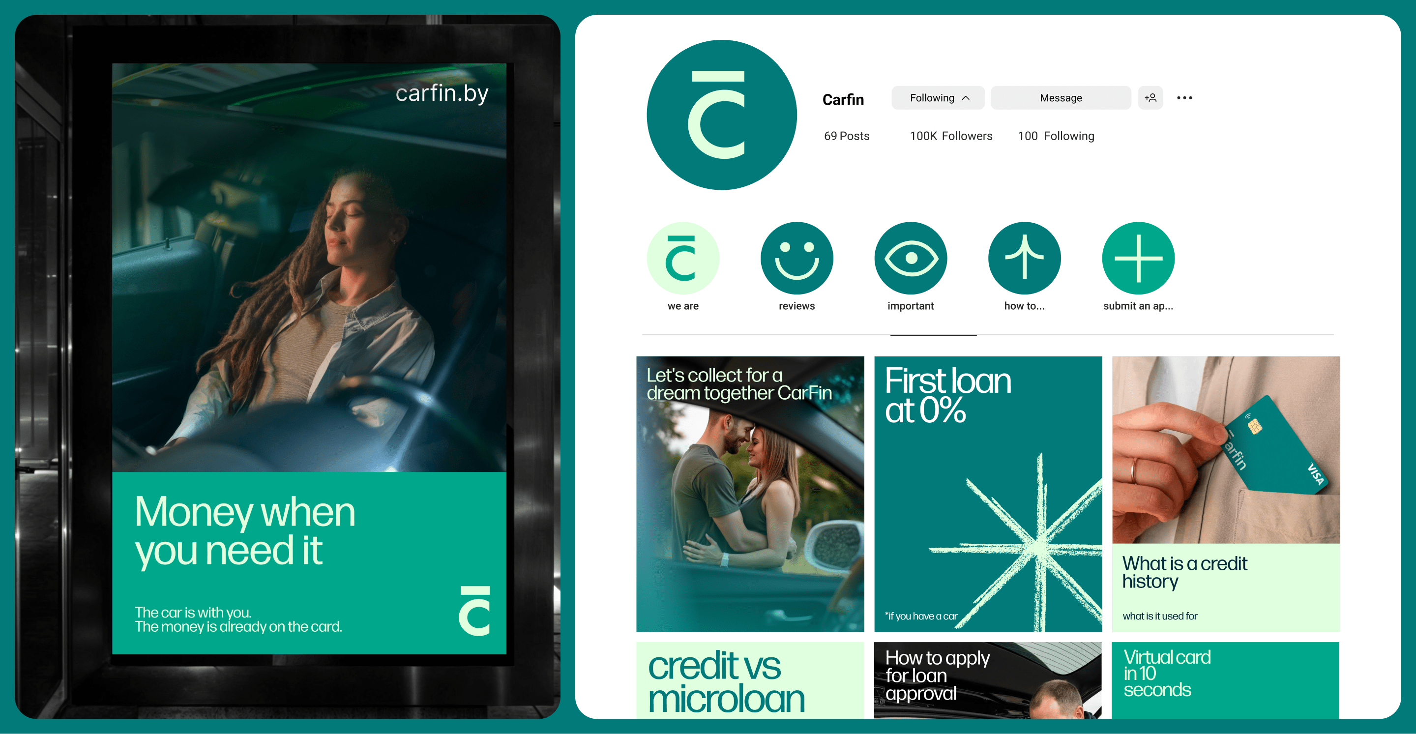
- social media templates;
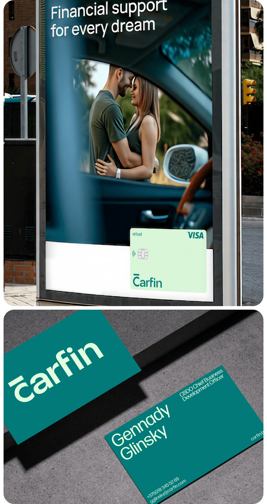
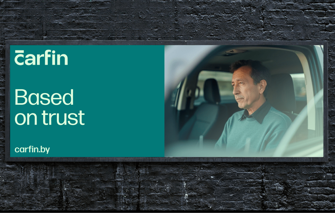
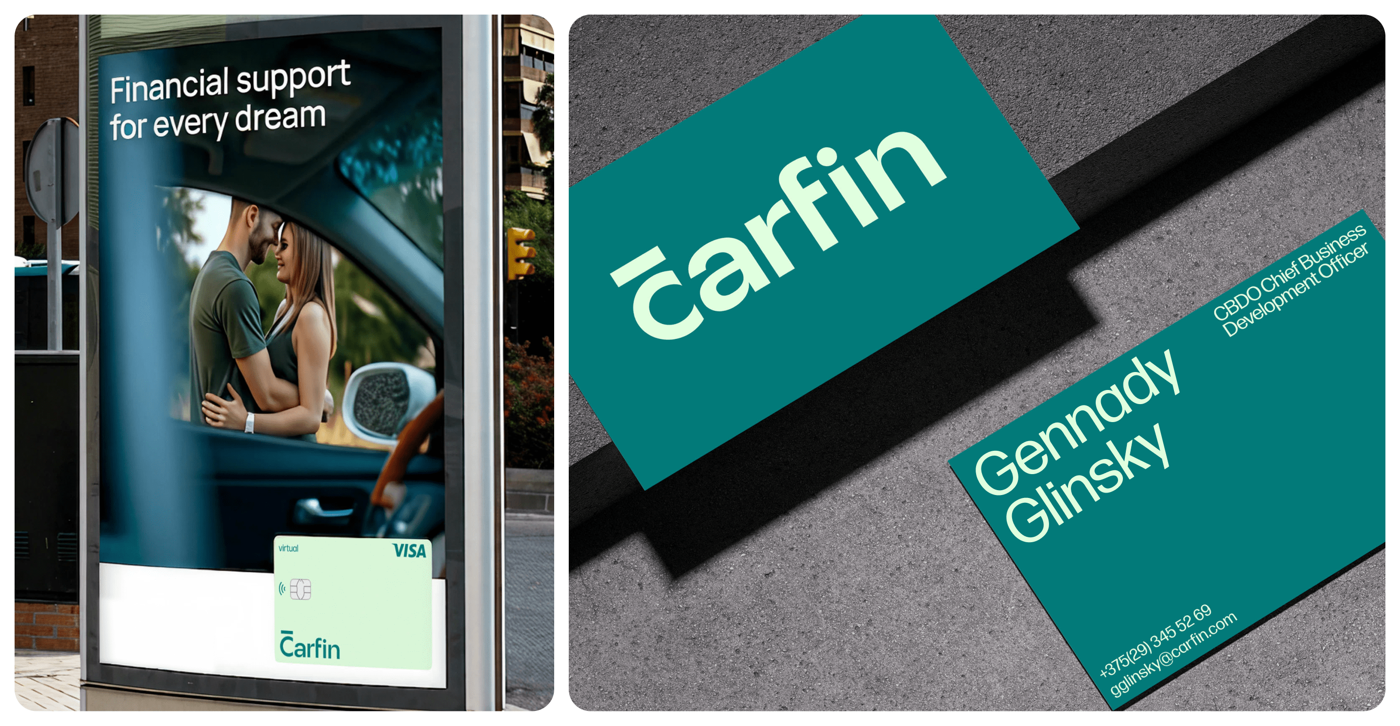
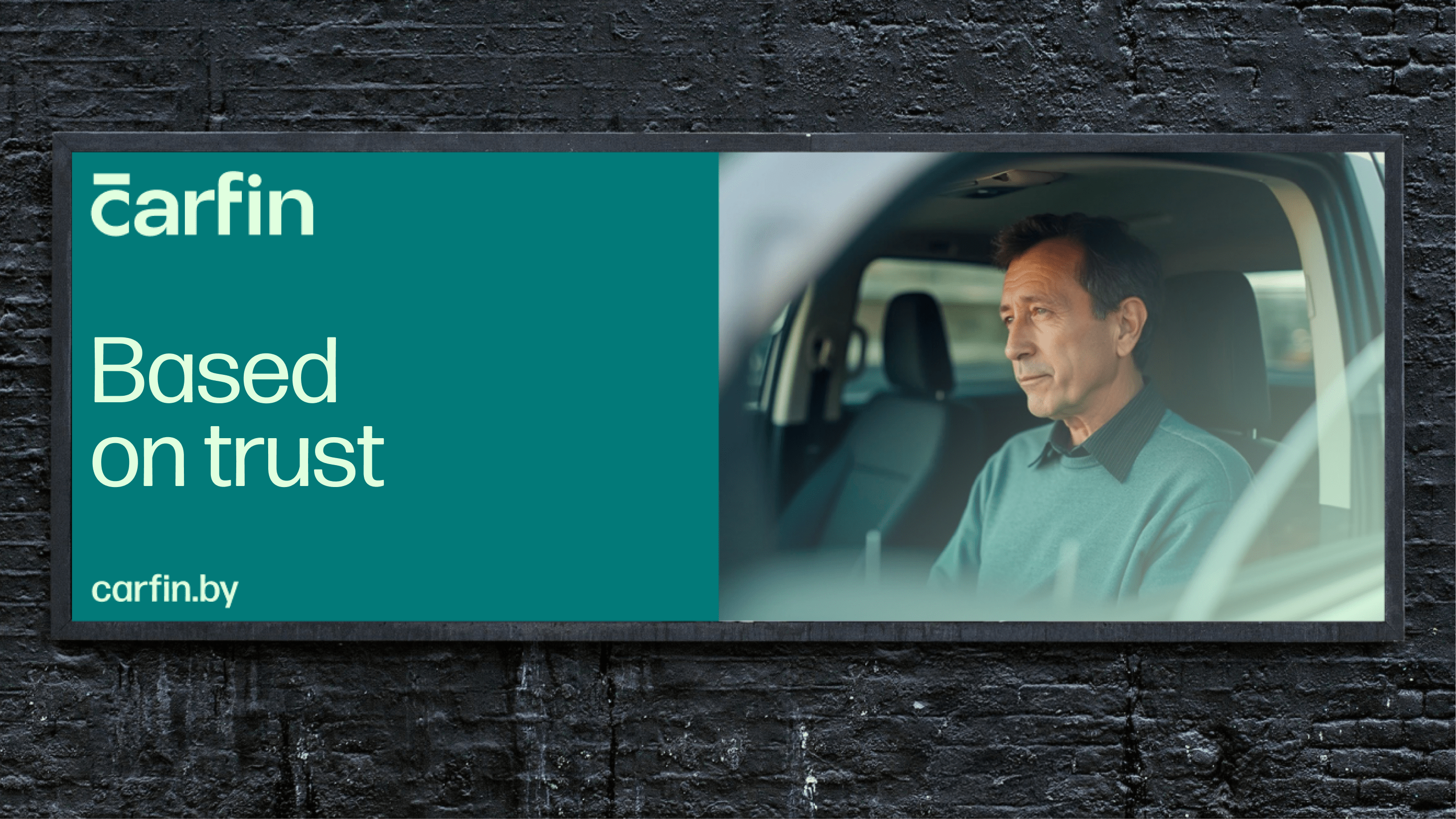
- a concept for advertising media;
- photo style recommendations;
- corporate materials and merchandise.
Special attention was paid to ensuring that the client’s team could independently develop communications without losing brand integrity.
The result
Carfin received a complete brand system that helps communicate a complex financial product with trust and respect.
The new brand stands out among banks, pawnshops, and microfinance organizations not with promises of “the most favorable terms,” but with its attitude towards people.
Carfin is a service that helps solve financial issues without unnecessary hassle or personal involvement.