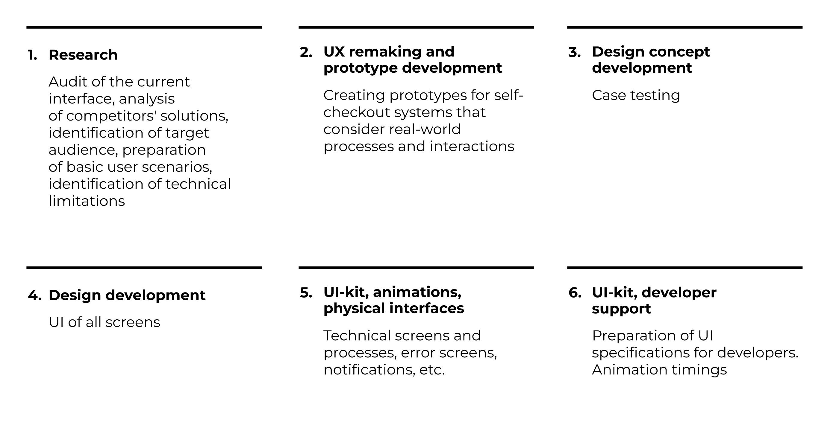
How to go beyond the rectangle and stop abusing people with poor self-service devices
We deal with the peculiarities of self-service devices and advise what to take into account in the process of developing so as to make it convenient for people.


Before we delve into the specifics of self-service devices, let’s ensure we’re on the same page regarding the meaning of this term.
A self-service device (SSD) is any equipment that automates routine processes and is located in a public access.
It is:
The challenge with self-service devices lies in their diverse user base, ranging from schoolchildren to retirees and other people who don’t have the practice of using such technologies on a daily basis. For many users, navigating these systems is entirely new, often uncomfortable, and sometimes even intimidating.
This often occurs because many self-service devices are designed incorrectly—prioritizing the screen over the user. It’s a common mistake among developers who treat the interface as just another display and design it based on the same principles as a mobile version or other standard interface of the same format.
Self-service devices interfaces are influenced by circumstances that are not typical of more conventional interfaces
Relying solely on aesthetically pleasing rectangles and treating the interface as just another mobile display during UI development is misguided. It requires different practices and approaches, with a focus on a product-centric approach placing the user at the forefront.
Interaction design, customer experience research and environmental considerations → Self-service device UI
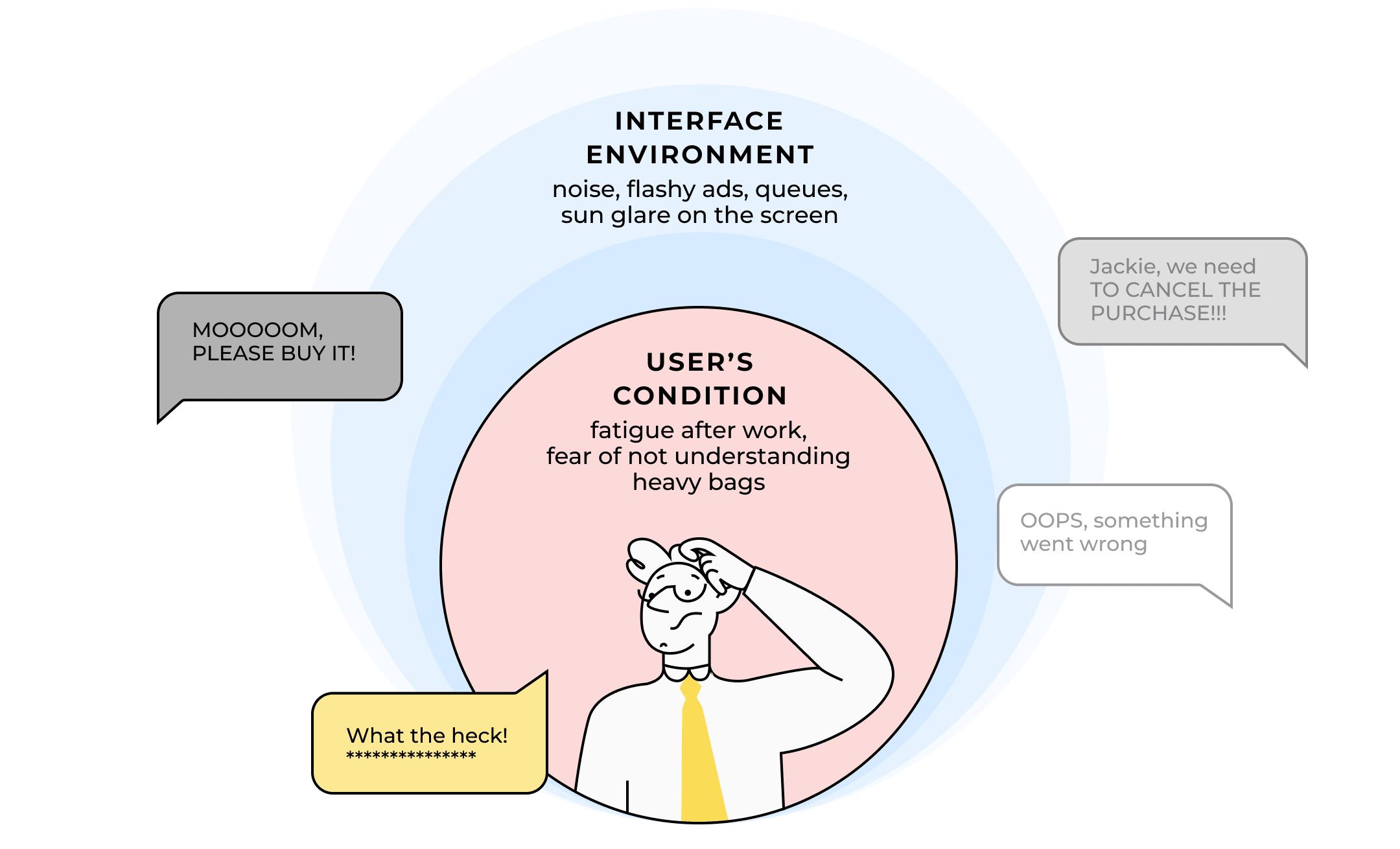
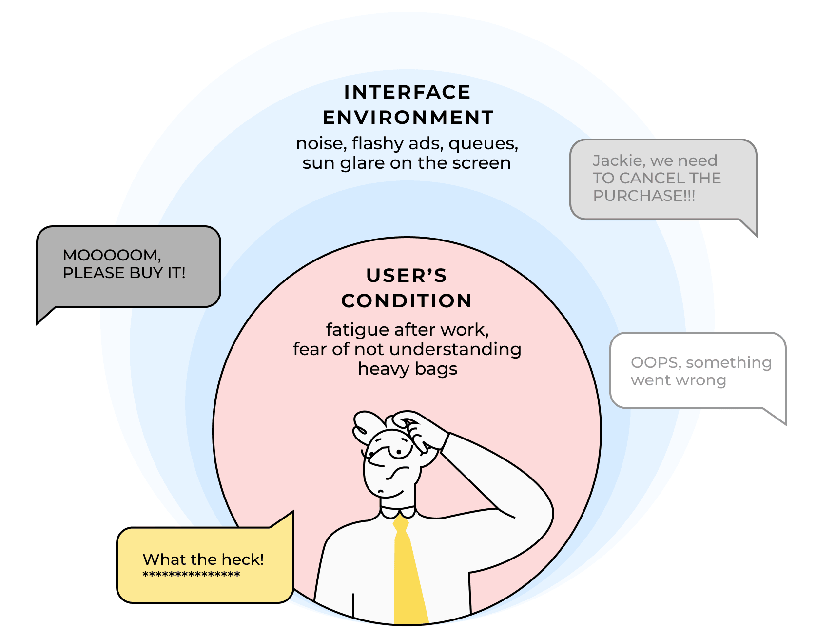
Factors such as queues, noise, tired users, device height, nearby children, sunlight glare, and pervasive advertisements all contribute to the user experience and must be considered when designing the interface.
Let’s delve deeper into each of these components.
Self-service devices are in a special interaction environment
It’s crucial to comprehend the context of this environment and consider the device as a unified entity, rather than designing the screen in isolation. When I refer to «context» I’m referring to two key aspects:
1. Environment: this encompasses the device’s physical location and how it impacts the interface.
How does the interface perform in bright sunlight or when positioned in front of a window? Do users typically interact with the device while standing or sitting? Is there excessive noise in the vicinity?
2. User’s condition: this includes the emotional and physical state of individuals (fatigue, anxiety, urgency) and how the environment impacts them (distracting, calming, etc.).
Whether a person is alone or with children, waiting in line with only a banana or purchasing groceries for the week, buying a single ticket or chaperoning a group of 30 children, being pressed for time or not, carrying heavy bags, or dealing with crying children craving chocolate bars — these factors all contribute to the context.
Let’s look at examples.
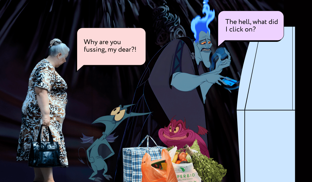
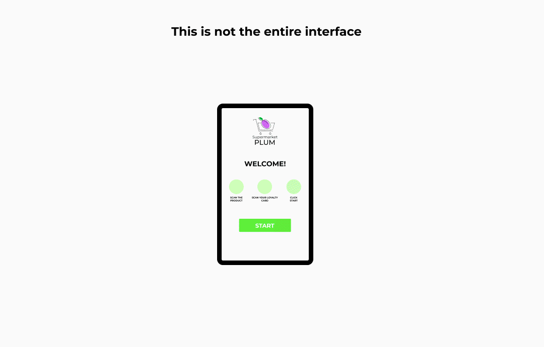
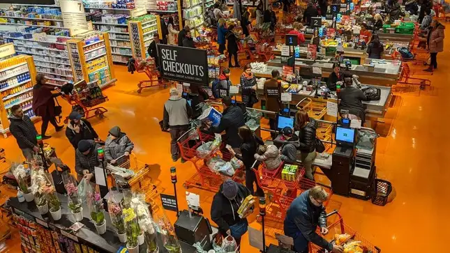
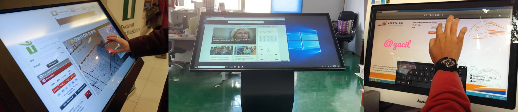
Self-service checkouts
Self-service checkouts aren’t just machines designed to help you skip long queues and bypass interacting with cashiers. This is also its context:
Evening, work is finished, the self-service area in the supermarket, children are distracting, unbearably heavy bags in hands, heads are humming, a queue of people who need to haste, a loud voice ‘Jackie, we need to cancel the purchase’, pew, pow.
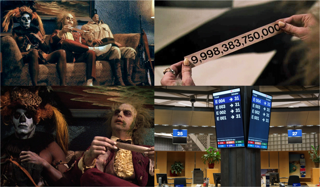
Electronic queue
It’s not just about providing a sense of calm and assurance that you won’t lose sight of the elderly lady in the gray knitted jacket. Context is key here too:
What’s the distinction between «Get a coupon» and «Get a coupon for another department»? And how about «financial services» versus «commercial services» at the post office? Where exactly should you click? Oh, and where on earth is window 328?
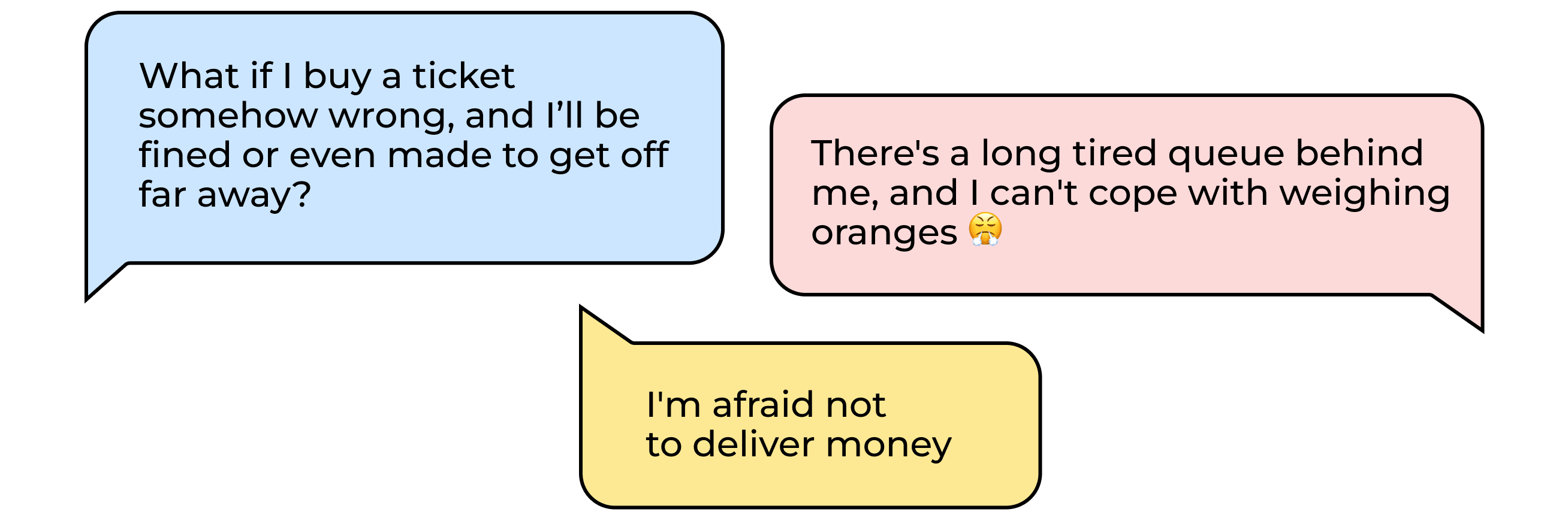
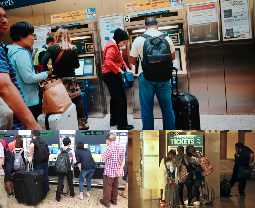
Ticket machine
It’s not just about skipping the need to arrive at the station early and avoid long queues. There’s also the surrounding context to consider:
You’ve got just 10 minutes left to catch your train. You’re anxious to ensure you purchase the correct ticket for your destination. It’s noisy, the terminal screen is glaring from the sun, making it hard to see, and everyone seems to be in a rush. Meanwhile, a young boy with a trolley tugs on your sleeve, asking, «Do you know where platform 9 and ¾ is?».

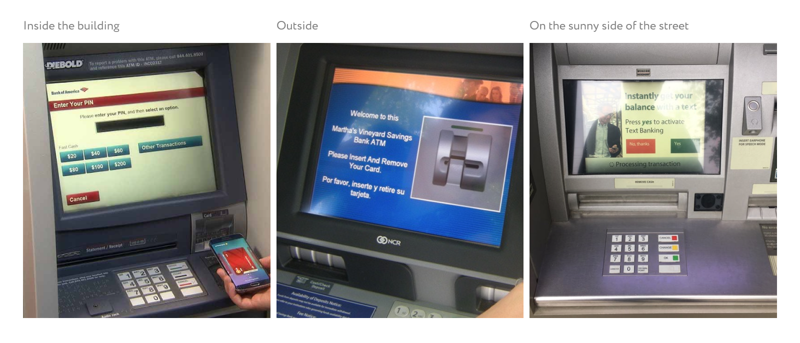
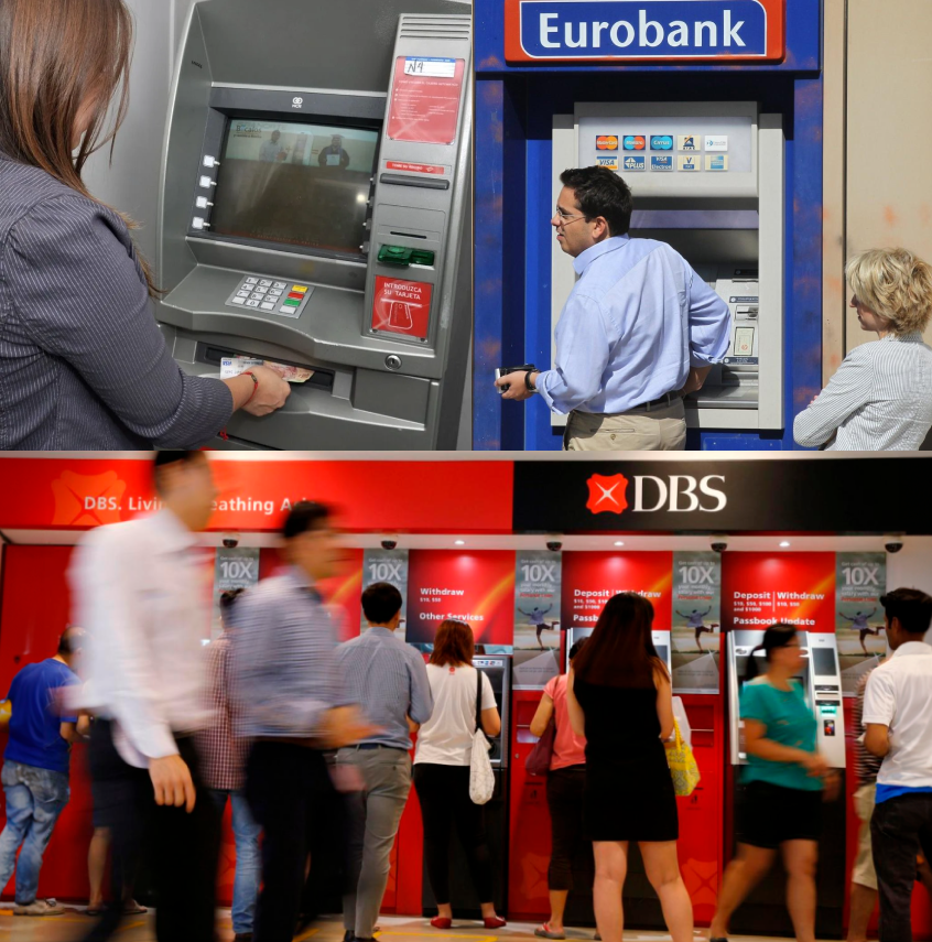
ATM
It’s not just a convenient tool for withdrawing money near your home without having to visit a bank branch. There’s also the surrounding context to consider:
It’s late evening, and you find yourself at a dimly lit ATM. You’re withdrawing your entire month’s salary from the card, but someone is already queuing behind you. To make matters worse, you’re dealing with a chatty ATM that loudly asks, «What currency do you want to withdraw your money in?».
The interface of a self-service device differs greatly from that of a mobile app used at home while lounging on the couch, listening to jazz, and scrolling through TikTok.
Using a self-service device demands more focus from the user due to increased distractions, worries, and discomfort compared to using a mobile phone on the sofa.
Anti-glare screen protectors, touch screens, voice guides for the visually impaired, tactile stickers, NFC technology, and other technical enhancements mitigate contextual factors and make using the device less stressful.
Understanding the ergonomics of the device is another factor that aids in this regard.
The ergonomics of self-service checkouts, terminal, and ATM are vastly different from those of a tablet and phone
Interaction Model
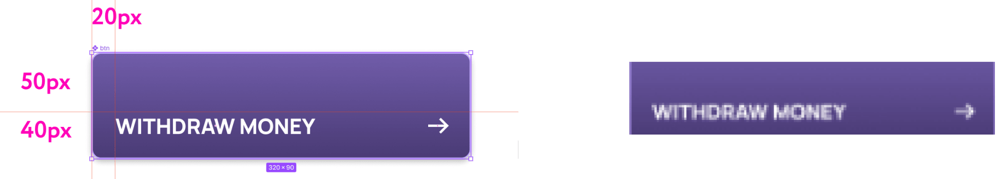
When using a mobile device, interaction with the screen primarily involves finger motor activity — precise, quick, and covering short distances.
However, the dynamic changes when operating a self-service device. Pressing elements on the screen requires the engagement of the entire arm, from the shoulder joint to the hand. This significantly impacts the size and placement of interface elements.
The time it takes to reach a goal depends on both the distance to it and its size.
The interface button should strike a balance: large enough to be easily pressed without missing, yet compact enough not to overshadow other interface elements.
Furthermore, the placement of elements impacts interaction with the device. Given that a person operates the self-service device using their entire hand, the angle of movement shouldn’t exceed a right angle—and it should be sharp. When the angle approaches a right angle, the usability of the cash register diminishes.
Vision peculiarities and reading information on large screens
It may seem that the larger the screen or display of a device, the better. However, this is not entirely true.
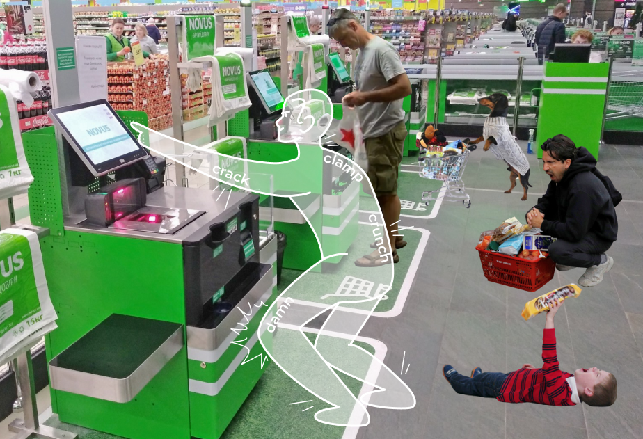
The peculiarities of human vision don’t allow us to see everything that is happening on the huge screen of a self-service device. Users see only what they focus their eyes on. The mobile phone interface isn’t so huge and therefore is created according to different rules.
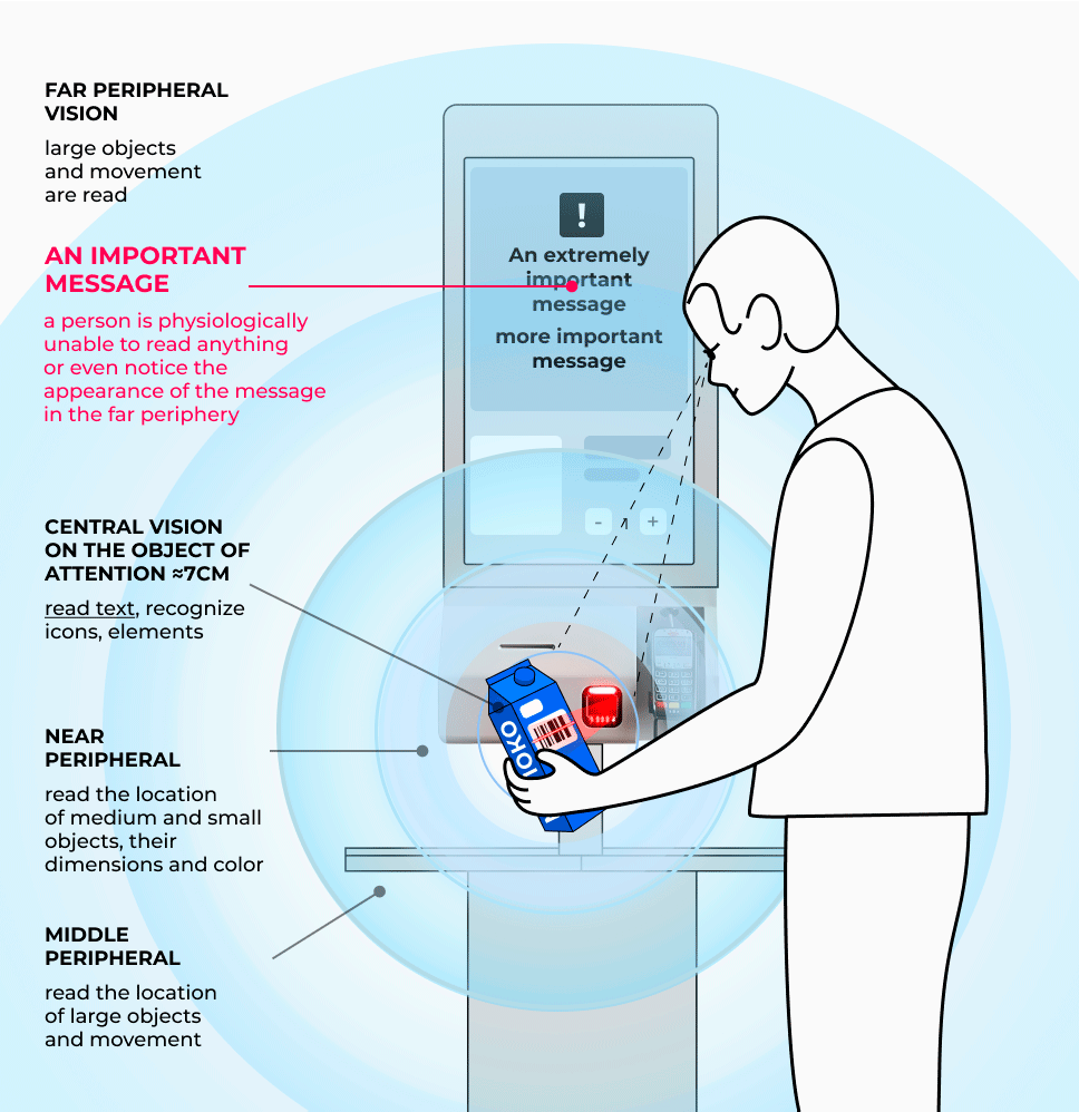
A significant part of the purchase process happens not in interaction with the interface, but with the products.
Take the product — find the barcode — scan — transfer to the platform — take the product — find the barcode — scan — transfer to the platform — take the product — find the barcode — scan — transfer to the platform — take the product — find the barcode — scan — transfer to the platform — and so on about a dozen times.
Therefore, the interface should be designed in a way that allows users, even with the assistance of peripheral vision, to comprehend what is happening on the screen —such as noticing error messages, price changes, etc. — and understand what steps to take next.
Individuals can read and process information within the locus, which refers to an area of vision with a diameter of 7-15 cm. Anything beyond these parameters falls into the realm of peripheral vision. When developing a self-service device, it’s crucial for us to grasp how to capture users’ attention when they engage with purchases and guide them to the locus field, signaling, «look, there is an error».
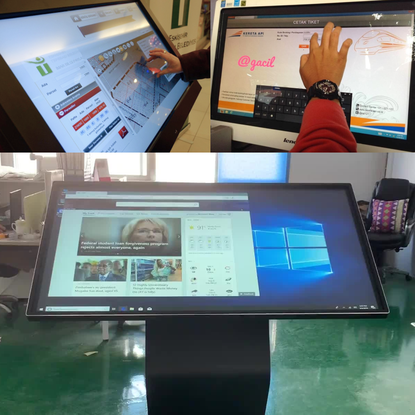
Self-service devices are less technologically advanced compared to your phone
These devices, particularly ATMs, are costly devices with a lengthy lifespan. Some ATMs have been in place for 25 years — the technology hasn’t been updated and, as a result, becomes obsolete. Thus, it’s crucial to recognize that animations designed for a Retina display won’t appear as impressive on an ATM with an outdated-style screen, which may have poor color reproduction, weak screen contrast, and low resolution.
Consider the technical aspects: thoroughly examine the device prior to development, stay grounded, and keep in mind how the rendering will appear on the screen.
First, people must withdraw money without making a mistake, not go blind while using the terminal when the sun is shining, and not miss the train. And last but not least, admire the animation in the interface.
It’s OK to make animations, but there must be an appropriate technological platform for this.
Self-service devices are used by people with different medical state
It’s impossible to predict whether your user has mobility or health restrictions, particularly when considering a terminal in a public setting. Hence, it’s advisable for your product to be inclusive and accessible to all users.
Ramps to the ATM benefit not only people in wheelchairs but also mothers with children. Buttons that are easy to tap expedite device usage for everyone, not just those with impaired motor skills. Additionally, contrasting interface elements enhance readability for individuals with normal vision, not just those who are visually impaired.
According to the World Health Organization, 2.2 billion people worldwide have visual impairments, which accounts for 27.5% of the global population, or nearly every third user of your device. Ignoring these individuals and sacrificing them to a ’trendy’ light gray design would be foolish.
Therefore, when developing an interface, it’s crucial to consider various aspects of vision and color perception:
- Ensure the color scheme offers high contrast, making it easier for users to read information under different lighting conditions and with varying vision capabilities. Utilize several Figma plugins like Contrast, Contrast Grid, Color Blind, and zebra to quickly assess palette accessibility and generate contrast options.
- Opt for contrasting typography: bold, large, and sans serif fonts, allowing users to read screen content even from a distance. Serif elements may not be ideal as they reduce letter size and overall contrast.
- Avoid outlining buttons. It’s frustrating to see ATM buttons displayed on a retina display with a thin 1-pixel outline and color #FEFEFE in Figma. Imagine what will happen when the chick has to fly out of the nest and face the harsh reality of the device’s low resolution.
Self-service terminals are located in public environments. The user treats them only as a tool that allows them to quickly solve the desired problem. Users don’t wish to navigate through complex interfaces; they’re pressed for time, eager to complete transactions efficiently, especially on a Friday evening. They’re not interested in navigating through stylish designs, admiring irrelevant animations, or straining their eyesight. Therefore:
The sense of beauty and the desire to do something like Revolut are bad assistants when designing a self-service device
Here are some hidden elements concealed beneath rectangles within a well-designed interface:
To ensure that your devices not only impress with stunning design that garners millions of likes on Dribbble but also bring joy to people and alleviate the workload for cashiers and call centers, remember a few key points.