How government and companies lose money and people’s trust by installing terminals for show

There’s a feeling that self-service machines in public environments are often installed in a formal way. How else to explain their disconnection from reality: they don’t take into account the environment, the people using them, or the ergonomics of the device. In this article, we’ll try to understand the causes of this scourge, rather than blaming designers.

An inconvenient interface of a self-service device isn’t always a consequence of the fact that it was made by a bad designer or developer. The problem of soulless machines lies not only at the level of the performer, but also at the customer level. Each of them has their own reasons and habits for doing bad things. And before we understand them, I’ll explain why I consider public self-service machines to be a separate category.
Terminal features that change everything
With self-service devices — terminals, ticket machines, ticket offices, etc. — there are several contextual features that make the project to develop them a task with an asterisk:
terminals are devices for public use
terminals are solutions in sensitive areas
a number of terminals have no alternative on the market
1. Terminals — devices for public use
Located in public spaces, the terminals are no longer just a commercial device. It is also an architectural and communication solution that must meet the same urban environment and aesthetic requirements as a public object — a bench, a bus stop, a bicycle stand, etc. Let’s look at a few examples.
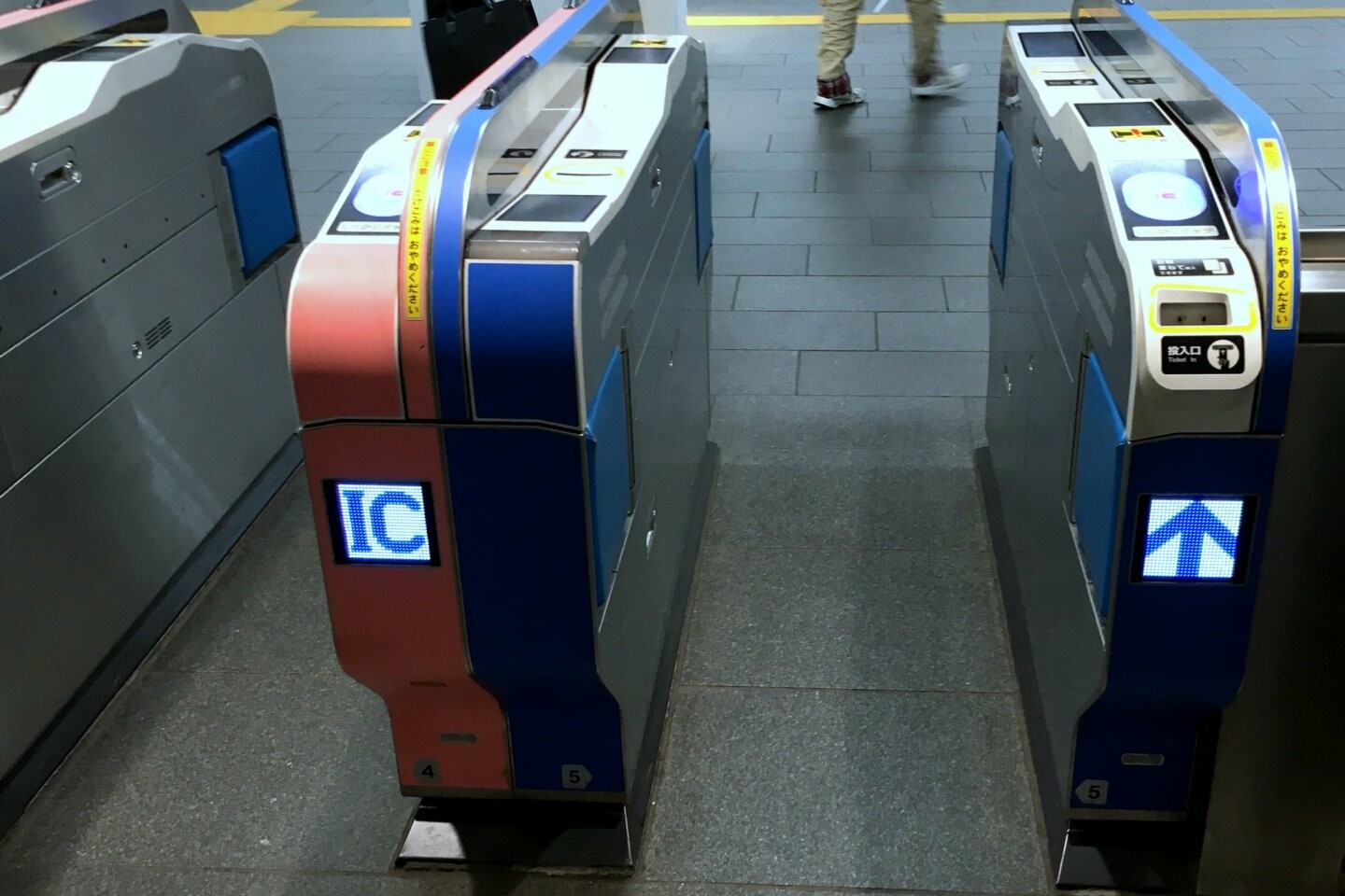
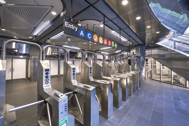
Turnstiles
Subway turnstiles are a striking example of a self-service device that has no alternative at all. If you love using the underground, be kind enough to go through the turnstiles.
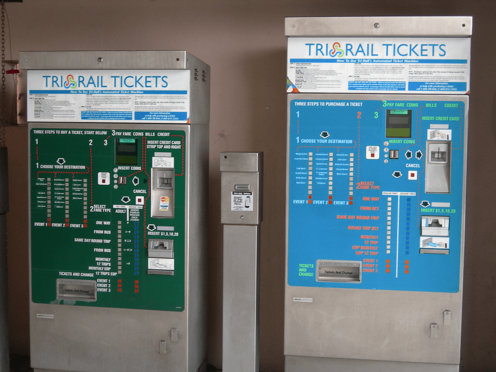
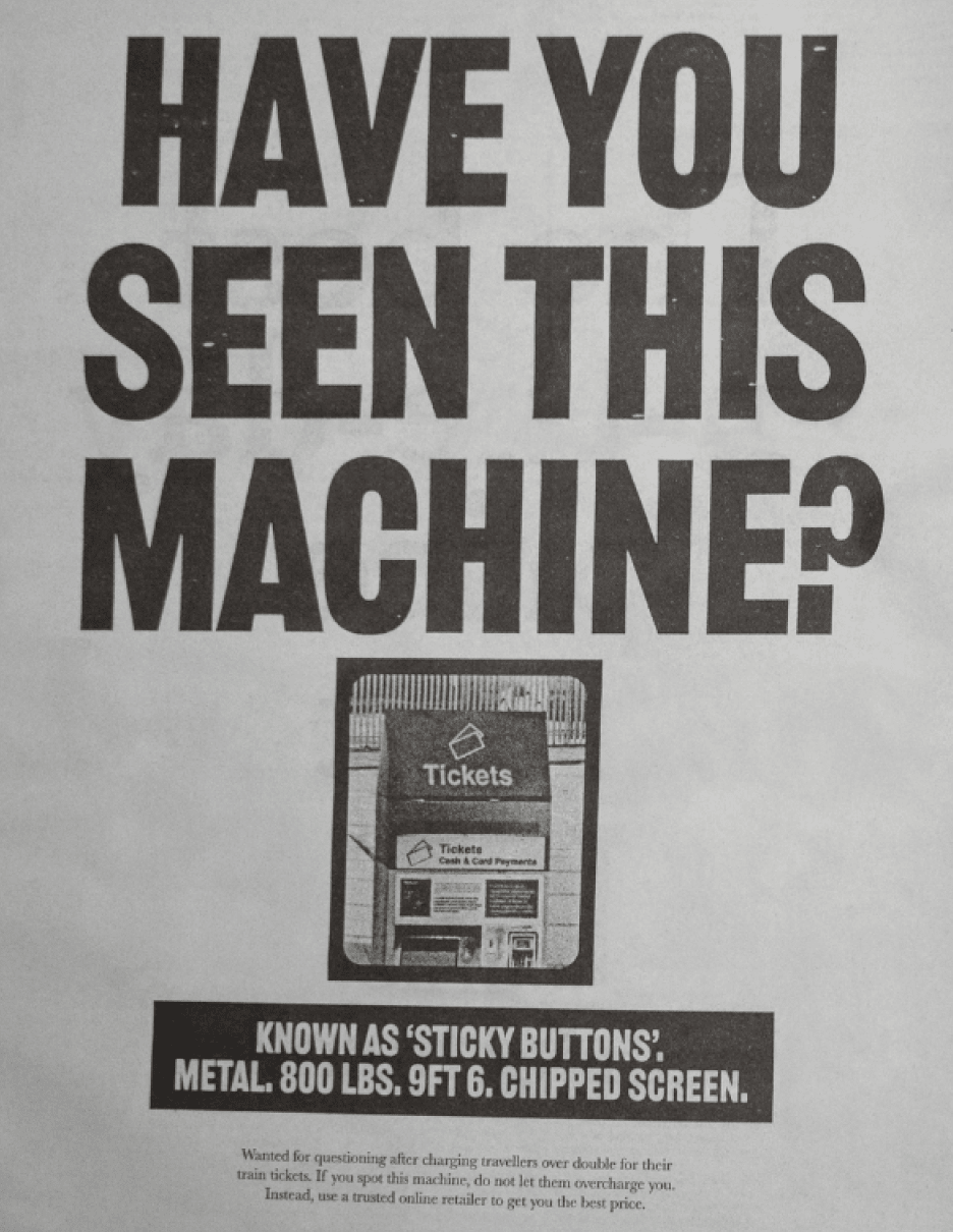
Ticket machine

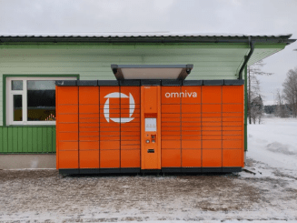
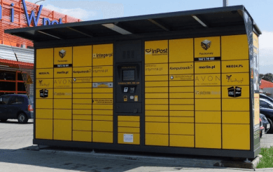
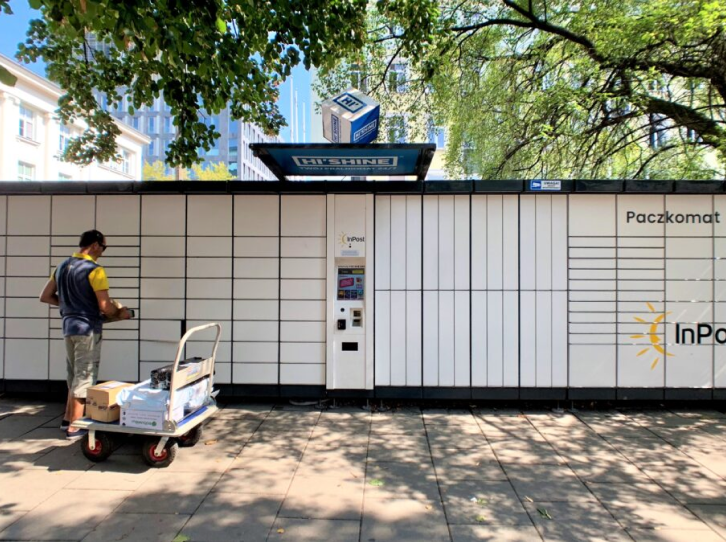
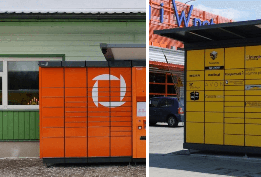
Parcel machine
And these are just examples of the «box» and its placement in the environment. It’s worth taking a look inside the device — there are often no quality standards at all and a pervasive attitude towards the user of «they’ll figure it out». Although the audience for self-service devices is far from just tech-savvy millennials with an iPhone as an extension of their hand who might be able to figure it out. This is also:


2. Terminals are solutions in sensitive areas
Typically, kiosks in public spaces are solutions to basic needs and therefore fall into the realm of increased vulnerability and sensitivity.
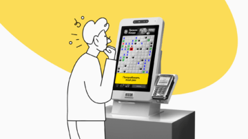
With a poor ticket machine interface, it’s easy to buy a ticket to the wrong destination, on the wrong day, mix up flights, get dropped off in the middle of nowhere, or get fined. With a confusing ATM interface, you can get confusing information about fees, overpay, or forget your card or money.
For projects in particularly sensitive areas, sensible design is very important as it can make the use of a device less stressful.
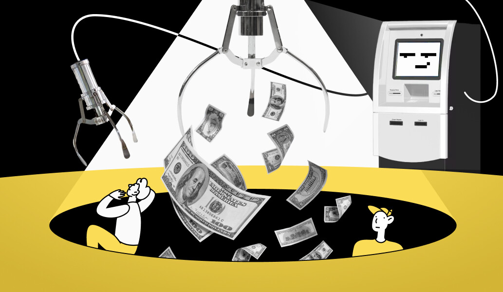
As an example, let’s look at the different processes for withdrawing money and the role of design in this.


3. A number of terminals have no alternatives on the market
Let’s say you’re using a financial accounting application. If you don’t like something about the way it works, you’ll uninstall it and install another one. The market is full of alternatives fighting for your attention and forced to take your needs into account, because you vote with your money.

When it comes to public devices, the situation is often different. Some of these projects are developed exclusively, so the user’s choice is very limited, if not non-existent. The user is forced to use the terminal, then hang on the support line, creating a queue in the store until they figure out how to weigh fruit.
A person can’t choose a different ticket machine, a different electronic queue at a clinic or post office, a different turnstile at the metro, a different bank ATM to withdraw money without a commission, a different car park near work or home.
These terminal features lead to three erroneous conclusions among customers and service providers:
- “The user has no choice, so he’s not going anywhere”. The monopolistic customer thinks that there is no competition and everything is unshakable.
- “No need to worry — the client will accept it anyway” and therefore you can do it as badly as you like, you can put a box and not think about how it will “fly”.
- “Design is not important”. Design is considered decoration and is practically not taken into account in the project estimate: its quality is not controlled, research and testing with users are not carried out, metrics such as conversion, failures, etc. are not tracked.
Let’s try to argue all this.
Competition exists
as a response to the belief that «the user doesn’t have a choice, so they don’t go anywhere»
Yes, there are a number of vulnerable groups who really don’t have that choice. But that is changing:
- Non-governmental pension companies are gradually being set up,
- Alternatives to postal services are emerging,
- Private kindergartens and schools are opening,
- The share of commercial health care is actively growing.
As soon as people are given the slightest choice, they choose the best service. The strategy of «that’s enough, nobody’s going to move us anyway» — if you look at it over a period of 5-10 years, it turns out to be unworkable. Because there is competition, it’s just much deeper.
Humanity is not moving towards pyramids and pharaohs, it is moving towards a technological singularity. This trend is inexorable. This means that the state will also have to restructure its processes and develop a new attitude towards the development of such projects. This must be done now, not by spending money on buttons, but by investing money in the right processes.
Indifferent doing of the project is unprofitable in the long term
as response to the belief that «you don’t need to worry about it — the customer will accept it anyway».
An indifferent monopolist makes indifferent performers. «Why bother, the tender has already been won and you can do as bad as you like.» Needless to say, this is the wrong form of attitude towards the project? A bad design may be accepted the first time, but when the customers receive negative feedback from the audience, when their business suffers losses due to the fact that part of the automation doesn’t work, will they remain a client of such a contractor?
A team developing public devices needs to move beyond the “customers will accept it anyway” paradigm.
Self-rotting products are not profitable for anyone: they don’t allow for long-term profit. Look at point one — there is competition and at the slightest alternative people will leave. And if the loss of money due to indifferent execution is difficult to track, then rest assured: it will affect your reputation.
What do designers and developers who create a product in a social environment need to consider?
Design is not decoration, it’s the basis for the customer’s use of the product
as a response to the belief that “design doesn’t matter”
What do you draw when the only thing on the screen is a “take a ticket” button?
Product design isn’t about decorating boxes and buttons. Design isn’t the same as picture. It is a solution that takes into account the interests of users and businesses, in line with the requirements of developers and the technical base, the ergonomics of the device, the environment and user habits.

Design is worth money because it helps the customer use the features of the product. Otherwise, it turns out stupid: there is money for the hardware box, the developers, and building a network, but no money to make it work.
It is the design that makes a project work. In addition, CX/UX/UI costs only a penny in the overall pie of project costs, but ignoring them can lead to collapse.
Bad CX design → a company has to spend many times more on support to get the device used.
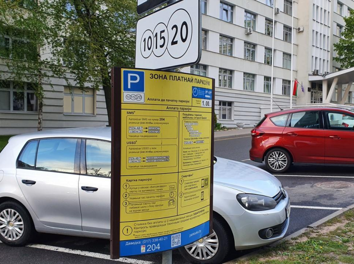
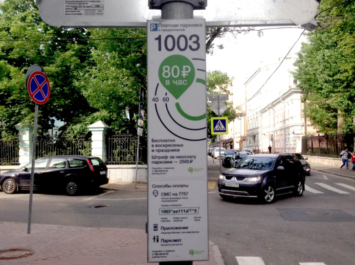
Parking
Hire inspectors and organise inspection flights, spend energy on litigation and explanation.
ATM
Spend bank staff resources and time on reissuing or returning the card and responding to complaints from users who didn’t notice the amount of the commission.
Self-service cash register
Hire a dedicated person to entice people out of queues and into self-checkout lanes, promising that using them won’t be scary.
Equipment without a user-friendly interface is lost profit and wasted money. It doesn’t matter how much a self-checkout system costs, if its CX is poor, it won’t evolve and will gather dust.
The article «How to go beyond the rectangle and stop abusing people with poor self-service devices» explained how many factors should be considered when developing self-service devices and what is hidden inside the rectangles of a competent interface.
Why do it well
✉️ For customers, monopolists and government organizations
Competition will also come to government services
Private organisations are nipping at your heels, and if you provide an inconvenient service, people will leave as soon as they have a choice. That’s why it’s important to create a strategically working competitive project now, so that the audience you already have remains loyal and grows.
Companies compete for people not at product level, but at state level
Not only companies, but cities, regions and even countries compete for people. People are the most important resource for a country’s development.
If migration used to be mainly urban, the battle for digital nomads is now taking place at the state level. Countries are offering well-paying jobs, reducing tax rates for working foreigners, making it easier to do business, offering scholarships and grants for foreign students, simplifying the visa process, and so on.
There is competition — it’s just not on the surface and it’s more complex. A non-competitive, non-digitised state will eventually lose.
✉️ Performers
Well-executed projects influence the growth of your industry
By doing quality work, you develop the culture of your professional environment, create demand for it and set the conditions for your work in the future. That’s why, when working with a client, it’s important to create a need for quality work and to communicate its importance.
Responsibility for projects is bigger than it seems
If you think strategically and globally, you’re not drawing a button in a terminal, you’re shaping the competitiveness of a city or a country. That is why IT companies need to engage with users, think about the usability of the service, add a budget for design research, consumer experience studies and testing.
It’s about developing skills, changing processes, explaining to the customer why it’s important, communicating that design is not about being ’pretty’, but about being convenient and forward-thinking.