The largest car resource in Belarus that helps to sell and buy a car.
Goal
To update the identity and create the image that will reflect the groovy nature of the brand.
An engine, a steering wheel, a roof, doors — one can already imagine a car without all these things. But wheels are something that one can’t still do without. There are wheels in every car and they let people travel around the world in search of new places and adventures.
It was
It became
The logo is based on a geometric grotesque. It’s built on simple shapes: a circle, a square and an equilateral triangle. The circles of the letters ‘a’ and ‘b’ follow the shape of car wheels.
The first letter of the logo is a stylistic element. It acts as a ‘portal’ to the automobile planet of buying and selling cars. However, the form itself doesn’t work: we add a car that drives out from the service portal.
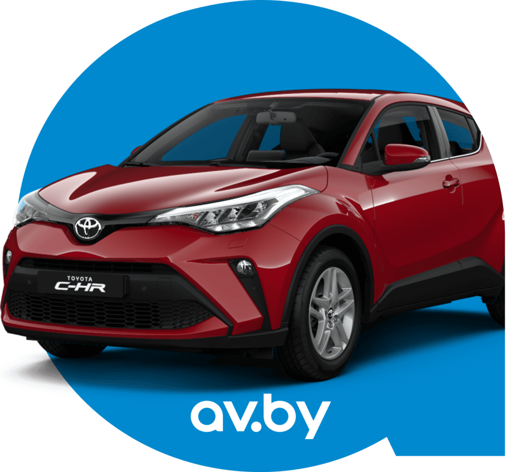
To buy?
QUADRATISCH, PRAKTISCH, GUT
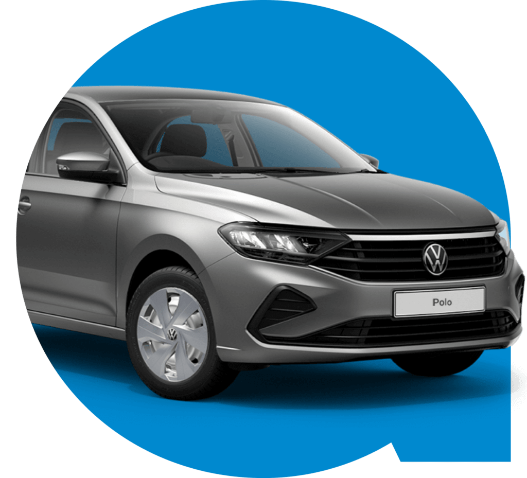
Or to sell?
Konnichiwa,
GODZILLA,
Kurosawa-san,
素敵
A style-forming element transforms easily. For instance, for events, souvenirs and different marketing materials.
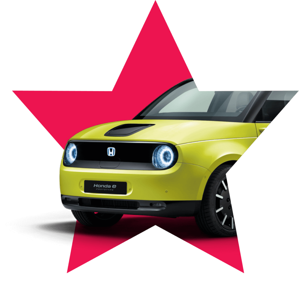
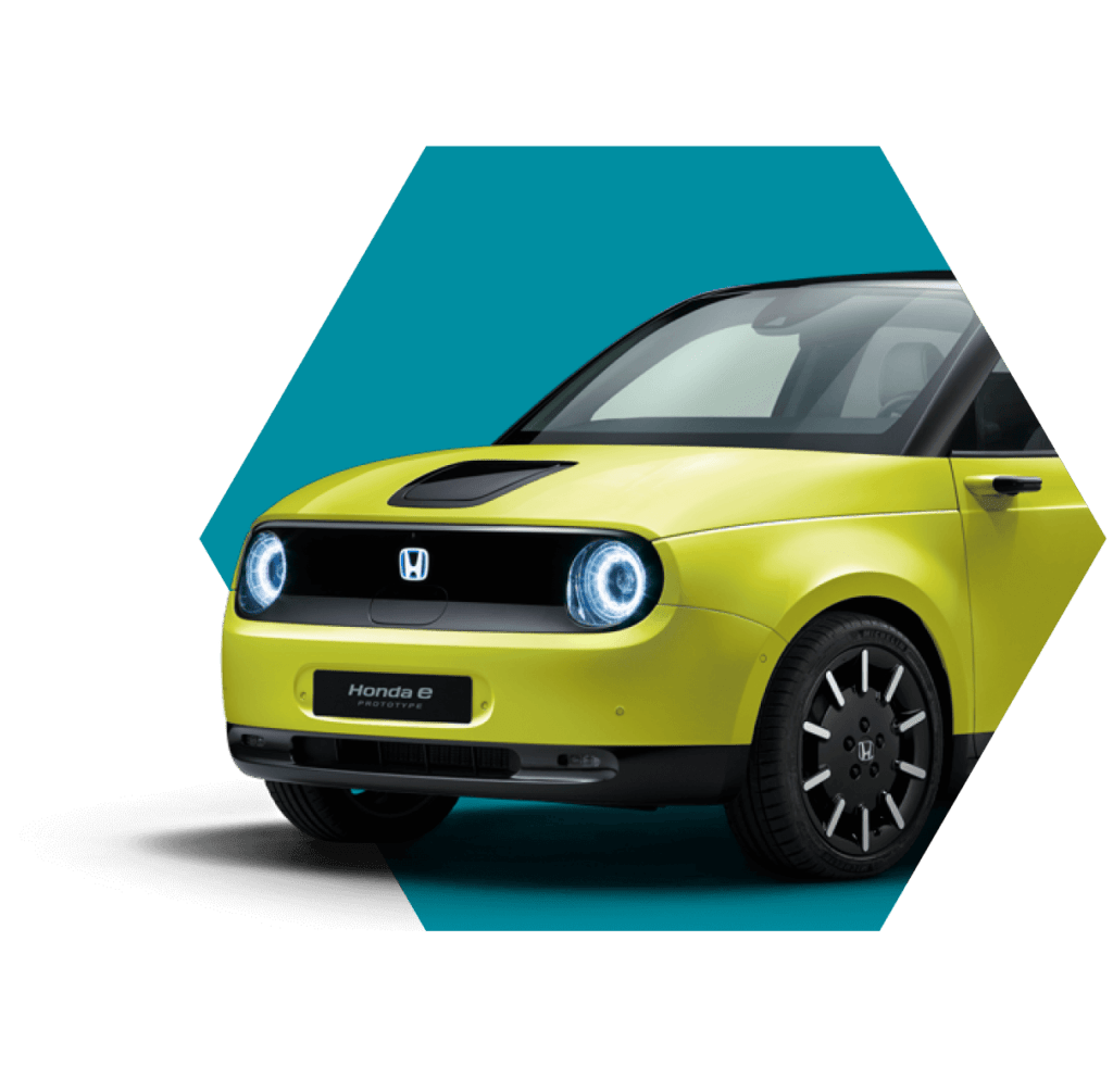
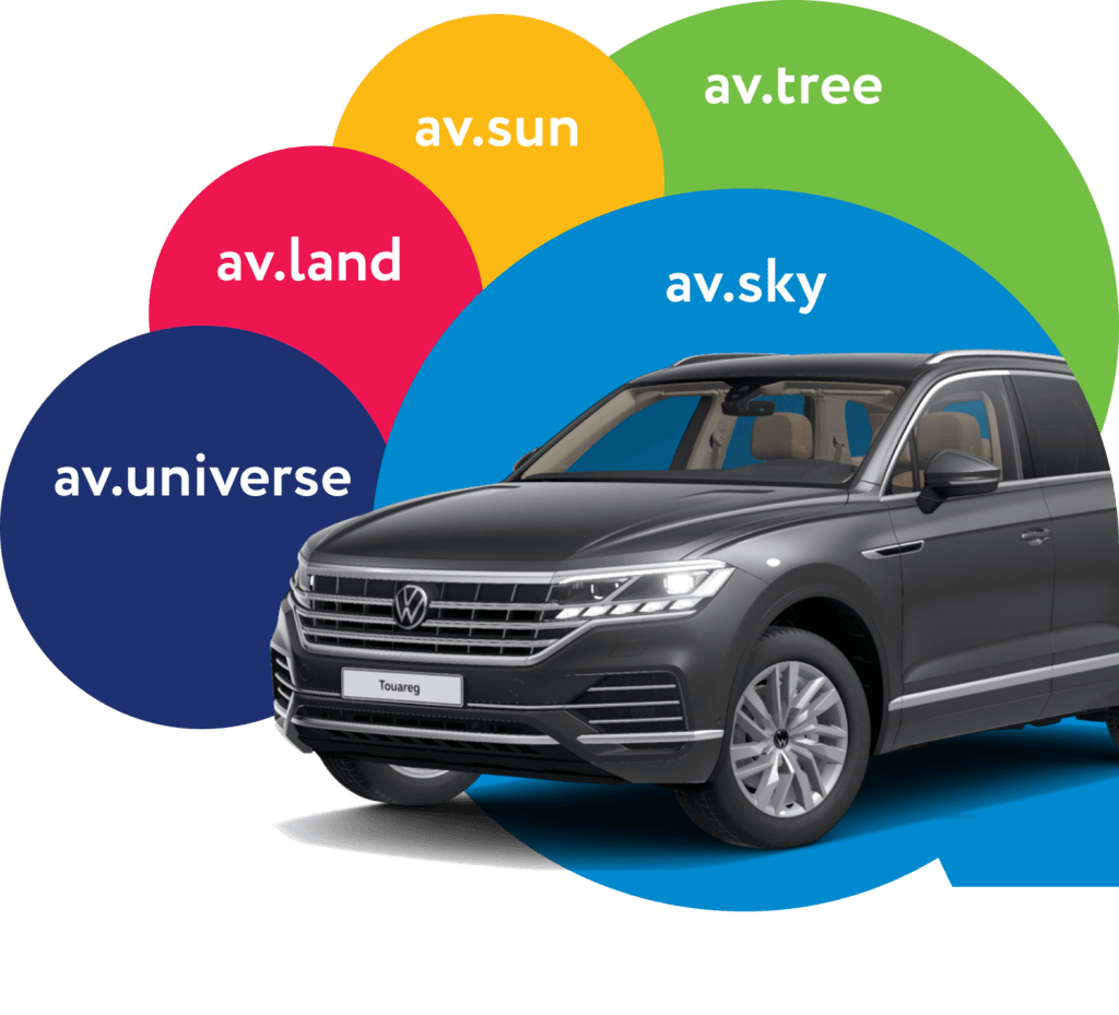
We choose corporate colors. The bright sun, the clear sky, trees around — what we want to see every day. Sometimes it’s what a car is necessary for.
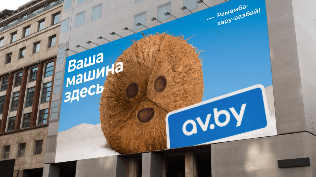
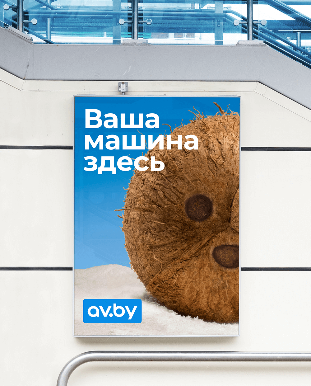
The Av.by corporate identity works on different media and distances well: it’s nice up close and recognizable even from a far distance at once.
The layout of the outdoor advertisement is made in the legendary AIDA Pioneer.
Your request will immediately go to the sales department. One of the managers will answer you in order to discuss details. It takes up to half an hour during working hours