ATM User Interface for Banking Self-Service System
How to engineer a convenient visual solution
What you have to know to create UI for ATM
There are lots of differences between designing an ATM interface and other kinds of screen UI, including both web and mobile.
Despite our rich experience in UI design, we had to dive deeper into this field. The target is to create a solution that takes into account machines position, technical restrictions, and other aspects. And, what is really important, that is easy to use for people with color deficiency or vision impairment.
UI control options for ATM


Touch screen
You can just press active digital elements on a screen to interact.
Push button
Use real buttons located on either side of a screen to control.
Combined
It consists of both interaction types.
How environment affects the interaction with ATM
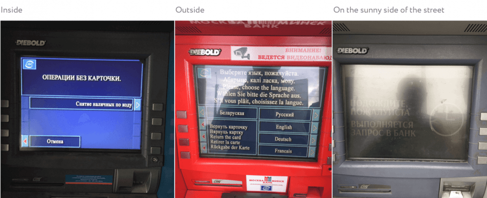
Any user can face some difficulties with screens depending on the time of the day, illumination, or ATM position.
Moreover, sometimes it’s really important to get a service rapidly. So our challenge is to take all these aspects into account to create simple and automatic scenarios of interactions.
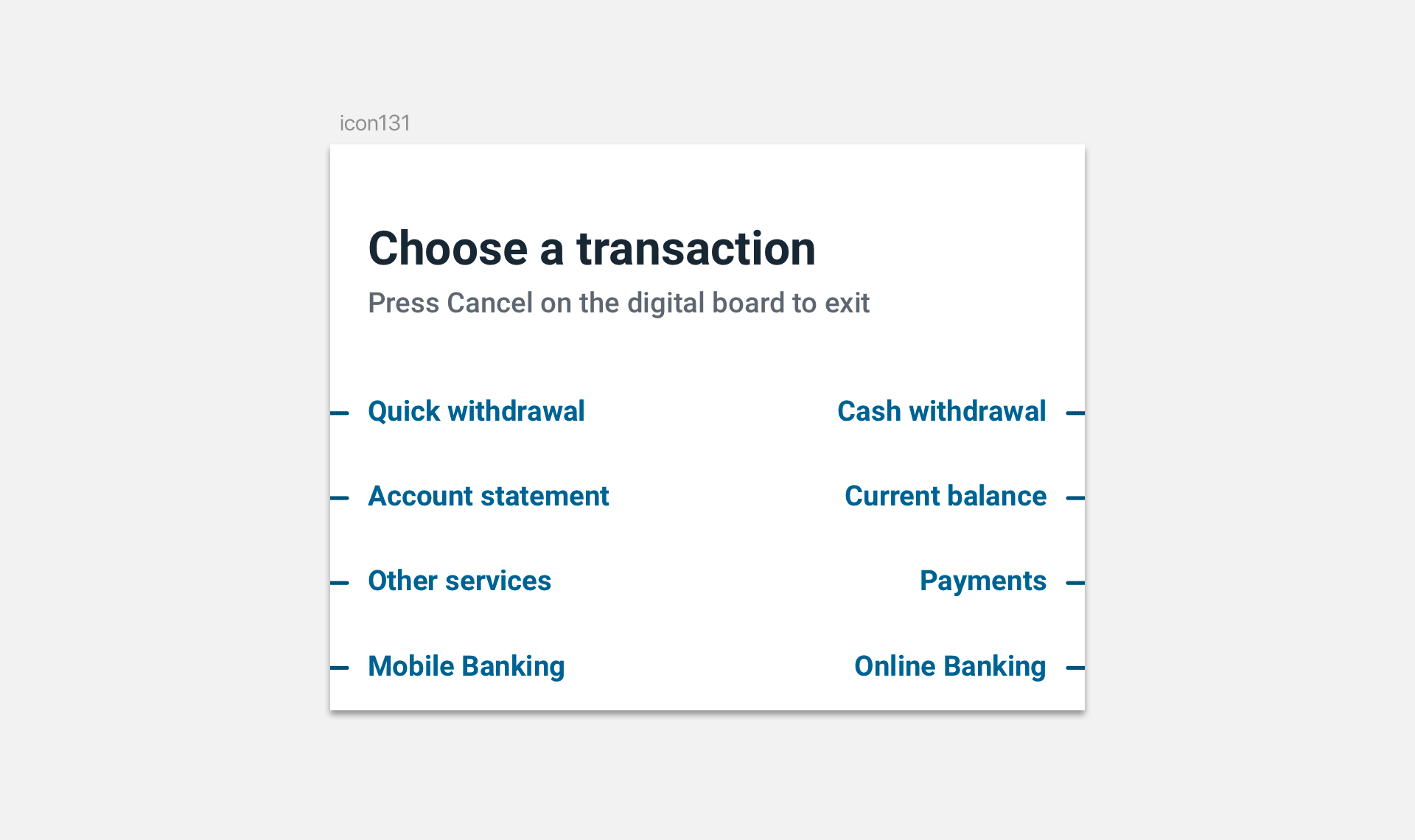
UI redesign
The original interface had dozens of problems, including awkward colors and poor layout. In general, it looked outdated.
What you saw on those displays reminded more technical screens or Windows from the early 2000s, than what we all are used to deal with every day, like smartphones.


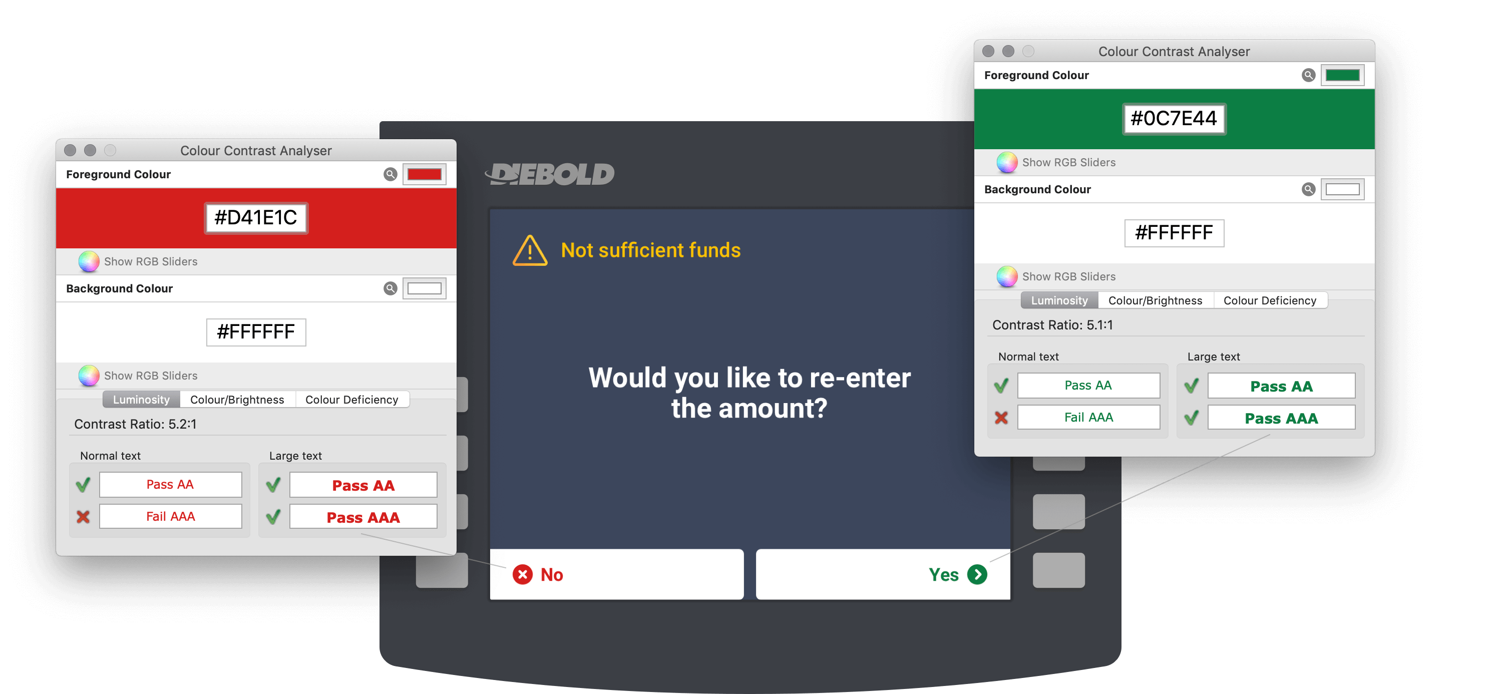
Contrast first
We worked out a color scheme with high contrast. The main reason for that is to make data on screens easy to read regardless of a luminance level.
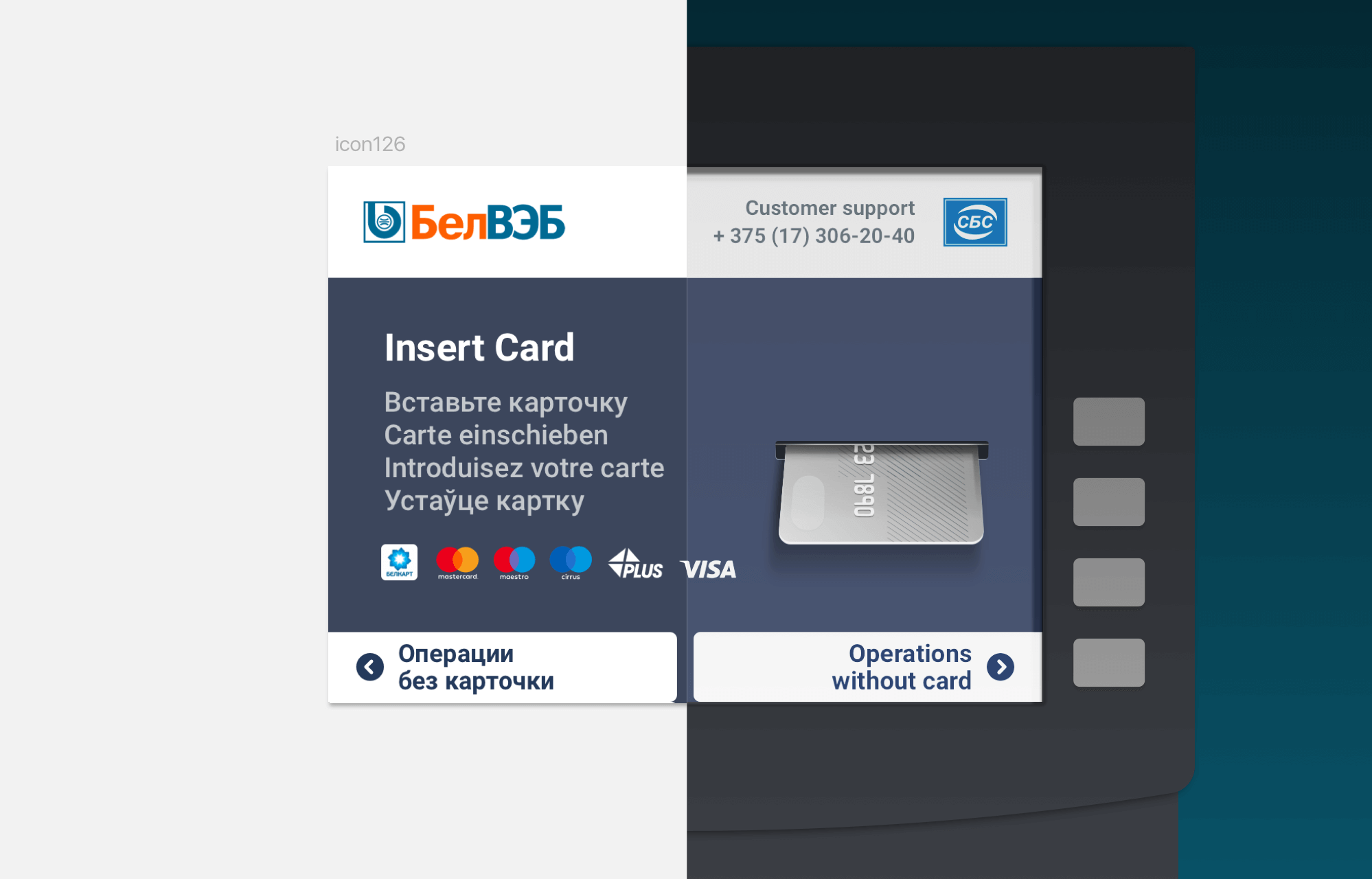
Universal colors
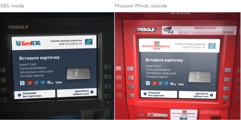
Banking Self-Service System provides services for different banks. We created a neutral and universal color scheme that fits any corporate style of banks.
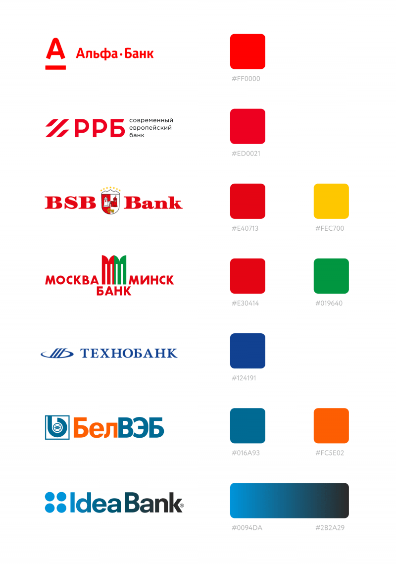
Then we adapted the colors to the GIF format which is used on every ATM.


So we got the universal color scheme that’s visually independent of corporate colors of the banks.


High level of accessibility
Text size and contrast for the navigation elements comply with AAA level of Web Content Accessibility Guidelines (WCAG 2.0).
The main color scheme is consistent with the Technical Code of established practice ТКП 064-2012 (07040) — the official document issued by the National Bank of the Republic of Belarus. It presents all the requirements and restrictions for developing this kind of interfaces.
Adjusting colors for people with color deficiency and vision impairment
According to the Technical Code, all the confirming actions has to be indicated in green color and all the canceling — in red. But there are people who can’t distinguish these colors correctly.
For us, it was essential to create a UI design that is easy and comfortable to interact with for all the users, without any exceptions.
-
![]()
Color vision works due to photoreceptors in the retina of the eye known as cones. People with normal color vision have enough red, green, and blue pigments in the cones.
-
![]()
It's a type of color blindness that causes poor distinguishing of green color. Around 2,7% of people suffer from this problem.
-
![]()
Another common problem of color vision that is a reduced sensitivity to red light. 0,66% of people have it.


Translation
After creating 177 layouts we got a challenge to translate them into 5 different languages. Because of using only static text screens by ATM we got 885 layouts in the end.
However, we managed to optimize the process and going to tell about it more in another article.
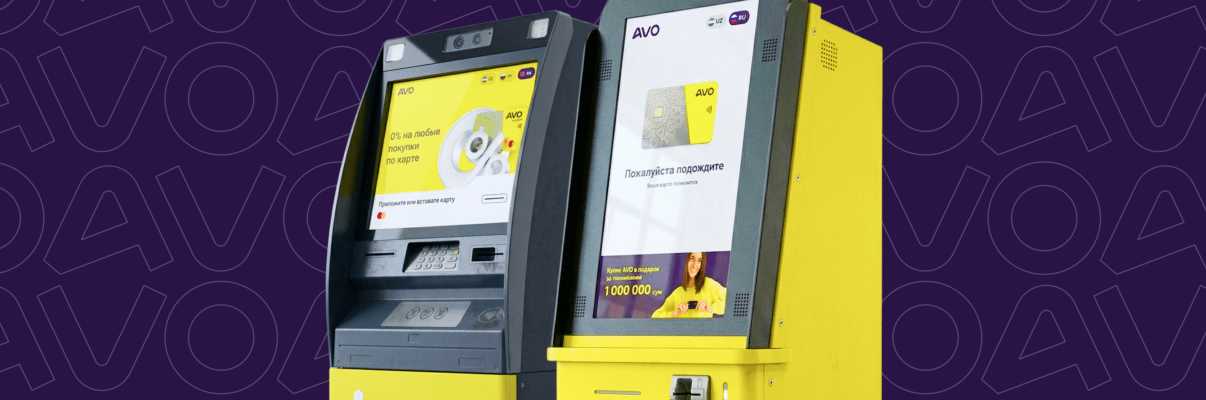
Burst into the Uzbek market

We figured out how to combine dozens of banks on one device perfectly
Your request will immediately go to the sales department. One of the managers will answer you in order to discuss details. It takes up to half an hour during working hours
