Brand Identity for Platforma Barber Space
We've created both image and physical environments for the startup
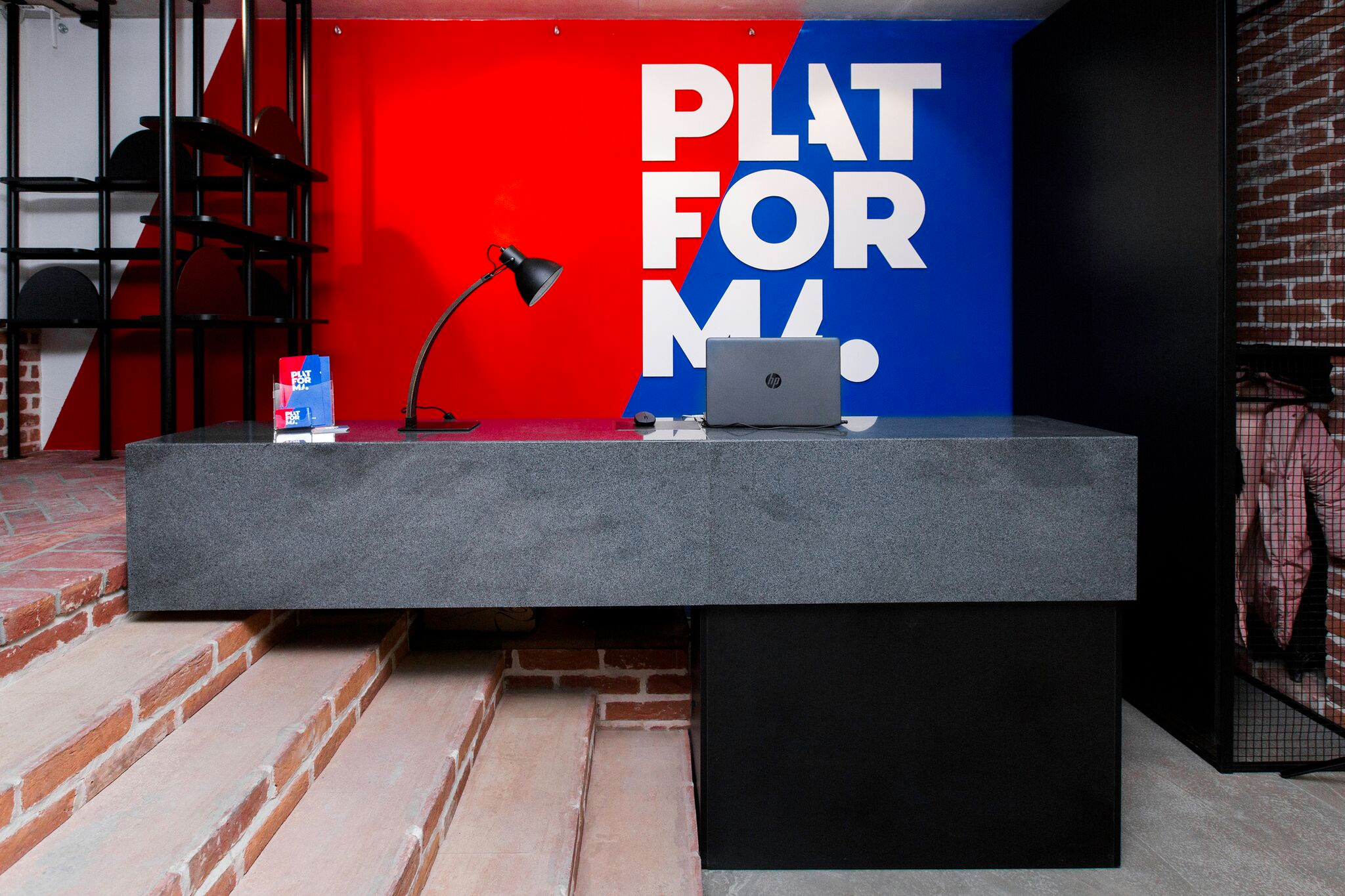
Platforma has a huge loft-style space and an ambitious business model. They are about to launch an app that gets together barbers and clients. So the challenge is to make a brand identity system that stands out in both digital and physical dimensions.
The professional coworking space hosts over 190 barbers. Every day they organize their schedule by themselves, have a lot of fun and master-classes. Every guest can book an appointment at an appropriate time, getting service in no less than a barber hub.

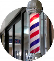
Here it comes a real barber’s pole that looks too cool to walk past. It appears in medieval times as a symbol of barbershops. Since XVI century poles signify and distinguish traditional salons from the ones that offer surgery services (here poles have only red stripes).
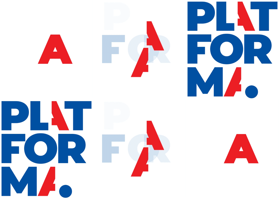
The logo absorbed the long history of barber mastery and flexibility that is required by the times. We keep the well-known color scheme and line slope.
Snip-snip… and here we got a graphic element that makes the brand unique and will do a good job while designing interiors and marketing materials.


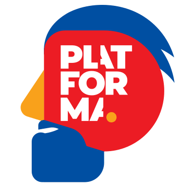
In every project there is something extra that never appeared in brief or original challenge. Things just turn out that way. This time we came up with a graphical “P-man”. This guy proves that you are welcome here, no matter what kind of beard you have. If you have one, of course.

Your request will immediately go to the sales department. One of the managers will answer you in order to discuss details. It takes up to half an hour during working hours


