G–L–O–B–U–S Brand Identity
How to plan a route from a service to a brand
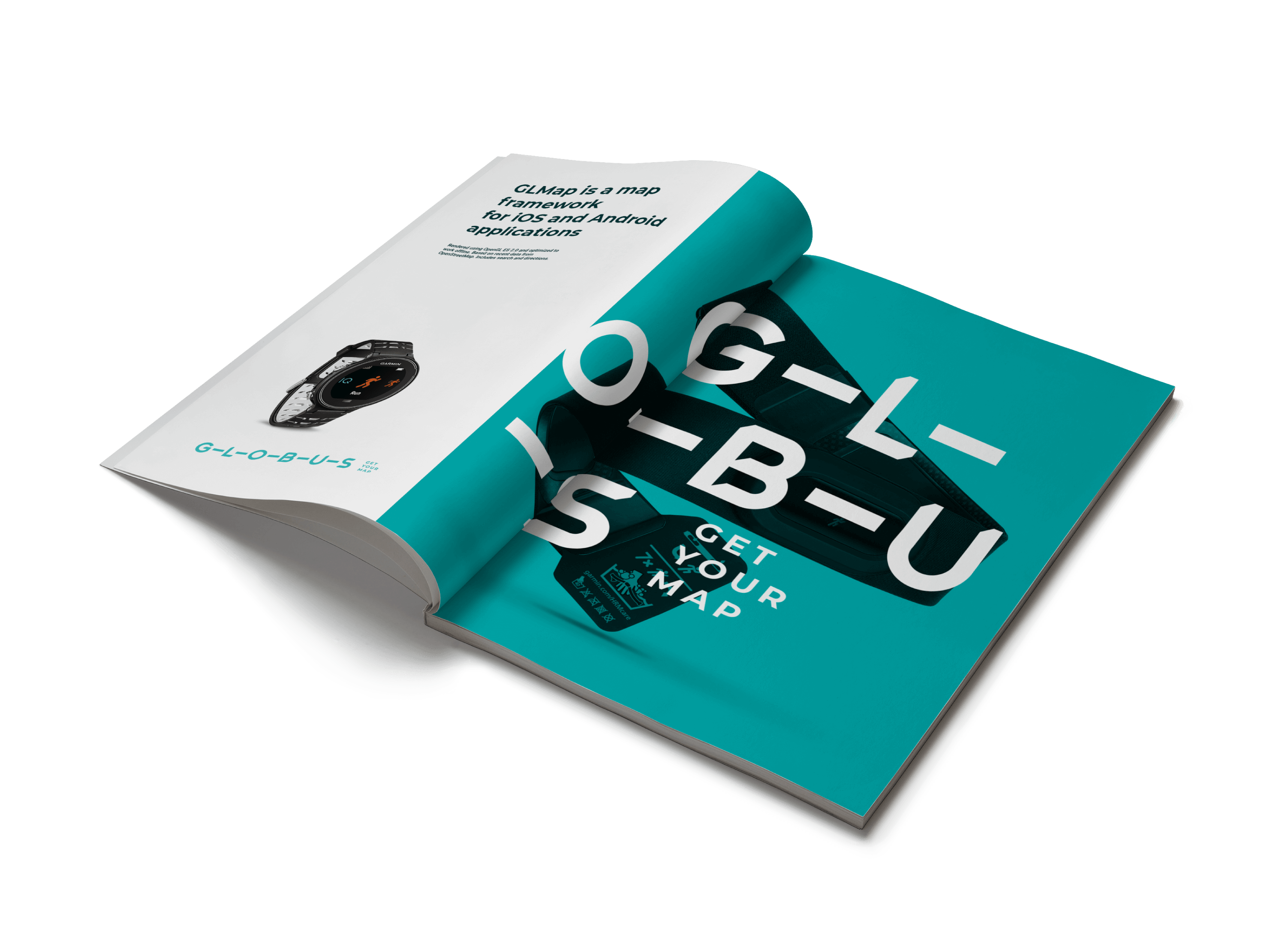
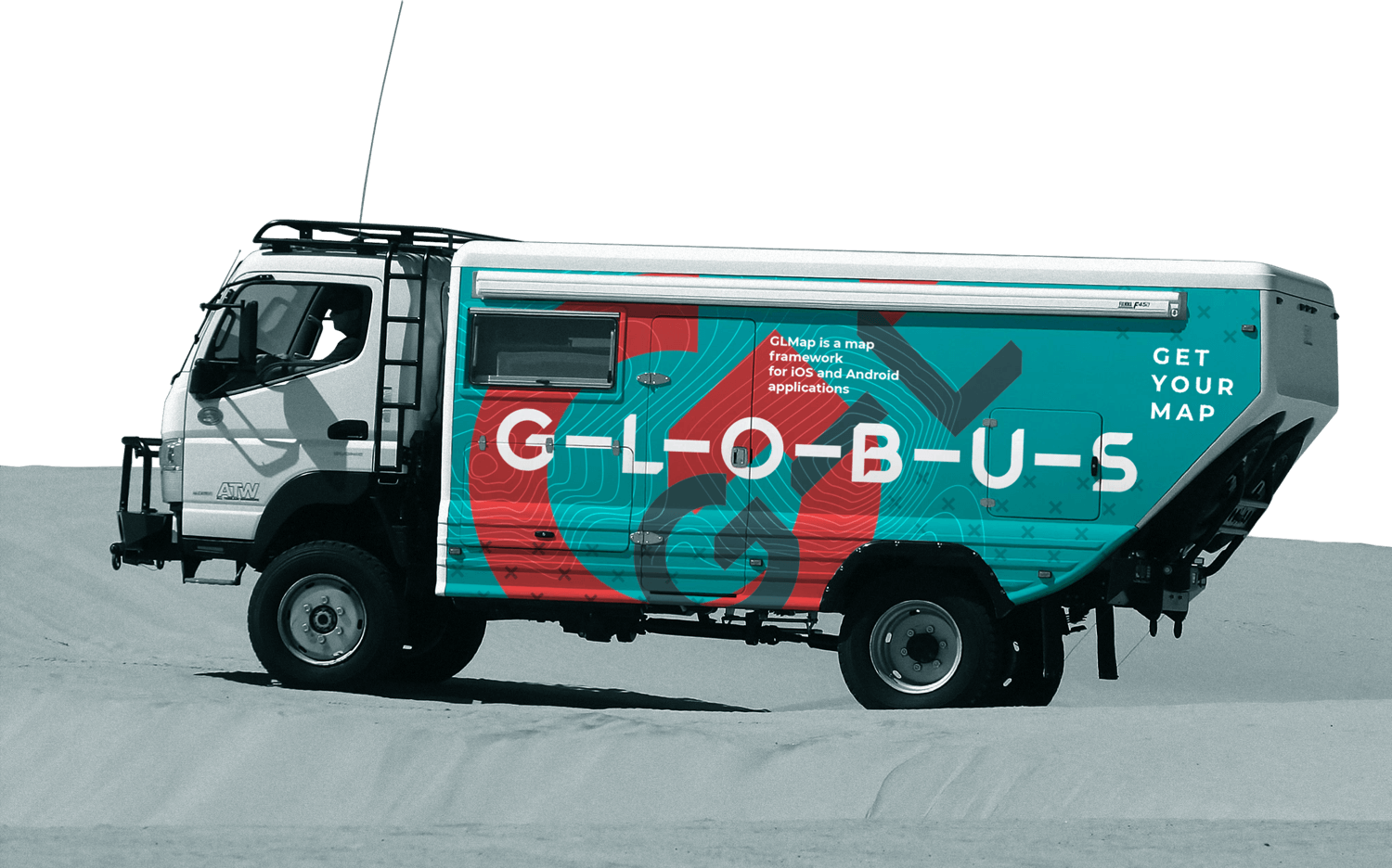
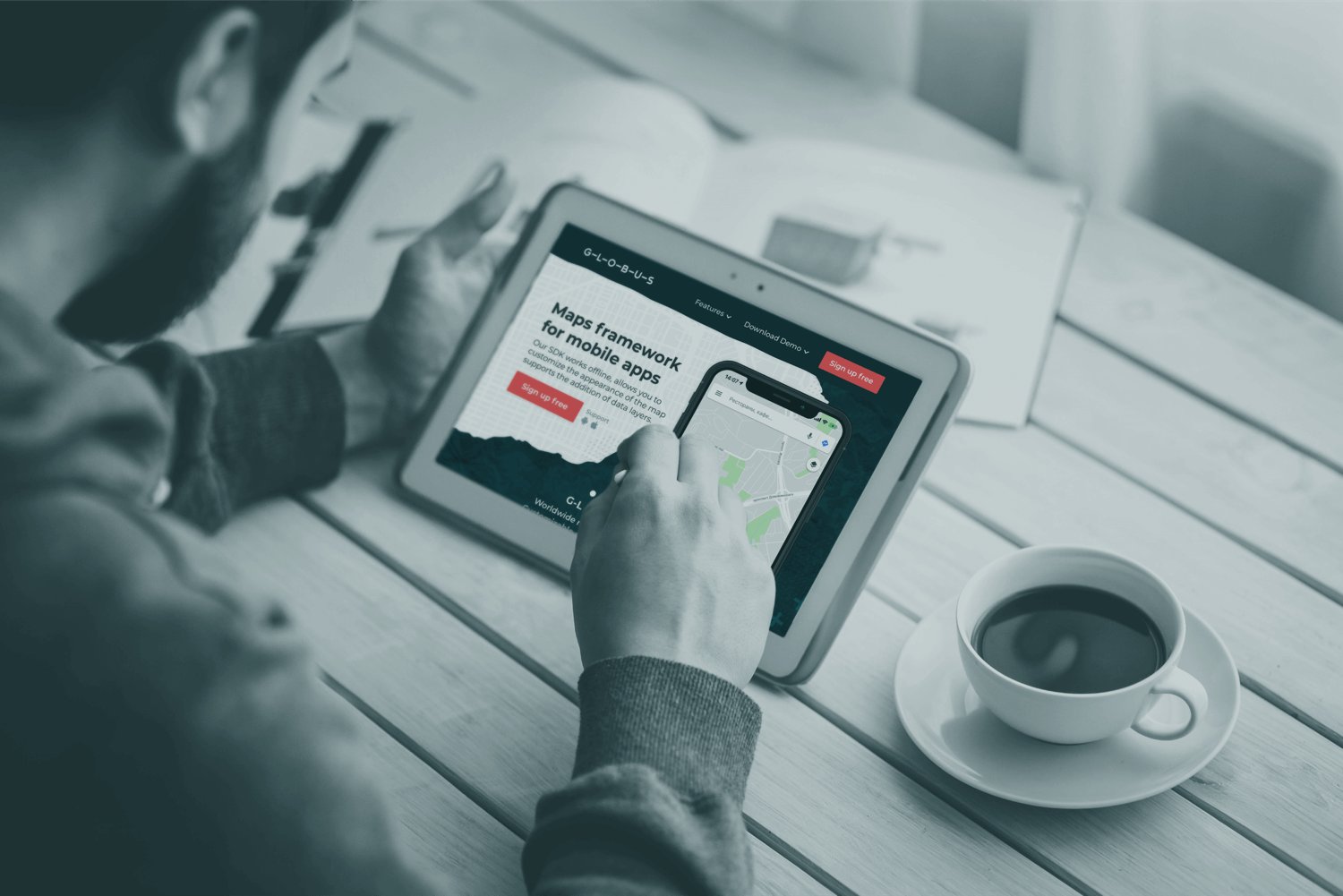
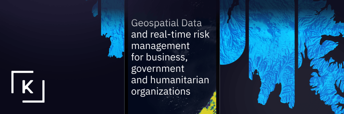
This time the challenge is to design a brand identity for the young B2B framework. G–L–O–B–U–S is helping business around the world to use customized offline maps that are fast, detailed and tailored to individual assignments.
This service can just show the route or to navigate your truck through Paris – Dakar rally with providing time and distances between intermediate points.
The huge amount of products with the same name makes the branding really challenging, but we are not allowed to change the naming.
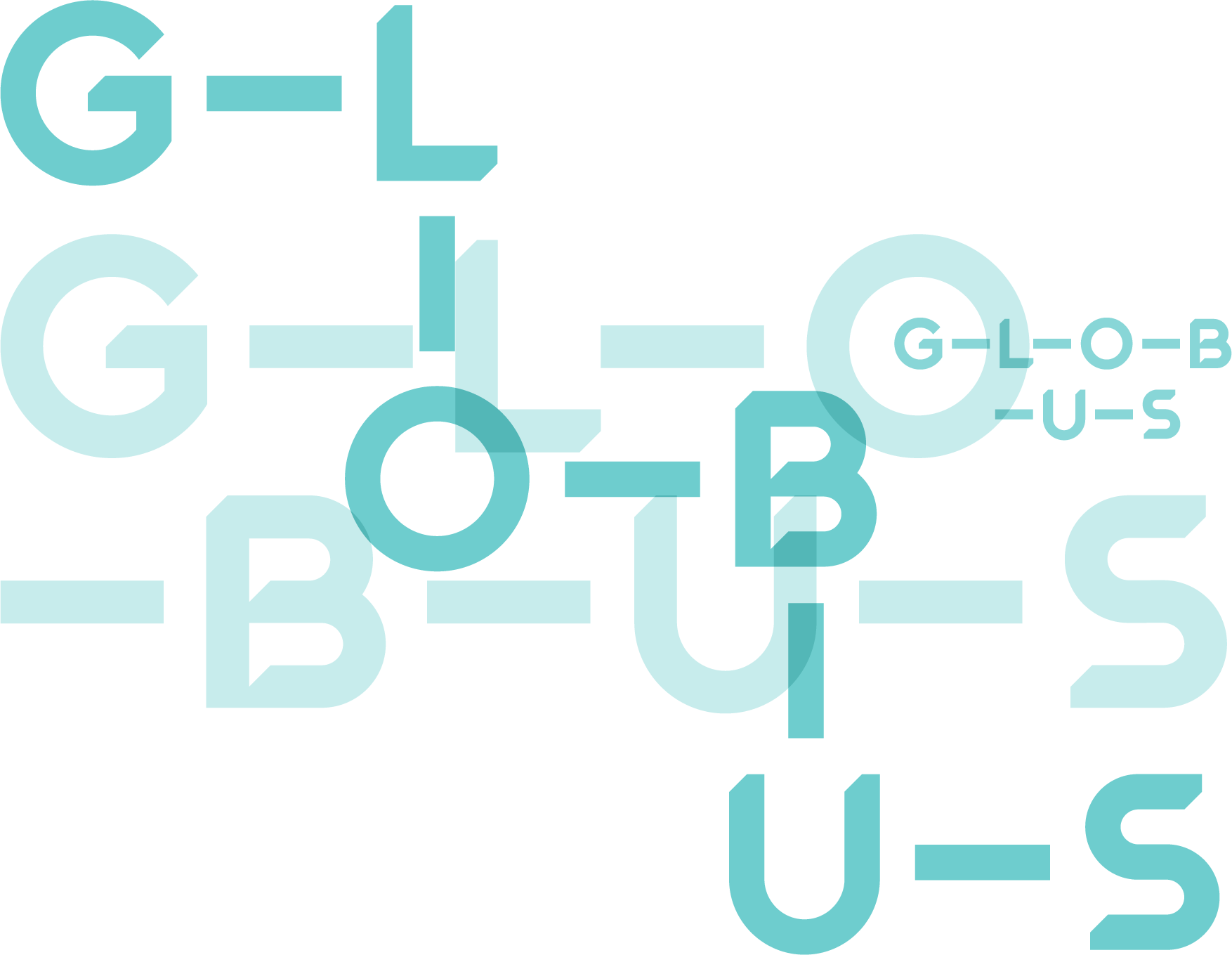
Let’s plan an alternative route to stand out — a visual one. The letters are turning into pins on a map because you can travel not only from point A to point B.

The name G–L–O–B–U–S starts communicating not just graphically but through any text. For instance, in a subject of an email or any marketing material.
But especially comfortable the name feels in its natural digital dimension. The sign keeps its recognition, but the structure may be flexible and adaptive, like the product itself. And varied, like routes on a map.
In addition to the main logo version, it’s possible to use alternative graphic constructions.
Corporate Colors and Graphics
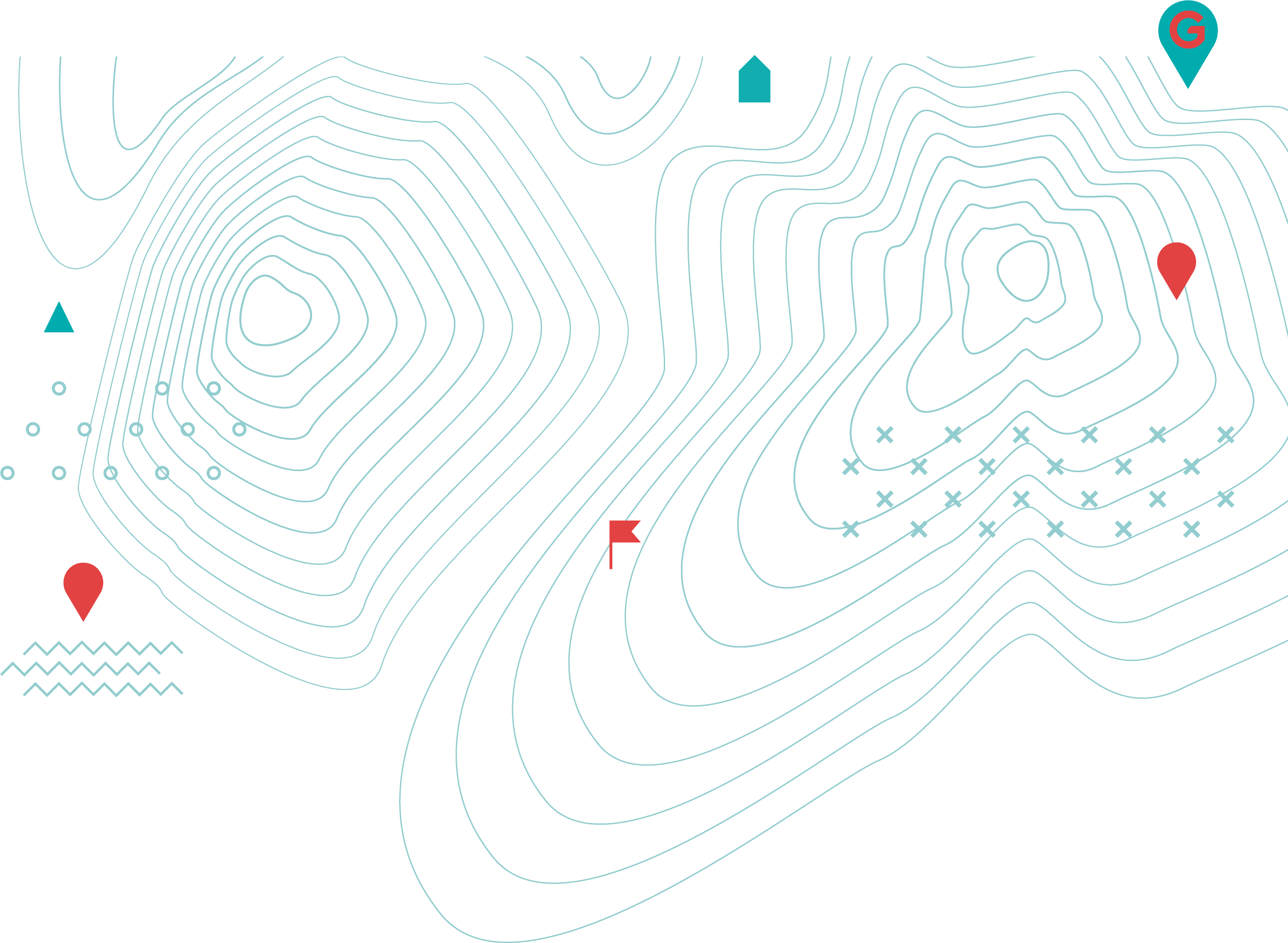
We used cartographic elements like topographical and geological signs to fit them into the corporate style.

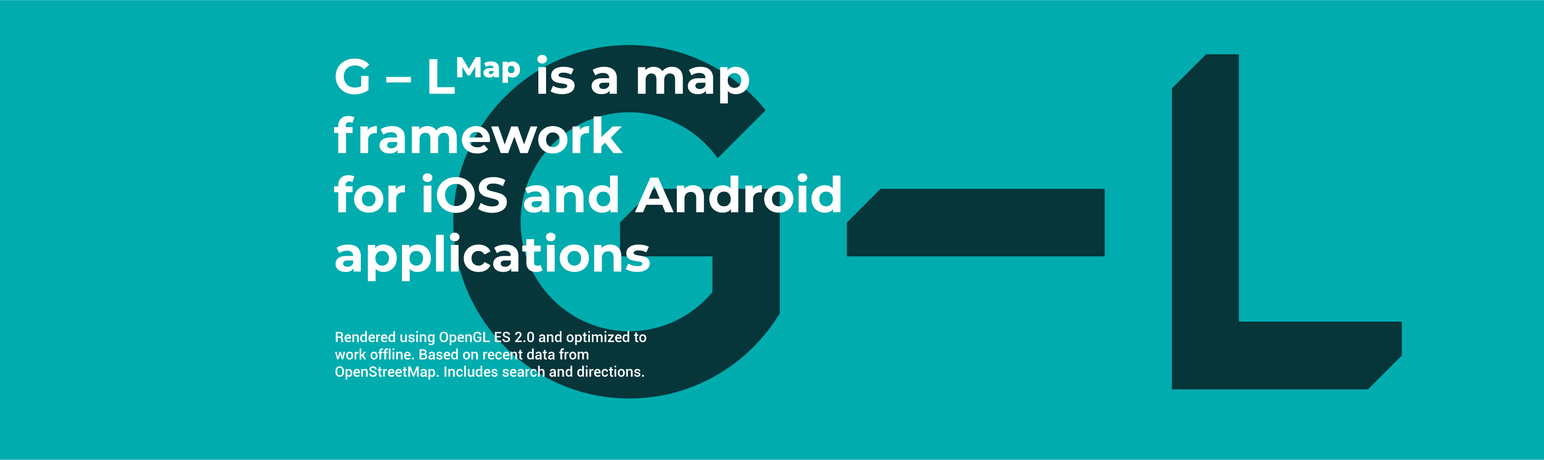
This style of letters composition is easy to implement for framework components. To do so we just use the first two letters: G-L Map, G-L Search, G-L Route.
Have put the brand on the map of startups that save the world
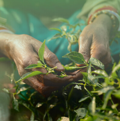
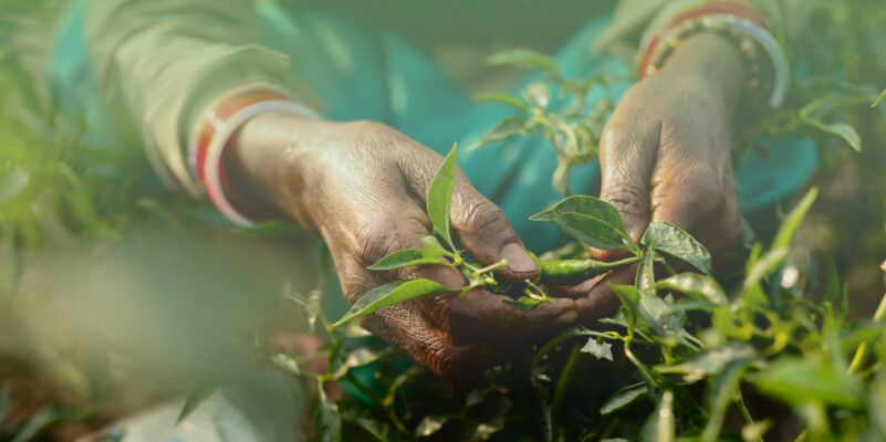

We have developed a regional site with useful information for farmers and finalized corporative guidelines
Your request will immediately go to the sales department. One of the managers will answer you in order to discuss details. It takes up to half an hour during working hours
