Total Rebranding for HealthGoesUp
How a brand takes off to the stratosphere with a minimal branding set
HealthGoesUp is a medical article directory with up-to-date info and recent researches. It includes all health aspects and written in clear professional language that is both competent and easy to understand for any reader. But the level of trust among new users was not that high.
So the challenge is… rebranding?Are you sure you’ve got a brand?


Any strong brand is a solid system. It will never grow up on a basement made of common phrases and values like “healthy”.


We get together right values, sharpen them, and translate into a graphic language
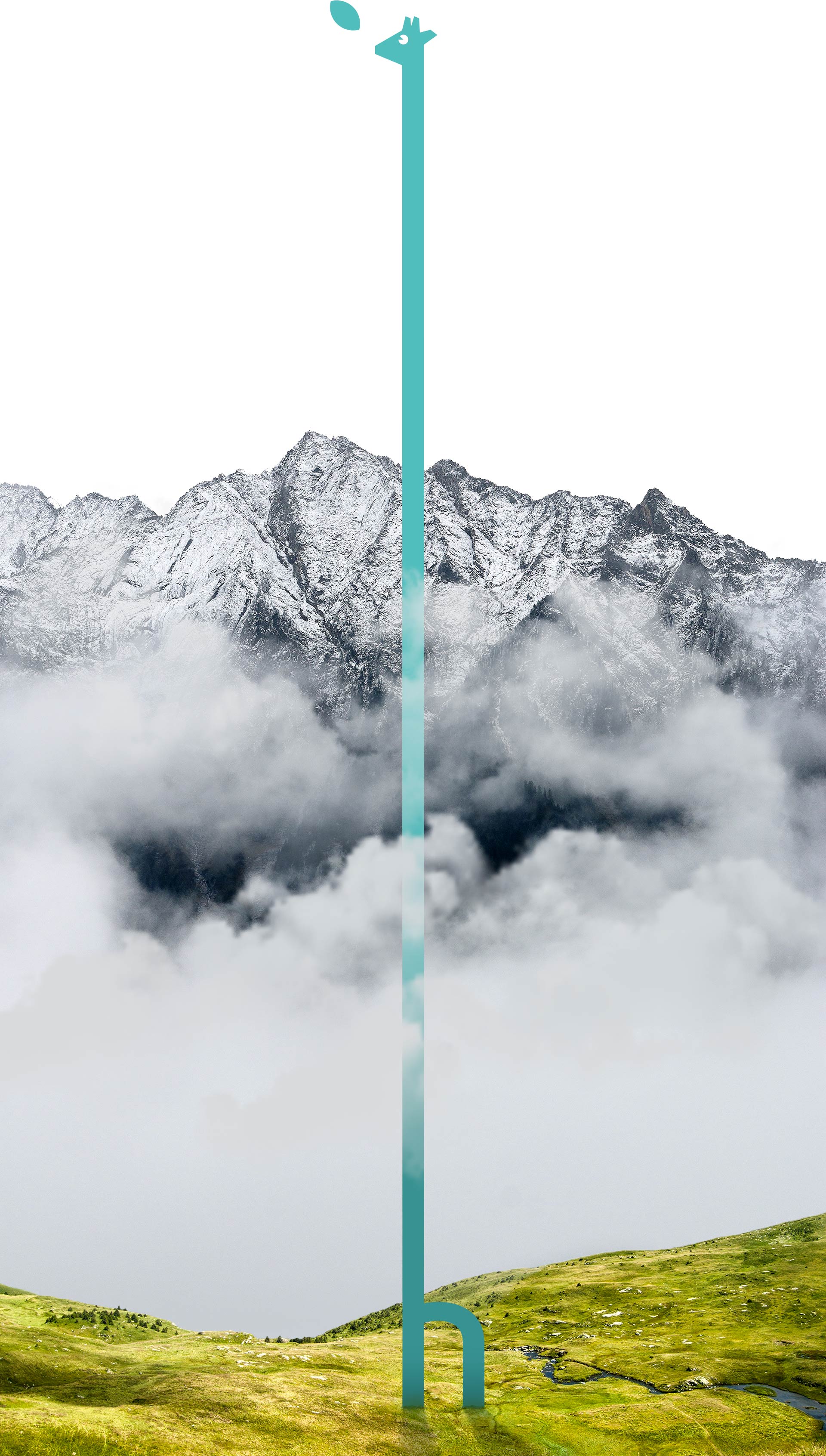
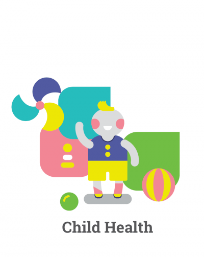
Curiosity and positive way of thinking — the first steps towards a better level of life.
From living on autopilot to the responsive understanding of your body needs.
Up, up, up it goes... Now we really want to learn more about ourselves.
Why a giraffe? Because he’s cool.
It looks like now we have a new graphic effect here...
We get together right values, sharpen them, and translate into a graphic language
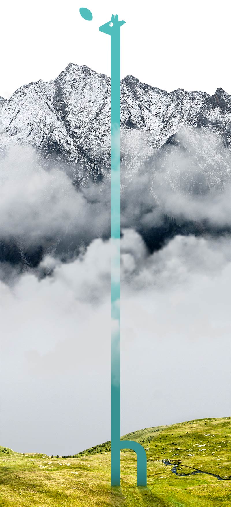
Curiosity and positive way of thinking — the first steps towards a better level of life.
From living on autopilot to the responsive understanding of your body needs.
Up, up, up it goes… Now we really want to learn more about ourselves.
Why a giraffe? Because he’s cool.
It looks like now we have a new graphic effect here…
... Look! You can brand everything around with it. And so simple!
Every logo has to be stable, and every giraffe — charismatic
Every logo has to be stable, and every giraffe — charismatic

Contrast colors will never make any medical references, but will cheer you up.


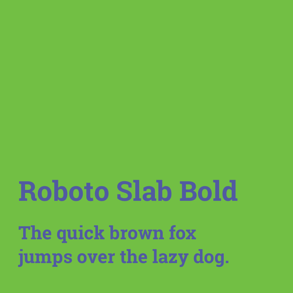
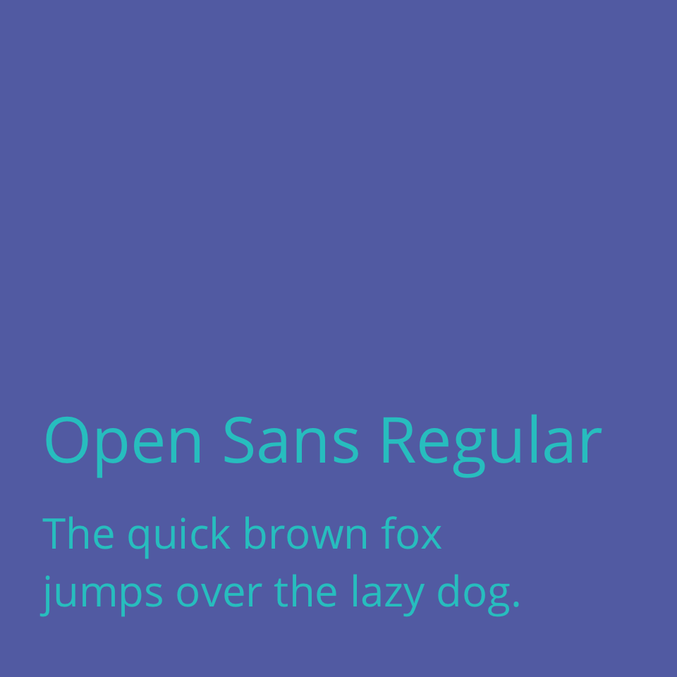
Healthgoesup.com is quite popular, so we have picked up expressive fonts with open licence.
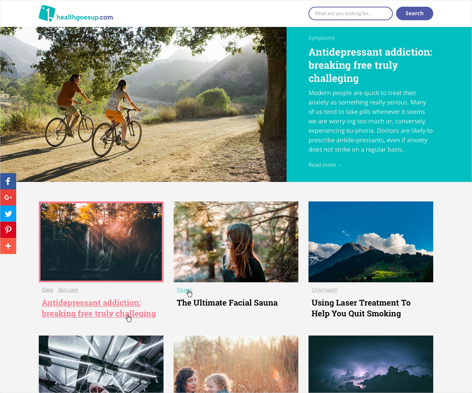
Now the Website

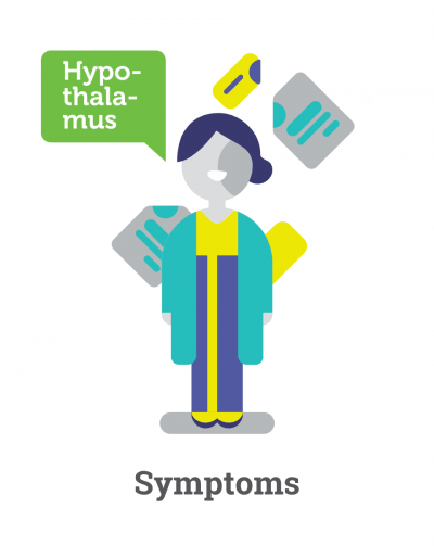
The new plasticity of forms is appeared together with some ideas for illustrations.

We keep the structure simple and put the new style on it. To make the look stronger we set the rules of image processing. Now it’s done.

Changes always follow a thoughtful rebranding. There are no heavy costs or difficulties here, but completed business challenges and a clear statement.
It's time to change something in your project?
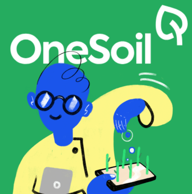
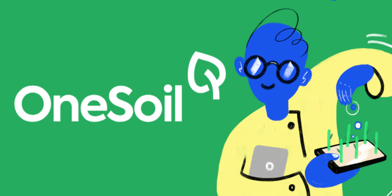
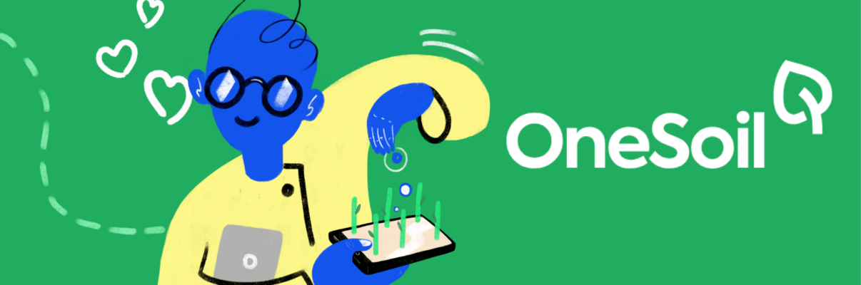
The guys have figured out how to revolutionize agriculture, and we’re here to help them tell the world about it

Have put the brand on the map of startups that save the world
Your request will immediately go to the sales department. One of the managers will answer you in order to discuss details. It takes up to half an hour during working hours
