Ridership Analytics User Interface
How to make tons of data turning into beautiful charts
Sometimes you come across projects that need to take into account requirements of not just a company but the entire industry. That’s how the public transport ridership analytics system was created. It shows lines workload, seasonality, and tickets sales pattern.
Close all your Excel files, sit back, and watch how you can draw with data and numbers.
The Challenge
Starting from scratch
If we put aside all the undue stuff, which is really essential for analysts:
- to count people (traffic/ridership analysis);
- to count money (sales analysis).
Organizing this data properly allows you to explain changes, see correlations, and find the right reasons of your targets variance. The visual analytics enables to control the transport load and capacity, tariffs, and sales points. Schedule corrections, ads campaigns planning, financial control — there are too much important functions to make a so-so product.
Shaping the structure of a report
So far there are no given requirements, we start off from creating a report structure with the client from the ground up. The result — three versions that differ in flexibility:
- Free and customized reports.
- Fixed variant with a set of specific parameters.
- Flexible structure for building personal reports with Google Analytics-like degree of freedom.
Creating UI
To transform a data set into clear and easy-to-read information we set up several working areas.
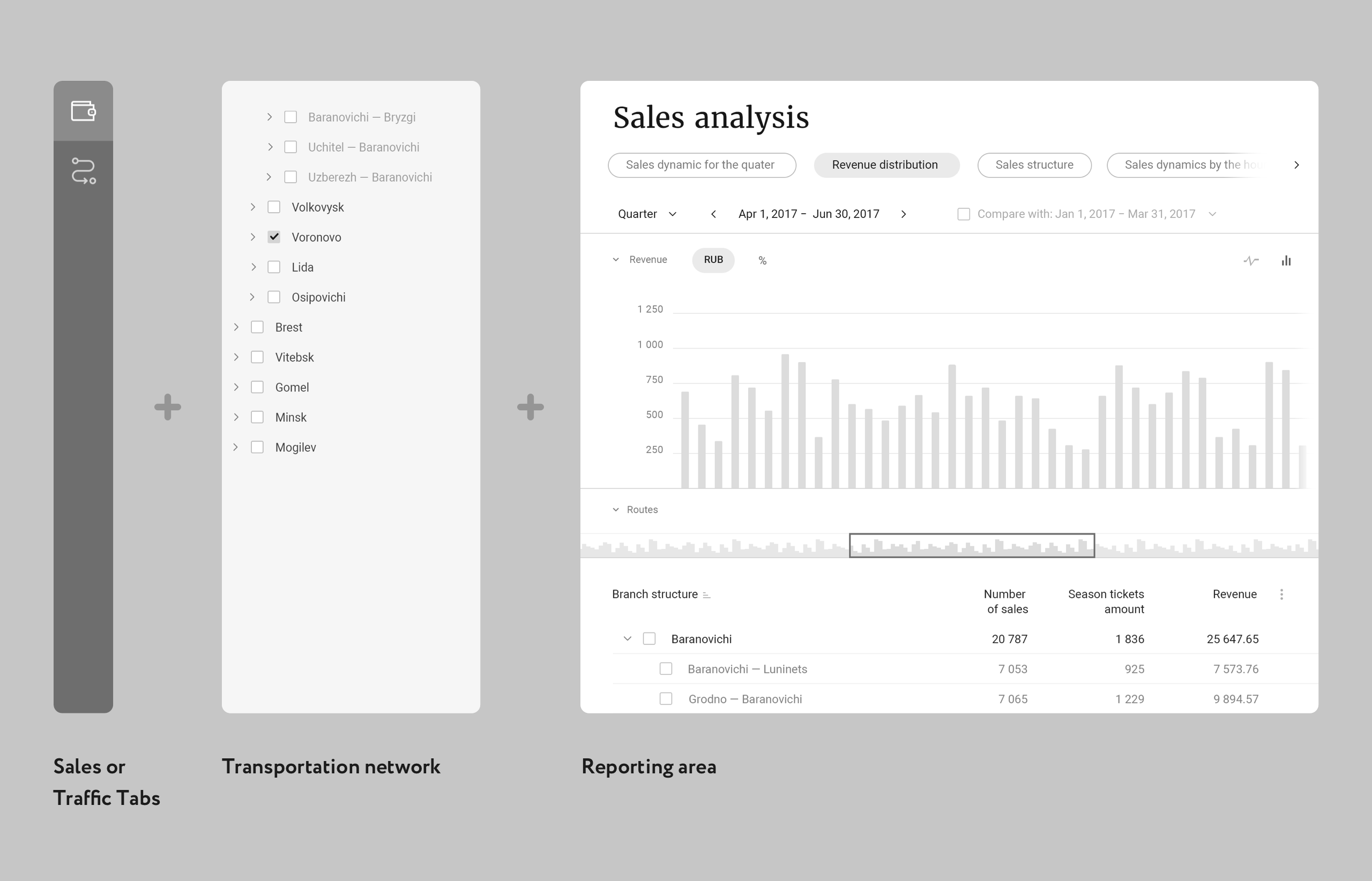
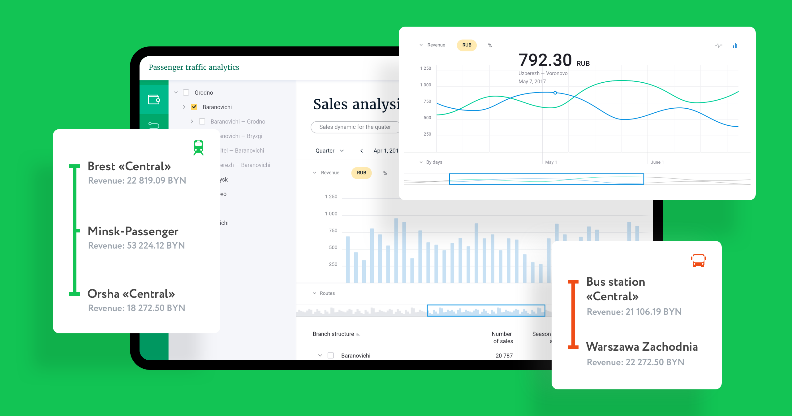
First, the user needs to decide what to analyze: money or traffic. Second, the routes directory shows up. You can pick data of particular localities, routes or entire districts.
Based on selected parameters the main reporting area is taking shape: with charts, tables, and filters.
Numbers come to life
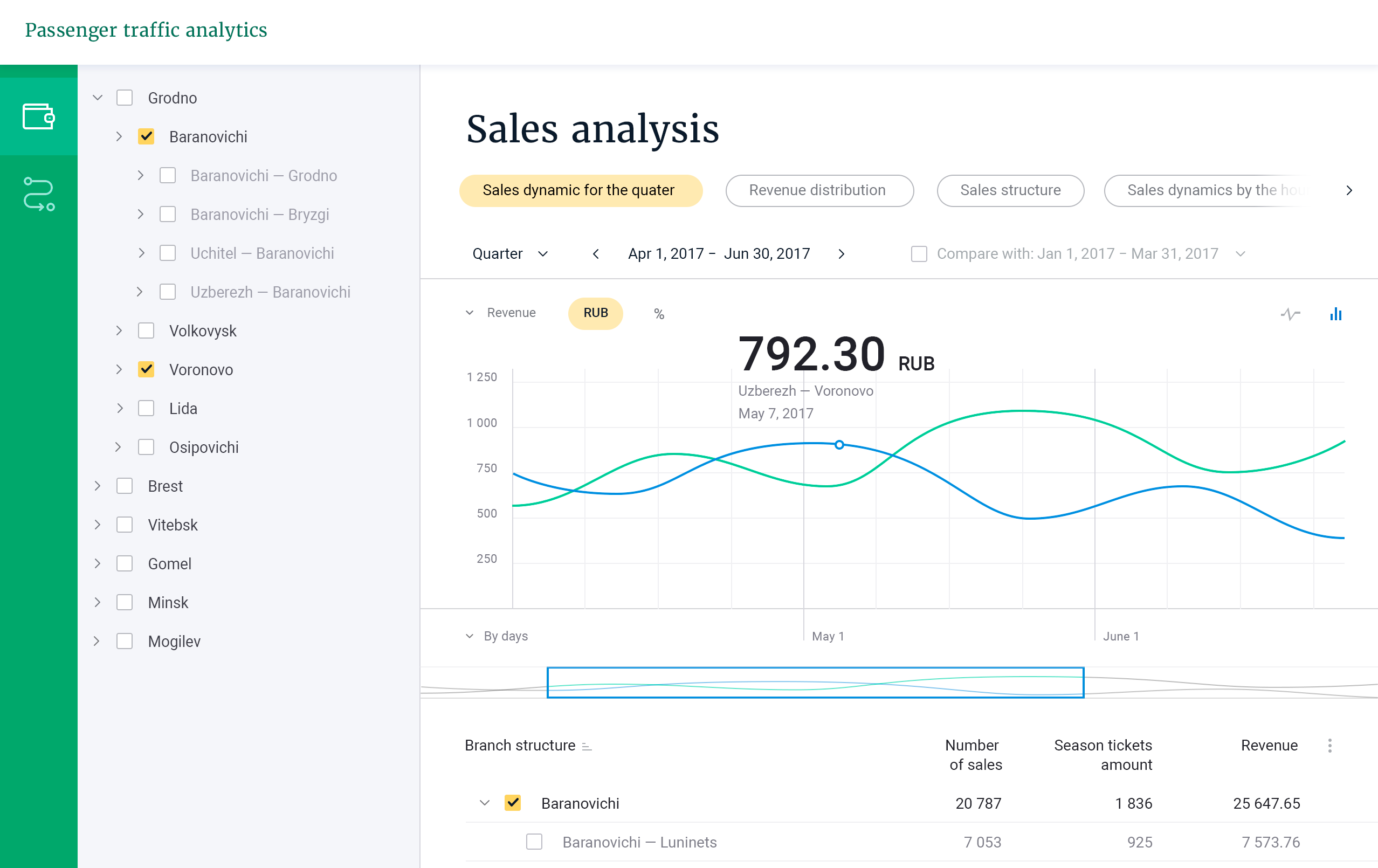
Let’s have a look, what sales analysis can tell us.
- Select a type of data: dynamics, distribution, or sales pattern.
- Specify the time.
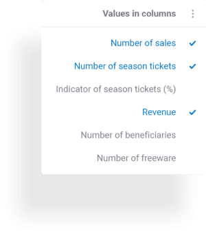
- Get a detailed report, where you can adjust a chart type or switch between absolute and relative terms.
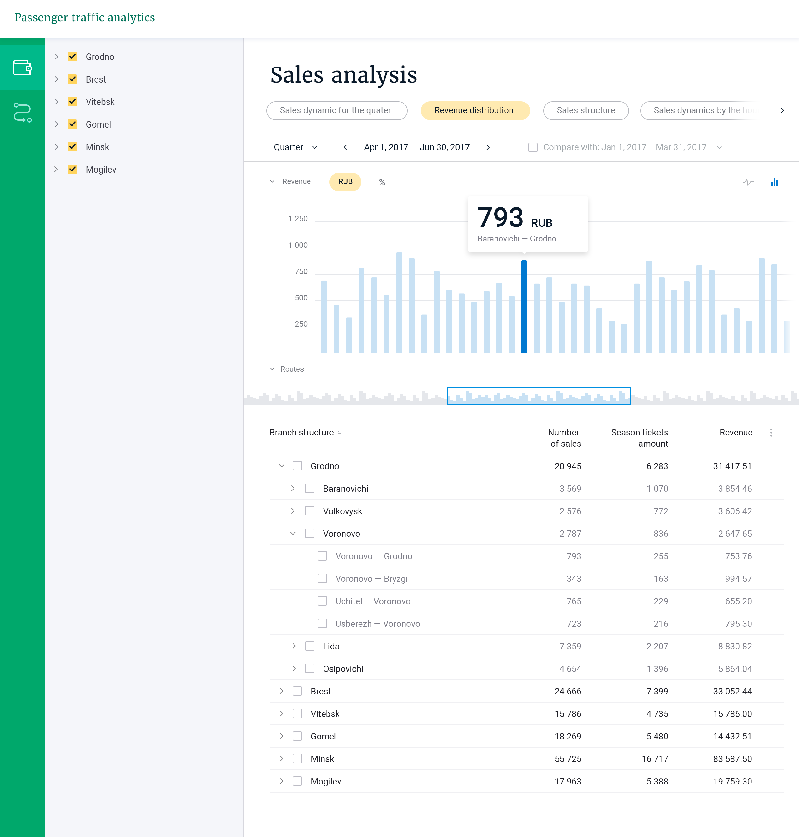
Then take a look at the selected stops. Here you’ll find the total amount of sales, the number of passes, reduced fares, proceeds. It’s easy to pick only the data you currently need.
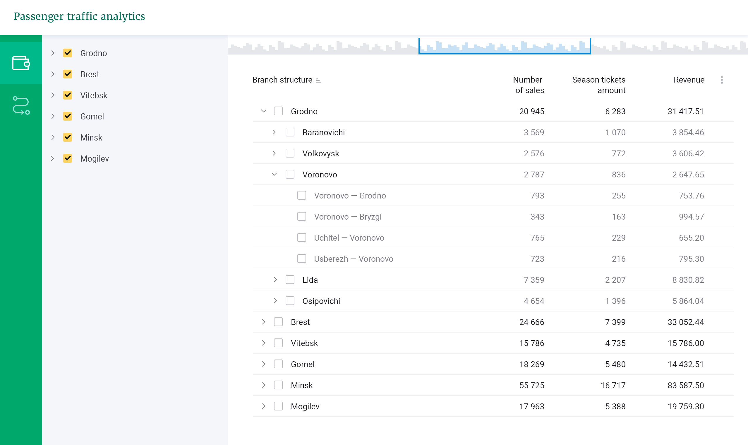
There are easy-to-customize report templates for quick access. The universal base of the system enables getting data really fast keeps you from comparing any incomparable rates.
It’s time to play with charts and put together report templates for various situations.
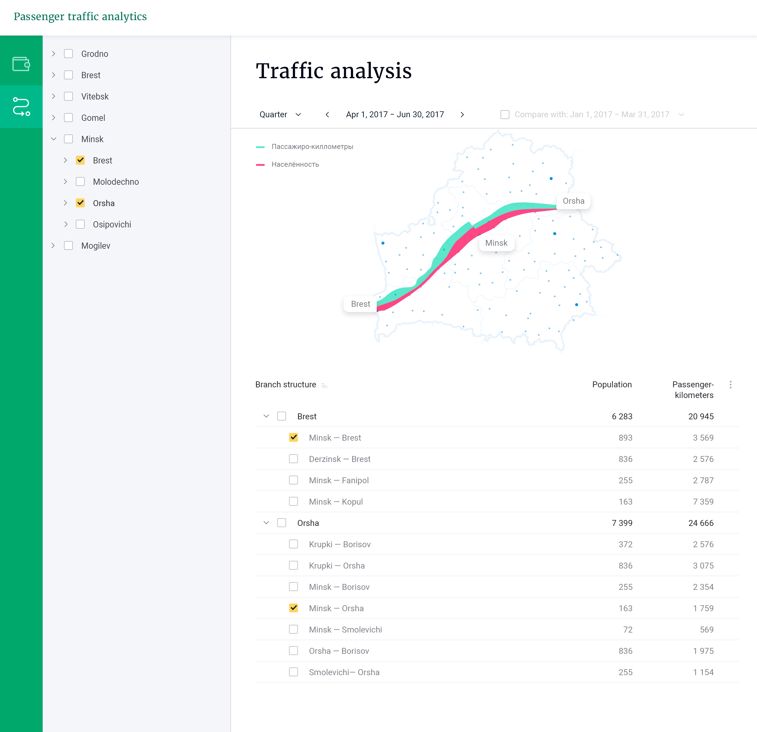
More than we all expected
Somehow there is something in every project, that we do without keeping it originally in plans. For this analytics system, the bonus is the ratio of population to passenger-km graphic concept.
This chart provides some food for thought regarding price policy, load balancing, marketing activities. For sure analysts will see here something else, but we just consider it as a beautiful thing.


We’ve taken a deep dive into a sophisticated industry to build a concept web-based user interface


Made trading accessible to beginners and differentiated the brand from the competition
Your request will immediately go to the sales department. One of the managers will answer you in order to discuss details. It takes up to half an hour during working hours
