A car dealership specialising in the sale of electric cars from Chinese brands.
The company offers a wide range of models and a comprehensive package of services: from car selection to after-sales service.
Task
To develop a competitive identity for a new car dealership in the fast-growing Chinese electric car market — from the name to a visual system that can differentiate the dealership from its competitors.
An identity charged with movement
Creating Seven’s visual identity was a journey into the world of energy and technology. We wanted to develop not just a logo and corporate colours, but a holistic visual system that conveys the brand philosophy and is associated with innovation, progress and the future.
The concept is based on energy as a symbol of progress. This idea underpinned all the visual solutions, from the dynamic logo to the rich, contrasting colour palette. Energy in Seven is not just fuel for electric cars, it is the pulse of the brand, its character, its strength. It defines the tone of communication, the visual language and the company’s positioning in the market.
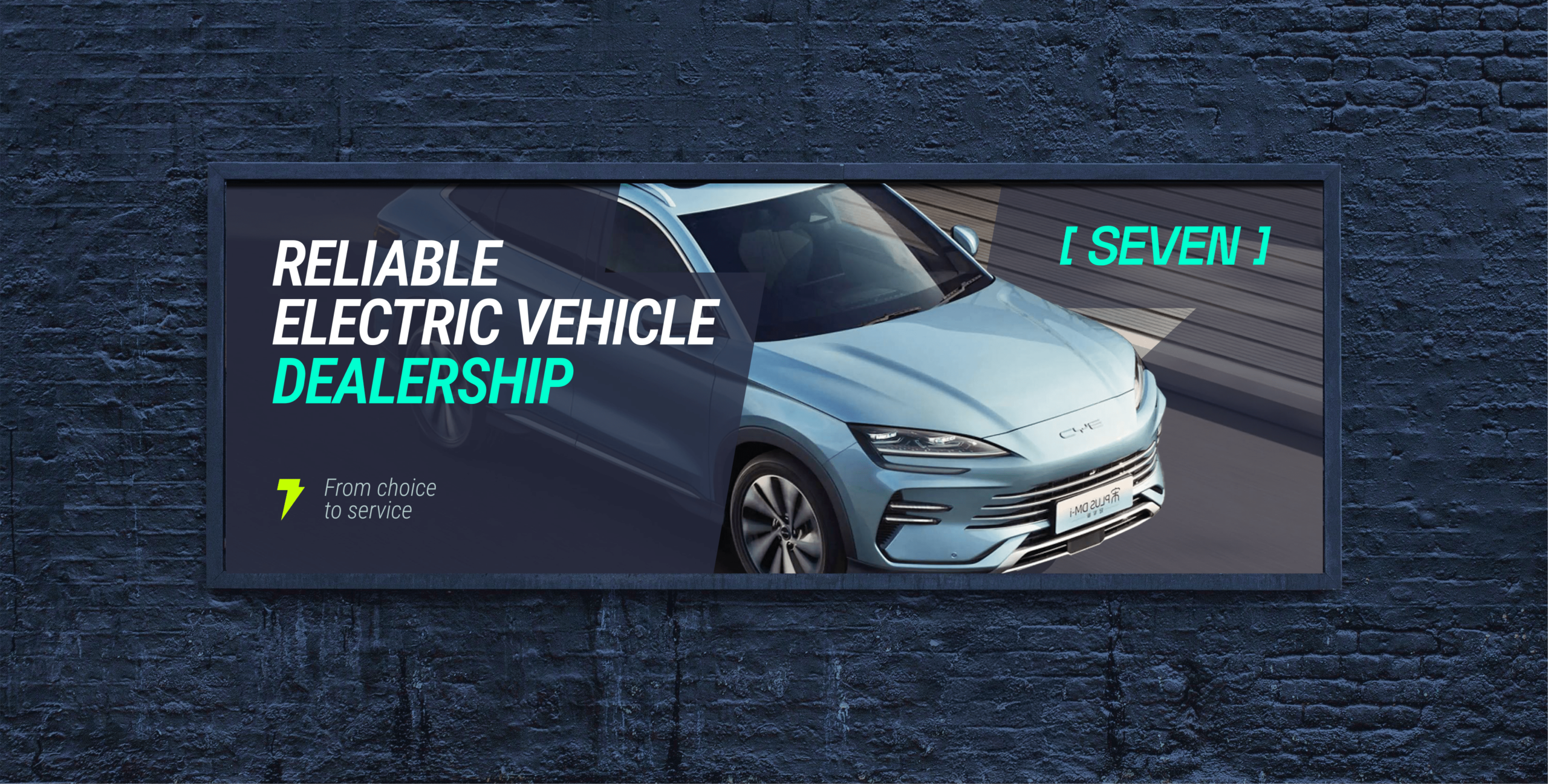
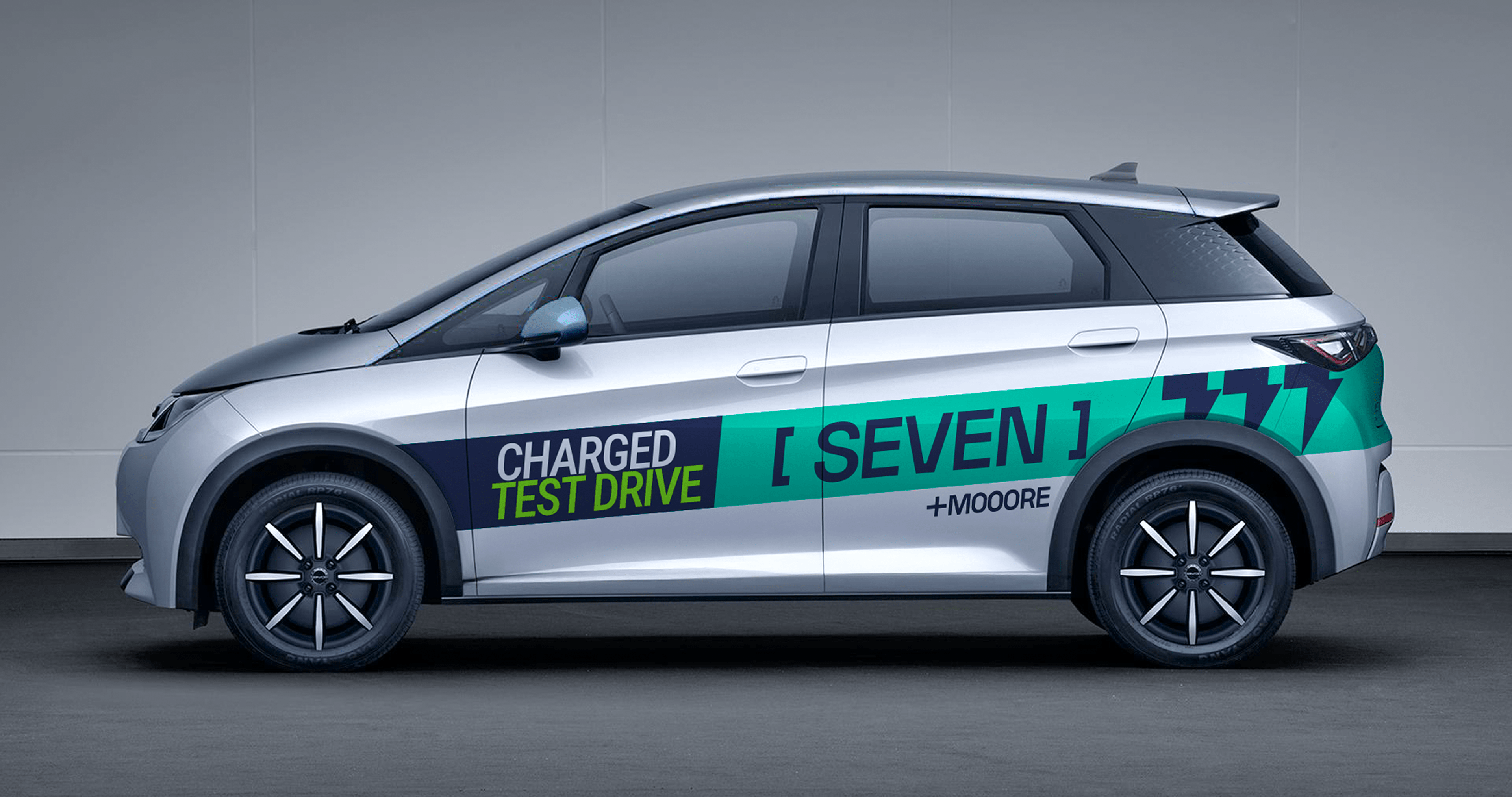
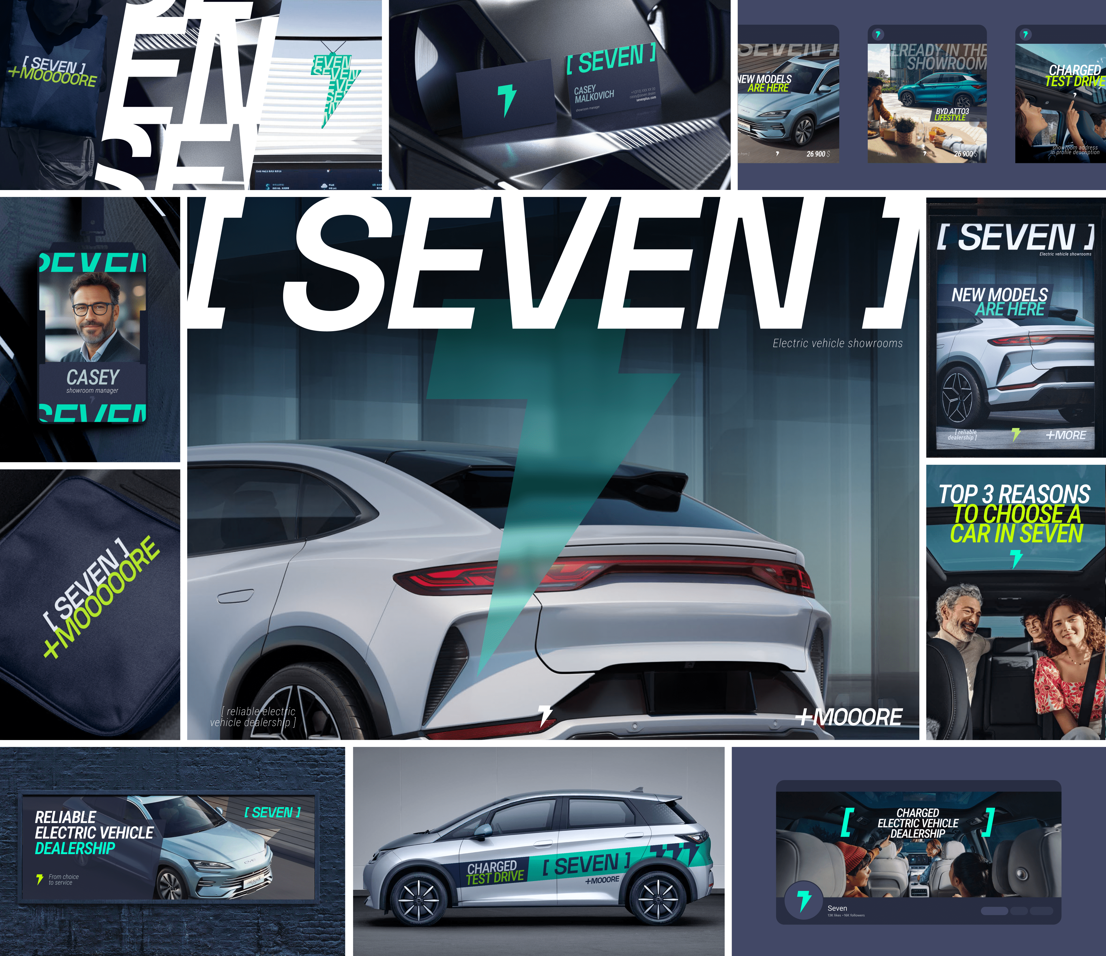
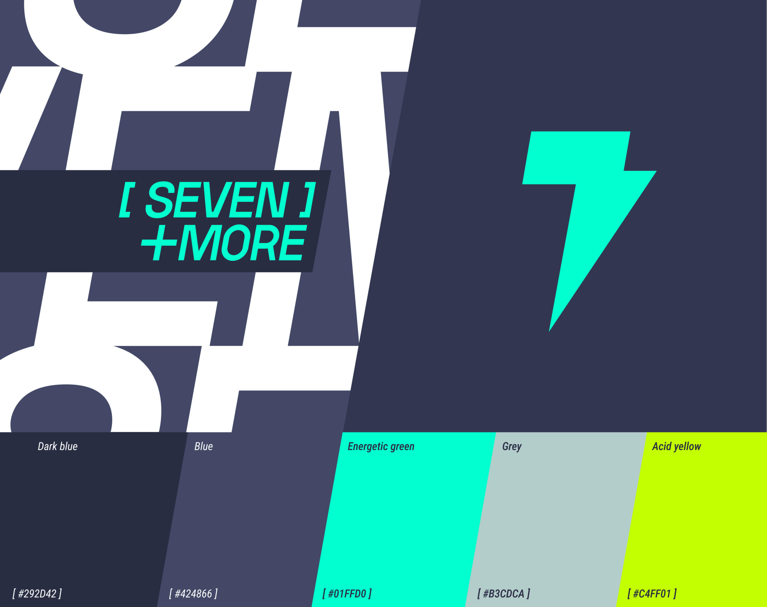
The Seven logo is a typographic composition based on the seven segments of the battery icon, enclosed in a strict rectangular shape. This solution reinforces the associative series, which refers to charging, power and technology.
Lightning at the heart of visual identity
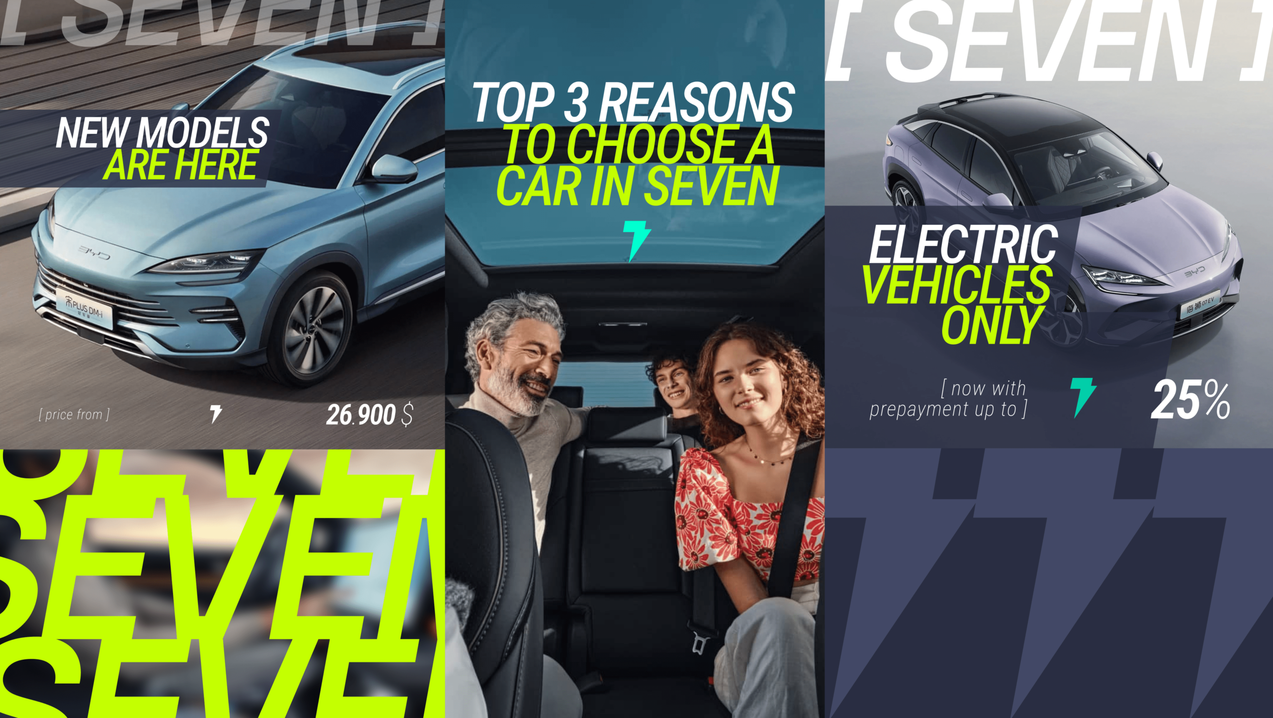
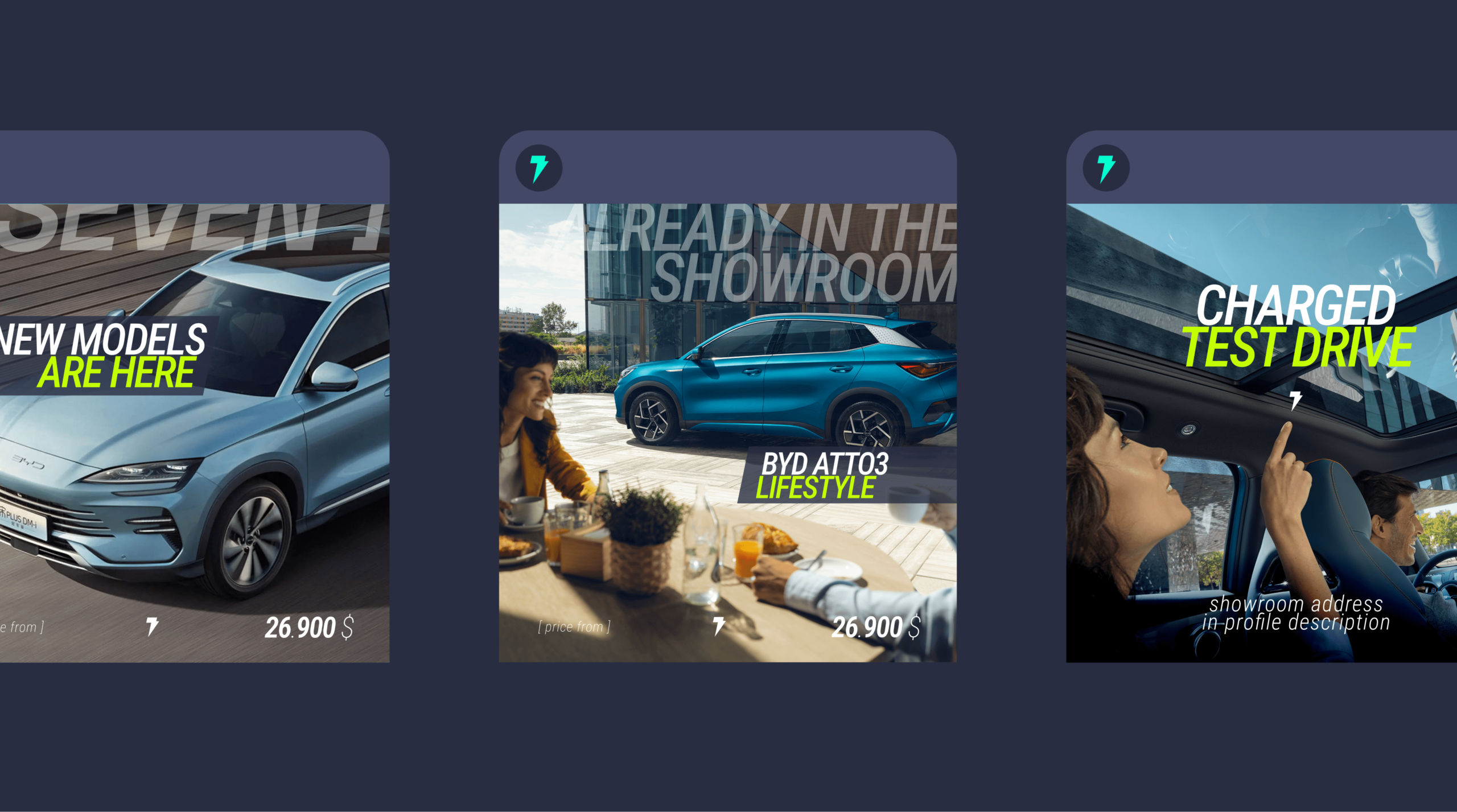
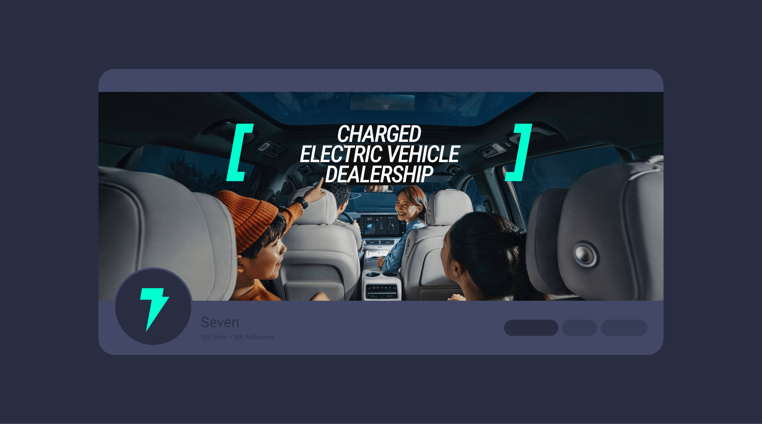
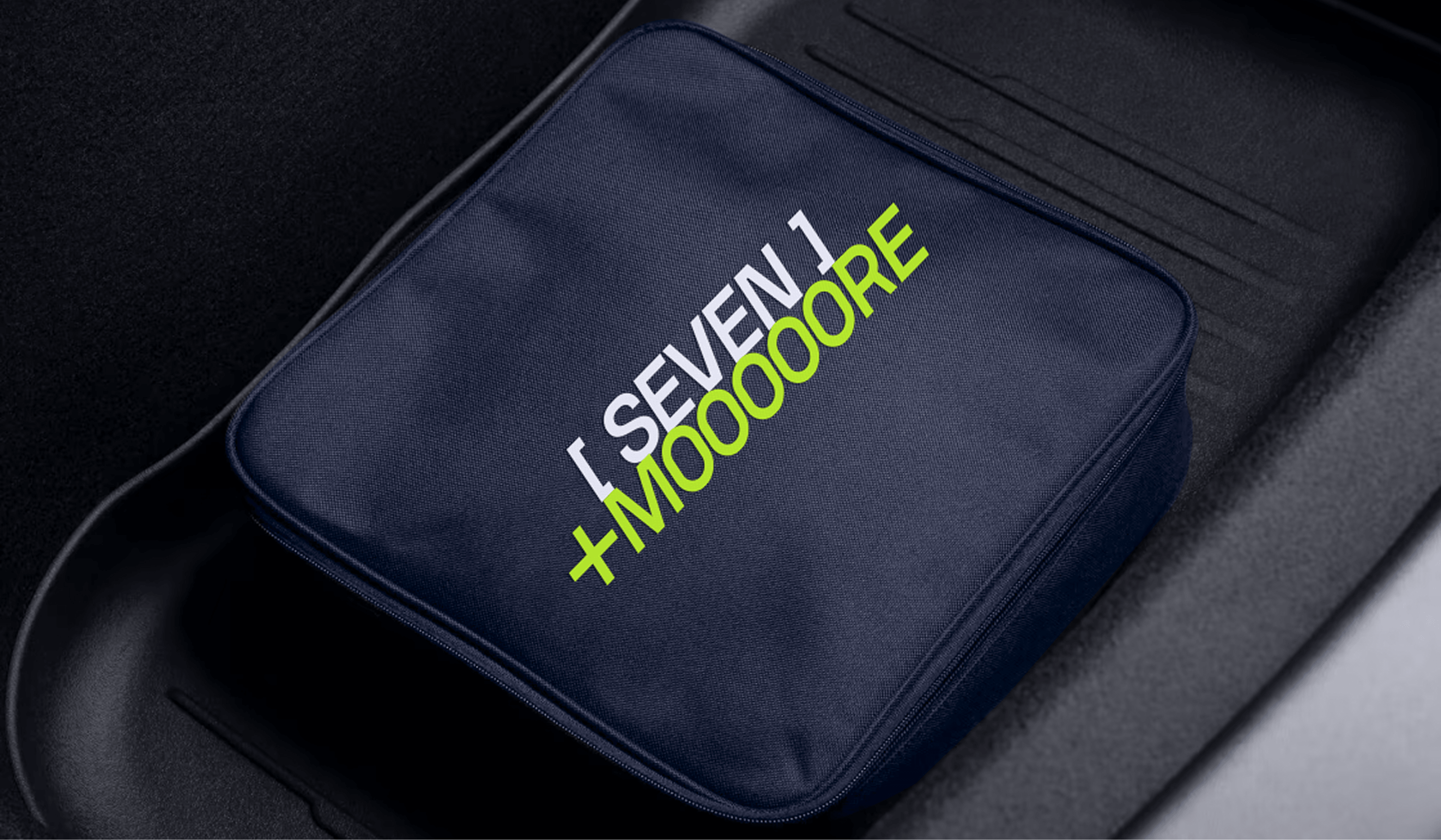
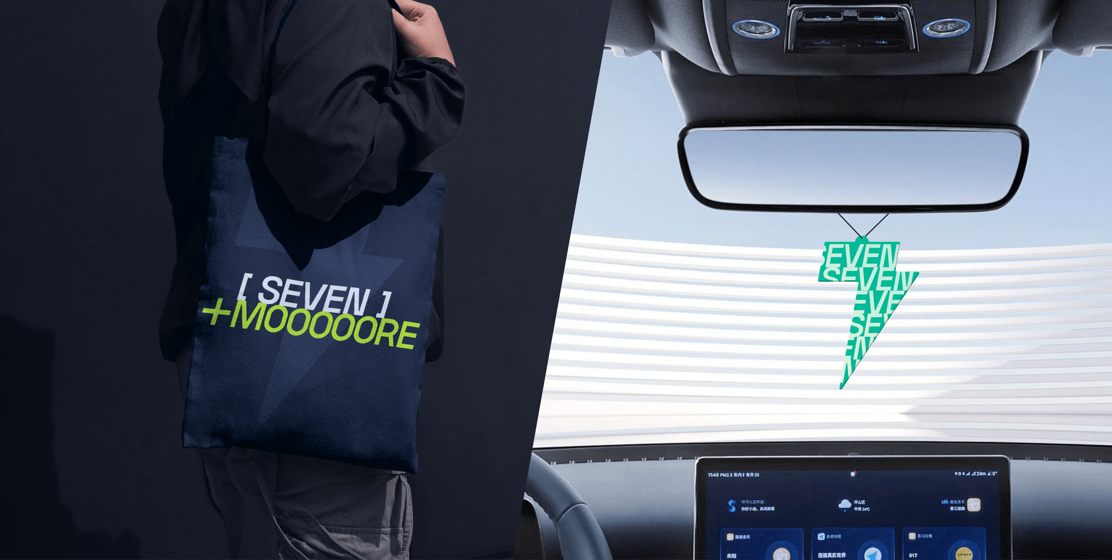
The key element of Seven’s visual system is the lightning bolt, a universal symbol of energy, speed and electricity. It immediately evokes associations with the world of electric cars and reflects the dynamic, progressive nature of the brand.
The lightning in Seven is not just a decorative element. It is the visual core of the identity, which sets the mood for the entire design and can be easily adapted in different formats: from communication to interior design and merchandise. Thanks to its clear geometry, the symbol works effectively in micrographics as well as on a large scale.
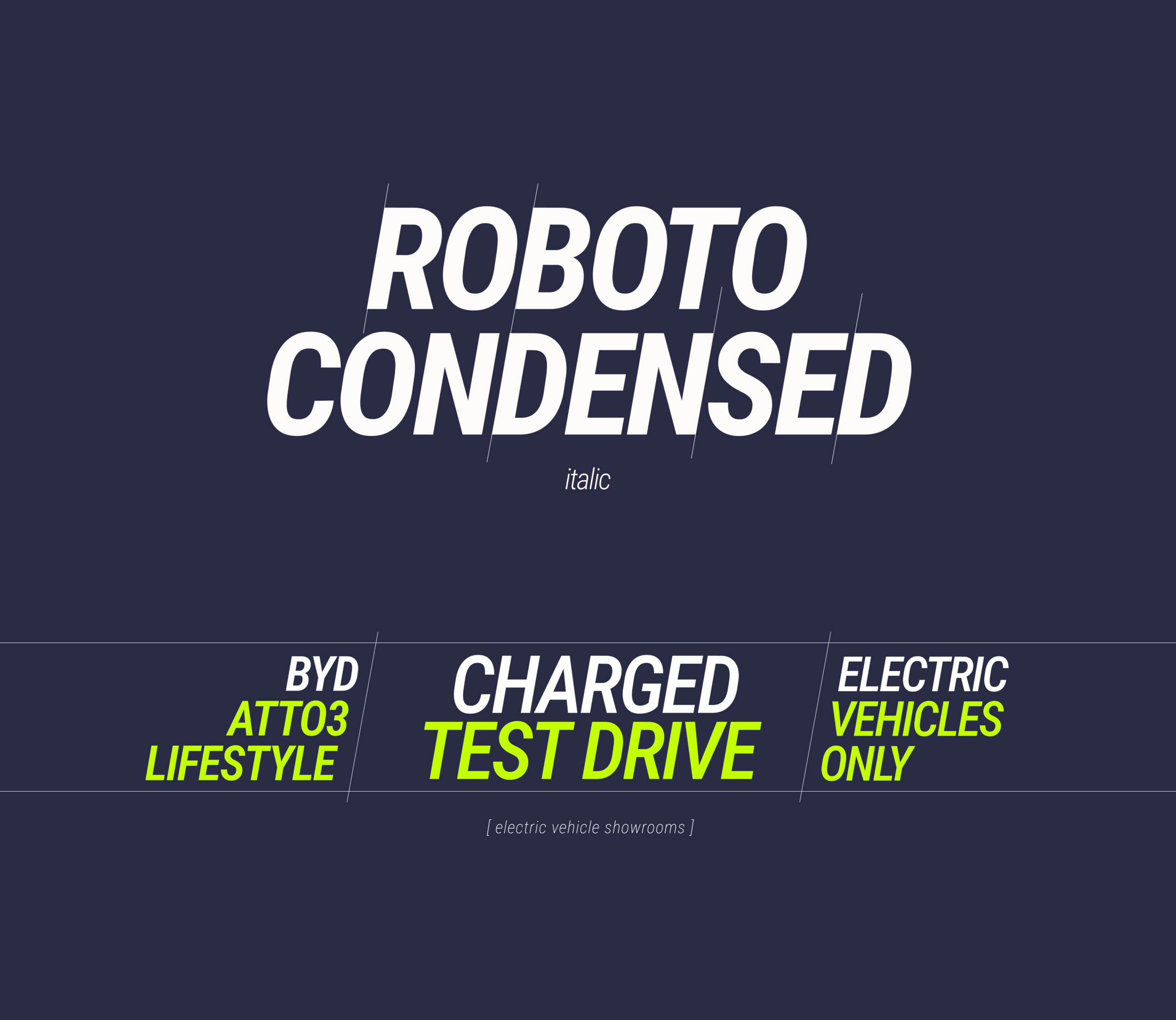
The branded 10-degree slope applied to the main graphic elements adds further expressiveness to the corporate style. This creates a sense of movement and acceleration — as if the brand is constantly striving to move forward. This detail reinforces the association with progress and underlines the company’s character as an energetic, technological player in the market.
Energy has a colour
Seven’s signature palette is a visual charge that reflects the essence of the brand: progressive, open and technological. We’ve collected contrasting, rich colours that enhance the feeling of energy and forward movement.
Energetic green, acid yellow and deep blue act as visual accents, setting the mood and differentiating the brand from its competitors. Together they create a modern, bright and slightly provocative atmosphere that is close to the target audience.
The palette is adaptable and universal — colours can be used pure or in gradients or overlays without losing their recognisability and emotional charge.
Everything works as one
The result is a vibrant, cohesive and recognisable identity that accurately captures the character of the brand. Seven is dynamic, progressive and forward thinking. Every element — from the logo and brand graphics to the visual presentation on social media — works to reinforce Seven’s image as a technologically advanced and reliable electric car dealer.
Seven is not just another car dealership. It’s a brand where the energy of the future is in every pixel and every detail.