Website for Solfy Instalment Card service
Clear product benefits. Interest-free.
For many European countries, instalment solutions remain pretty exotic. Solfy fintech startup decided to change the situation and launched a brand new credit product. It brings together banks, merchants, and its customers in a single financial ecosystem.
The Challenge
To tell about the benefits of the instalment card to all the market operators.
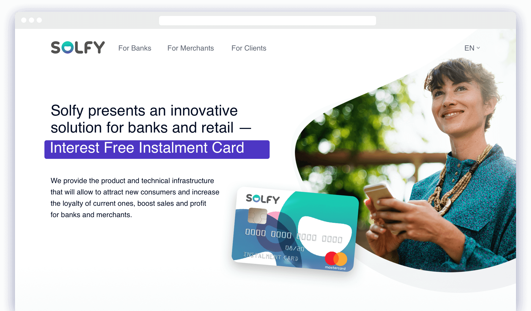
Structure first
There are many strong points that Solfy has. But it’s essential not to confuse customers and show detailed profits for every type of users.
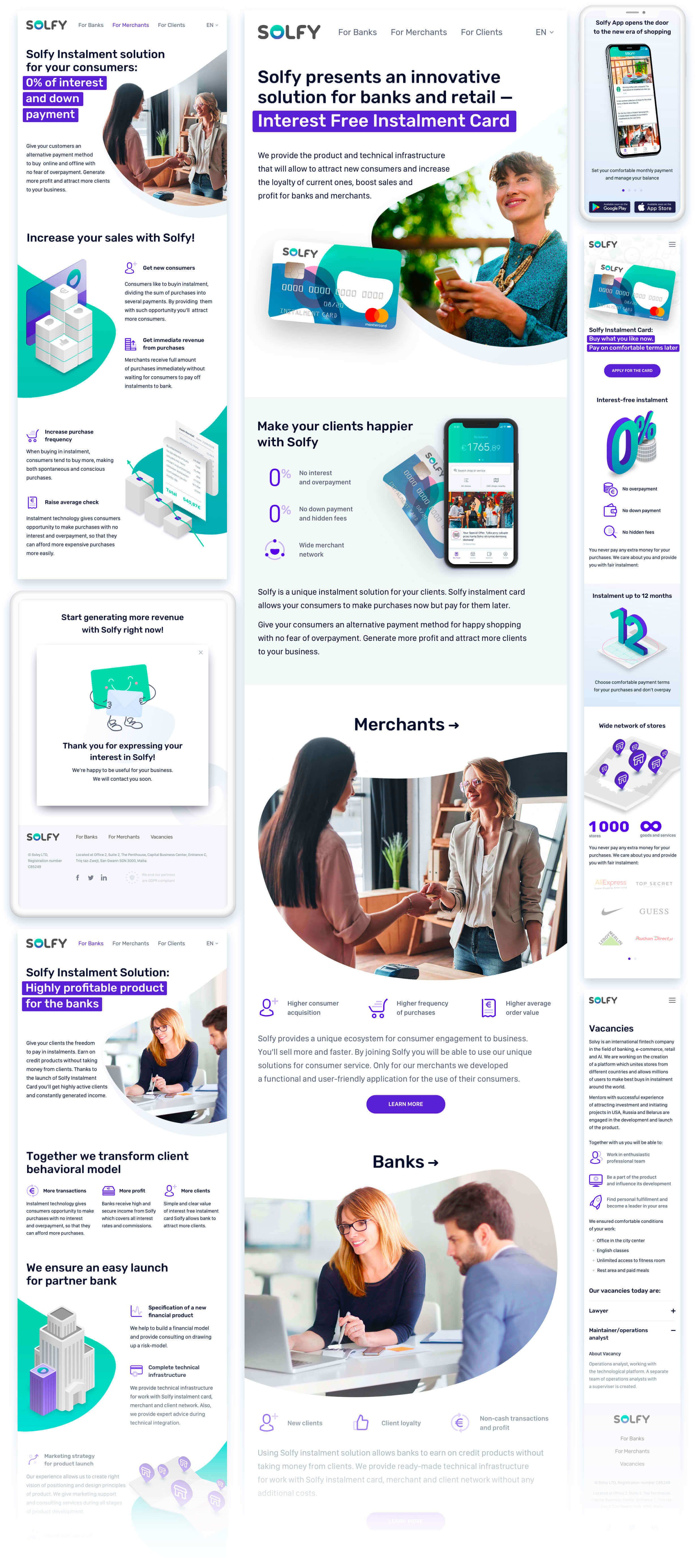
The main page works like a crossroad, where banks, shops, and customers see their relevant “green light” of benefit and turn to their section of the site for detailed information.
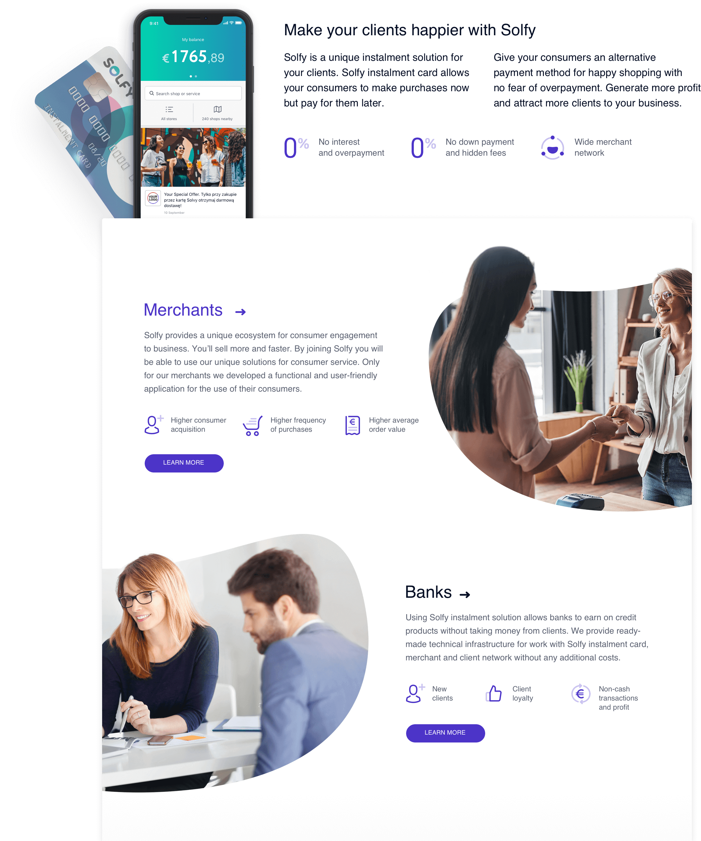
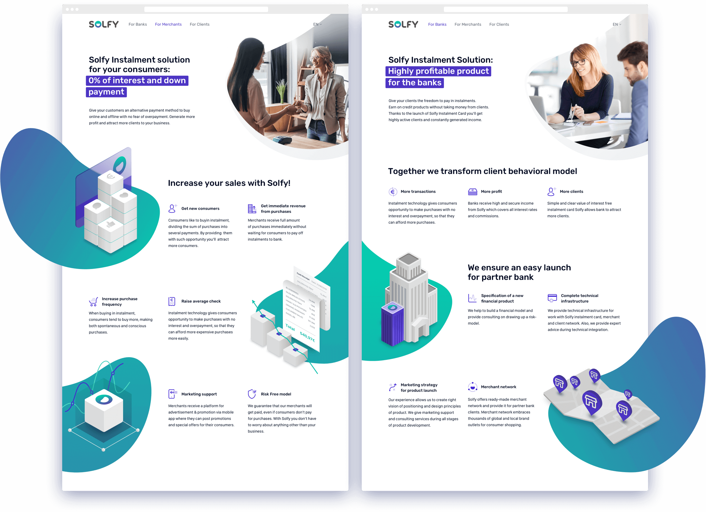
The common and the particular
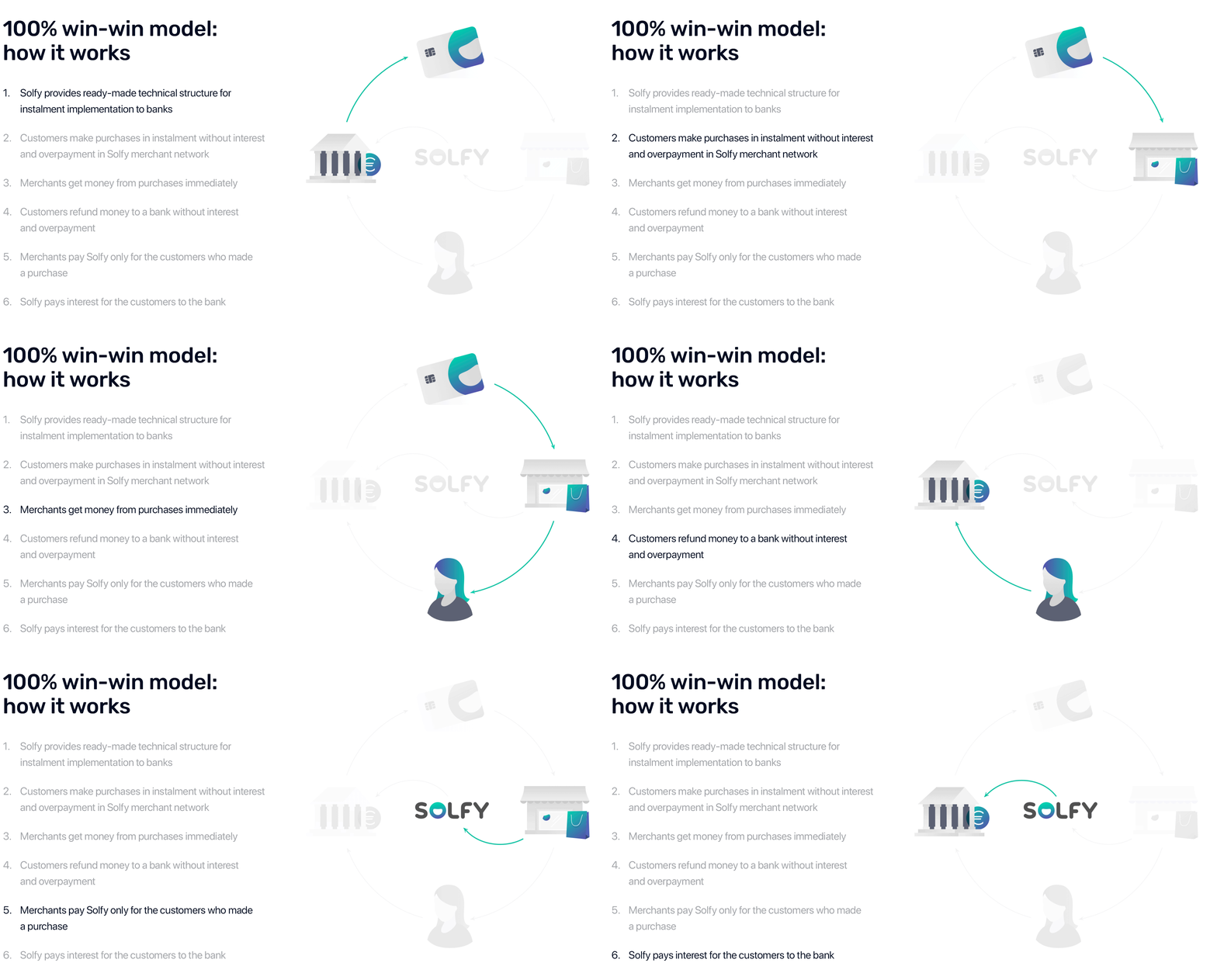
Here is a block dedicated to a mobile app. It’s a through one as well, but each page has its own content. For instance, we show customers the info about shops, sales, addresses, their account balance, and expenditure control tips. The merchants can see sales, average transaction value, and other useful statistics.
There are features of the app next to the screen view. Video and text are synchronized, so just click on a description and see how it works in the app.
Trying on the corporate style
We took a corporate Solfy “smile”, that is a universal graphics element, and used it throughout the website. This trick may be applied to any marketing materials.
The result is easy-to-recognize and has no emotional overload. It works as single corporate “spots” or as a part of photo and illustrations framing.

Icons and illustrations
We've made a bonus for this project — a set of illustrations for each section. They added some informativity and expression into a kit of over 60 icons.
Responsive design
A flexible structure of blocks and well-considered graphics allowed to compile the responsive version of the site really fast and to move on to the development.
Your request will immediately go to the sales department. One of the managers will answer you in order to discuss details. It takes up to half an hour during working hours

How to make tons of data turning into beautiful charts

