AVO
An internet bank in Uzbekistan that launched the first card fintech product.
Task
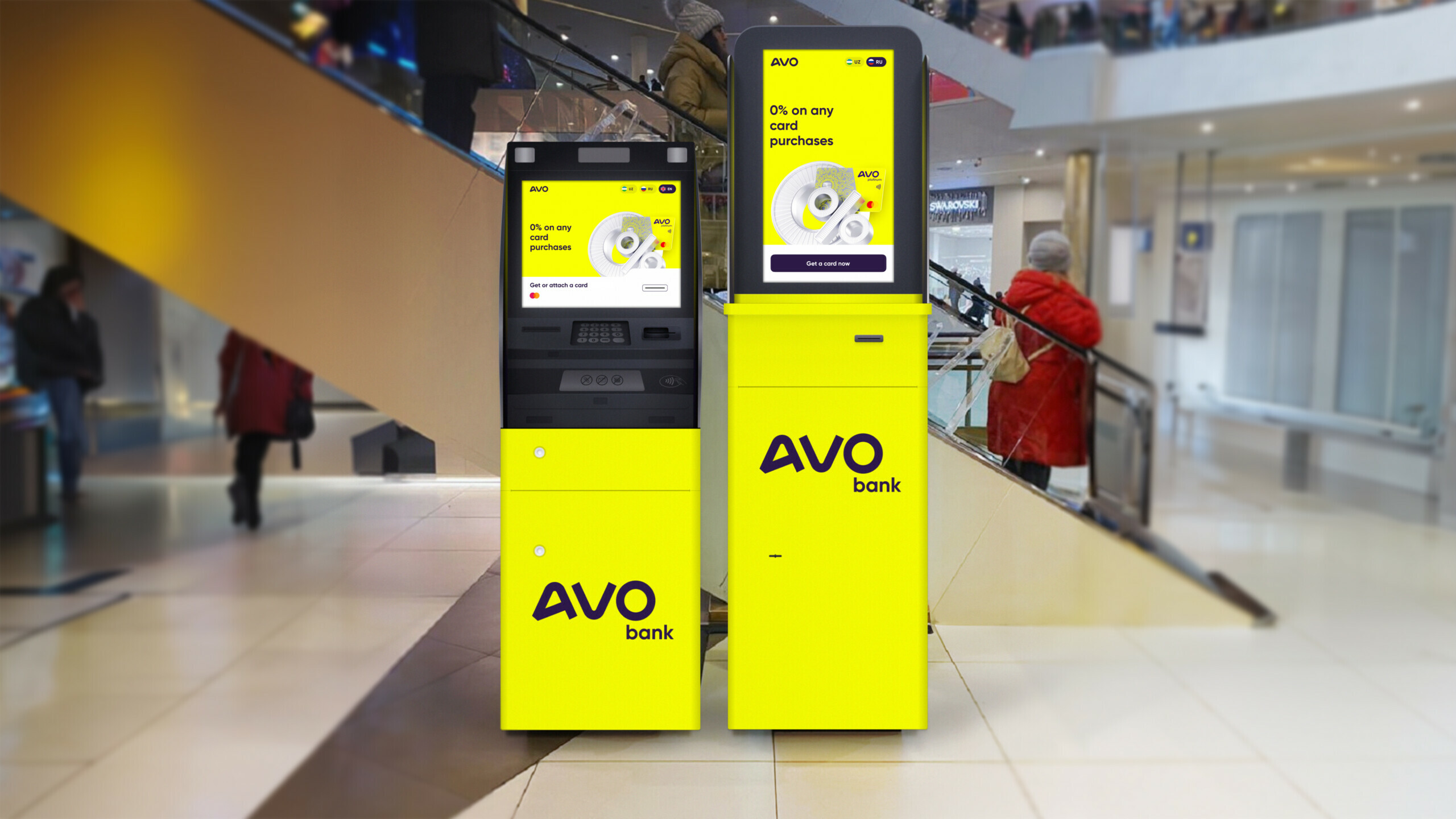
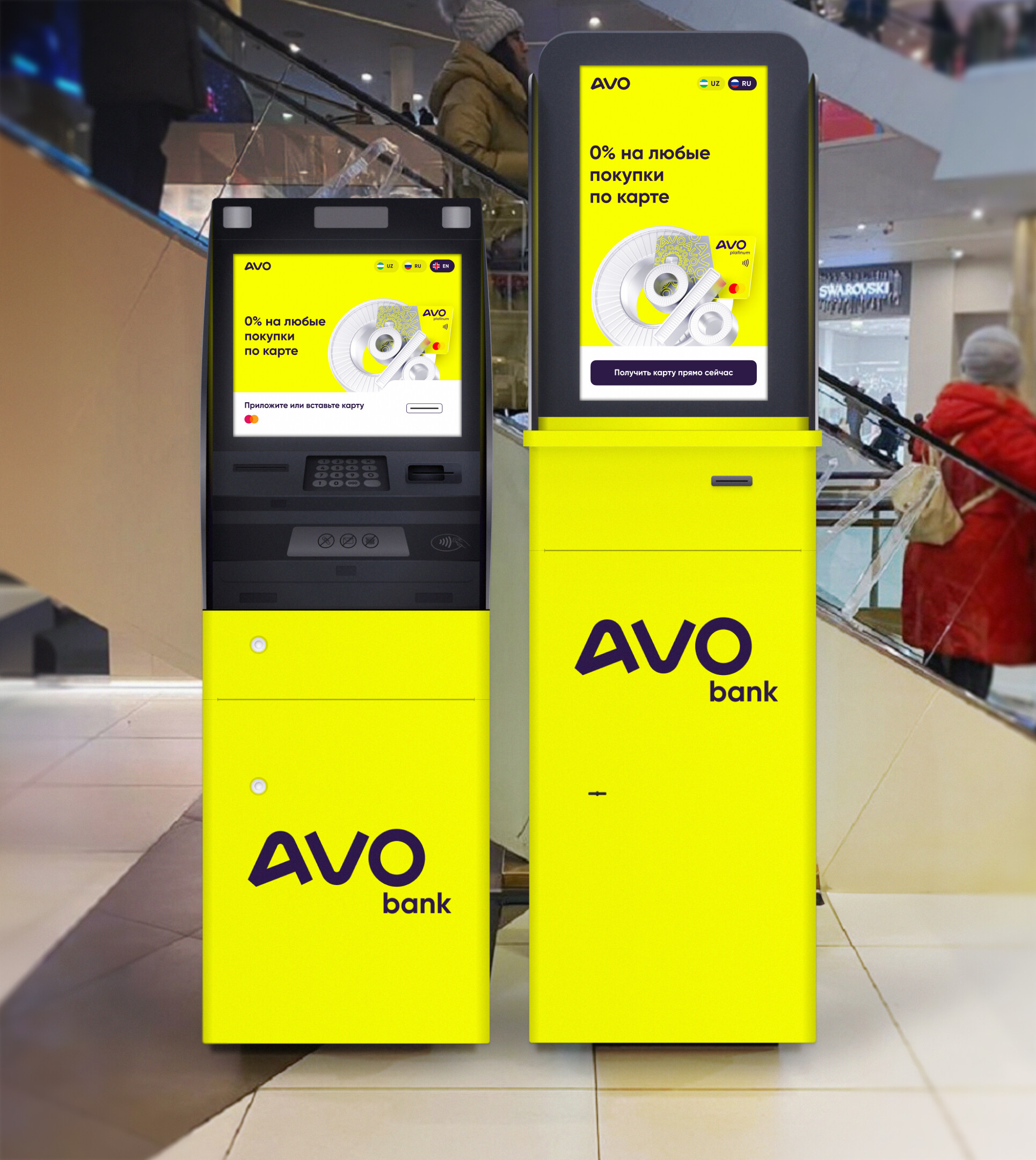
Create a unified and accessible design for ATMs and cartomats to make the new product easy and pleasant for Uzbek citizens to use.
AVO — the first credit card with a grace period in Uzbekistan
The card can be received immediately at the сartomat or issued in the mobile application to use the money immediately. When we started, there were no such products on the Uzbek market yet. Responsible! Our task is to study the market and implement the best solutions from our practice for the AVO project, so that the people of Uzbekistan will quickly accept the new product and enjoy using it.

Market research and device specifics
We quickly immerse ourselves in all the processes, analysing local and international markets and looking at competitors’ solutions in search of best practice. As we are not based in Uzbekistan, the client actively helps us with our research: we ask them to make videos of similar interfaces in specific scenarios. We study the footage and use this knowledge in our design.
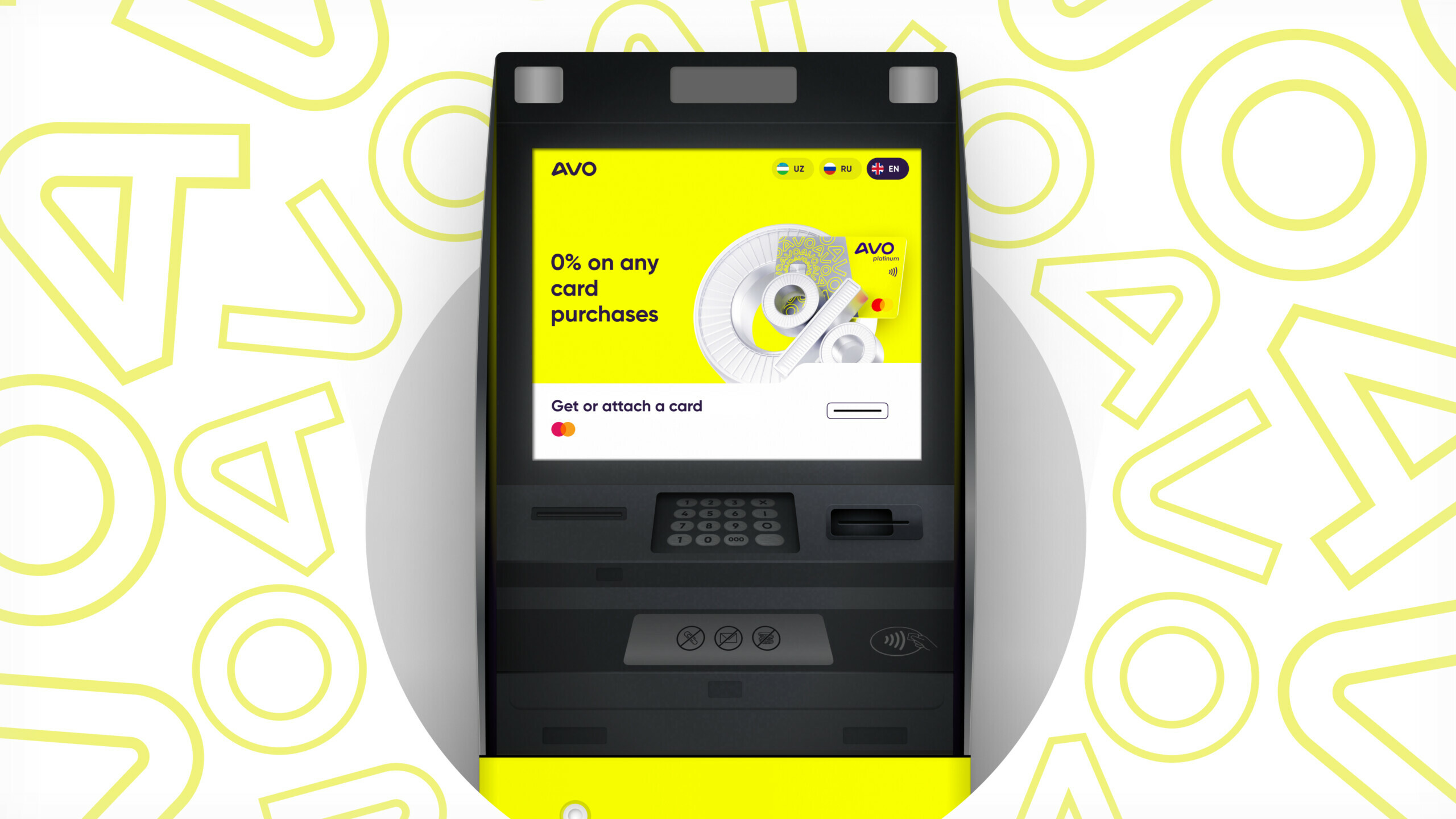
At the start, it is also important to consider the specifics of the screen. The AVO screen is large and has a high burn-in rate. This affects the design and how users interact with the interface. For example, Uzbekistan is a sunny country, and the static on the home screen will quickly burn out and develop artefacts.
Preparing prototypes and designing
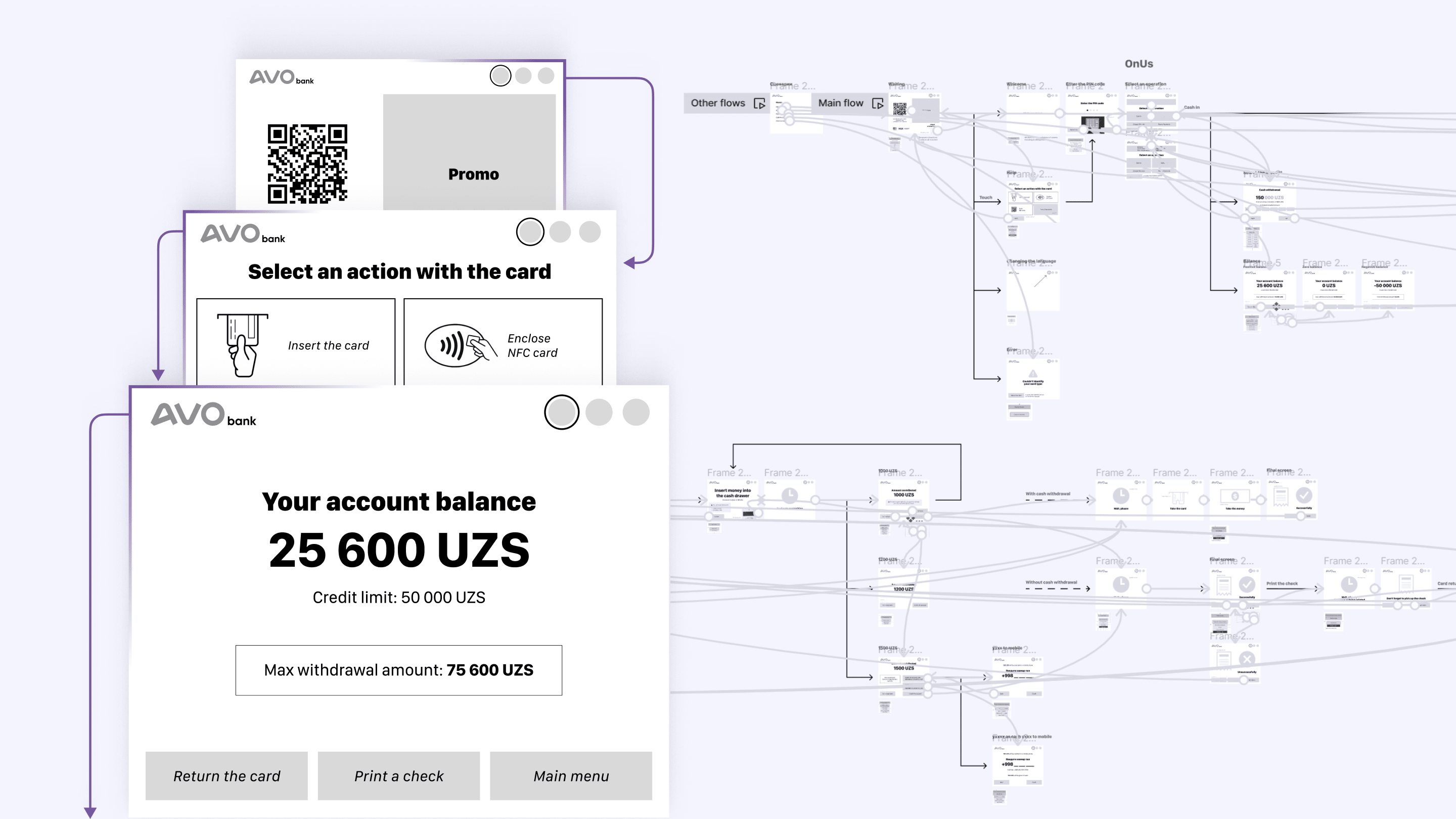
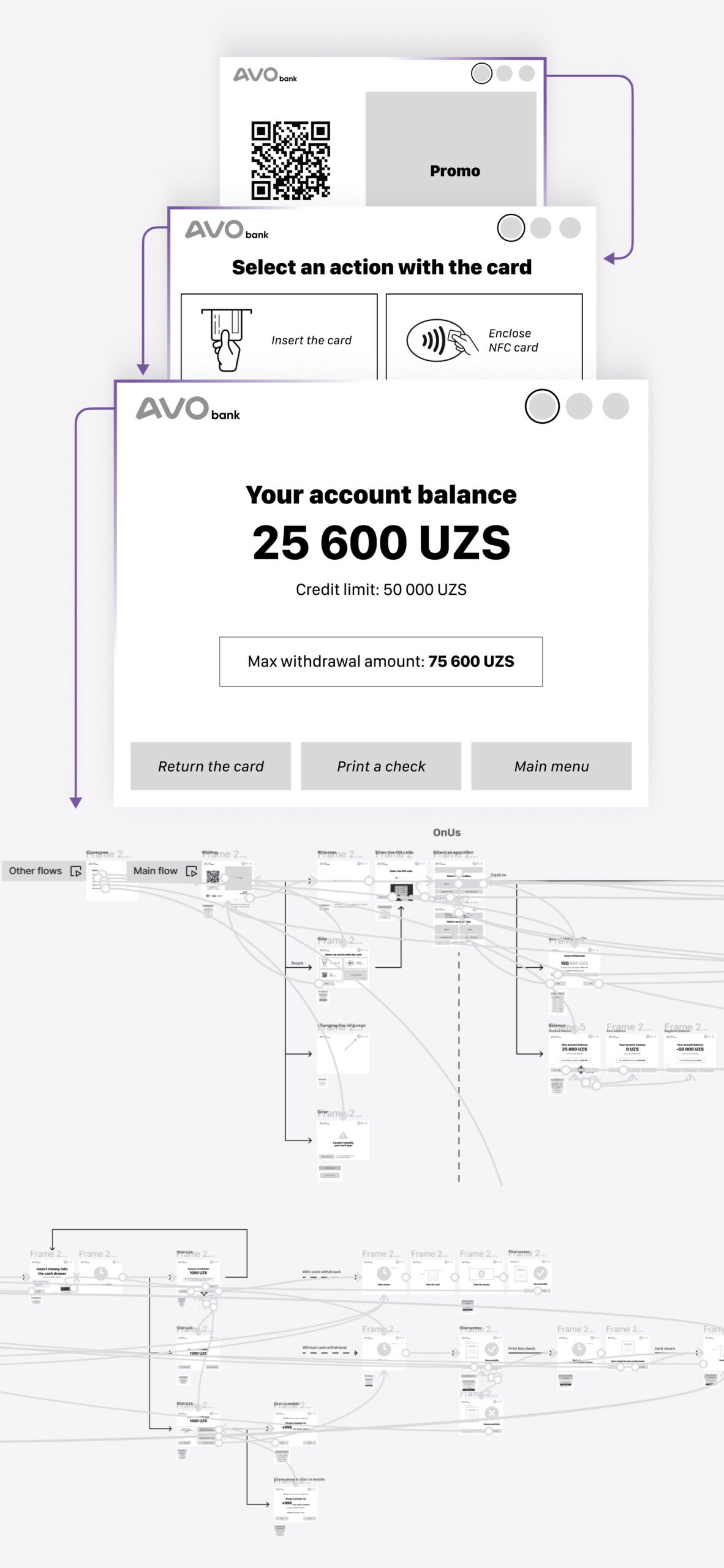
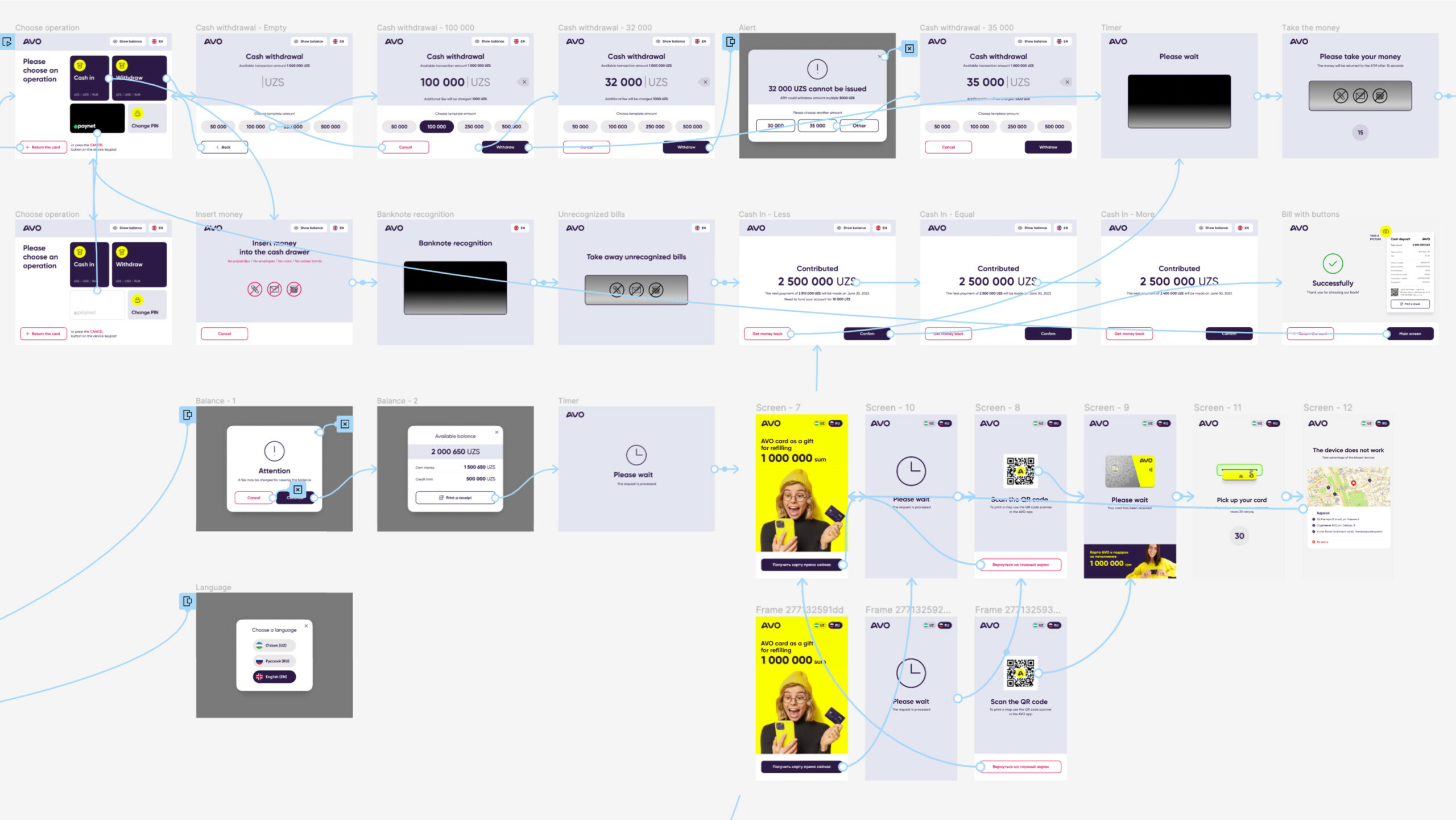
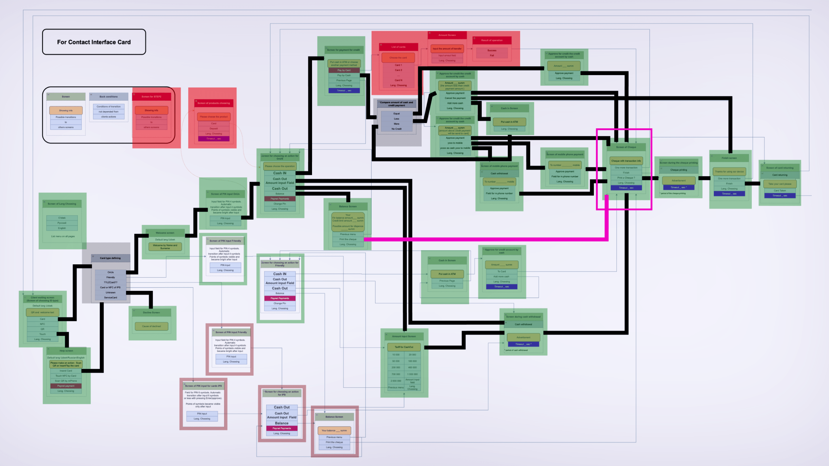
So we define the core logic and make a general plan for the MVP of the product. We do this by agreeing with the team what features the ATM will have at launch and what will be seamlessly added later.
We create interactive prototypes. We take into account timing for pop-up interface elements and waiting time for user actions.
This approach to prototyping gives the client the opportunity to use them as test materials to gather feedback from focus groups, conduct additional research, and show to developers and investors how the product works.
Interface tips
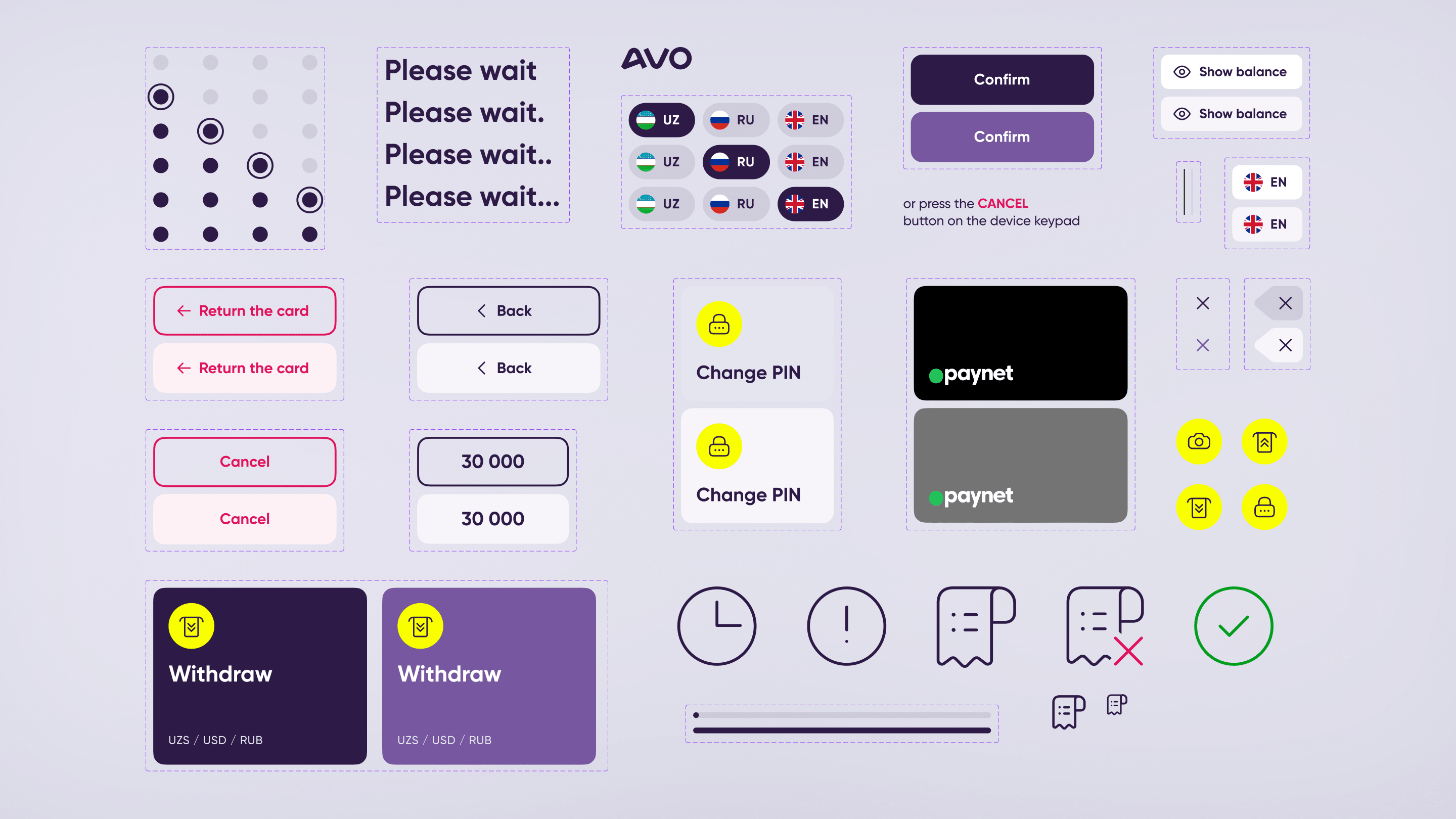
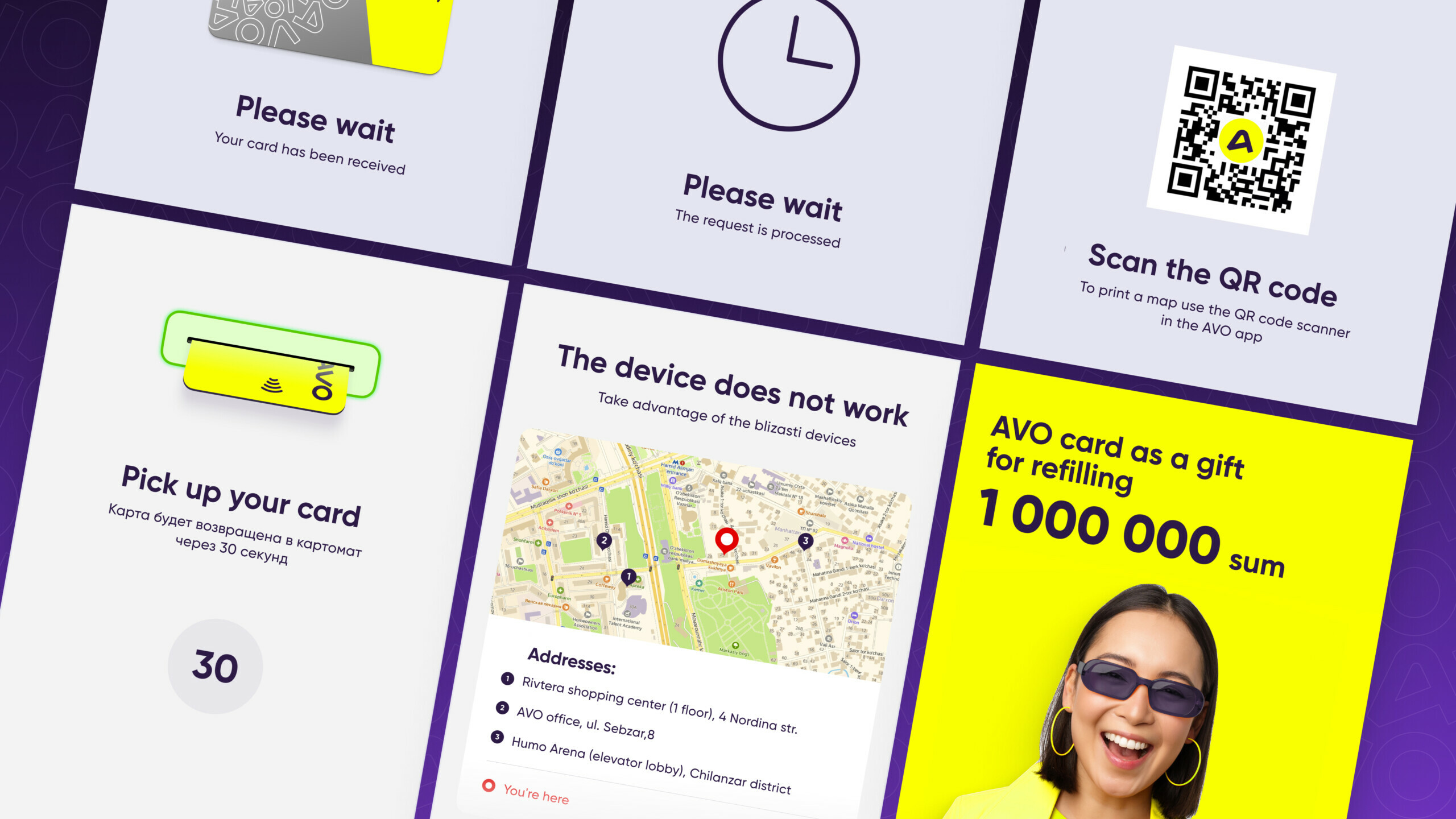
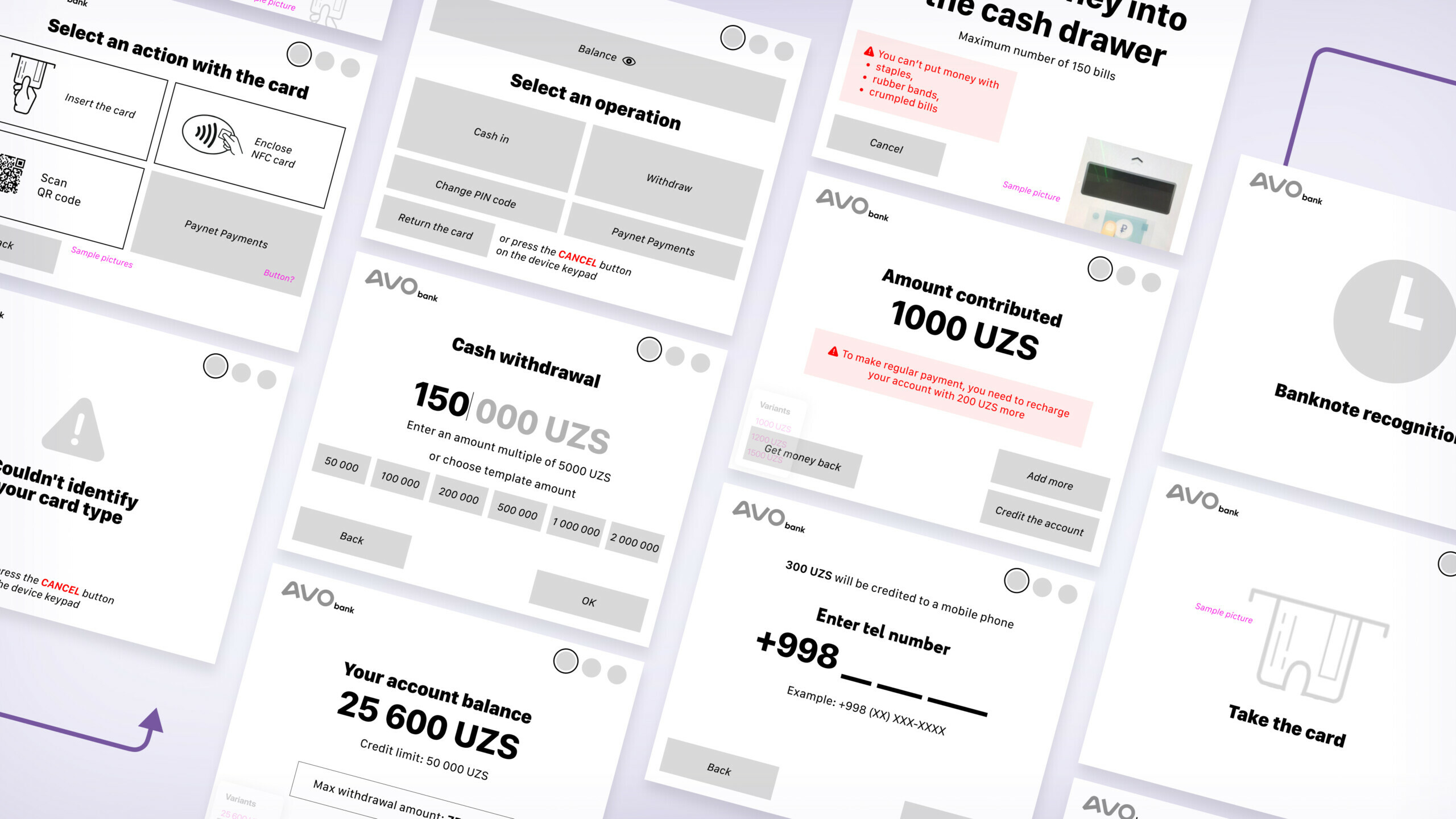
Some of the solutions are quite innovative for this region. To simplify the interface management processes, we create animations instead of text instructions. For example, this is how we tell the customer to take money out of the bill acceptor or to straighten the corners of a banknote. Animations also show the state of the system — the calculation process or information request.

When developing the animation, we take into account the location of the device elements: where the keyboard is located, where the bill acceptor is — to make it is even easier for the user to navigate.
In case of a global device error, we display the address of the nearest other device and the route to it.
Local currency specifics
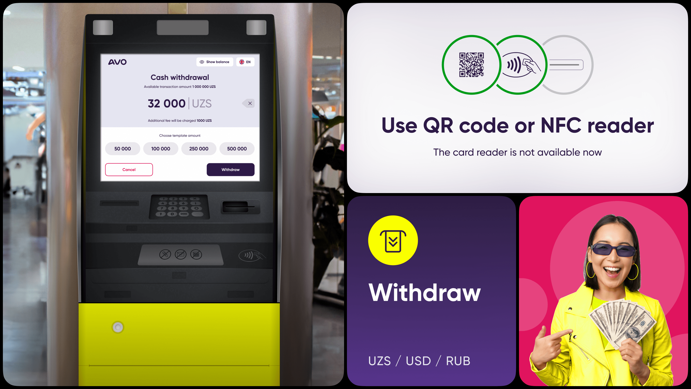
Sums in Uzbekistan are in millions — we take this into account when designing. 45 dollars is about 500,000 sums. So there will be a lot of zeros in the interface, and the bill acceptor must be able to «eat» thick wads of money.
We determine the six most popular withdrawal amounts: from 50 thousand to 2 million.
With such a large number of banknotes, it is easy to lose something foreign: paper clips or something else in your pocket or purse. The animation encourages the user to check the banknotes for foreign objects.
We design ATM interfaces not only for withdrawals, but also for top-ups.
Balance demonstration options
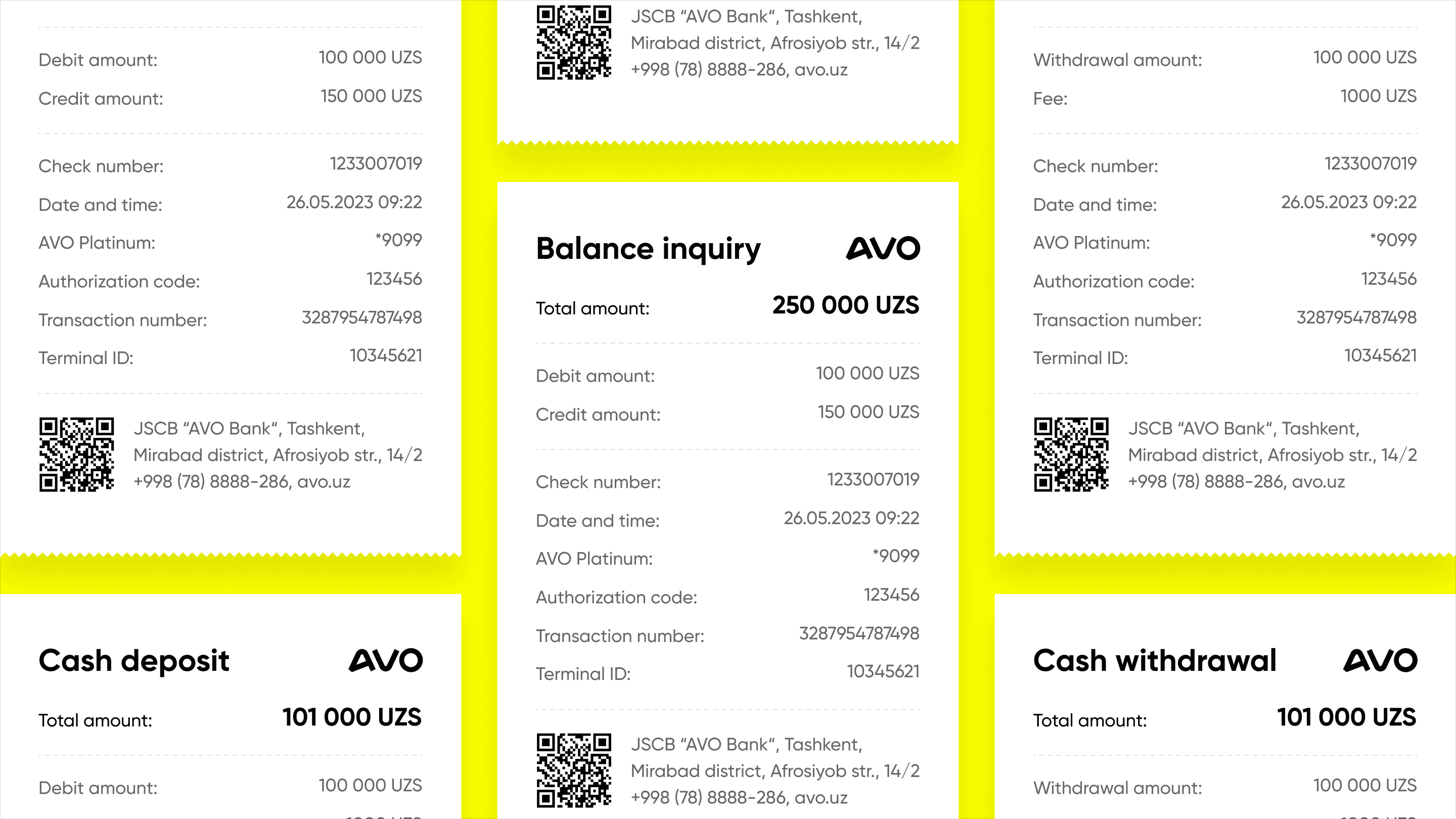
When the user checks the balance, three values are displayed on the screen at once: the total amount of funds, the debit information and the user’s credit limit.
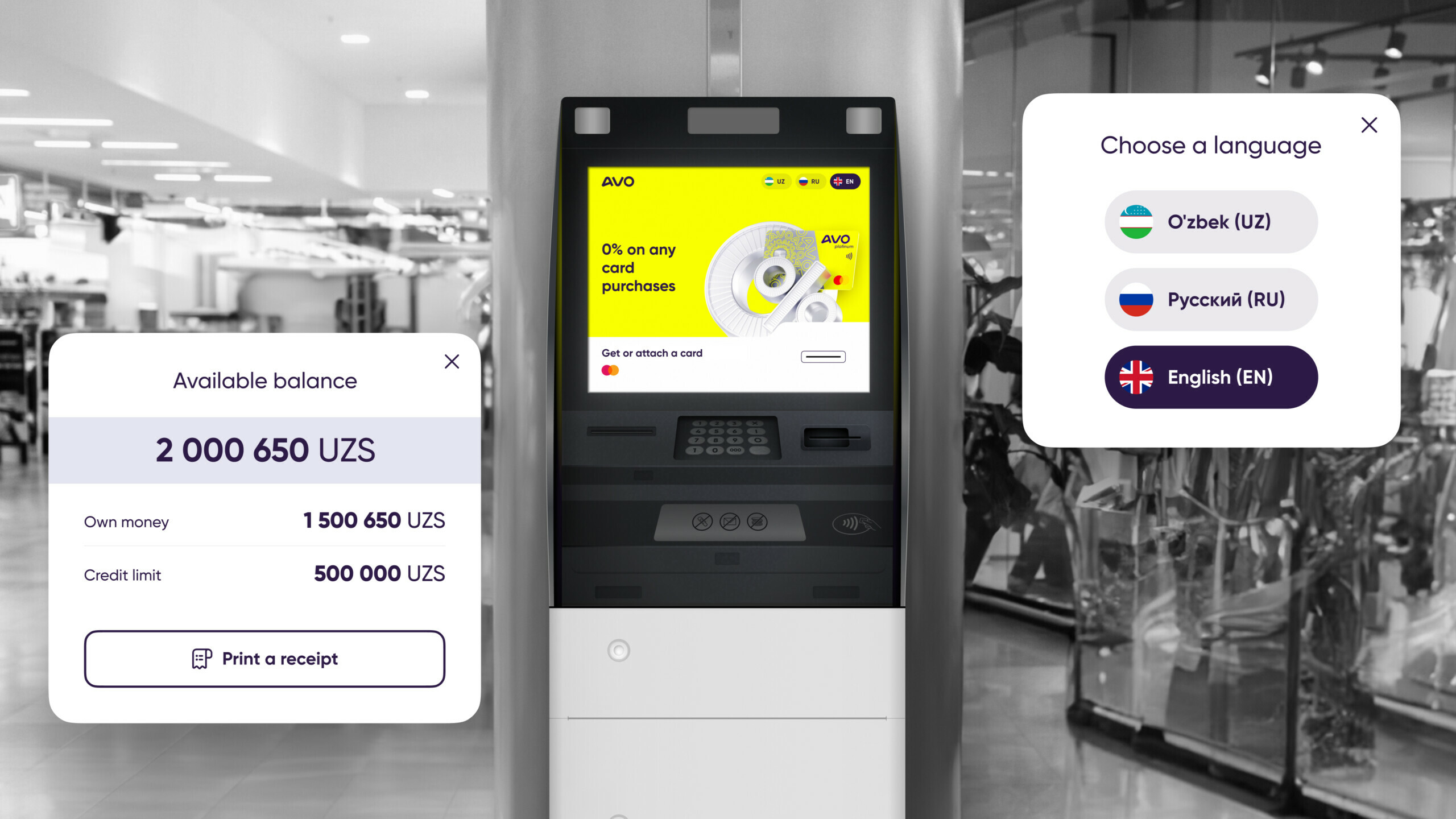
Displaying the receipt
At the end of each transaction, we display a receipt on the screen. It is a common practice in this market to take pictures of the cheques from the screen. This is good for us! Even if the device runs out of paper, the user always has a receipt, and the company can refill the device with paper less often, reducing the need to service the ATM so often.
Testing and handing over to the developers
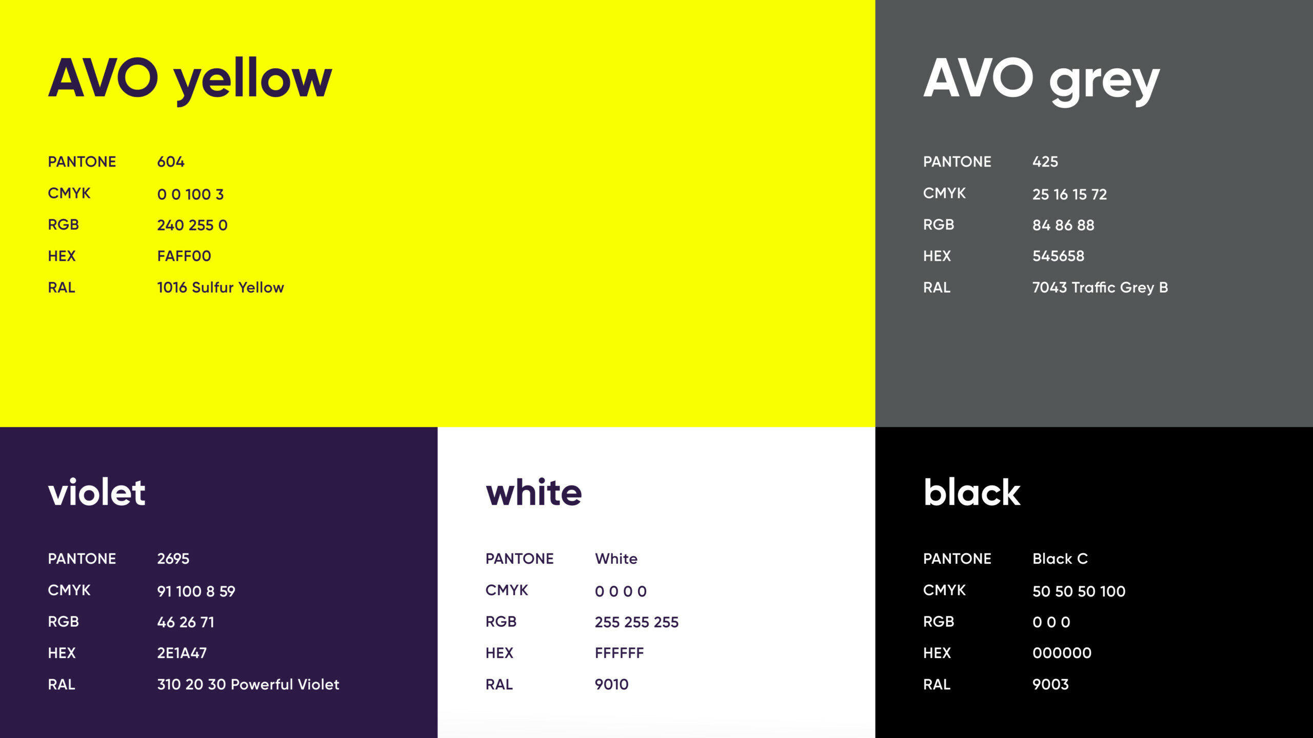
We prepare two branded colour schemes. This allows us to carry out ’field’ tests and decide on the most appropriate one.
Many screens for cartomats or interface elements go straight to the developers for implementation. The flexibility of the process from our side is maximum! This allows us to test designs immediately and refine them quickly if necessary.
The interface of ATMs and cartomats helps businesses to achieve their goals, meets the needs of users and sets new standards in the market.
We want to continue doing cool, modern things with care! Please contact us if you would like to join us in developing your product to delight your customers.

