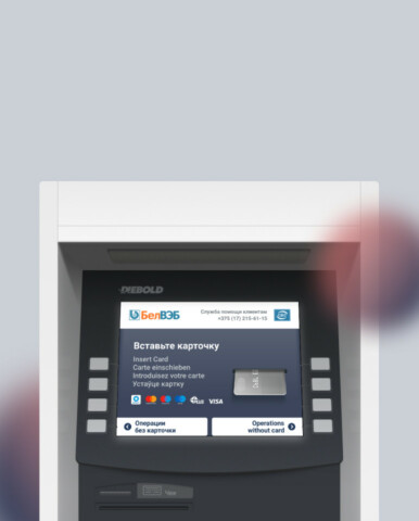
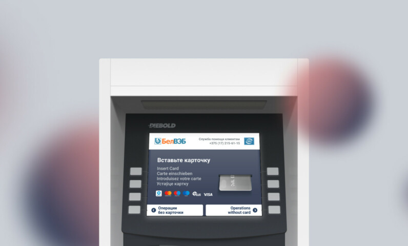
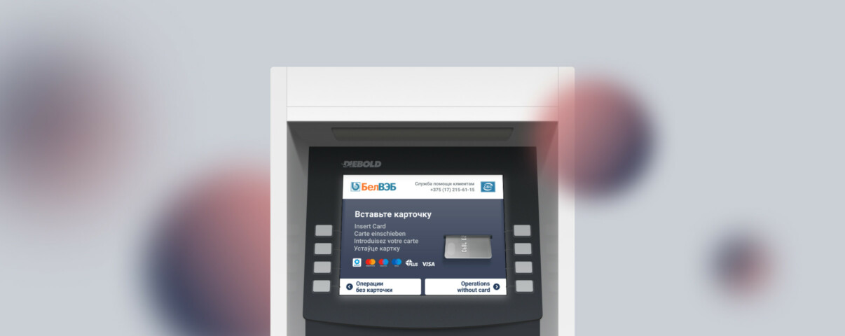
ATM and terminal interfaces
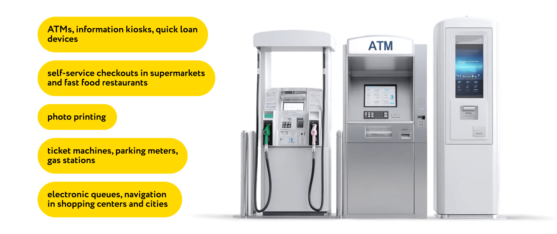
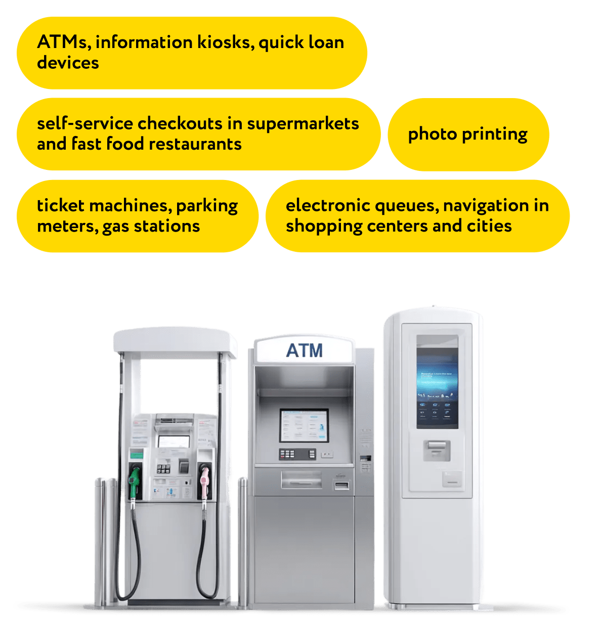
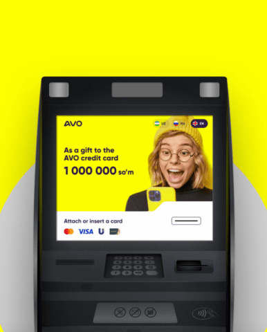
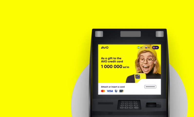
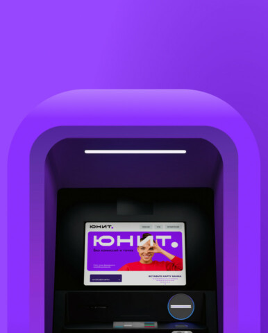
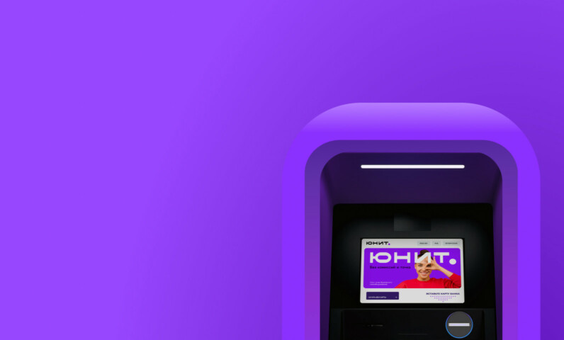
We build interfaces for payment terminals, ATMs, interactive kiosks, self-checkouts and more, giving special attention to the place and the context in which the device is going to be used. We do our best to make the UI as clear and intuitive to anyone as possible.
Self-service terminals have made their way into quite a number of spheres including banking, entertainment, travel, sports, healthcare, hospitality, etc. Yet, a large proportion of their interfaces look disastrous, they are clumsy and rather user-unfriendly. That’s because they were built without a proper idea of their context of use and ergonomics.
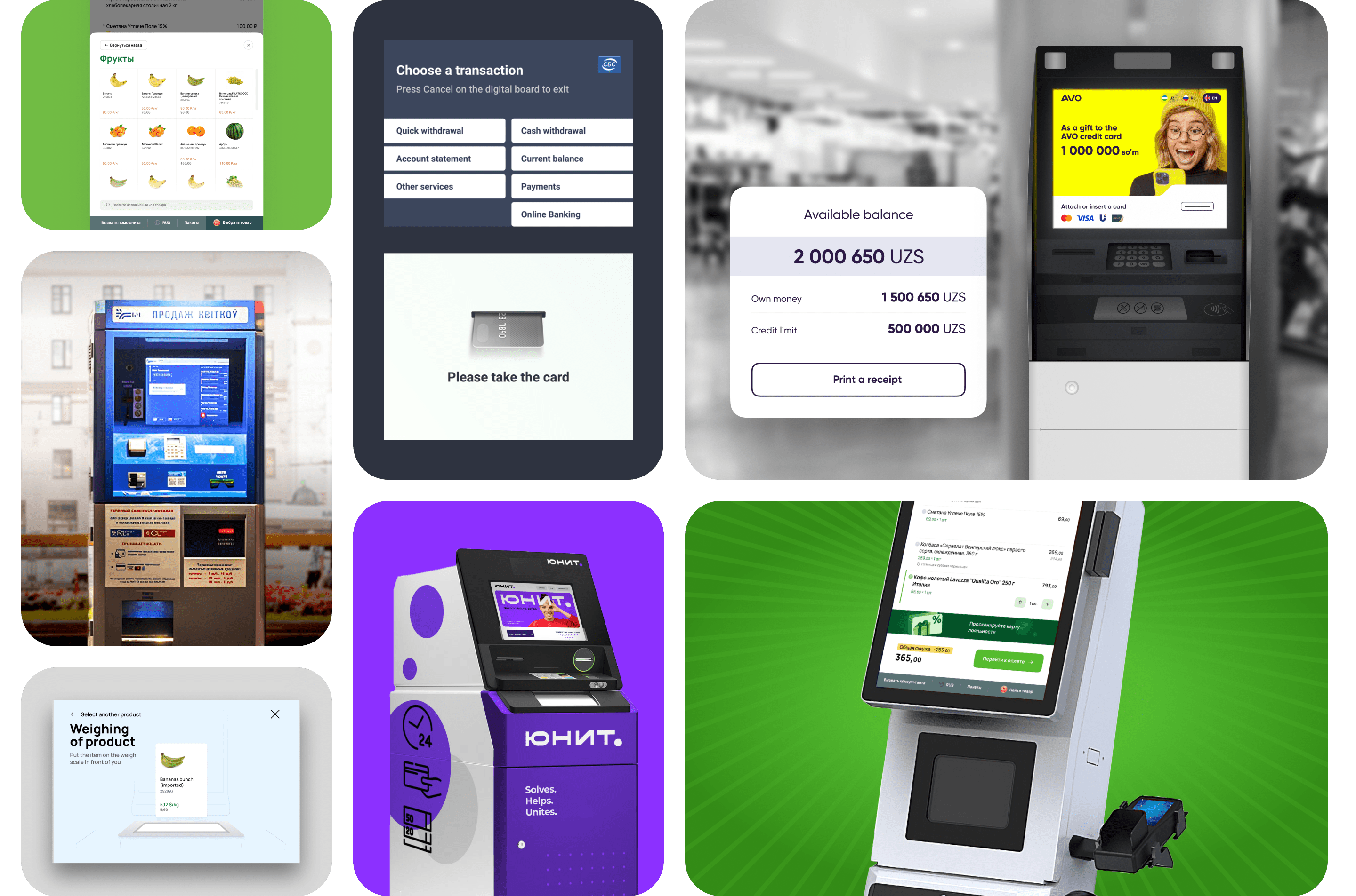
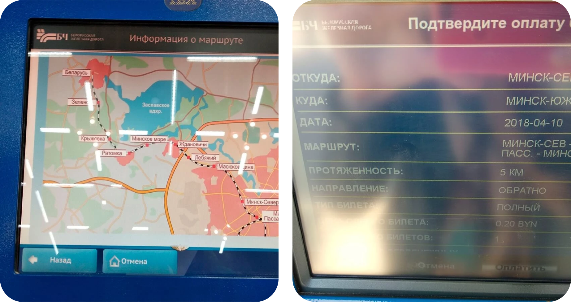
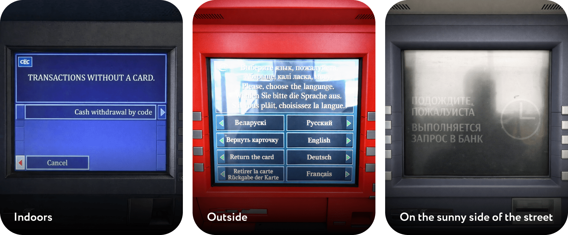
The old TVM displays felt equally lousy and inconvenient both outside and inside the building.
Terminals, ATMs and other self-service machines come equipped with two interfaces: a physical and a digital one. Users interact with the interface on the surface of the screen but get «physical» output in the end: the device swallows a card and gives back money, a check or a ticket.
Users have to perform many unfamiliar operations during their first experience with a self-service kiosk. For instance, they need to scan the barcodes on their purchases at a certain angle when processing them at a self-checkout, put their bag at a certain place or remove security tags. All these actions have to run smoothly and speed up the procedure instead of being a burden. That’s why it’s important to keep the user journey in mind throughout the UI design process.
Here we go
Improving existing interfaces
We carry out a professional assessment to diagnose the problems. For example, we can help reduce queue waiting times and the SST failure rate.
Designing automation solutions
We figure out how and how often a terminal is going to be used and then design an interface to be deployed on a fully-fledged self-service kiosk.
4 Must Factors to Consider while Building UIs for Electronic Terminals
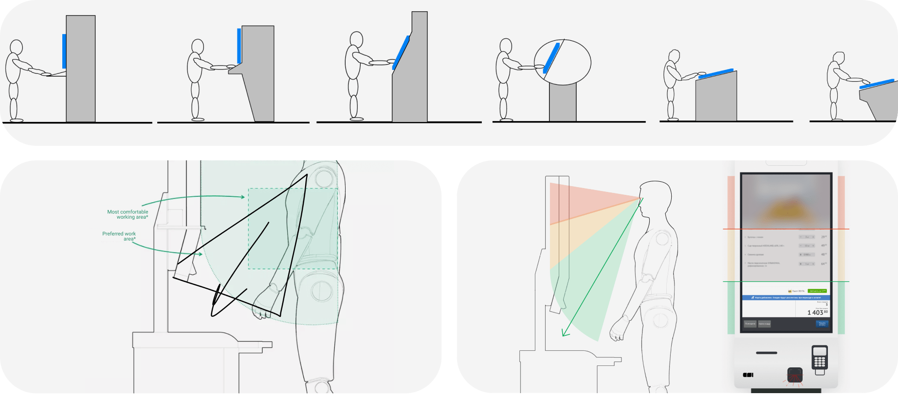
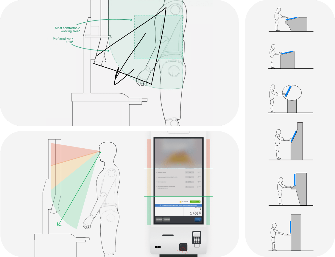
In order to get your self-service kiosk right, the first thing that needs to be taken into account is how users will interact with the physical part of the device like its size, the environment, the distance between them and the device, and the screen angle.
1. Form factor and environment. Generally, the approach to building terminal UIs is pretty similar to that of web interfaces or desktop software development. Which explains why designers fail to include the environment, the distance and users’ body position into their calculations.
2. Screen size. Designers need work with the real-world screen dimensions from the get-go because the size of the elements depends on the size of human fingers. This way a designer will be able to understand, first hand, whether it will be convenient enough for users to point their fingers and hit the intended area on the screen and where it might get partially obscured under their hands.
3. Color contrast ratio. Terminals are devised to work for years, and are often guilty of poor color reproduction, low resolution, small viewing angles and other sins when it comes to display limitations. All these factors are essential to create a consistent UI color scheme.
4. Understandability. The text on the screen has to be quick and easy to read and save users from unnecessary or repeated actions. The wordings have to be precise and unambiguous, too.
UI Design for Self-Service Terminals: The Workflow
Preliminary research
In a number of interview sessions with the client company’s employees, we discuss the main use cases of the SST. We analyze what questions people ask, identify the most frequently used features and trouble spots.
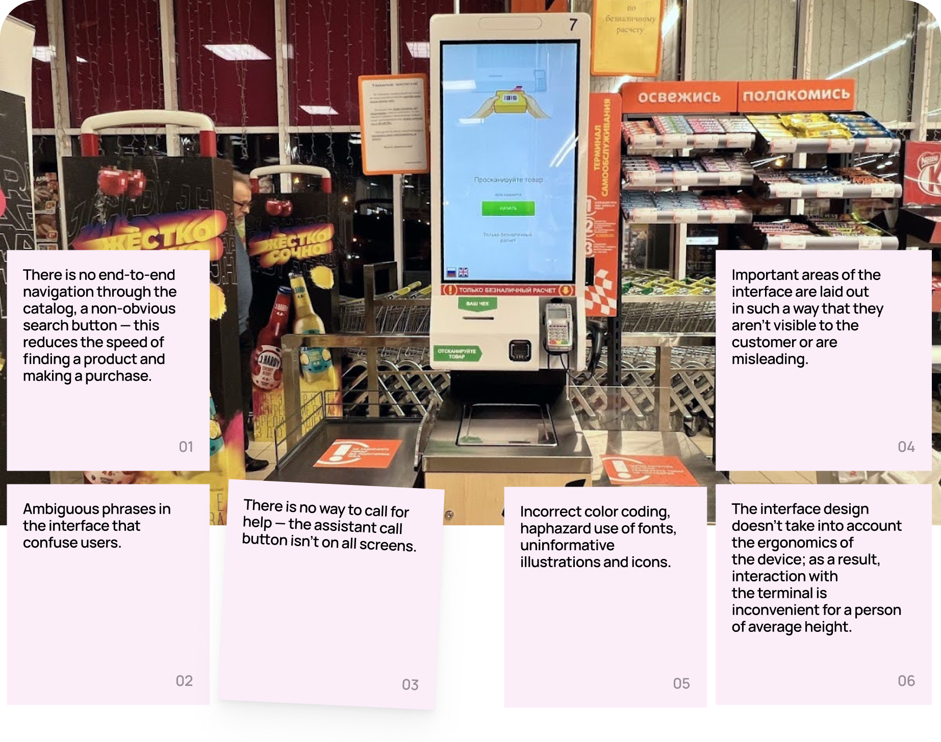
For functioning terminals, we carry out a UX audit of the interface and identify the issues.
Prototyping
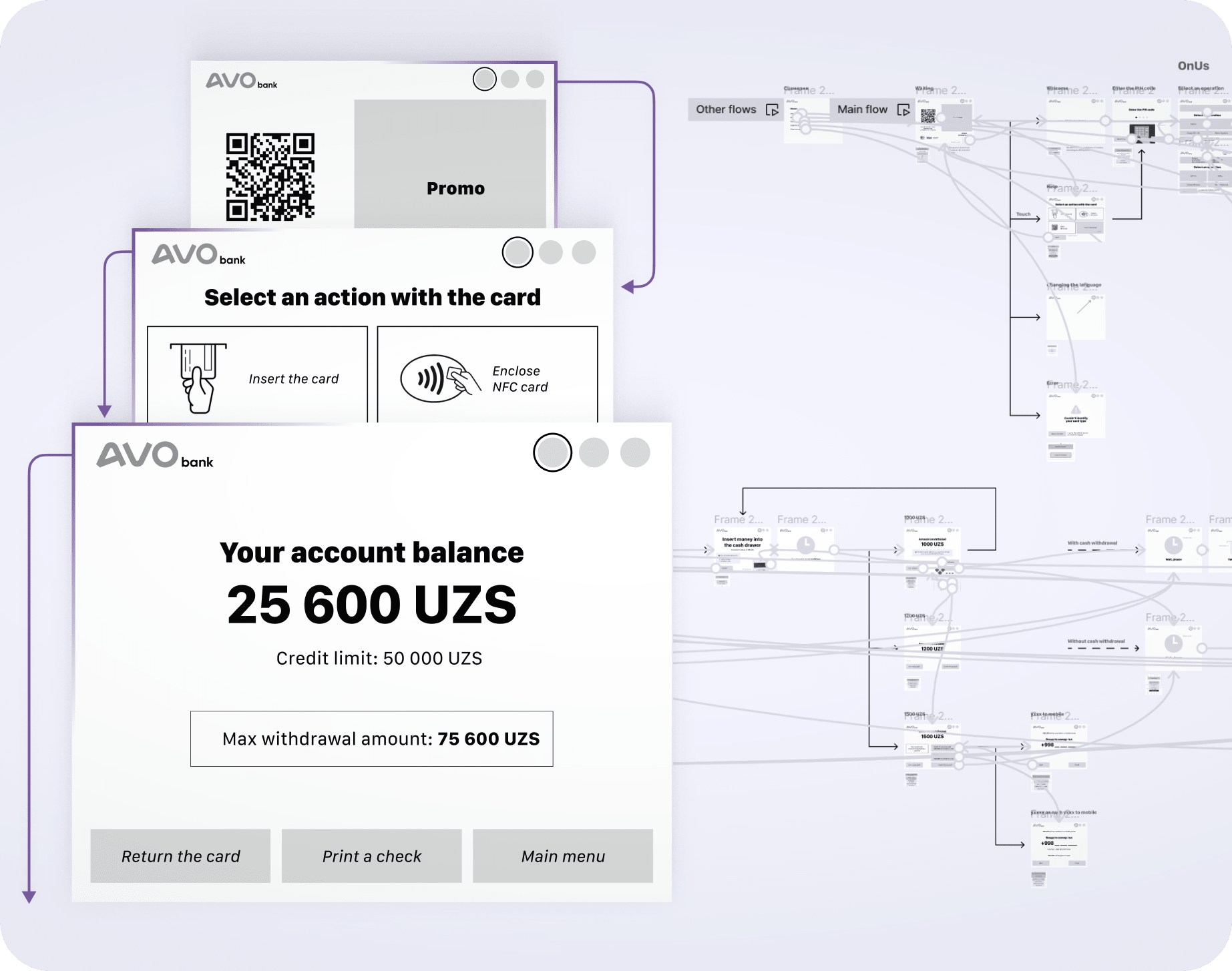
Based on the interviews and our analysis and audit findings, we suggest ideas that might improve the existing interface or help migrate to a fully automated solution, and build the first prototype.
Testing the prototype
The next step is to evaluate the assumptions made through usability testing. We select a sample from the target audience, build scenarios and reproduce the conditions that are as authentic as possible.
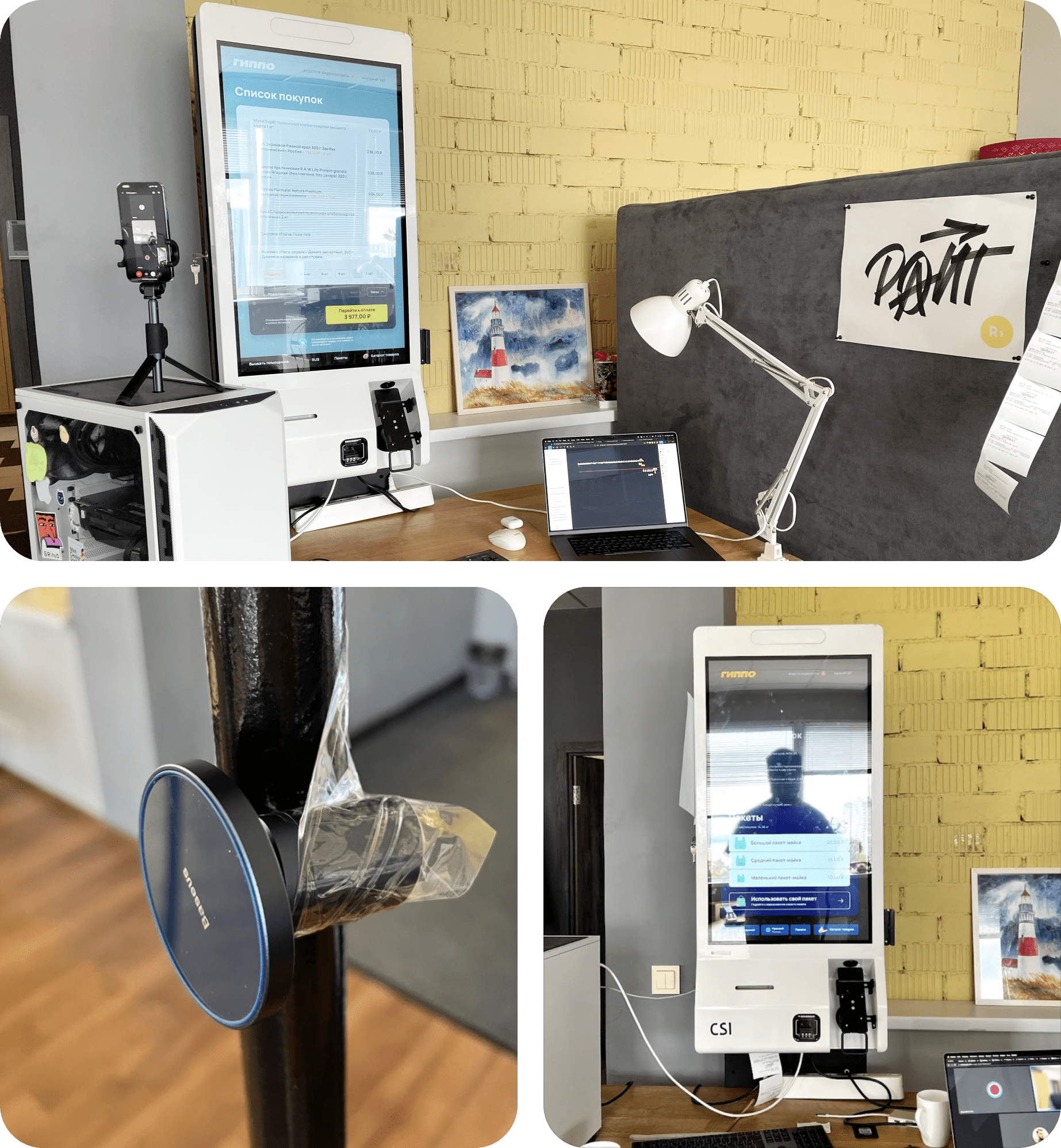
Revision and UI design
Based on the testing results, we analyze user feedback and fix the problems. We look at the nuances concerning how quickly the users managed to complete the proposed scenarios, check how understandable the interface is and digest the general recommendations we received from the participants.
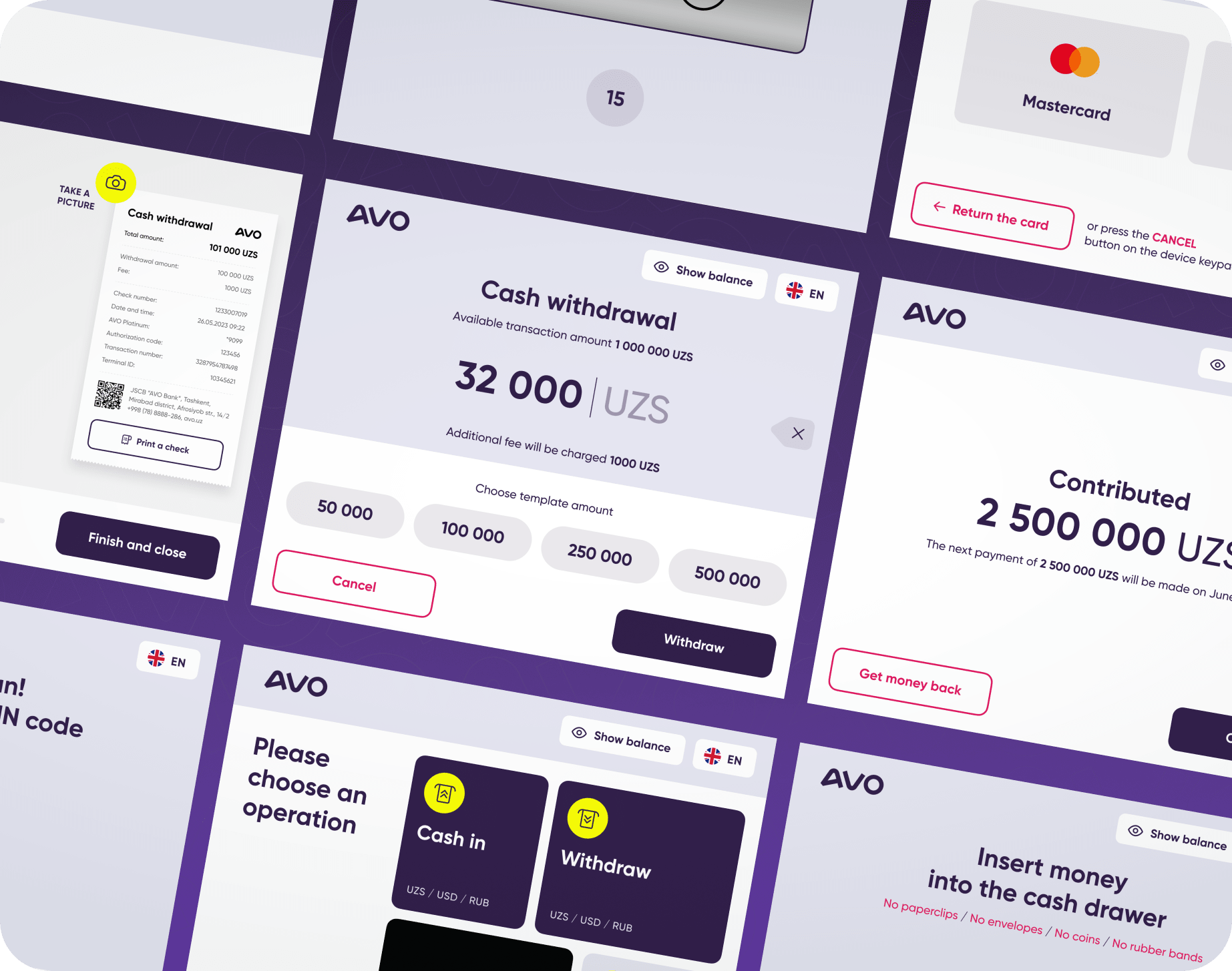
Development
Now we build a specification encompassing all the UI elements, clarify tricky points on animations and prepare a UI storyboard. All the docs and pics are then delivered to the developers via Zeplin, Figma or Invision Inspect.
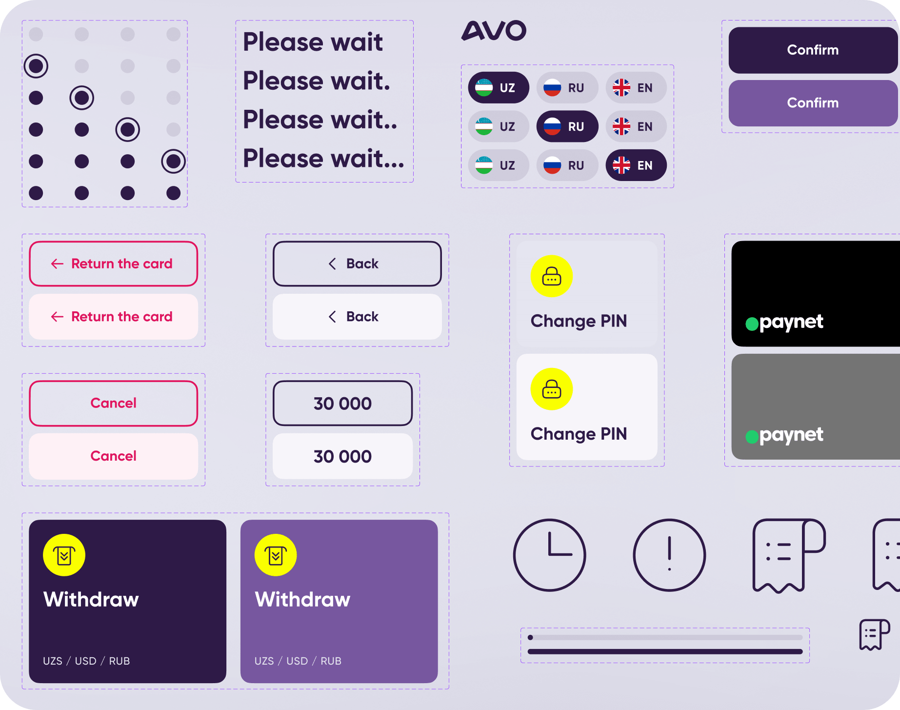
Testing
The next stage of finalizing a terminal UI is one last user testing. It gives us a more accurate picture of the problems people face while using actual terminals and of what causes trouble.

