Wellse is a wellness startup building a unified ecosystem for trainers, experts, and users. It serves as a structured alternative to the chaos of promoting services through social media.
Task
To create a brand that reflects support, trust, and community rather than the pressure of athletic records, and to translate this vision into a cohesive mobile application experience.
Key Challenges
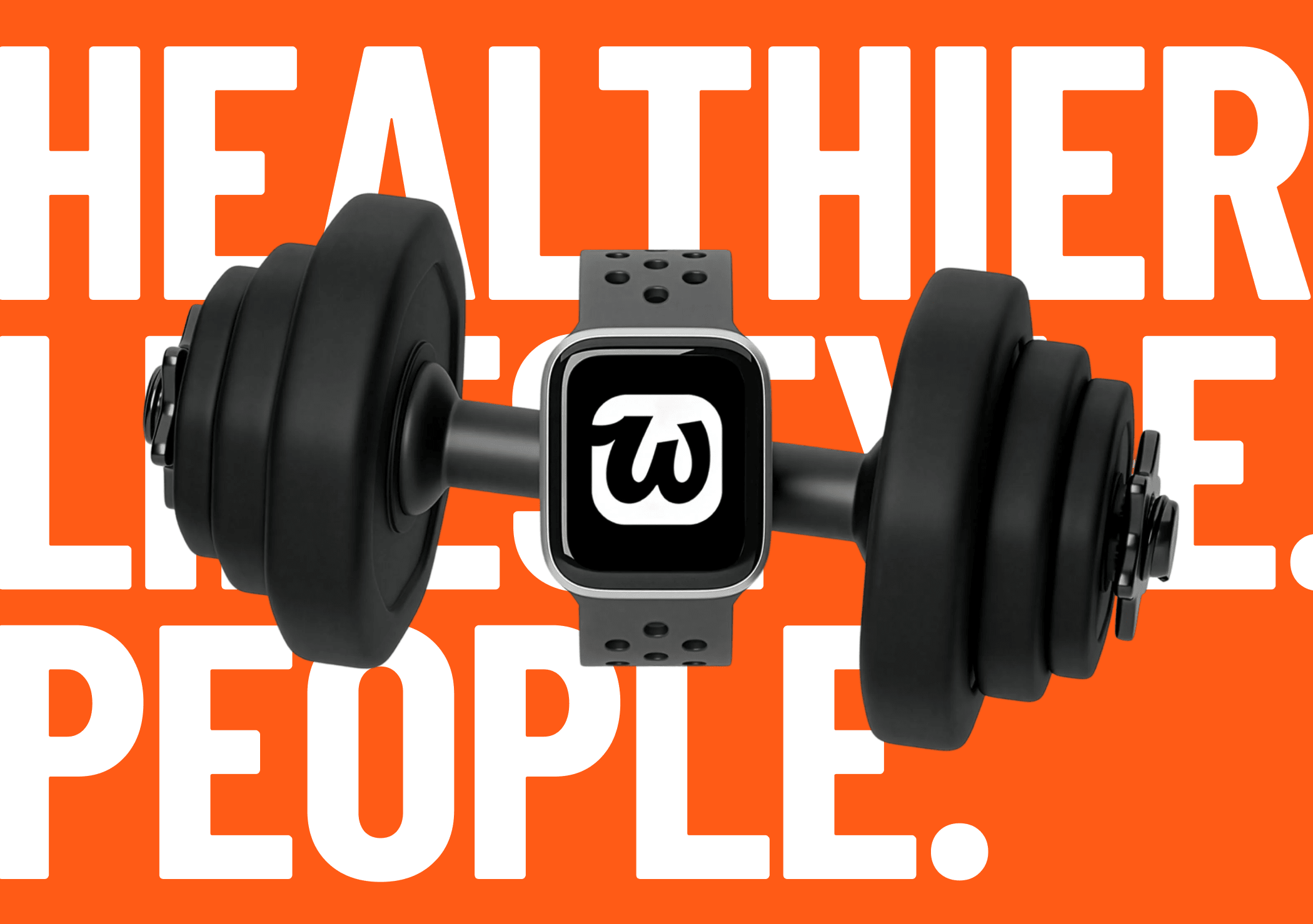
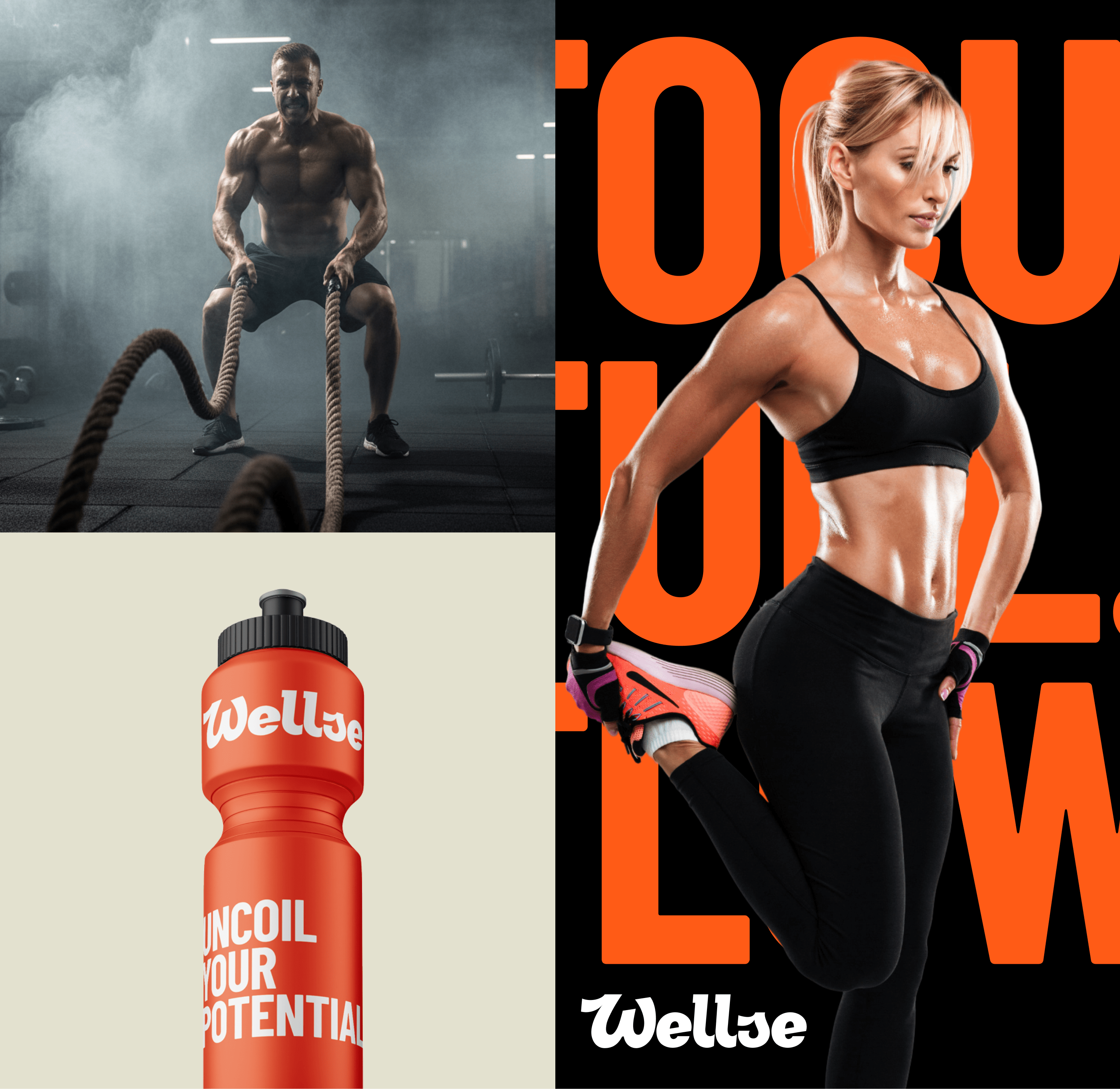
- The wellness and fitness market is saturated with visual clichés — muscles, stopwatches, trophies, and aggressive motivational messaging.
- Most platforms focus on performance and competition rather than long-term wellbeing and community support.
- The product needed a unified system where both the brand identity and mobile experience feel consistent, accessible, and relevant for beginners, professionals, and wellness experts.
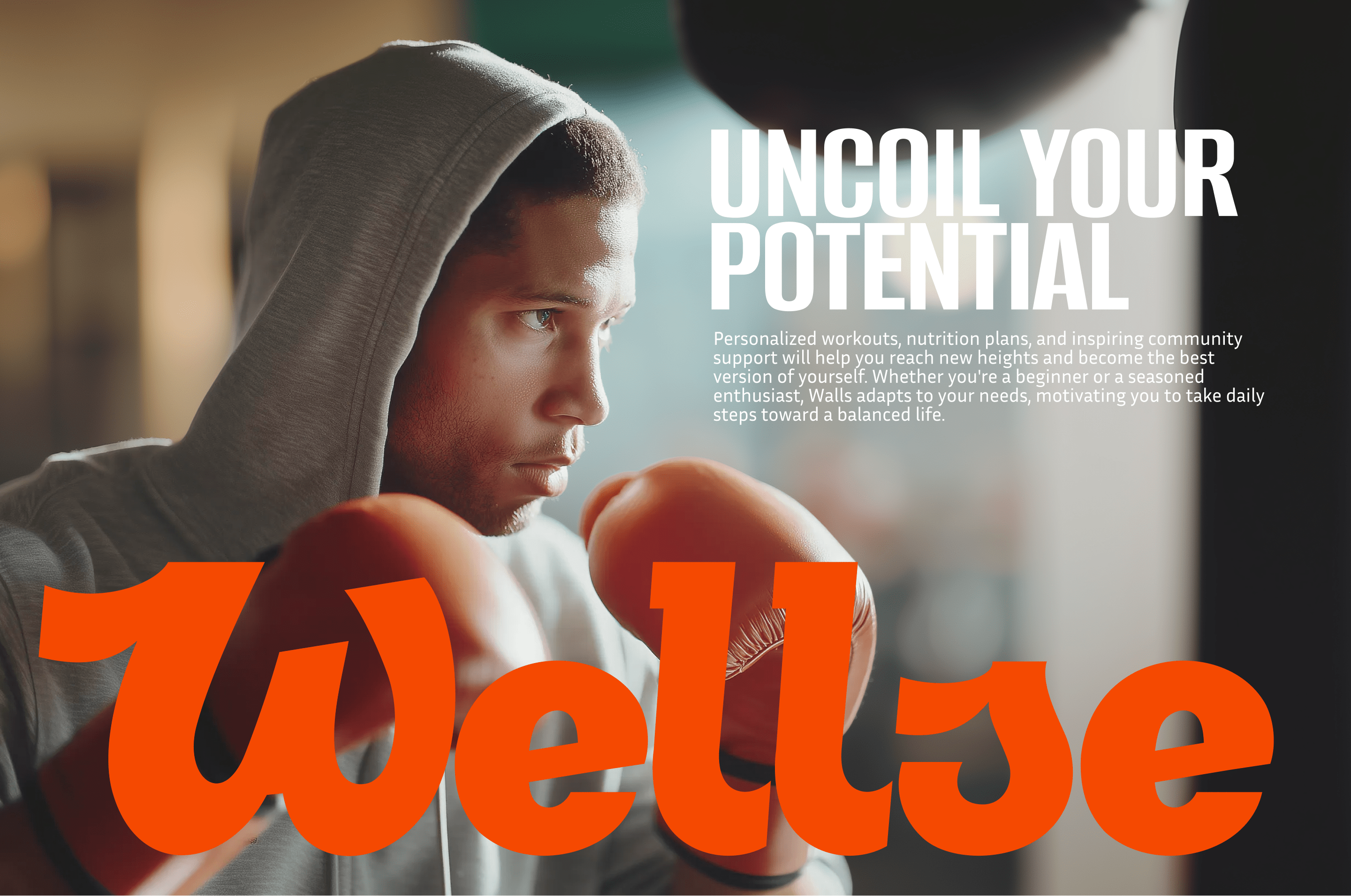
Our goal was to create a visual language that moves away from the traditional ’fitness motivation’ narrative, reflecting a more human-centred approach to health and personal growth instead.
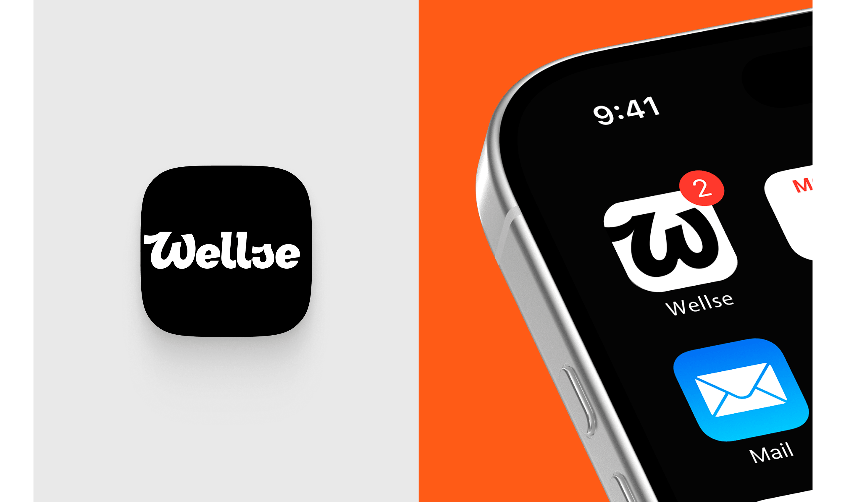

A cliché-free logo
The typographic logo became the central element of the brand identity. We deliberately avoided obvious sports symbols and literal metaphors, instead focusing on the form, rhythm and personality of the typeface.
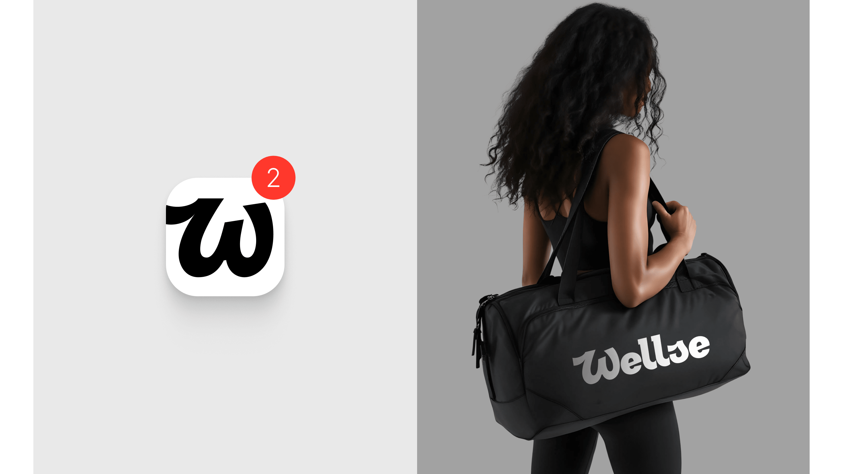
The result is a logo that conveys a sense of calm confidence and flexibility.
It can be scaled easily across digital interfaces, remains recognisable at small sizes and isn’t tied to any specific activity or discipline. To ensure adaptability across platforms, we also developed inverted versions and micro-variants optimised for compact digital environments.
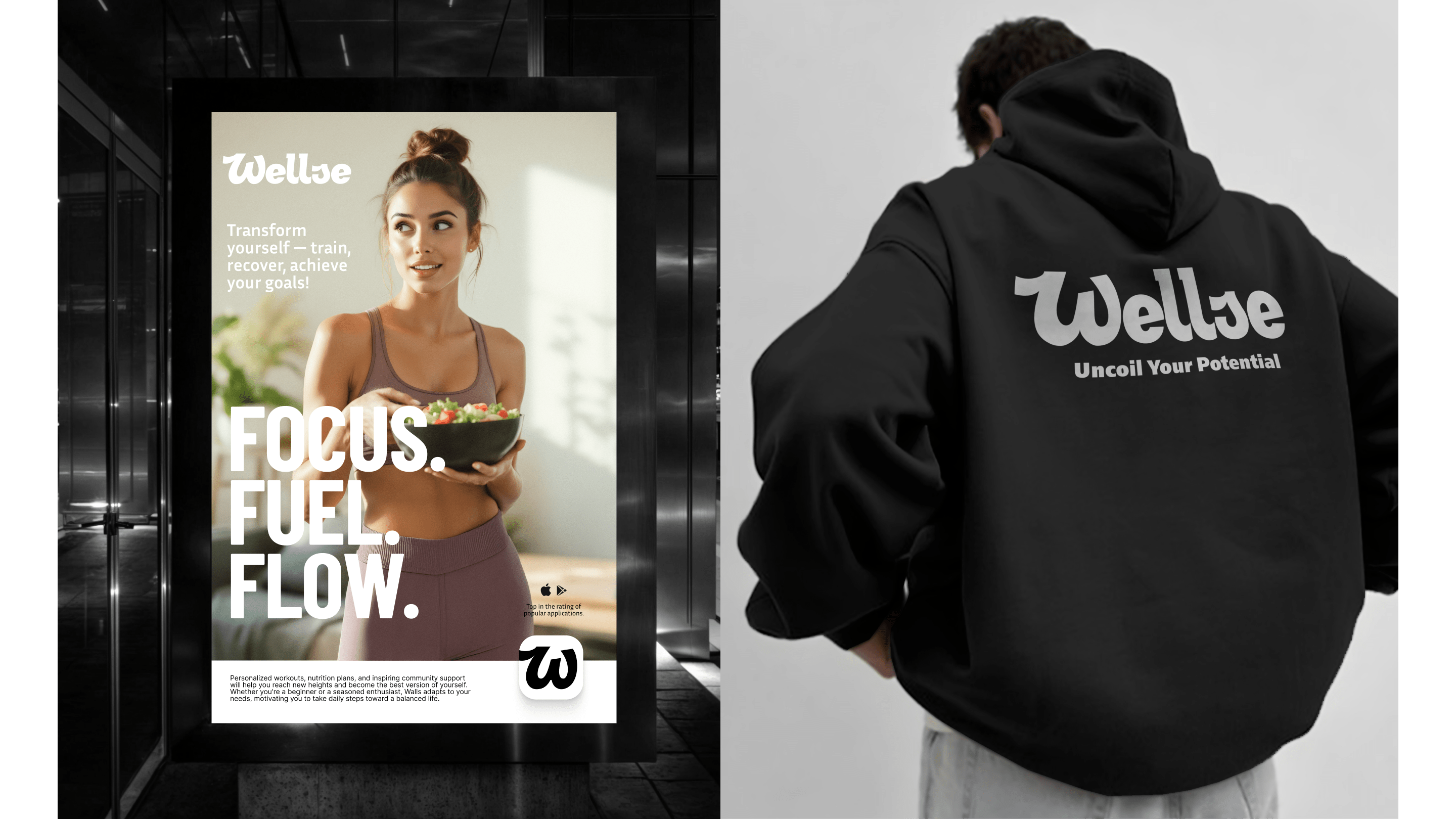
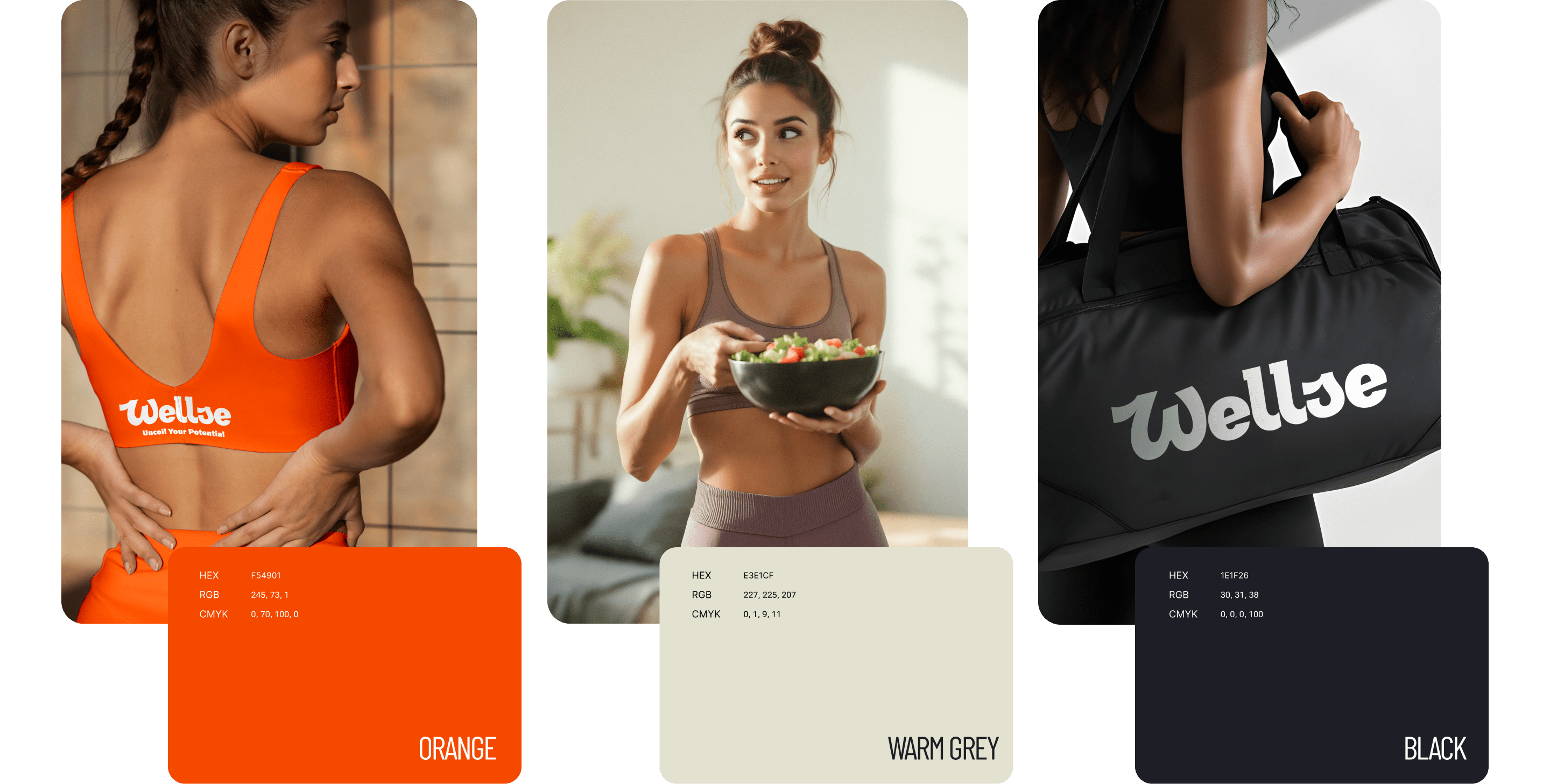
Visual System
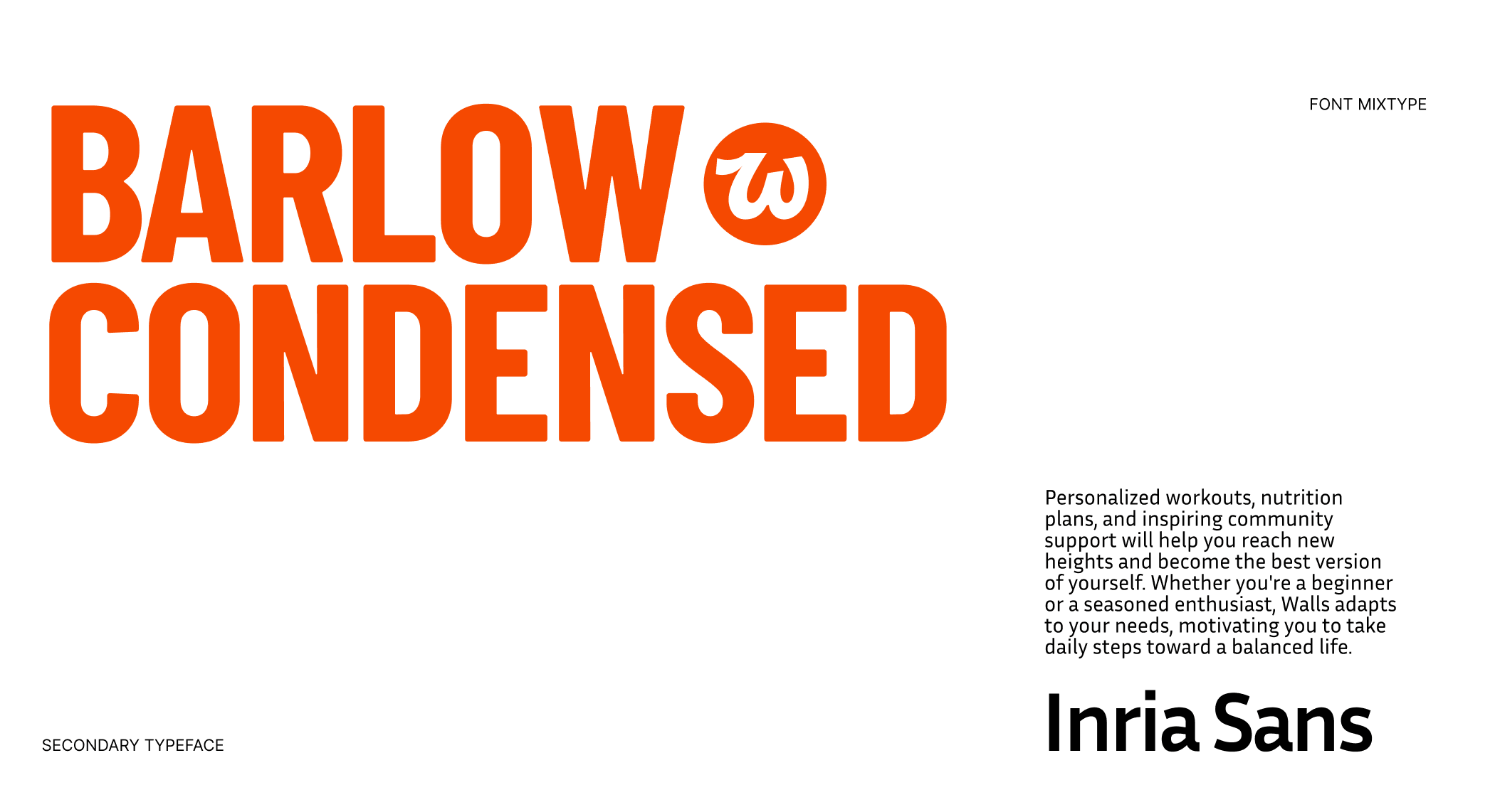
The identity is built on contrast, clarity, and typographic confidence. A bright accent colour works alongside neutral backgrounds to create a bold yet balanced feel — expressive enough to inspire action, calm enough to maintain trust.
Typography reinforces this tone through a strong hierarchy: condensed, energetic headlines paired with clean body text ensure personality and readability across every digital touchpoint.

Designing the Digital Experience
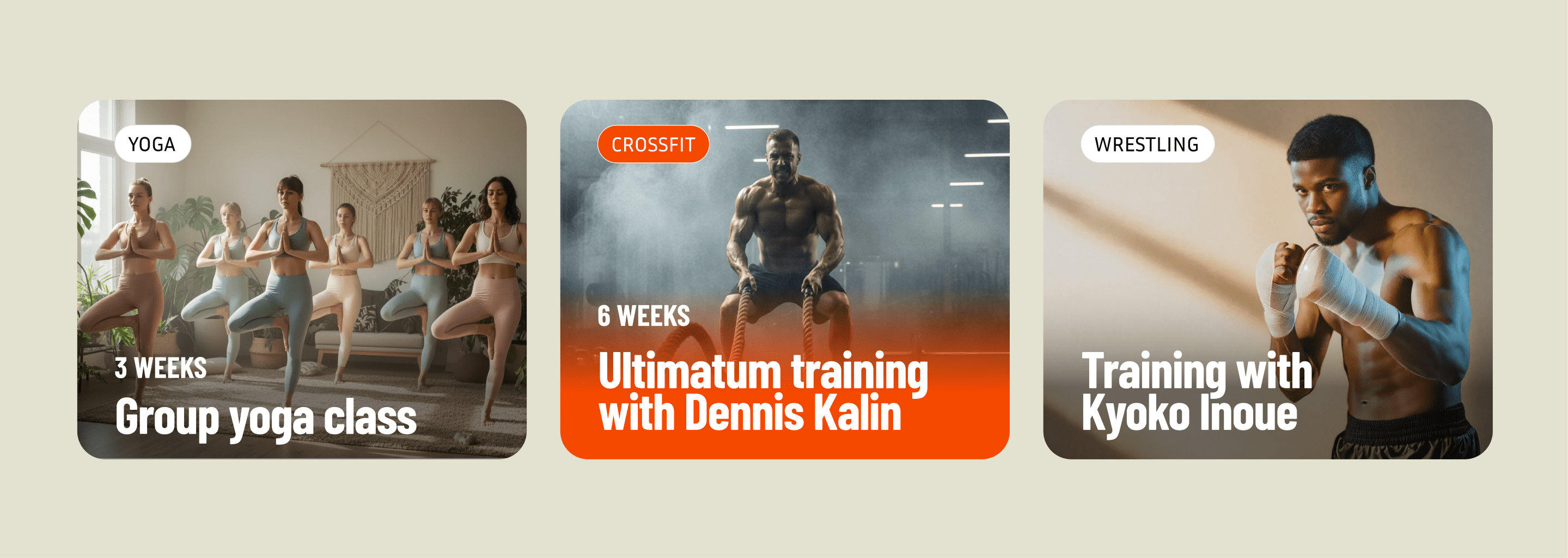
Alongside the brand identity, we designed the Wellse mobile application, translating the visual language into a clear and intuitive product experience.
The app combines the platform’s key features — personalized workouts, nutrition plans, and community interaction — within a structured and easy-to-navigate interface.
Designed to feel supportive rather than demanding, the product helps users build healthy habits through small, consistent steps toward a balanced lifestyle.
A Brand That Stays With You
Wellse isn’t about chasing perfection. It’s about being there for you.
The final identity creates a strong and scalable foundation for the product’s future digital ecosystem. The brand feels modern but warm, universal yet distinctive.
By focusing on people rather than performance, Wellse positions itself not just as a fitness platform, but as a space for sustainable wellbeing and community support.