For business, it’s not about emotion. It’s about confidence
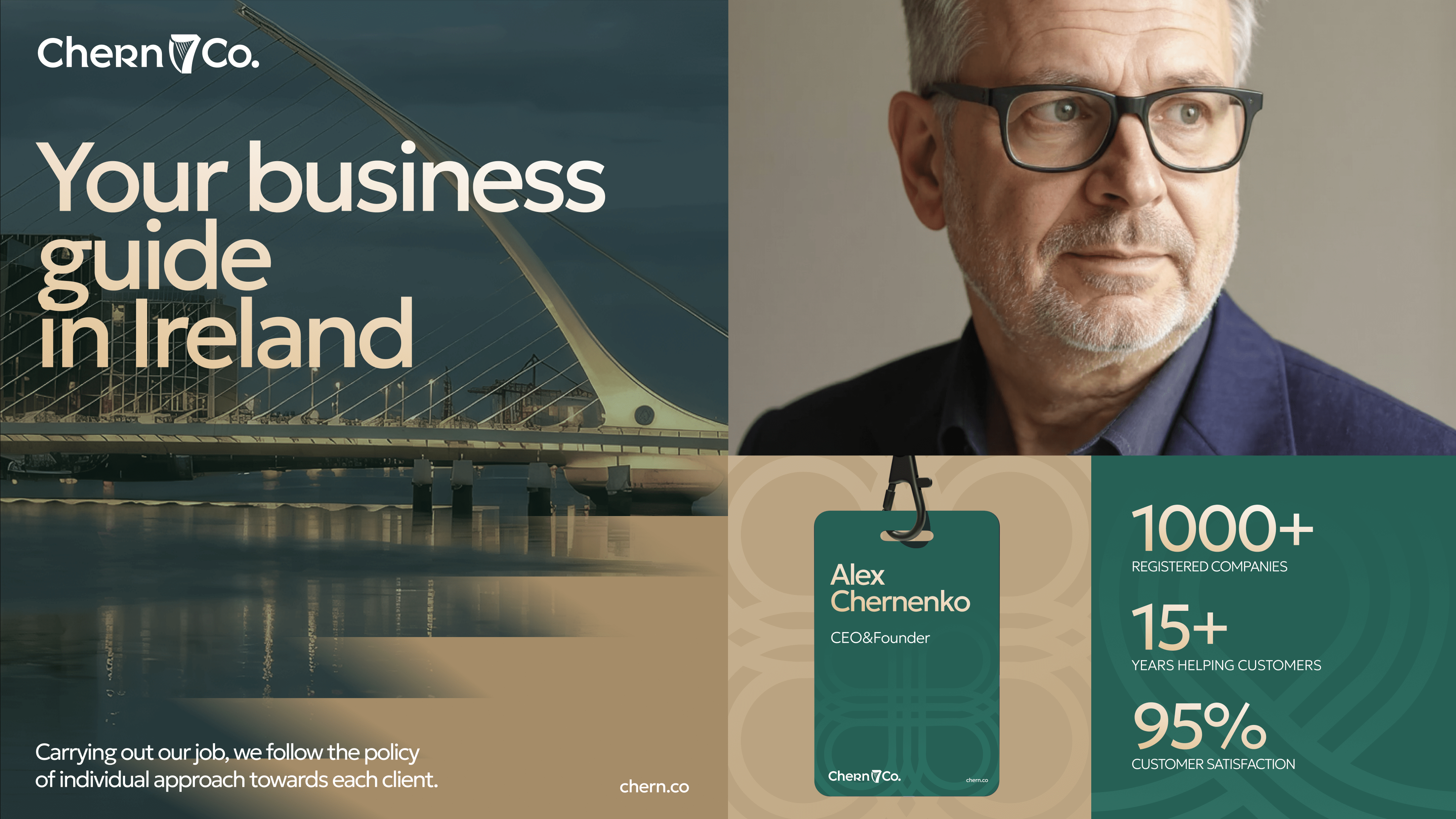
CHERN & CO is a company specializing in business registration and corporate services in Ireland. At the time of engagement, the client was scaling its offering — evolving from a one-time registration provider into a full-service partner, covering accounting, compliance, and interaction with government authorities.
This shift required a brand that would match the new level of service: more structured, more credible, and better aligned with international expectations.
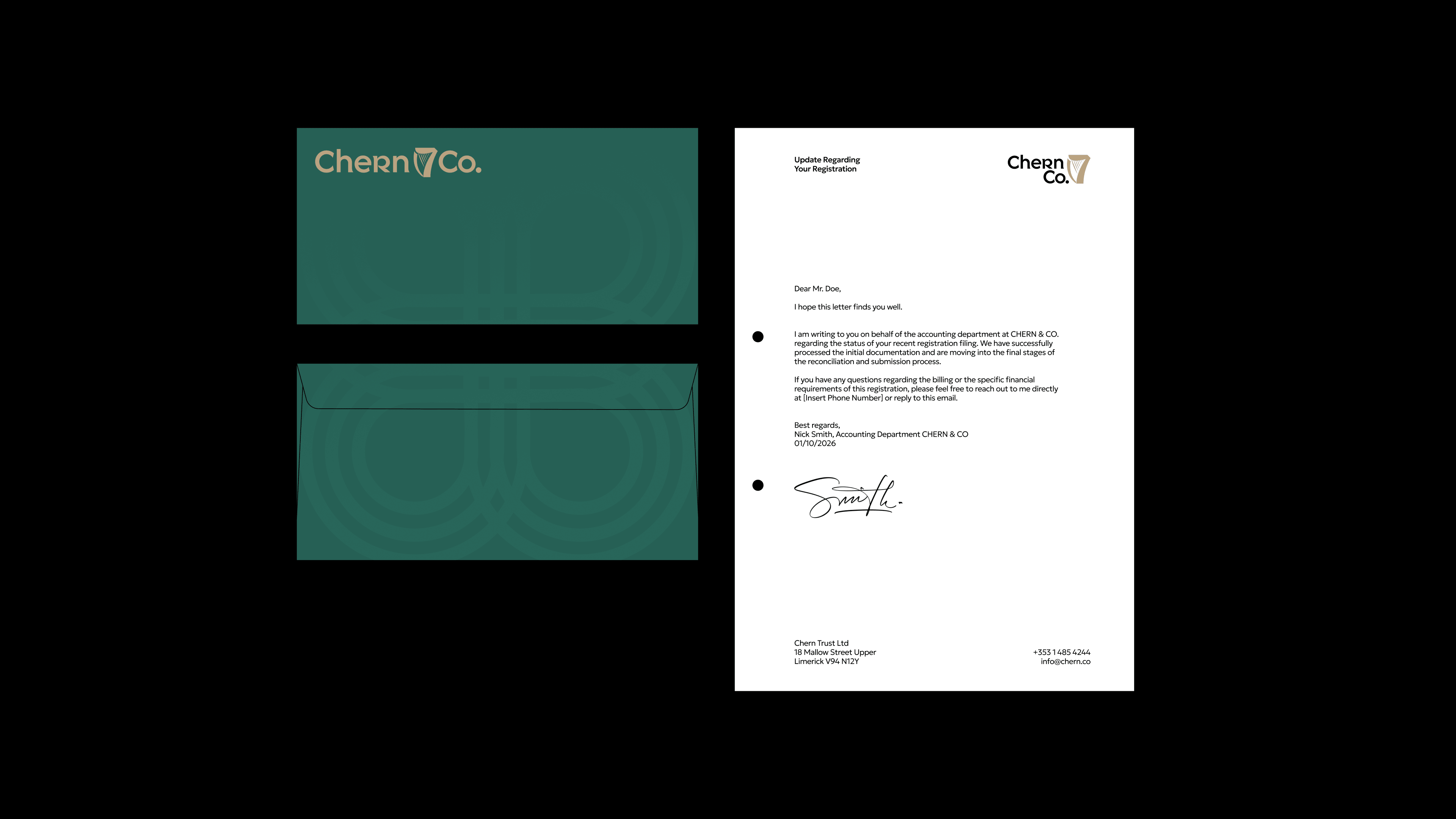
We were brought in to rethink the visual identity and develop a refined branding system — one that communicates trust, clarity and professionalism across both B2B communication and formal governmental contexts.
The Irish context — concise and precise
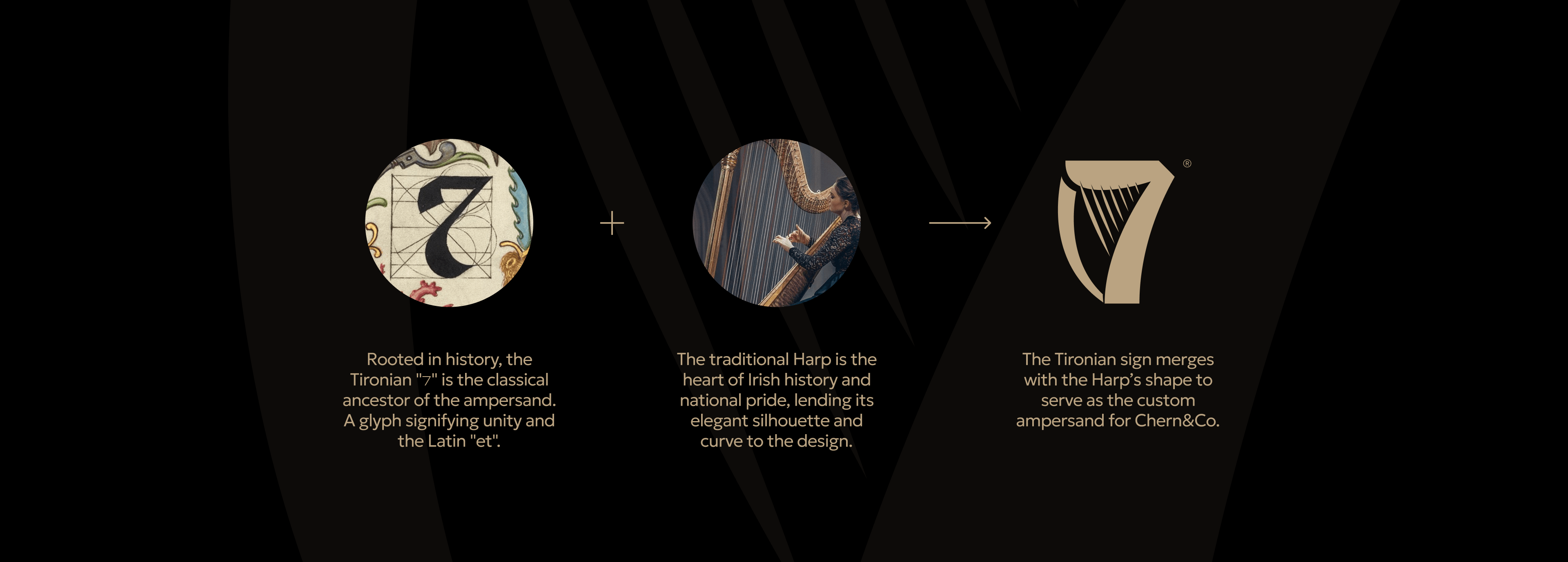
The process began with an analysis of the competitive landscape and visual clichés in the market. Most competitors used simple green and orange colour schemes and the most basic solutions to emphasise reliability.
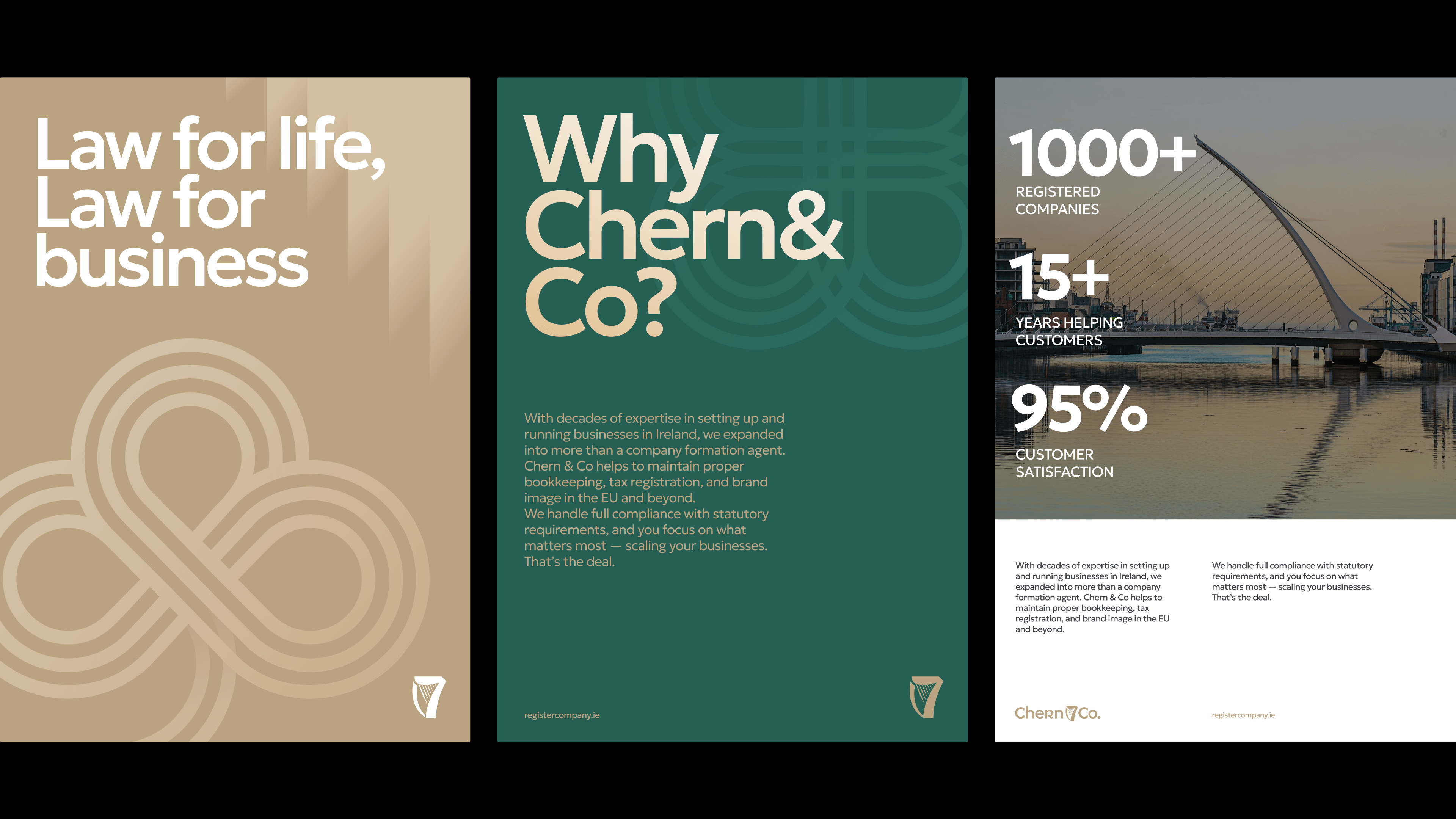
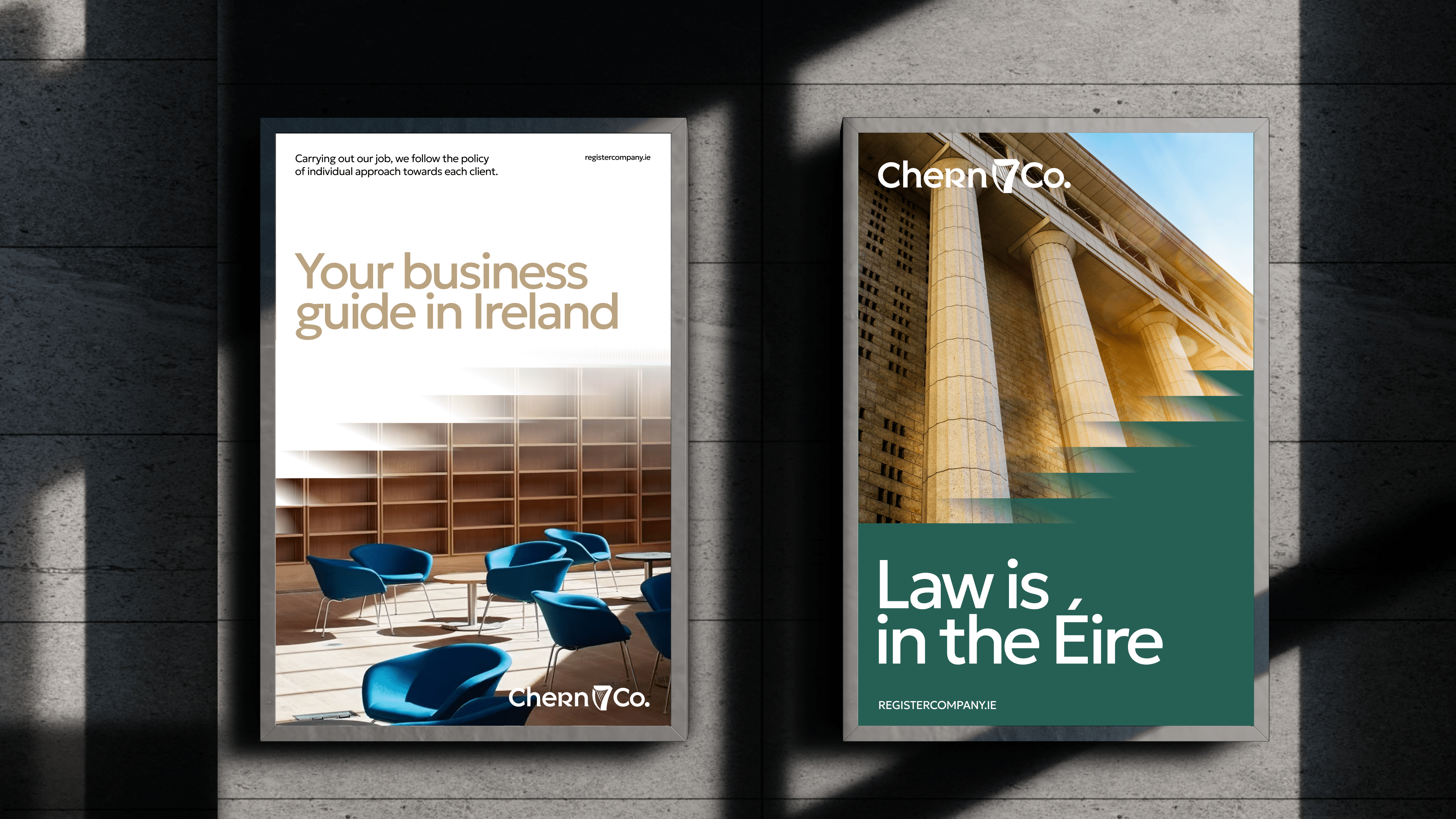
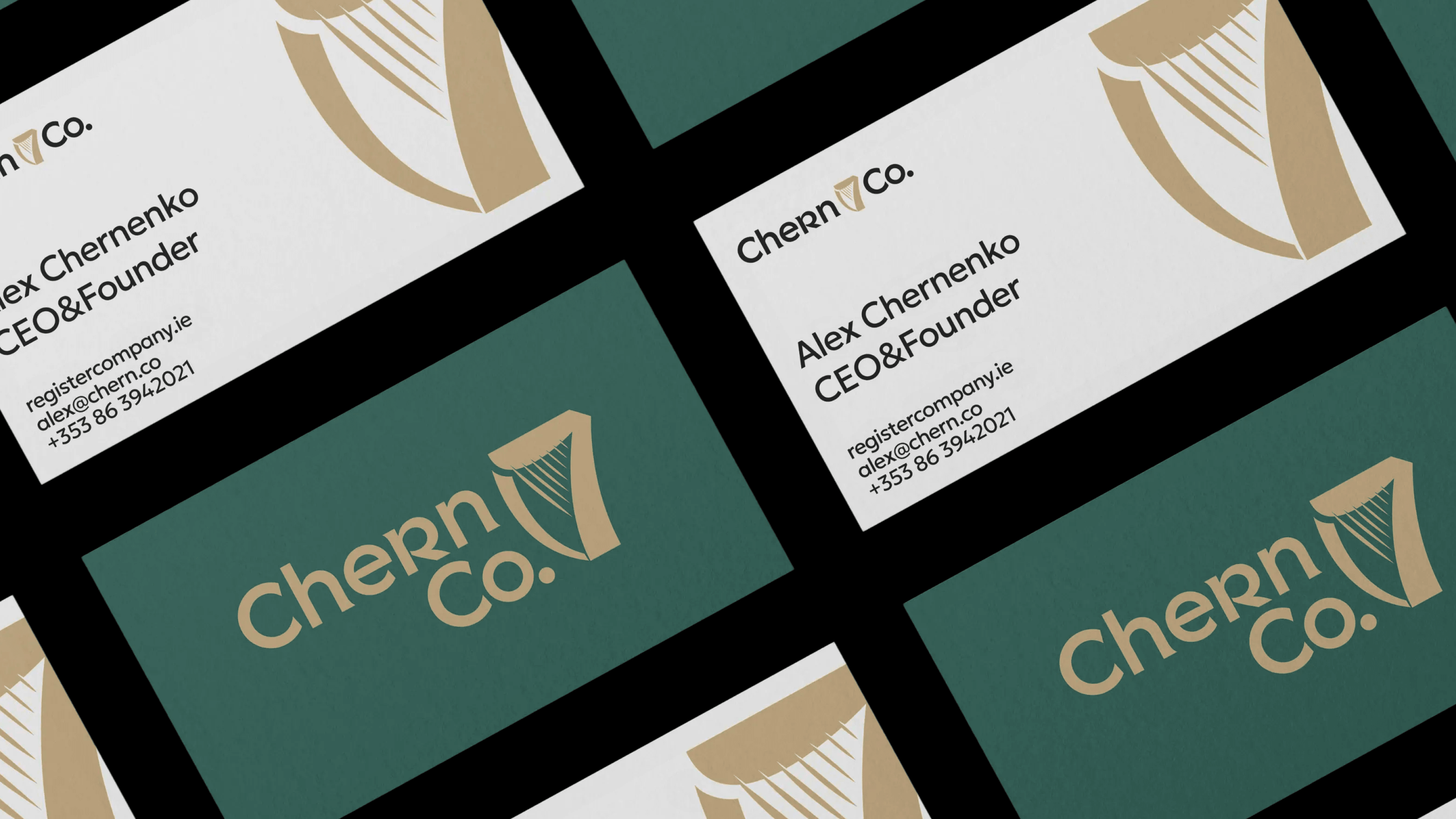
We proposed a more nuanced approach: keeping a subtle Irish reference while avoiding literal national symbols or visual solutions already overused by competitors. Three logo directions were developed within a single conceptual framework, accompanied by a minimal yet carefully considered branding system.
We created a brand that doesn’t distract from the essence of the product
The client is an entrepreneur with a practical mindset who has no interest in «design for design’s sake». Therefore, we focused on clarity, status, and reliability rather than flashiness.
We see CHERN & CO as a guiding brand: it should exude calmness and confidence, helping clients to navigate complex legal processes without creating unnecessary visual noise.