Crowning a New Era in Social Gaming
SweepKing is a growing social online casino that came to Right Studio with a clear ambition: to solidify their position as the “King of Games.” The challenge was to completely reimagine their brand identity, moving away from generic casino tropes to create something premium, bold, and trustworthy.
With a core audience of mature, professional women, the new branding had to feel luxurious and rewarding—never gimmicky, always trustworthy.
Our scope covered the full brand identity system: logo, mascot, color palette, typography, custom iconography, in-game 3D assets, seasonal adaptations, and a comprehensive brand book.
Heavy is the Crown: a Logo built for the Throne
For the logo, we moved away from cliché literal crowns and focused on typographic weight and classic American advertising aesthetics.
We developed a custom, heavy block font that projects monumental reliability, luxury, and confidence. To tie the typography to the core mechanics of the game, we replaced the dot on the ‘i’ with a sharp, embedded crystal—a subtle nod to classic casino rewards.
For maximum versatility across digital touchpoints, we also designed a punchy, two-letter “SK” monogram optimized for mobile app icons and avatars.
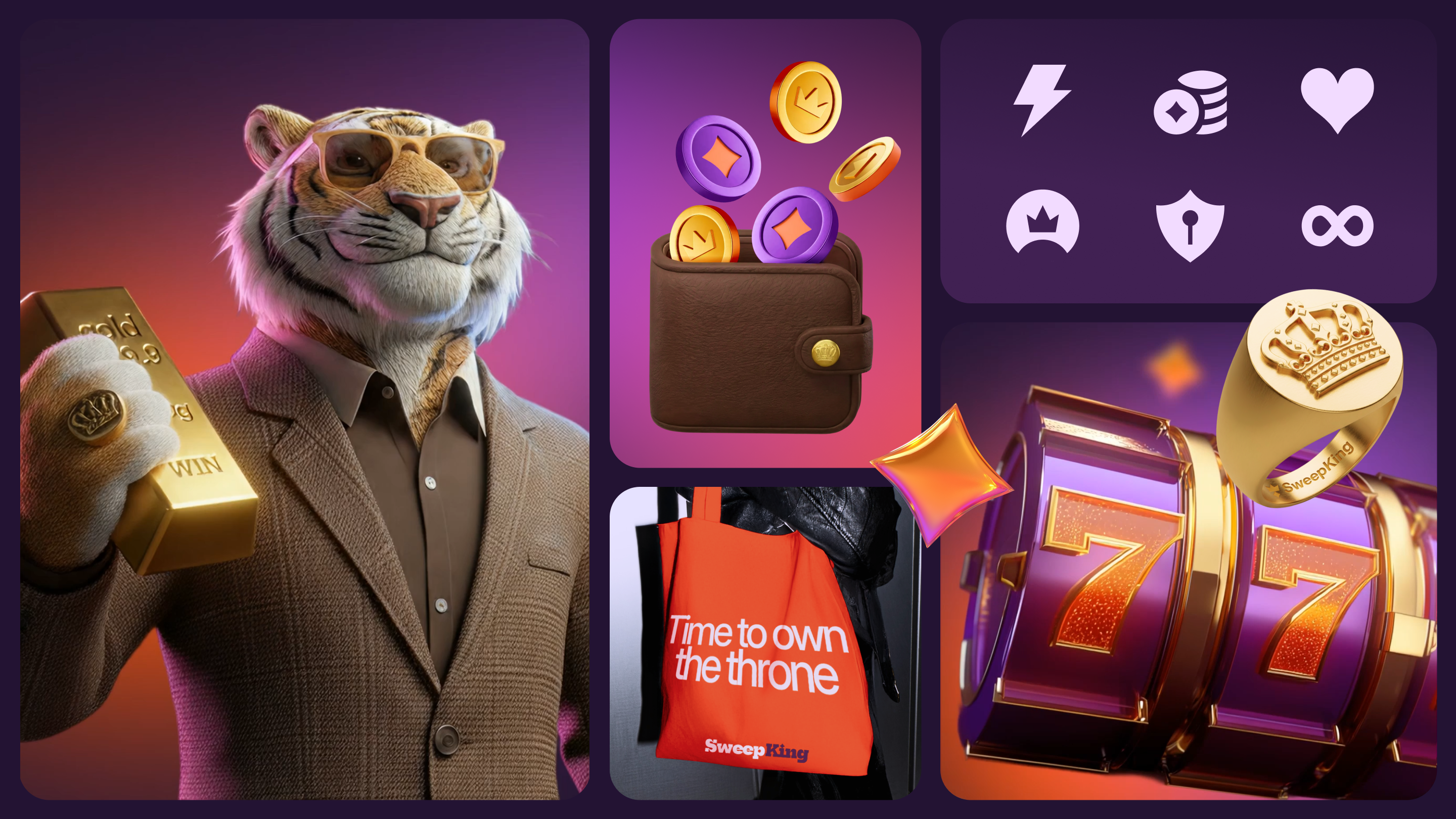
Enter the King: сharisma, сlaws, and generative AI
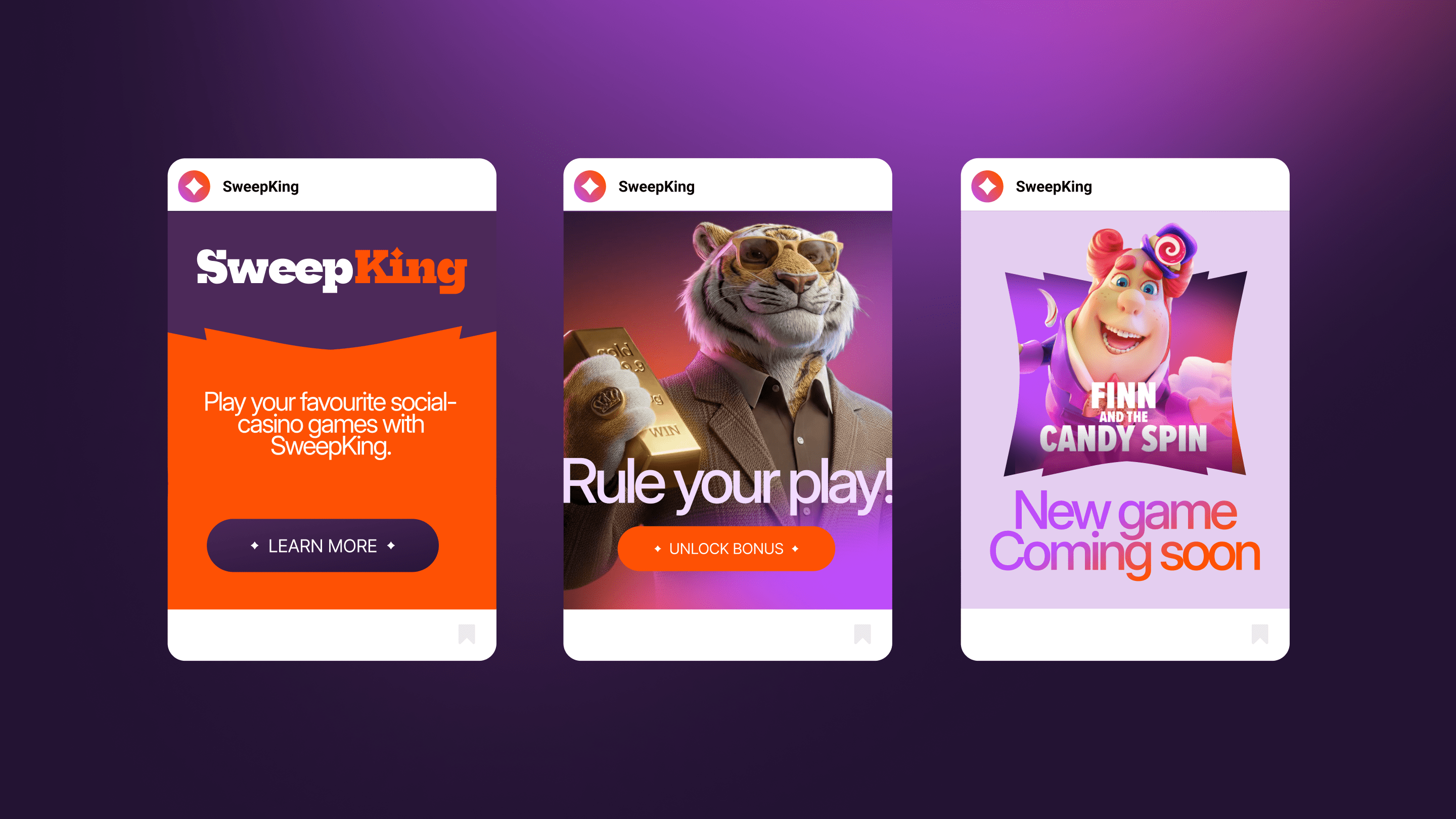
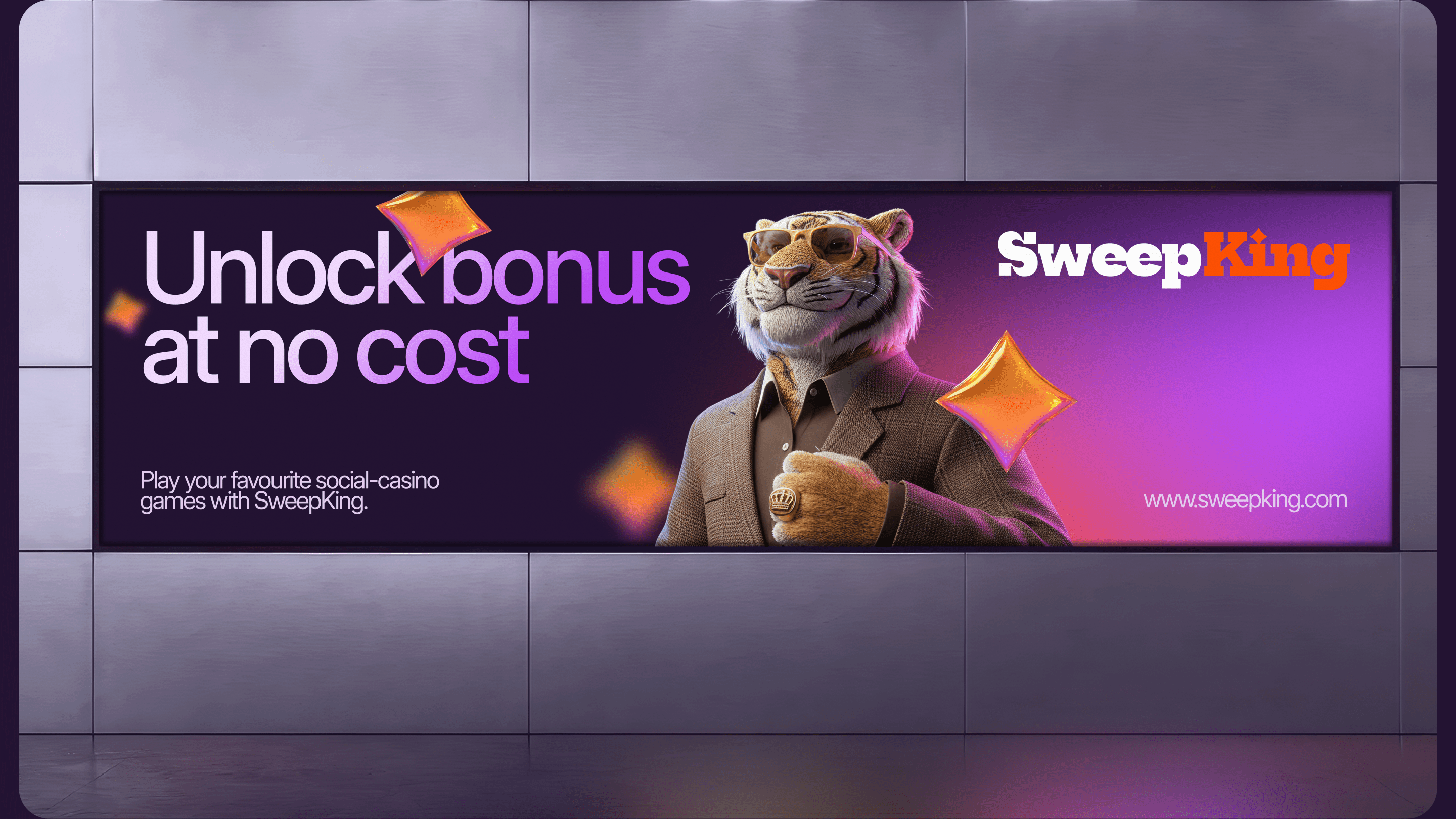
The brand needed a face, so we introduced our mascot: a confident, gentlemanly tiger in a tailored suit and sunglasses. He’s relatable, charismatic, and radiates success.
To bring him to life across dozens of use cases, Right Studio leveraged Generative AI as a core part of the production pipeline — enabling us to produce highly consistent character poses and emotional states at a speed and cost that traditional 3D rendering simply can’t match.
For the color palette, we refined the client’s vision by moving away from standard casino hues. We anchored the brand in a deep, regal “Eggplant” (dark magenta) base, accented by a highly contrasting, vibrant orange. This combination, paired with a subtle, soft-contrast tiger print background, creates a rich, recognizable, and highly clickable UI environment.


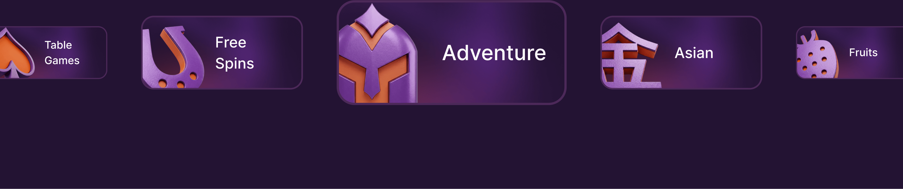
The language of Luck: custom iconography
A seamless user experience requires a cohesive visual language. We translated the brand’s bold identity into a custom library of 60+ icons designed specifically for the platform’s interface.
From navigation elements to game categories, every symbol was crafted to be instantly recognizable. The solid, clean, white shapes provide perfect contrast against the dark eggplant background, ensuring intuitive player navigation across both desktop and mobile platforms.
Visualizing the Win: tactile 3D assets and currencies
In a social casino, the thrill of the win is everything, so the rewards had to look incredibly satisfying. We designed tactile, visually striking in-game assets—from glossy, glass-like crystals to heavy gold bars, Sweeps Coins, and vibrant slot machines.
Here again, our AI-assisted workflow proved invaluable, allowing us to quickly iterate and produce high-quality, glossy 3D elements that perfectly match the premium aesthetic. The result is an in-game economy that feels tangible, rewarding, and seamlessly integrated into the SweepKing universe.
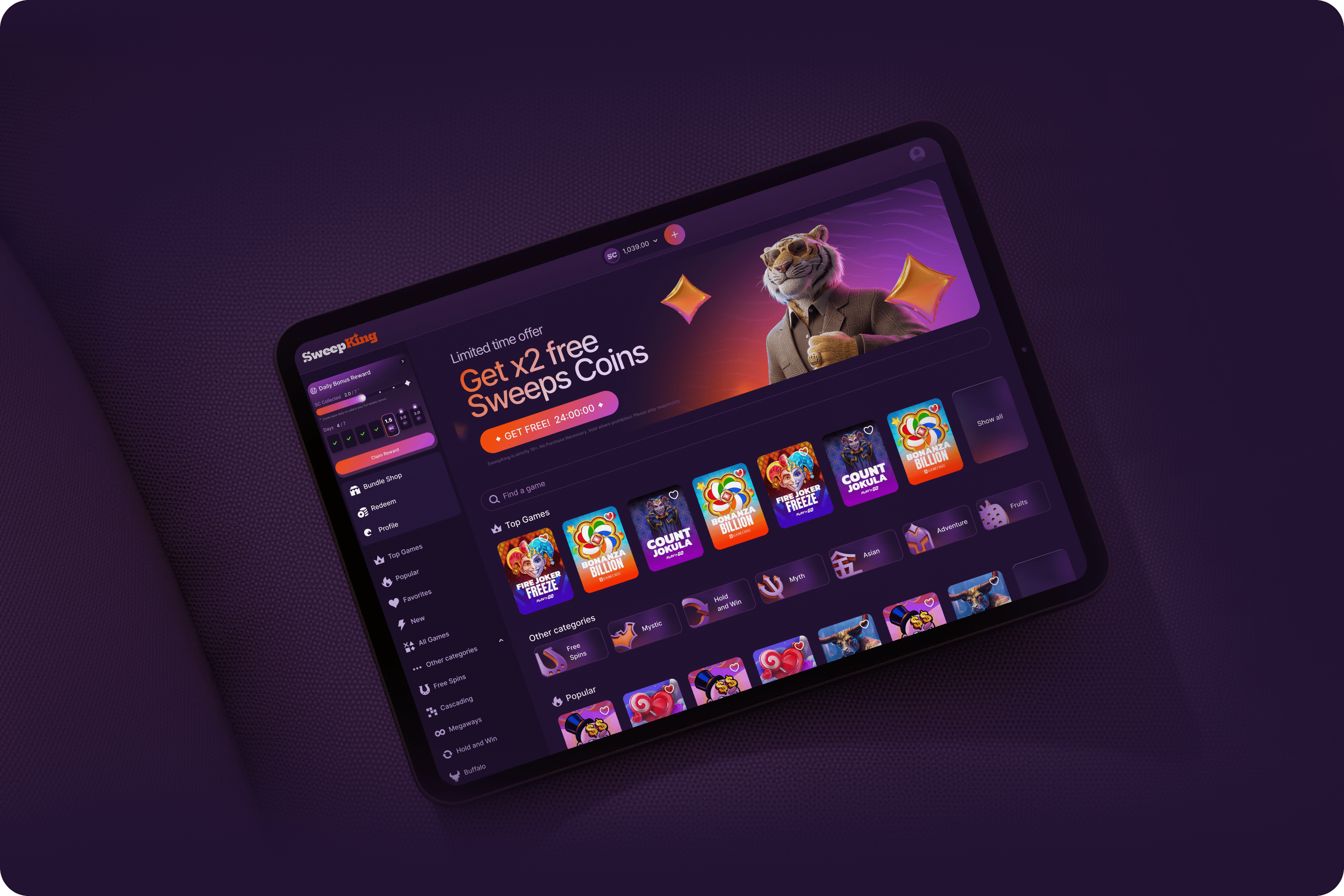
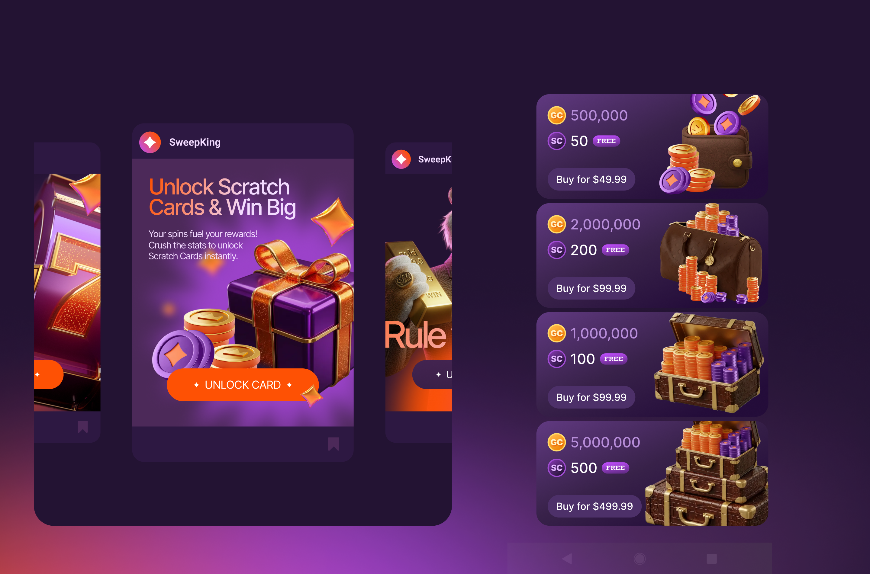
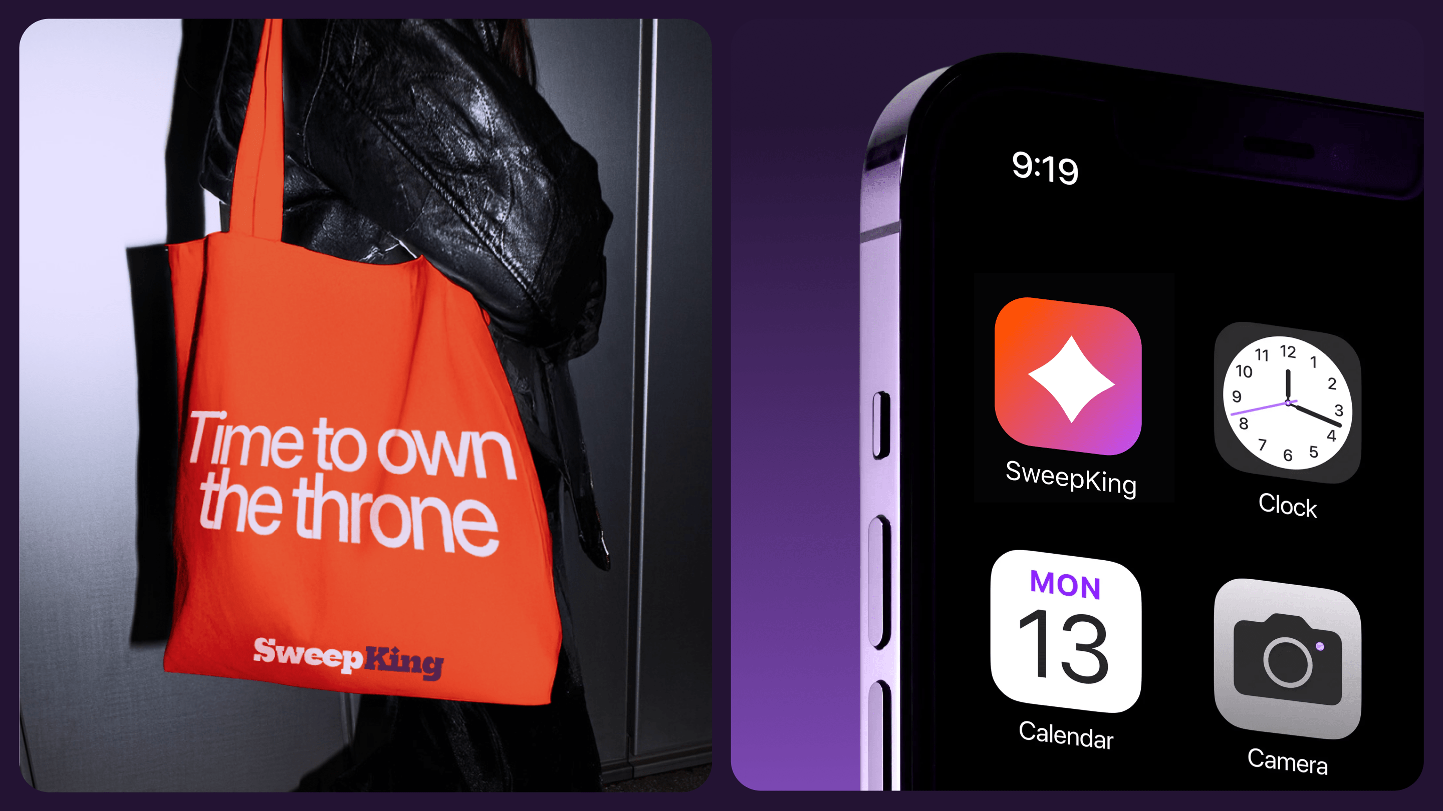
Owning the Space: from app screens to tote bags
A strong identity must scale effortlessly. We designed the SweepKing branding to look just as impactful on a towering digital banner ad as it does on a compact smartphone screen.
We extended the visual guidelines across various brand touchpoints, ensuring consistency in promotional banners, UI pop-ups, and even physical merchandise like a vibrant orange tote bag with the bold brand tagline: “Time to own the throne.”
A King for all seasons: festive adaptations
A dynamic product needs a flexible brand. To bring holiday cheer to the platform, we created a cohesive set of Christmas design assets.
Thanks to our AI-driven production process, we easily adapted our charismatic tiger mascot—dressing him in a Santa suit—and generated thematic 3D elements like candy canes, gingerbread men, and wrapped gifts.
This seasonal flexibility allows SweepKing to keep the user experience fresh, visually compelling, and culturally relevant all year round. This isn’t a one-off holiday reskin — it’s a repeatable, scalable framework that lets SweepKing roll out themed campaigns for any occasion with minimal turnaround.


Long Live the King: results and impact
In under five weeks, Right Studio delivered a complete brand identity system — from strategic concept to a production-ready brand book — for a product operating in one of the most visually saturated markets in digital entertainment. By combining sharp creative direction with an AI-augmented production pipeline, we gave SweepKing a visual language that is unmistakably its own: bold enough to stand out in a crowded app store, refined enough to earn trust, and flexible enough to evolve with every new season, feature, and market.
The SweepKing team launched with a unified brand that finally matches their ambition — and a mascot that players actually remember.