From a small coffee shop to an entire chain with its own production facilities
With the growth of the chain and the launch of its own production, the company decided to scale through franchising. However, an outdated logo and unsystematic visual communication made it difficult to manage the brand and therefore scale.
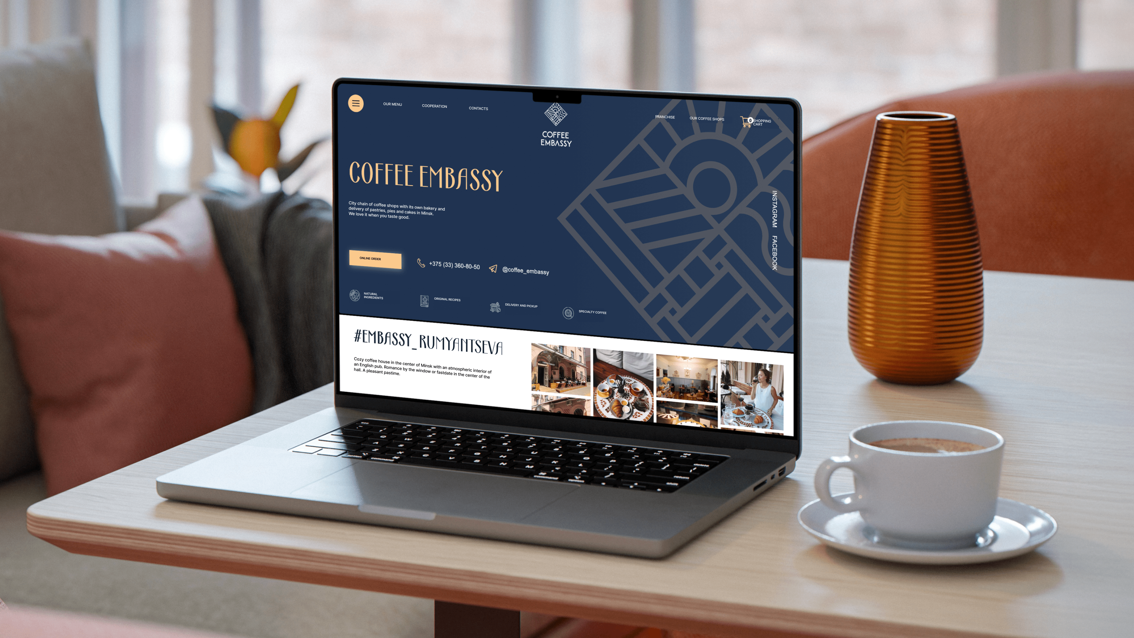
So our task was not only to refresh Coffee Embassy’s visual identity, but also to create a flexible branding system that would serve as a foundation for scaling through franchising and maintain a consistent brand identity at all levels.
Go for it!
Coffee Embassy — an embassy of flavour and spirits
The first café was opened in the former South African embassy building in Minsk — hence the name: Coffee Embassy. But over time, the brand has become more than just a café and the history of a building — so we rethought the name and created a new concept that emphasises the multiculturalism, eclecticism and richness of the brand.
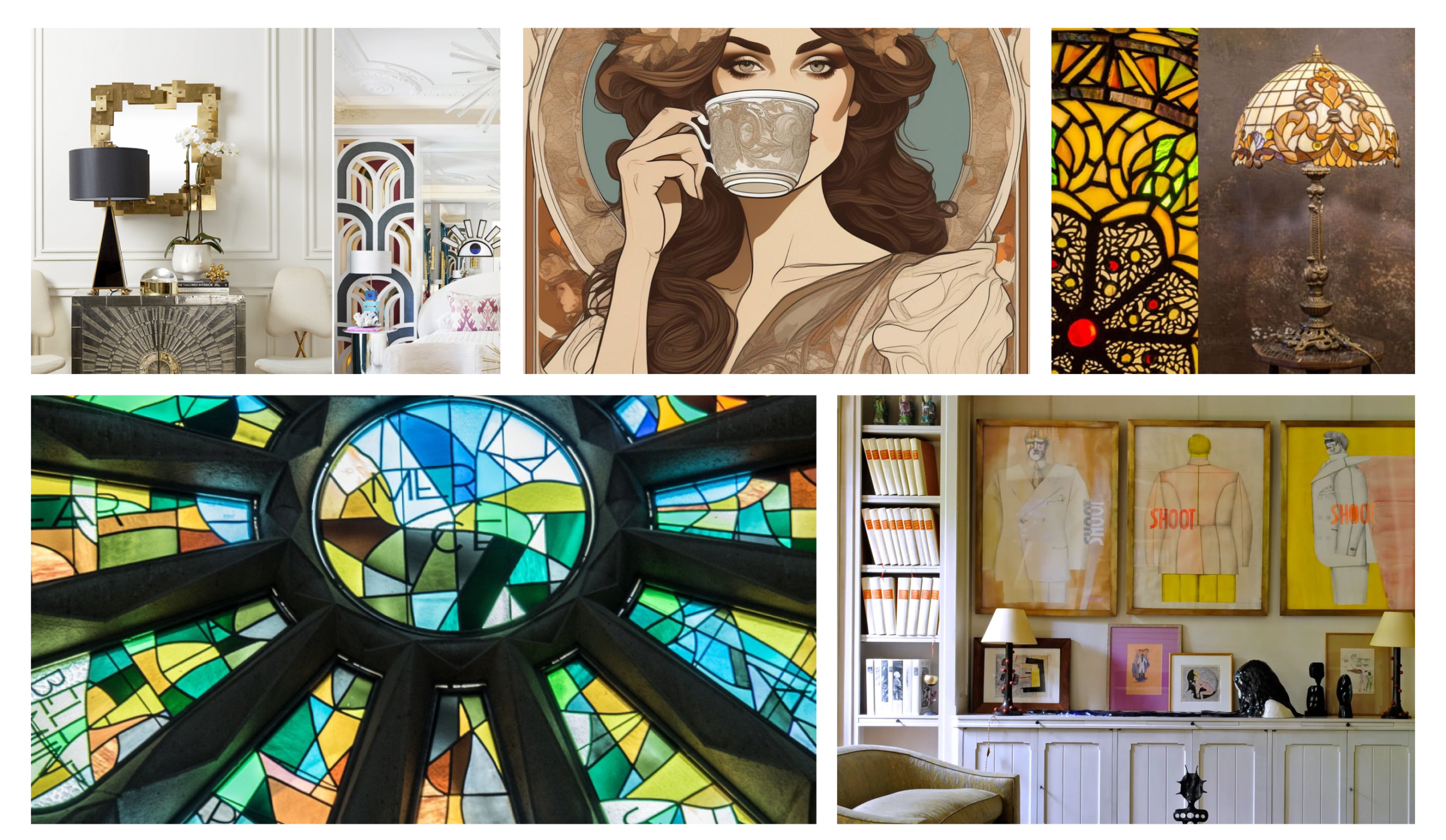
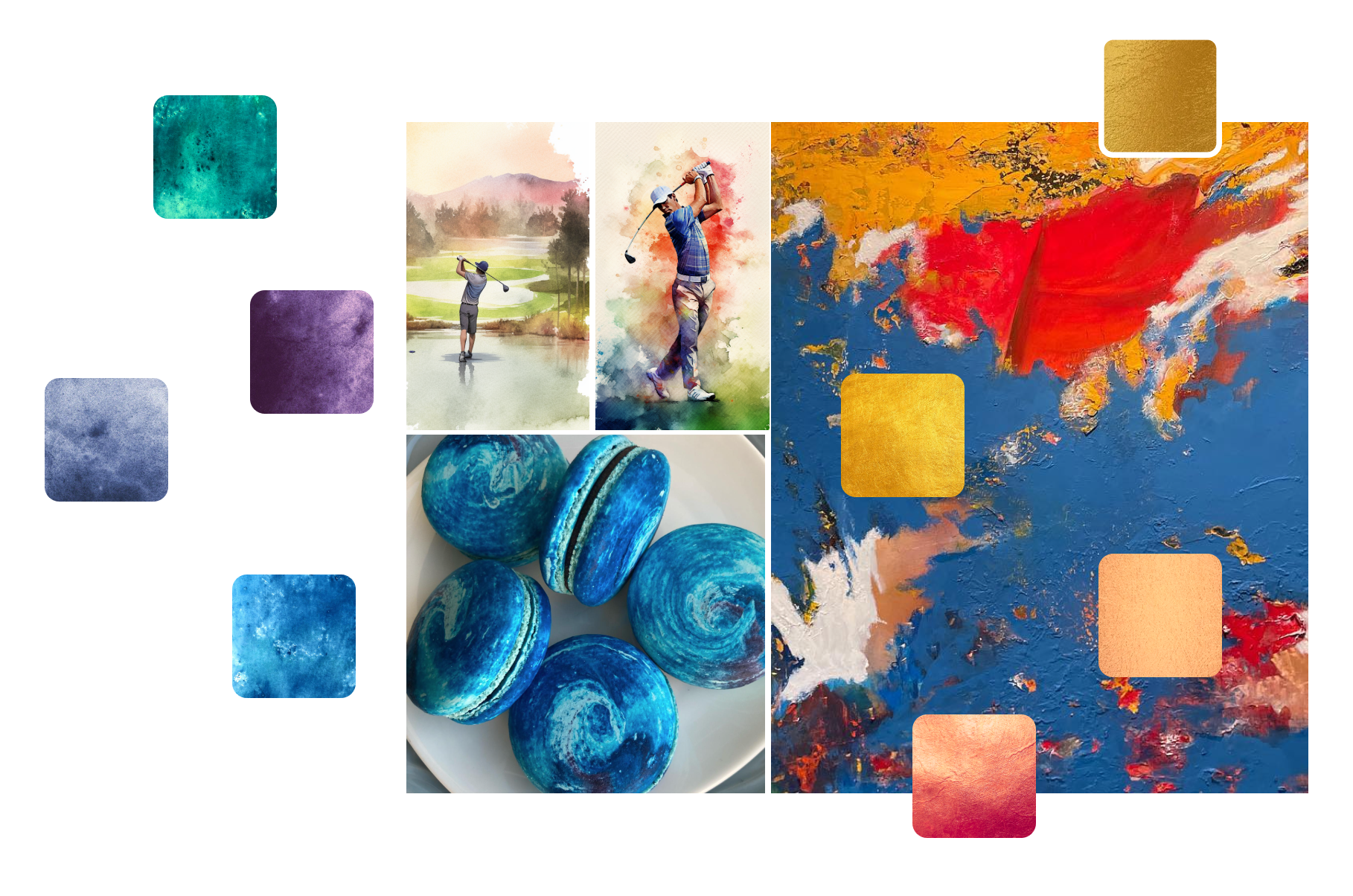
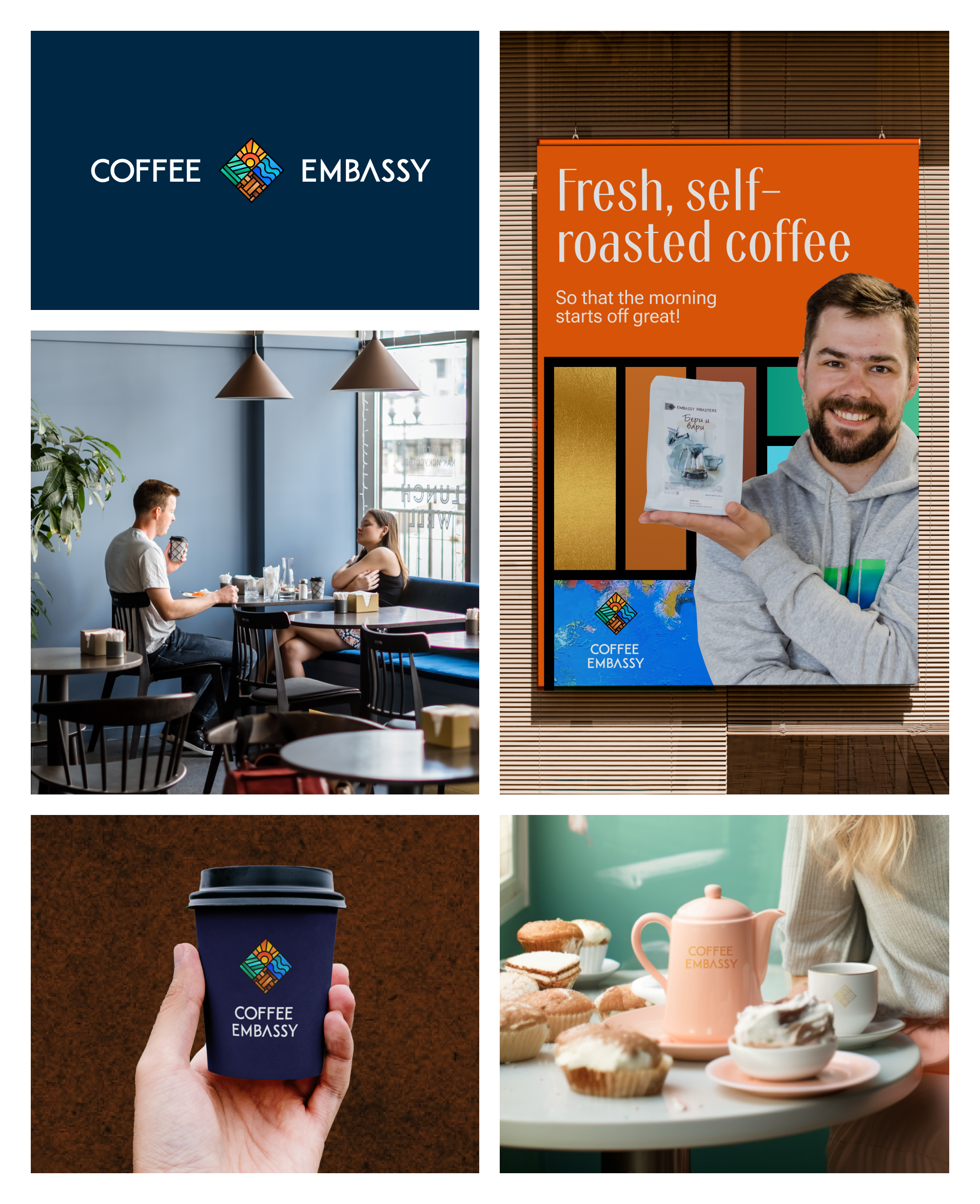
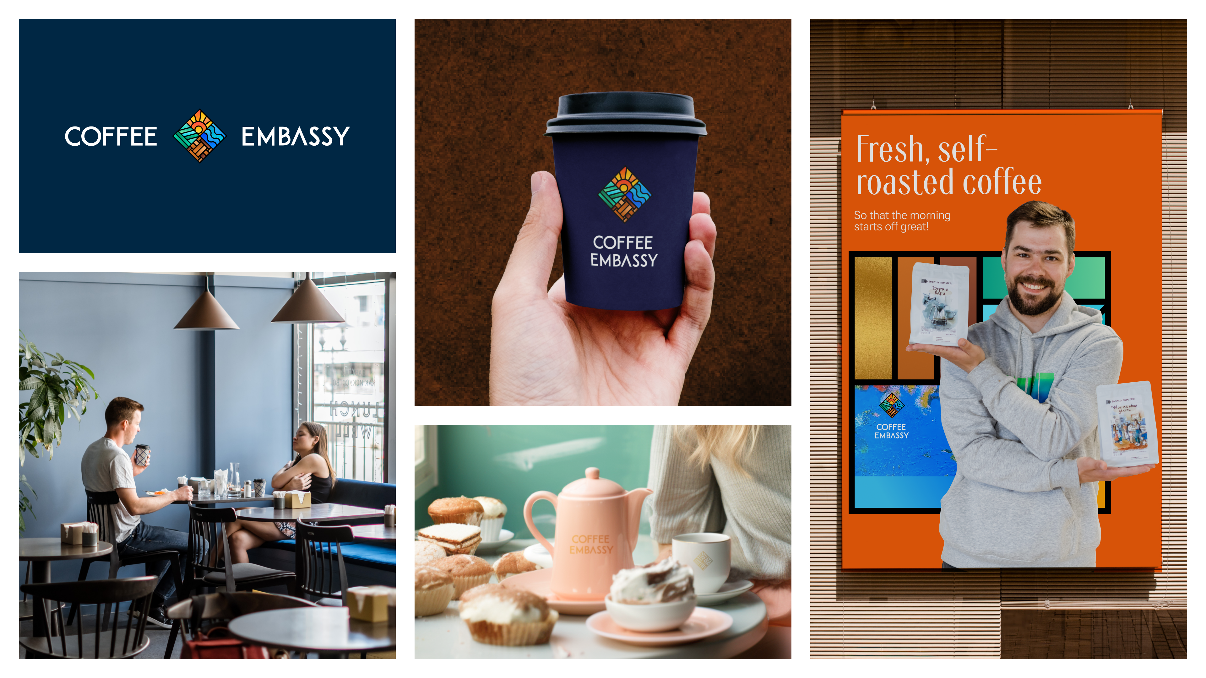
The idea of multiculturalism is reflected in the menu and interior, and became the basis for the new visual identity. The font architecture has Art Deco elements, while the stained-glass style of the logo refers to Art Nouveau: Tiffany lamps, works by Alphonse Mucha and, of course, light.

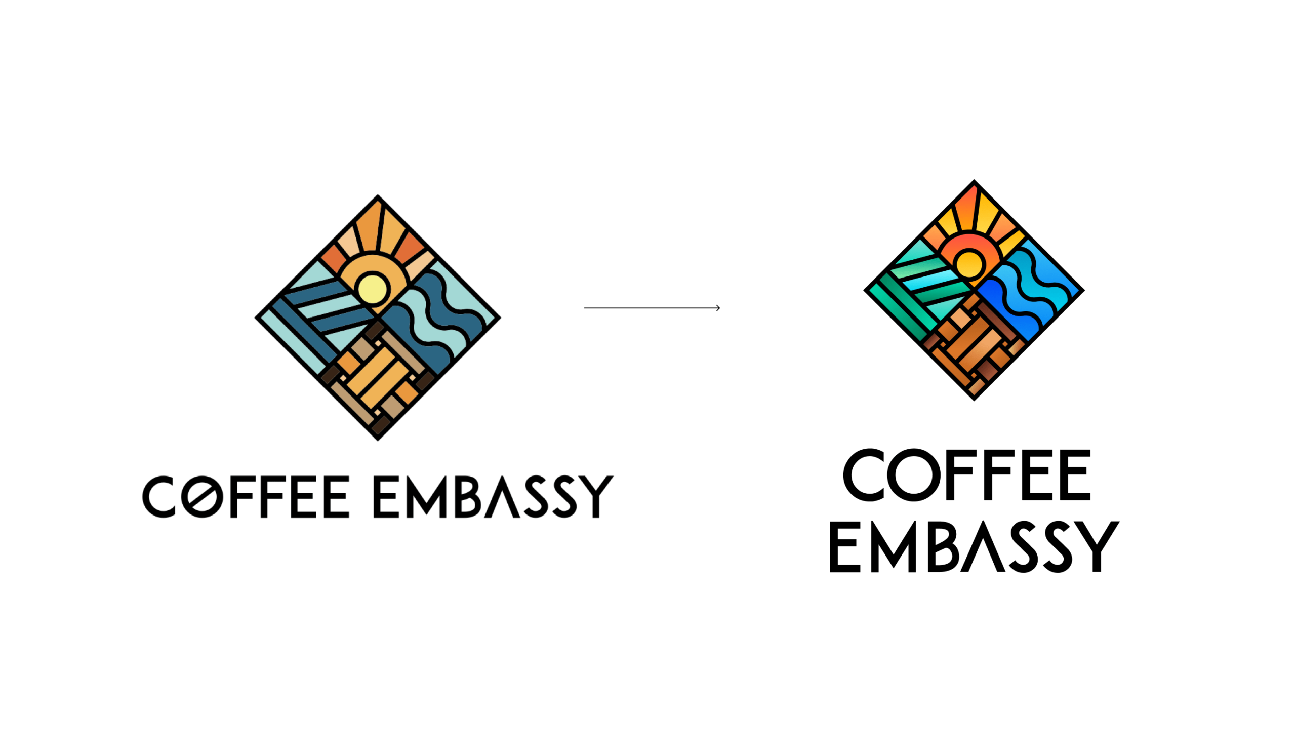
Adaptive logo
We respect the history of the brand and inherit the Coffee Embassy logo, but adapt it to today’s challenges.
We make the colours of the brand active in the online environment and seem to glow — like in stained glass windows. We got rid of the rabusta symbol in the letter ’O’, which resembles a pill. We optically flattened all the letters, slightly raising their ’waists’ – giving us an Art Deco style of communication.

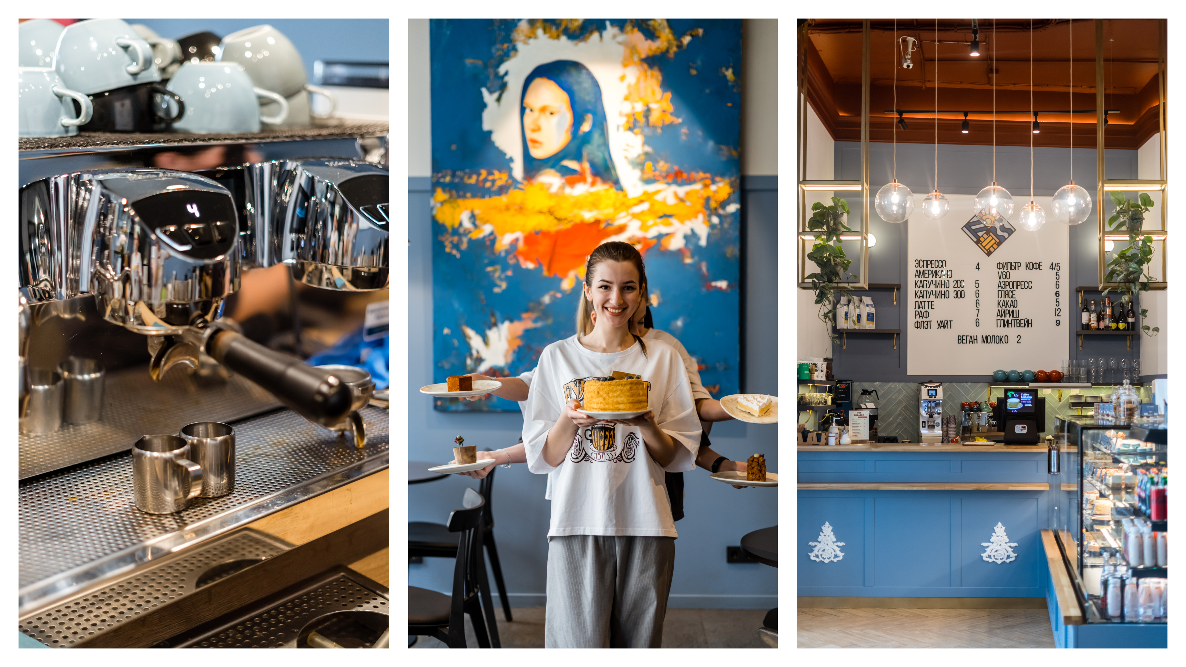
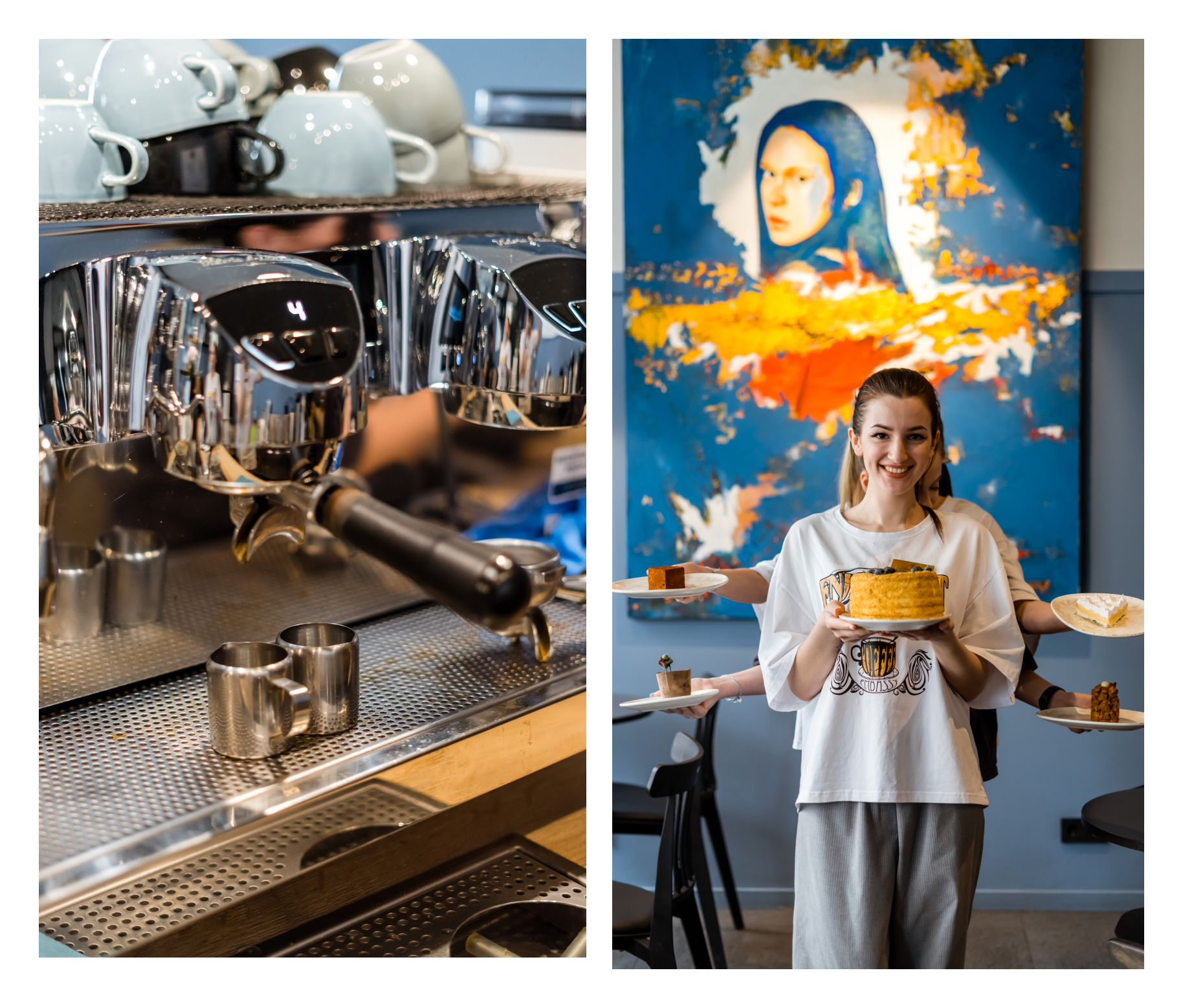
The logo is multi-elemented. To make it readable and recognisable on all sizes of media, we create different versions. We reduce the level of detail on small formats, but keep the expressiveness — a logo for all occasions is ready!
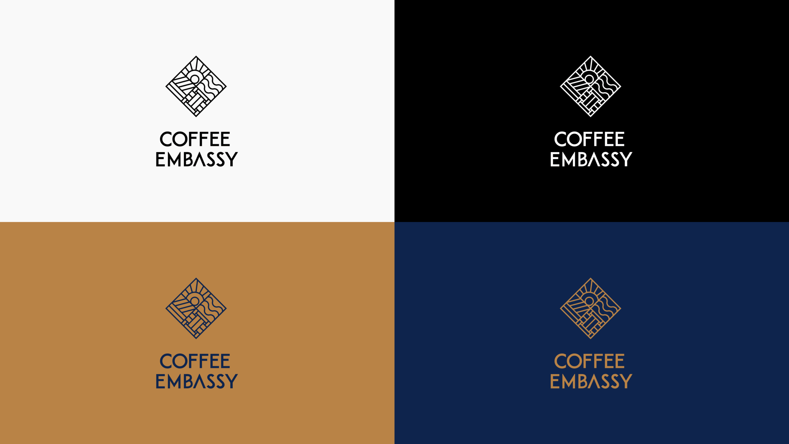
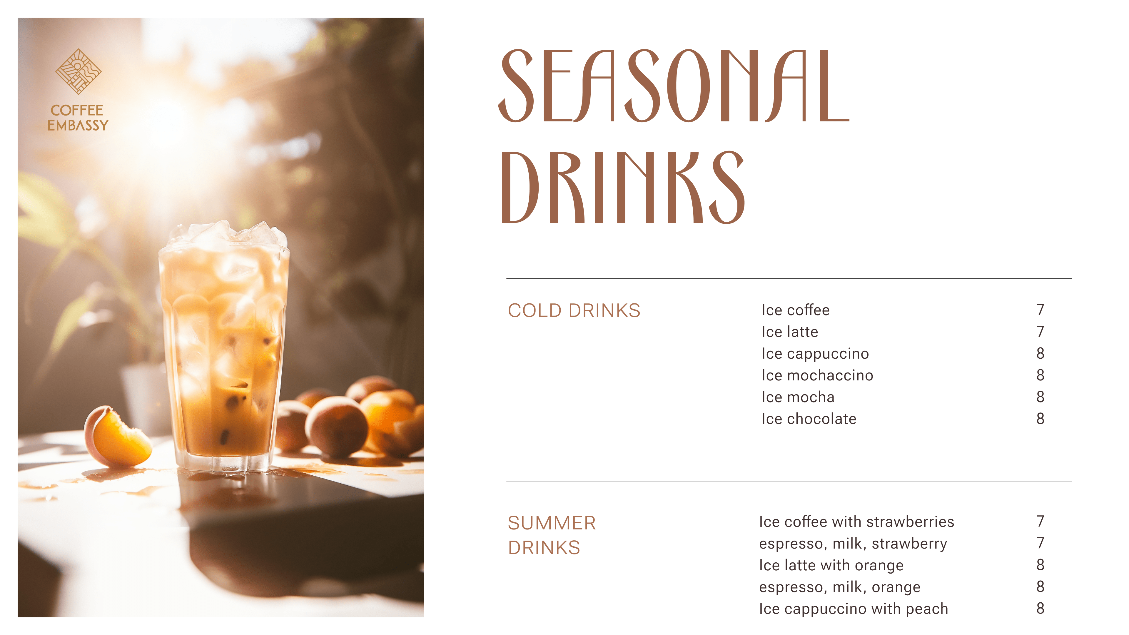
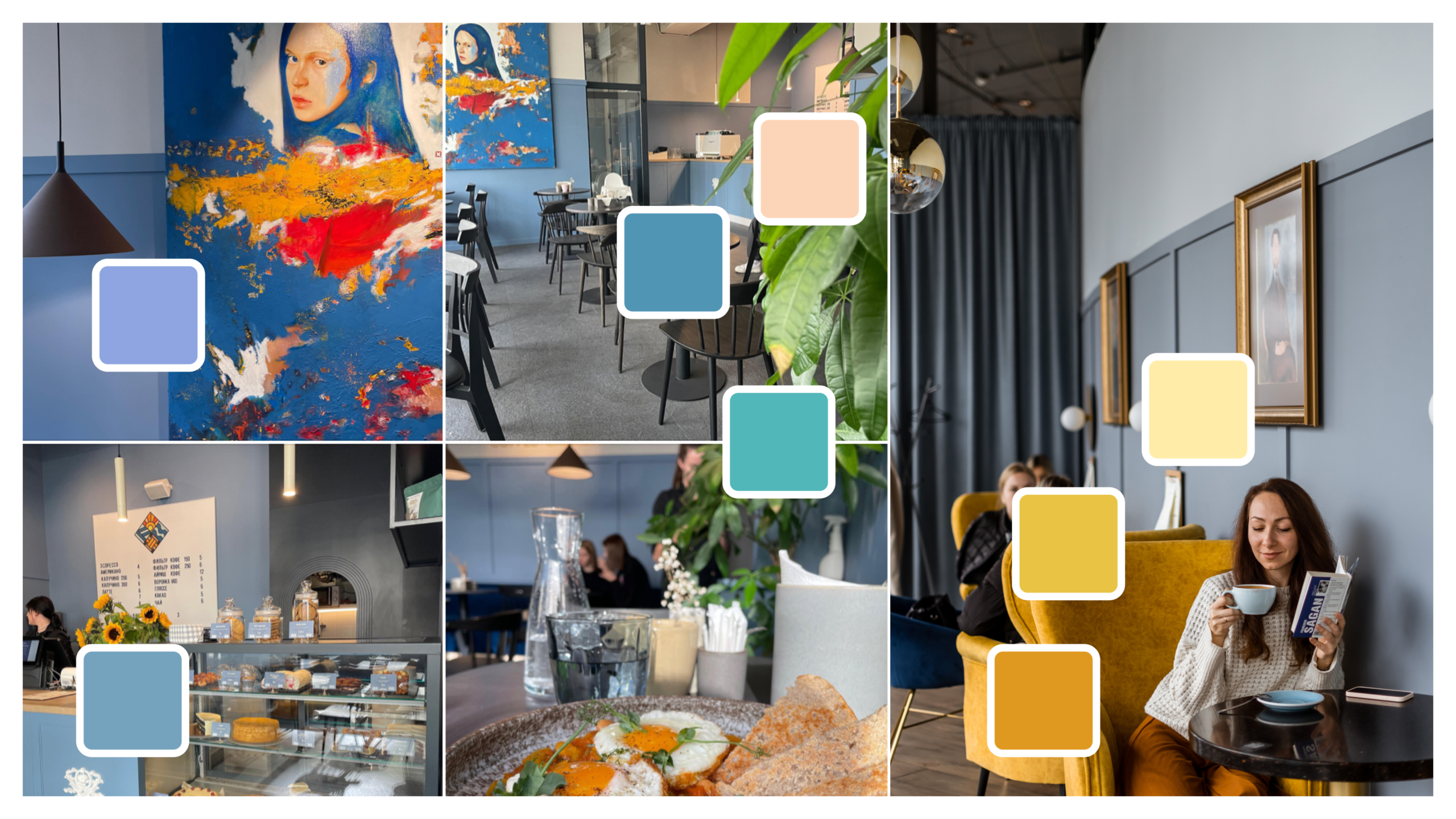
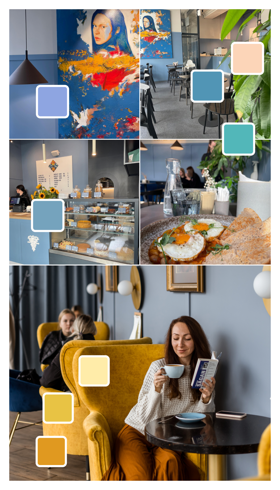
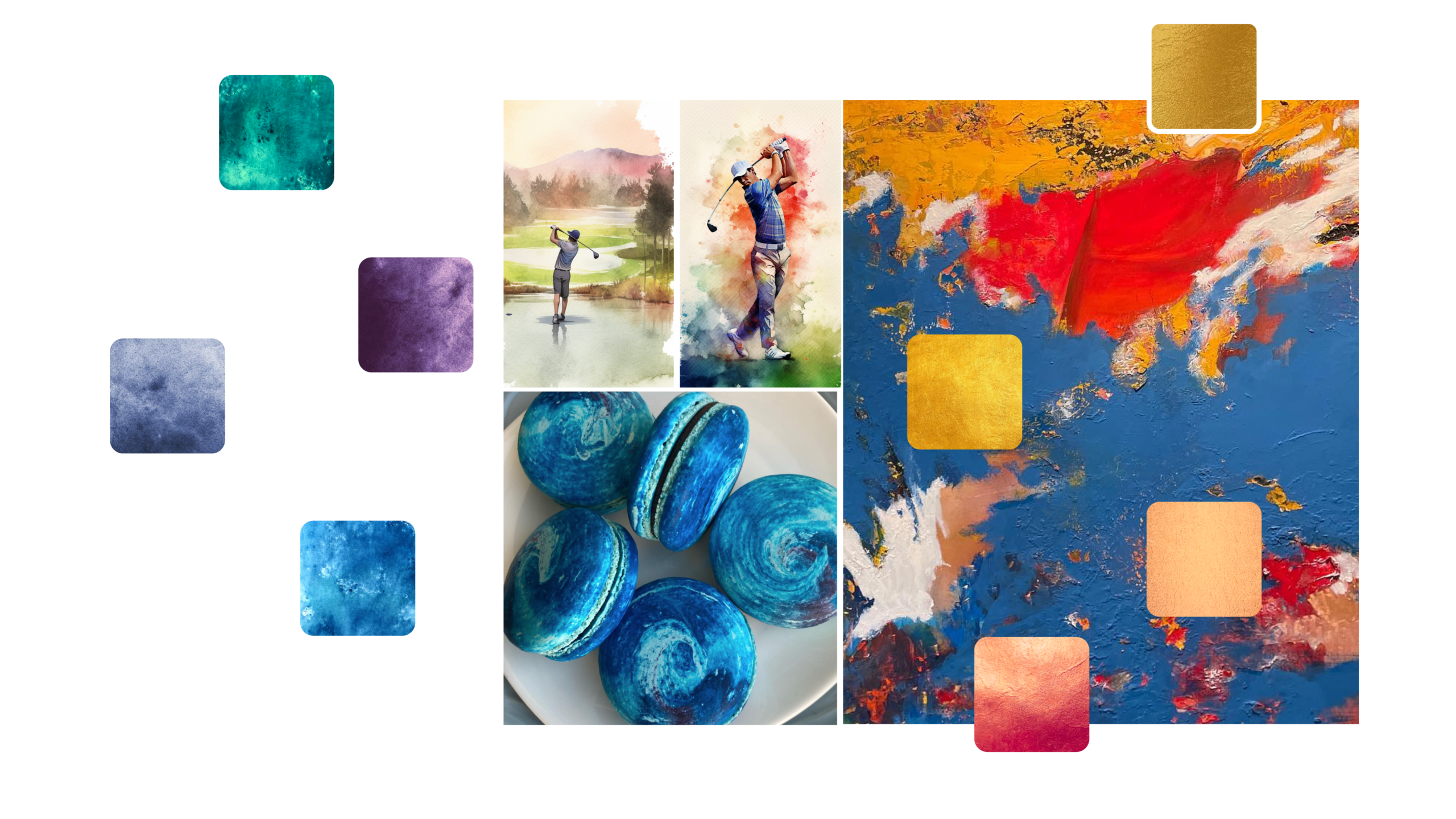
A set of palettes for different communication channels
For the logo and brand in the online environment — down with the dull and analogue! For the interior, on the other hand, we choose passive colours that create a comfortable environment and do not impose their ’weight’ on visitors.
A font inspired by art deco aesthetics
Art Deco geometric typeface with smooth lines — for headlines accents. RobotoFlex — for typesetting.
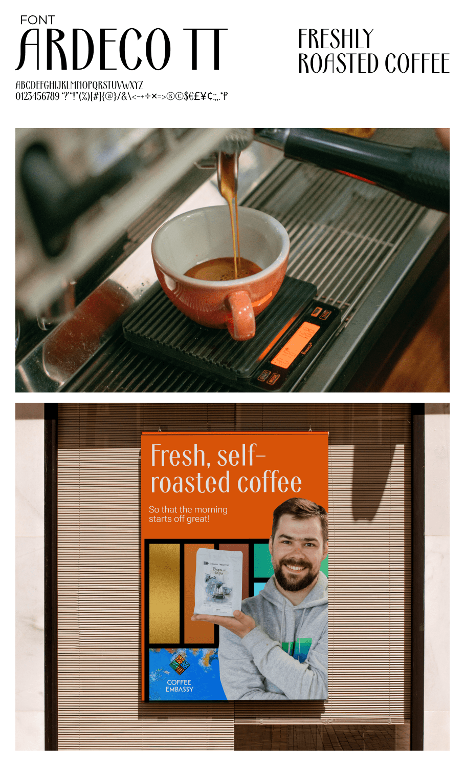
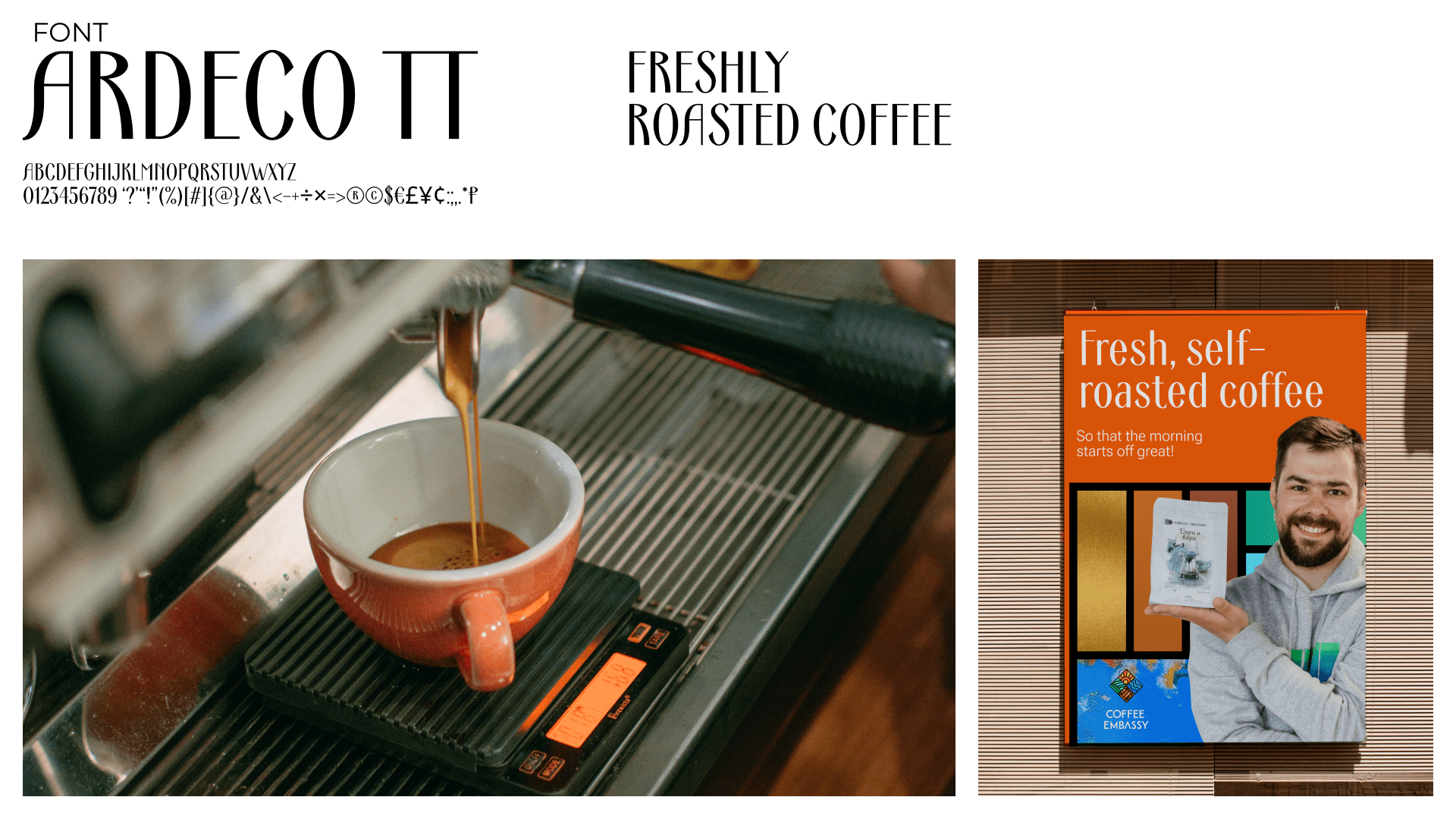
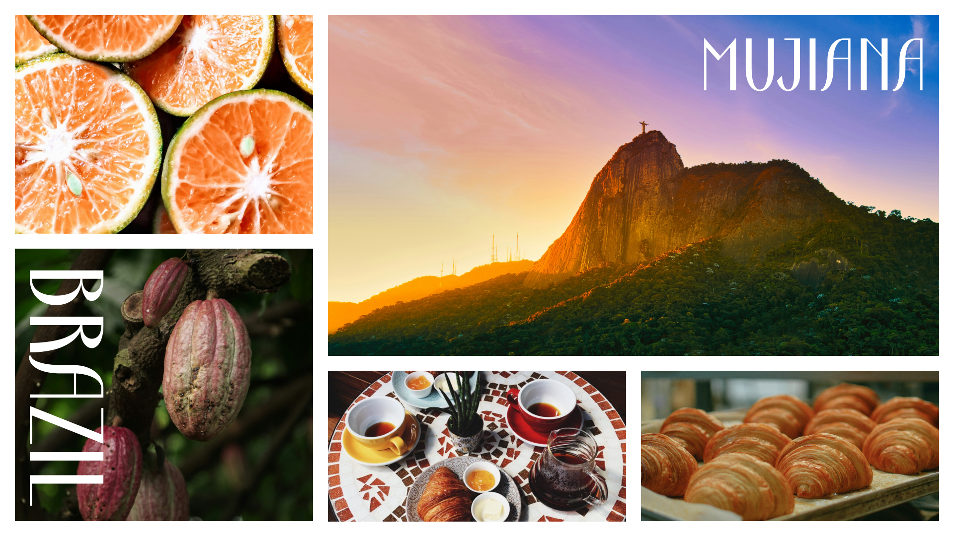
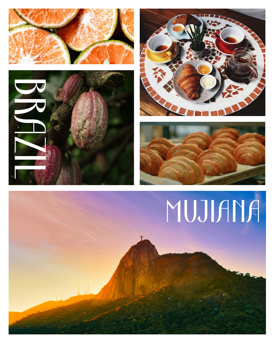
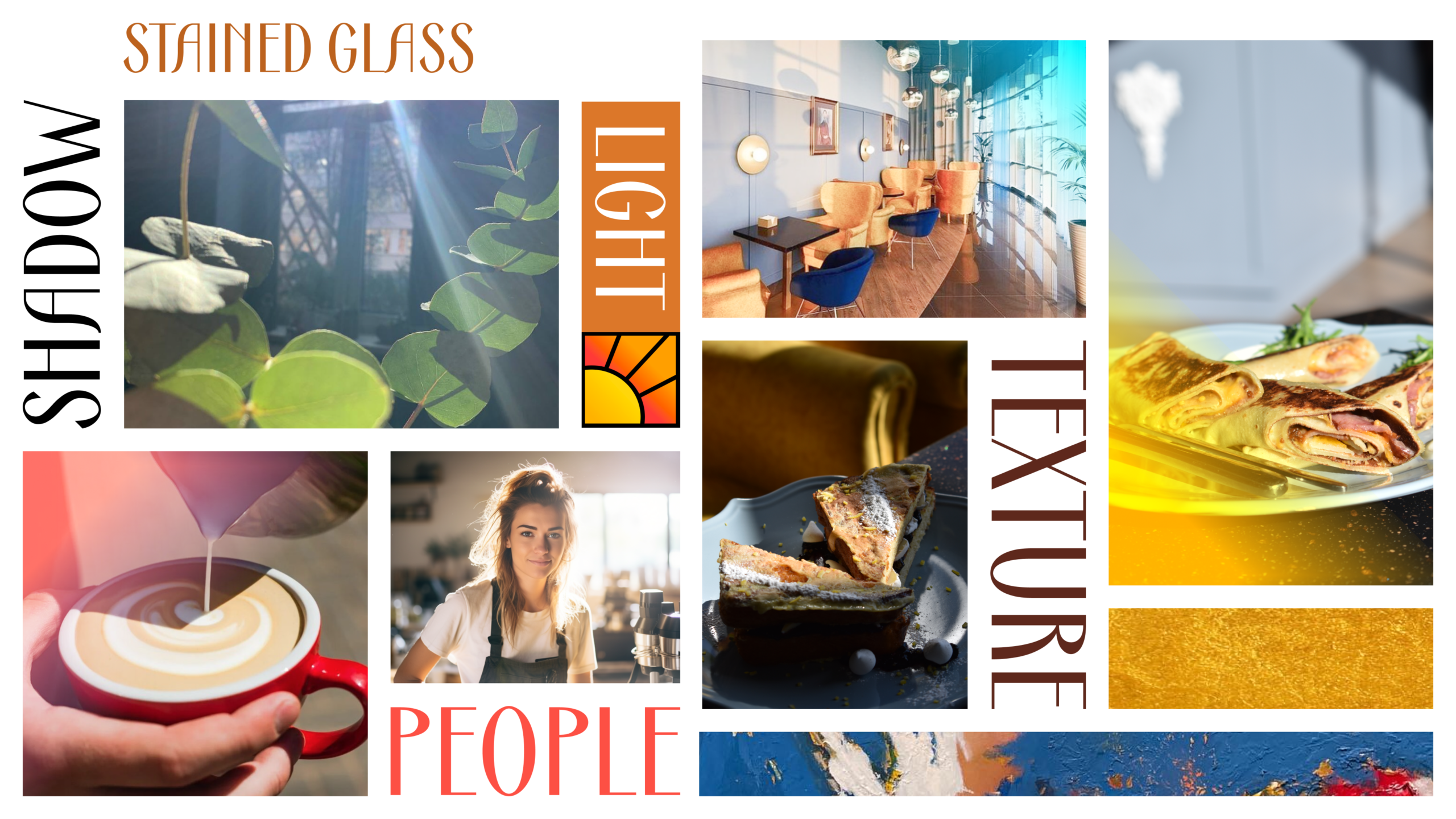
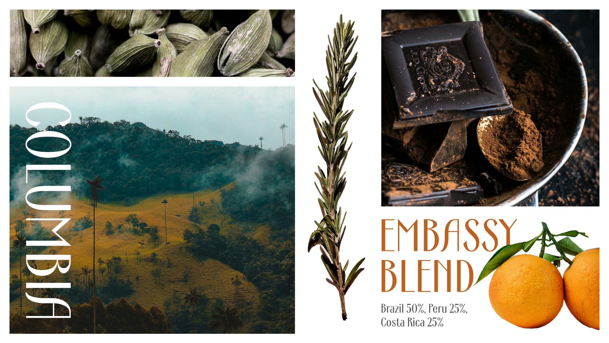
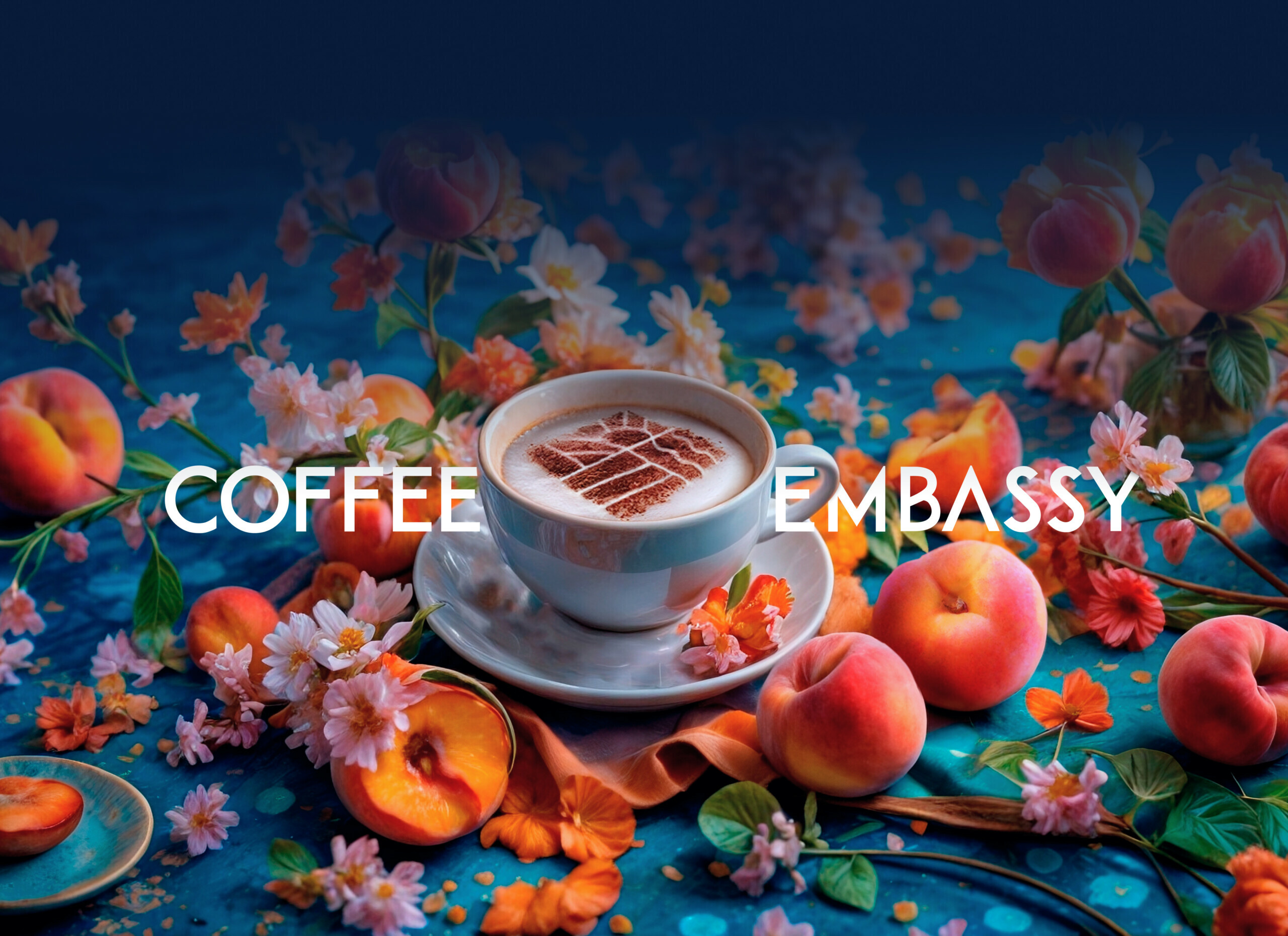
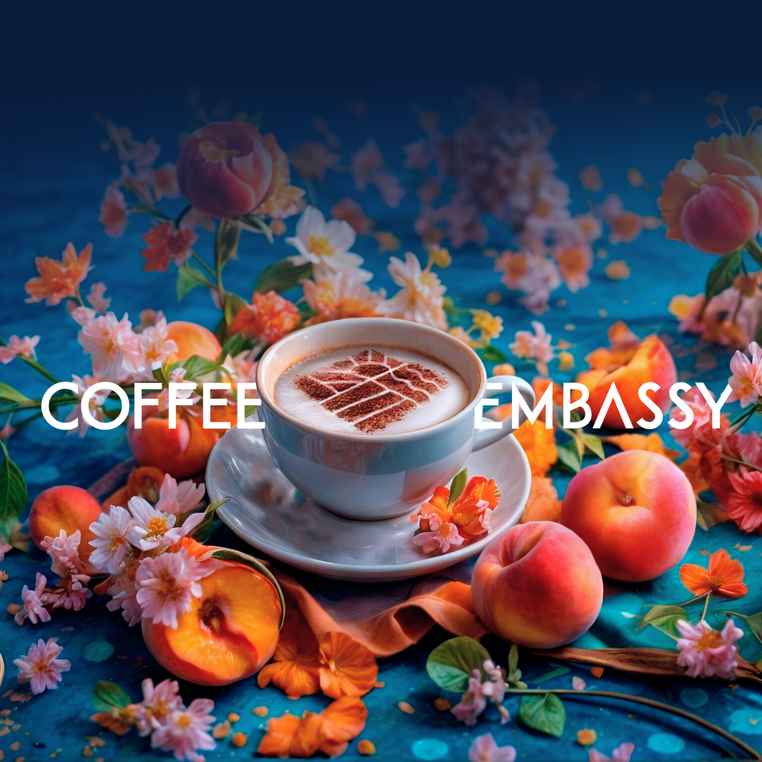
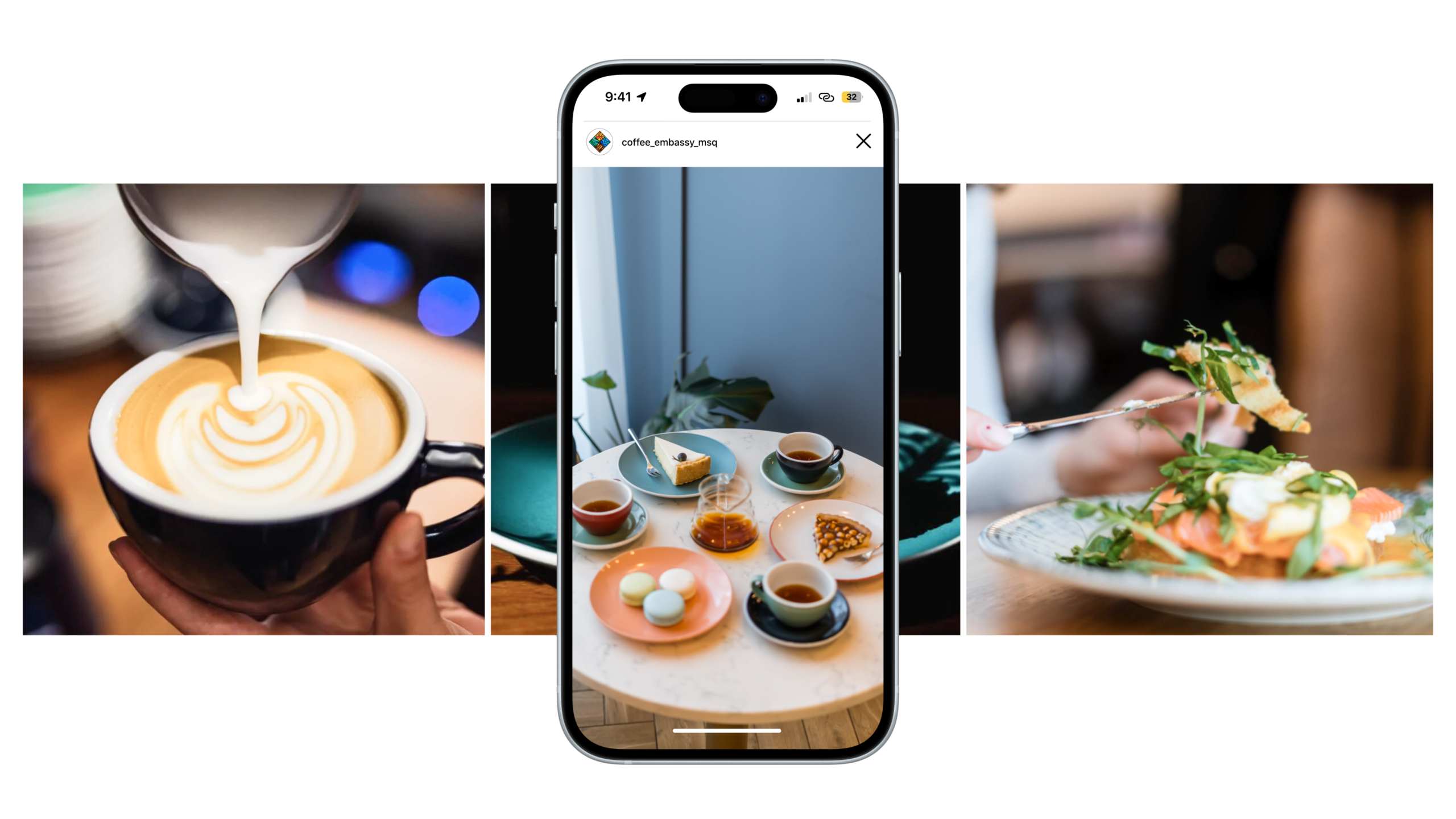
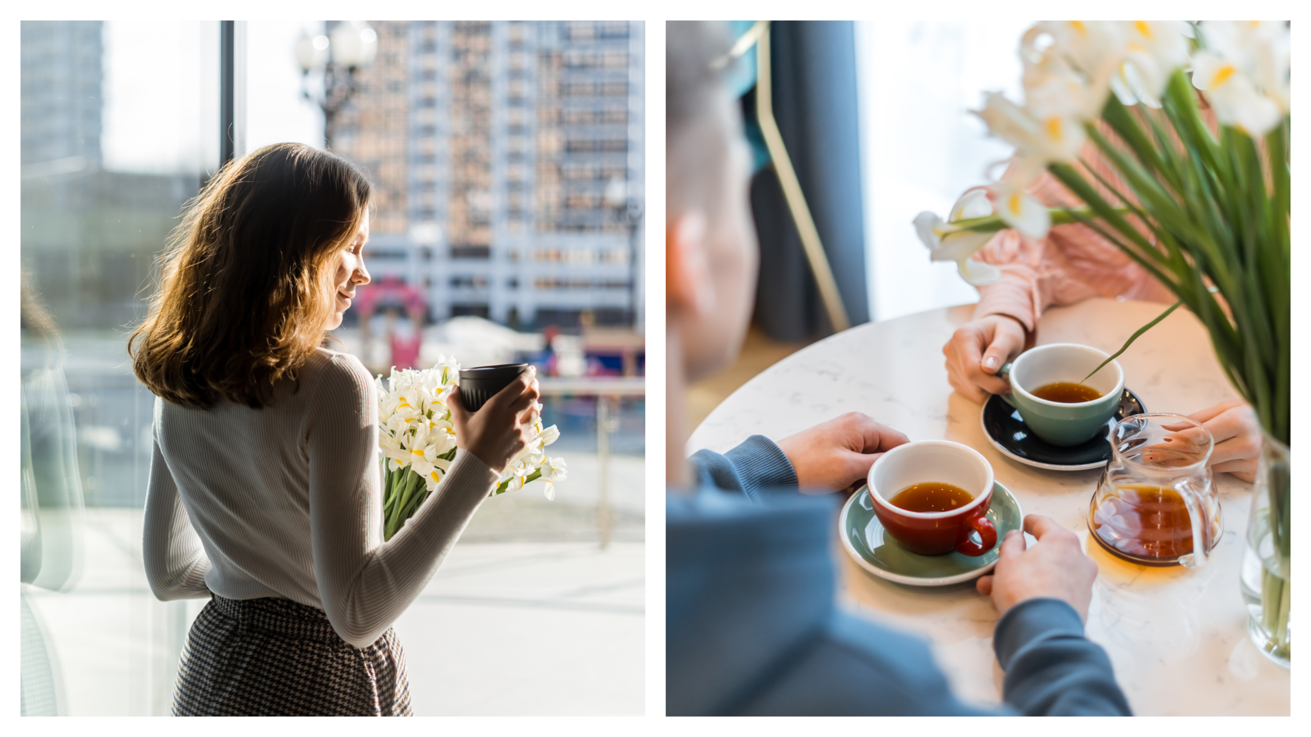
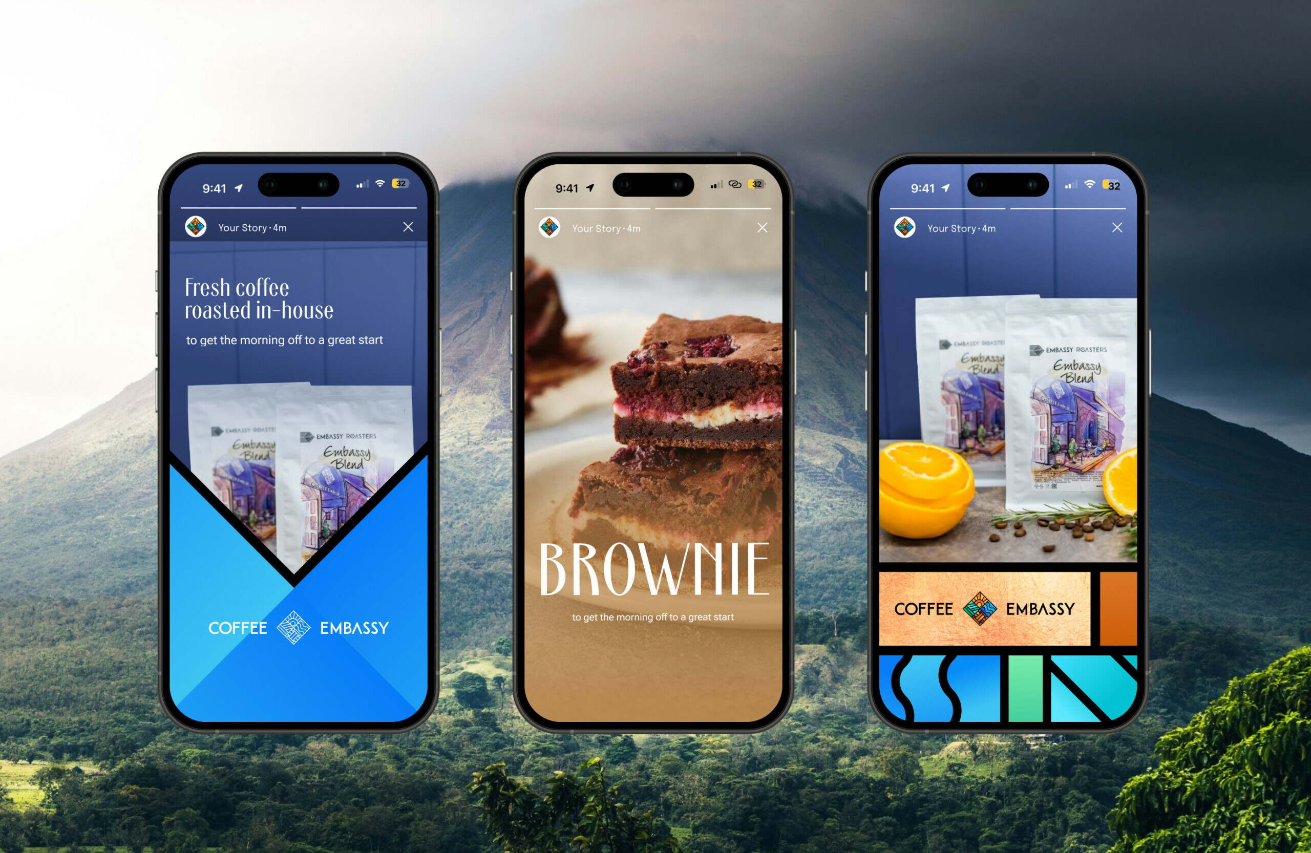
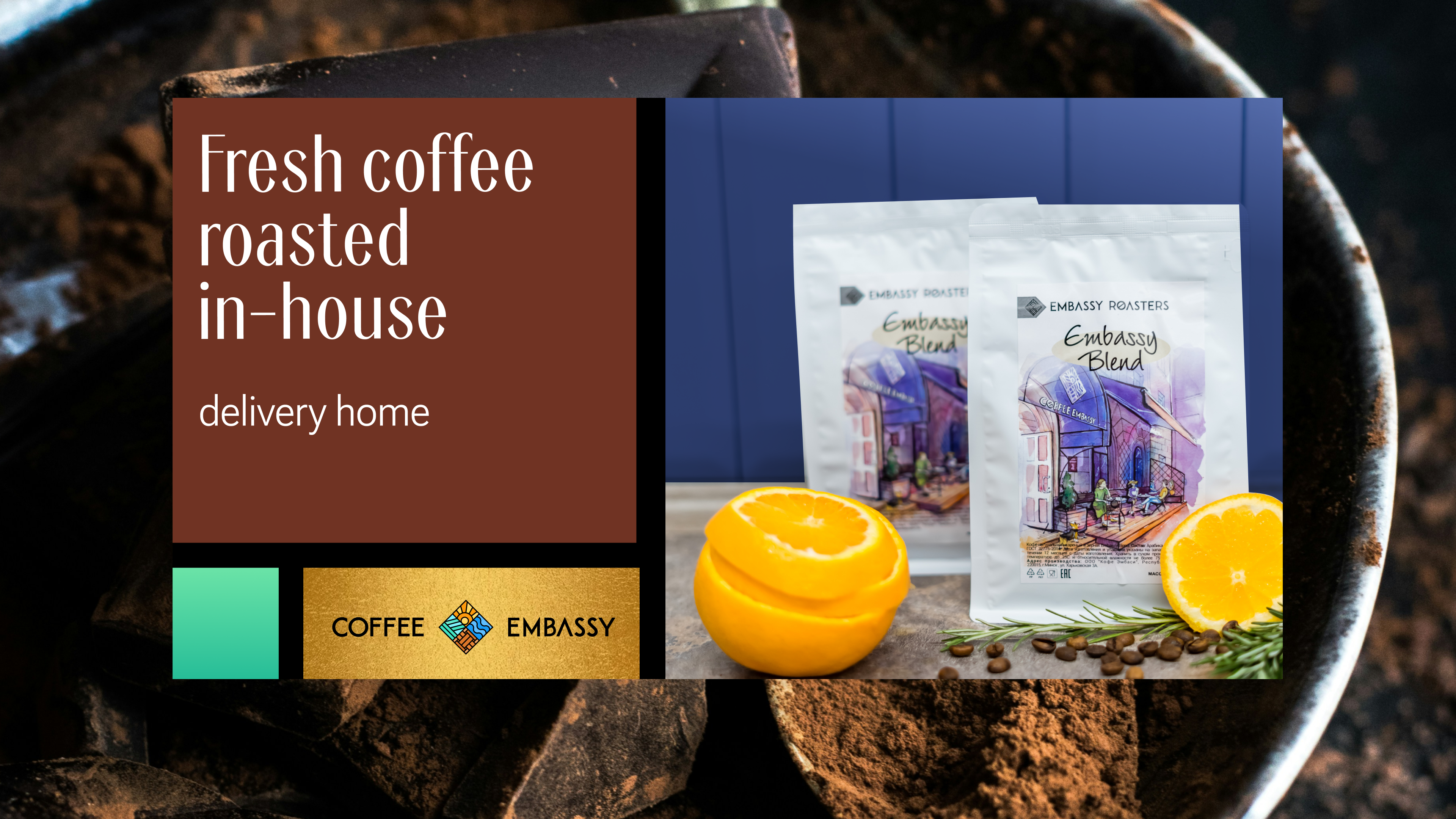
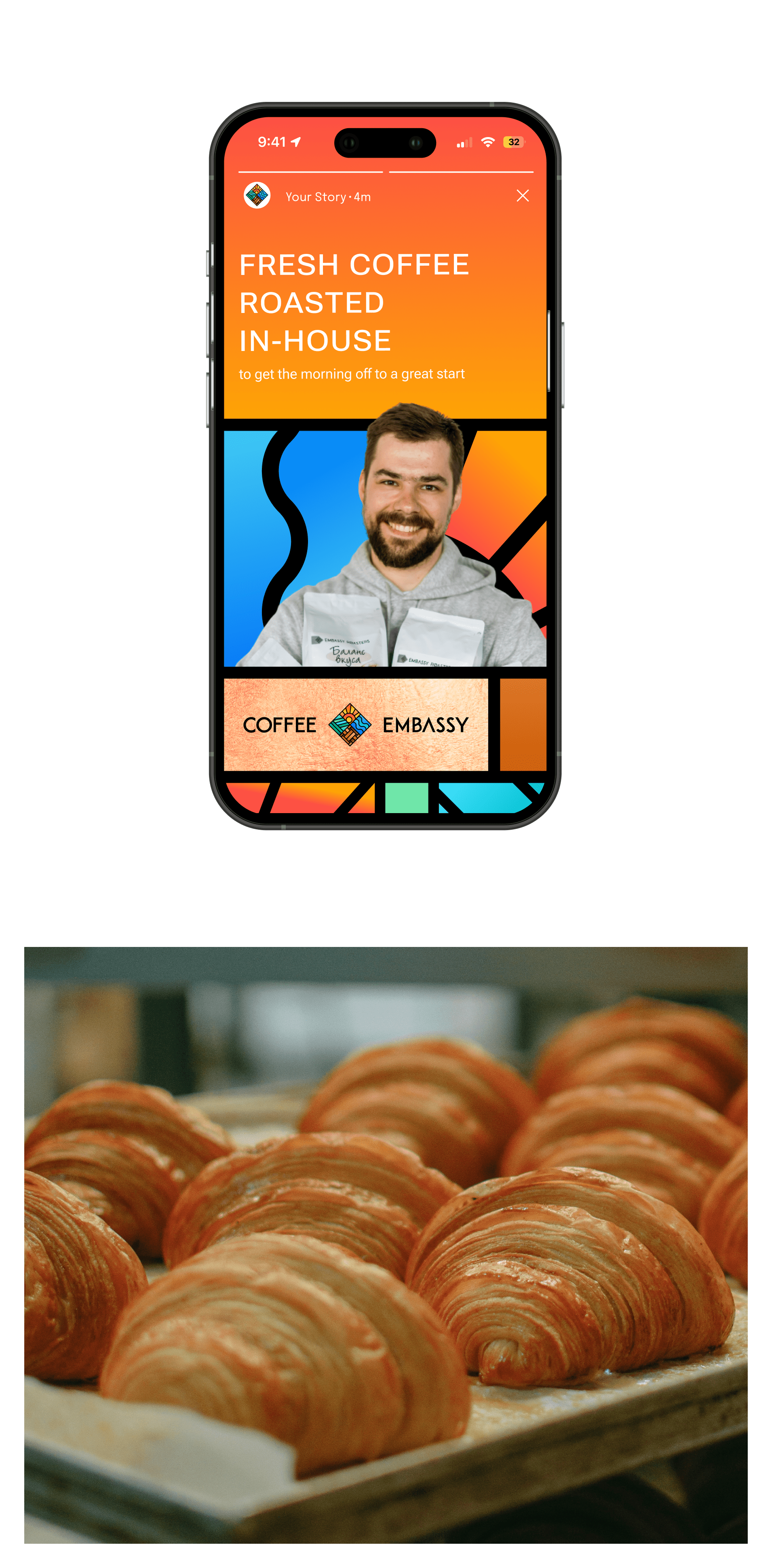
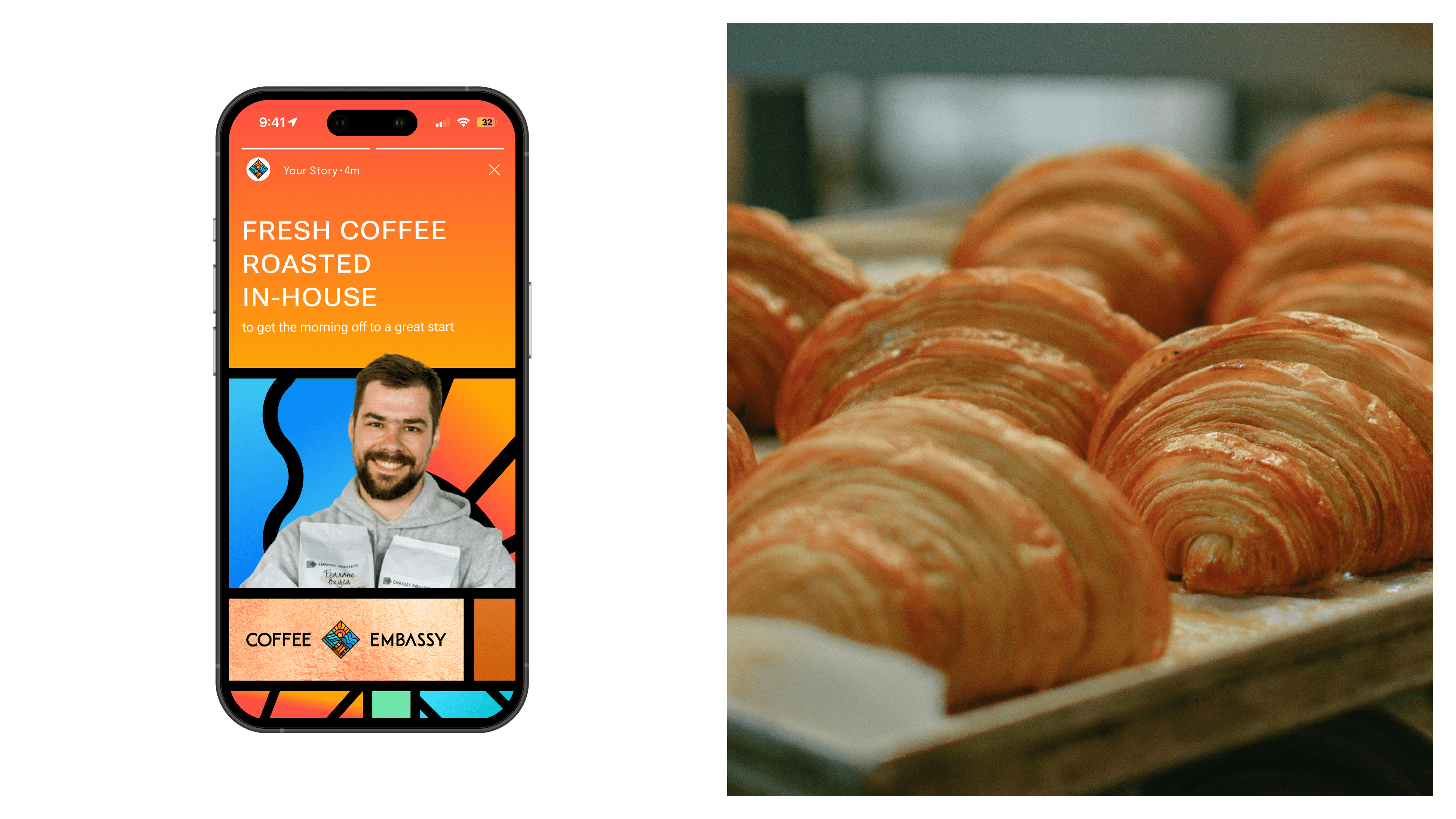
Photo styling to create expressive visuals
Taking a cue from stained glass, we create a grid into which different elements can be easily inserted and combined. Now banners and social network visuals can be created quickly and in the same style.
Done!
The updated visual identity has made it easier to open franchises and expand the business faster, to the delight of coffee drinkers everywhere. And the brand book has made it easier for designers to keep the brand high and consistent.
Let’s have a coffee and enjoy the results 💛
Email us if you would like to work with us on your brand. We will do so with respect for your company’s history and with an eye to bold plans for the future!