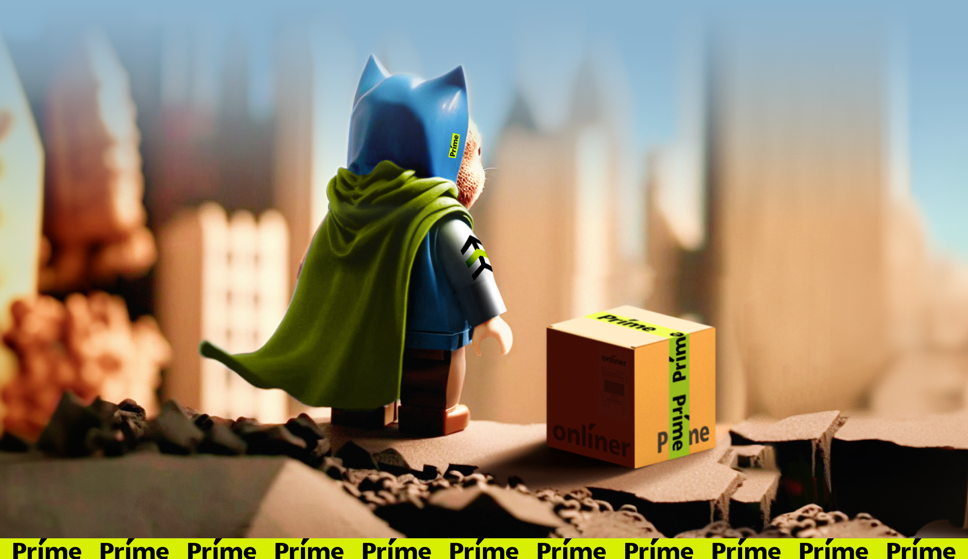
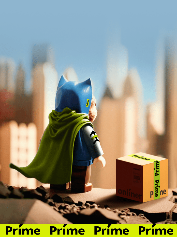
The mission of Onlíner Prime is to set a new quality standard for the delivery of goods in Belarus.
Problem
There are 1500+ stores in the Onlíner Catalog, which deliver orders with their own delivery men or with the help of contractors — and they do it with different levels of quality and predictability.
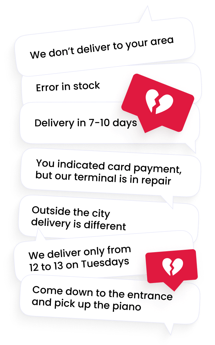
Every user, having experienced a hard comparison necessity, chooses a product in the Catalog, adds it to the cart, clicks ‘buy’ and obtains a ‘pig in a poke’. It occurs at the moment when the user is already willing to relax on the sofa looking forward to the delivery man. It seems that the product has been ordered and confirmed, but:
The goal of Prime as a business is to create the perfect delivery:
- goods are in stock 100% even if it kills us: delivery isn’t in 5 days, but next day,
- at a convenient time for buyers: slot an hour,
- polite delivery men,
- delivery right to the door,
- without suddenly non-working terminals and without ‘Unfortunately, we don’t have change’.
It’s impossible to solve such a hard equation with the guarantee of the quality standards by thousands of participants, just by renting cars and delivery men. Prime is a breakthrough in the Onlíner evolution: the company becomes a fulfillment service with the launch of delivery.
Onlíner takes care of all processes, beginning from placing items in the Catalog to real-time availability in their own stock and careful delivery.
Prime was to be built into Whole the Onliner design code. But here we can wait for the pitfalls
On the one hand, Prime is a child product of the Catalog, and, consequently, a ‘grandchild’ of Onlíner itself. On the other hand, on whose behalf does the delivery man come to the client’s: on behalf of Prime / Onlíner / Onlíner of the Prime catalog / store with the Prime quality mark? And what if the client gets the purchase at the delivery points or postomat? And what about picking up the purchases at a partner’s or their own points?
In brief, the task isn’t a piece of cake!
Our goal is to create the brand that:
- fits like a glove into the Onlíner brand system,
- won’t create a conflict with verticals (Houses, Car Flea Market, Services ..),
- will be quite expressive even against the bright identity of the Catalog,
- will be independent offline and won’t be considered to be a Catalog,
- will emit fluffy cat vibes and trust.
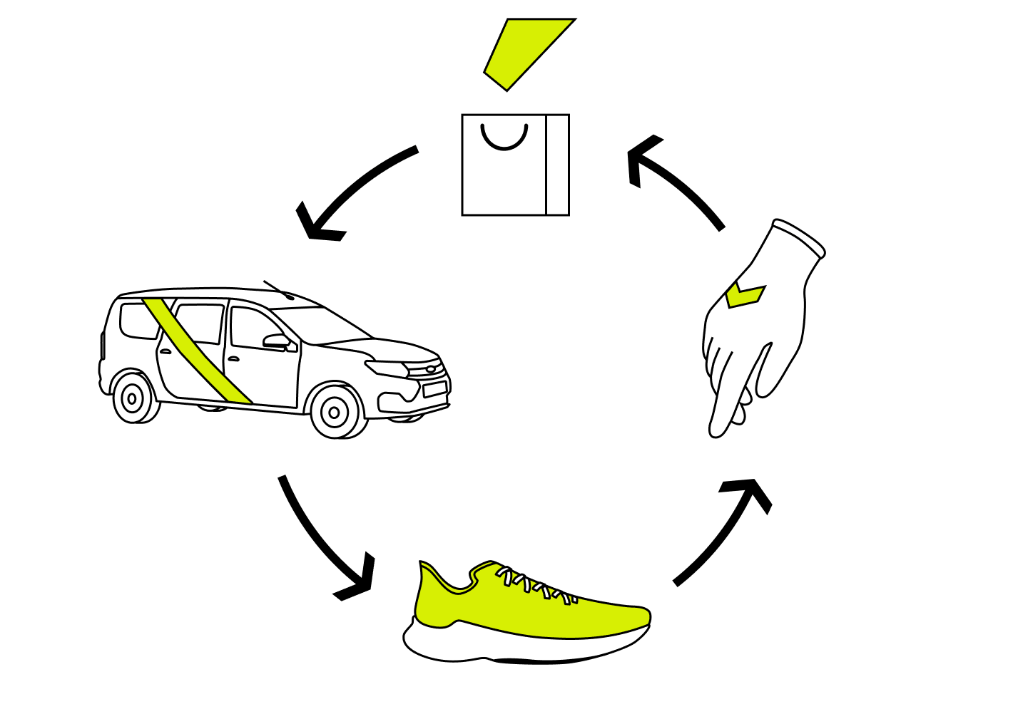
We meditate on the cycle of orders in nature and the realization comes:
Prime isn’t an independent brand but a continuation of the legendary Onlíner, its new feature that brings even bigger value to the customer: careful and fast delivery. Consequently, down with everything superfluous, far-fetched and cliched.
Prime should be moderate and complement Onlíner, not pursue only its interests, but bring more value to the client. All major identification should be shown not in the logo, but in some kind of superior marker.
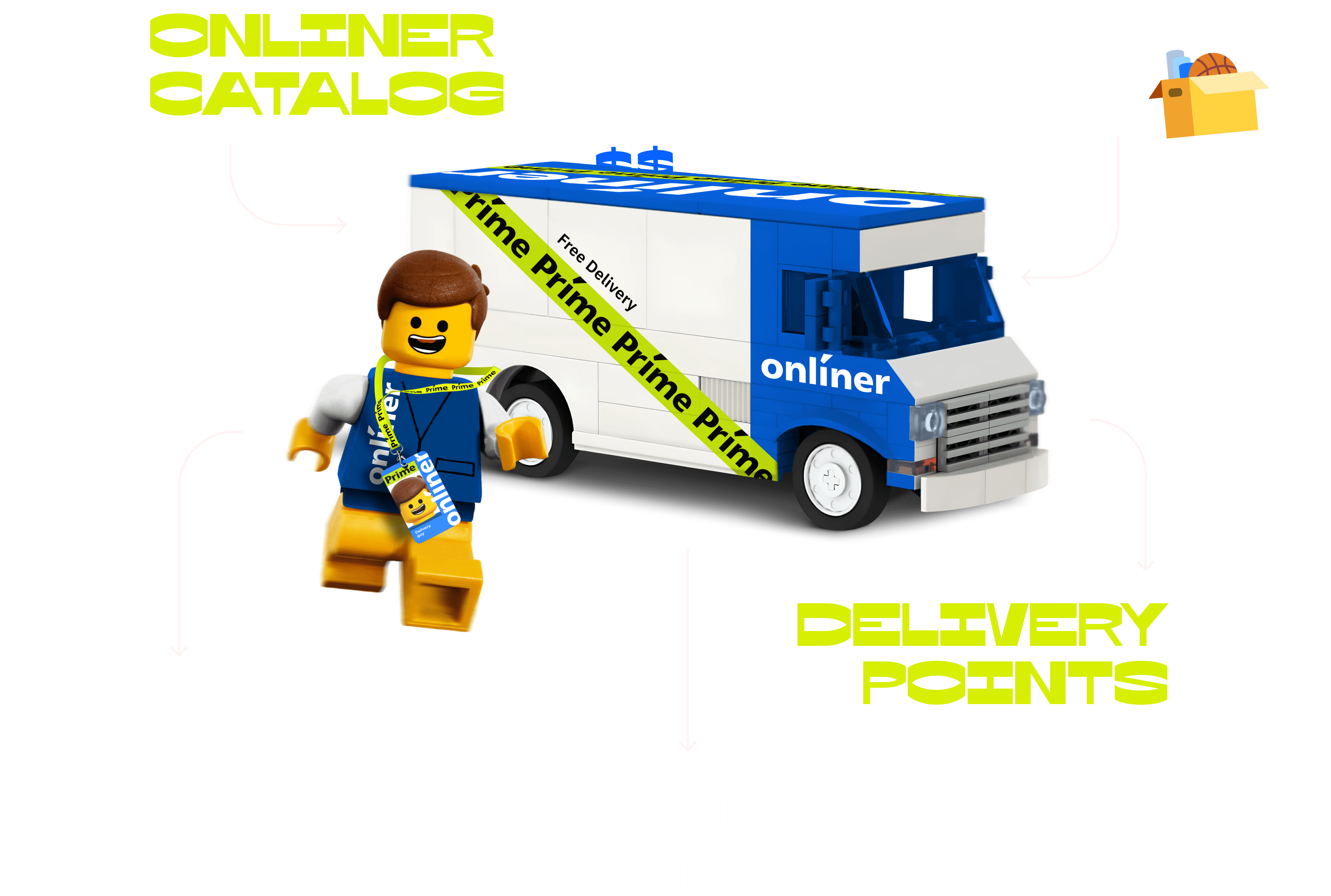
Delivery men are the personification of Onlíner Prime. So first of all, we work on them, and not the logo.
We suffer and ask heaven for inspiration. The sky gives a hint with a student passing by and Tiffany for some reason.

Speedy trainers + gloves allowing careful handling of the order + fast wheels + heart filled with primality = perfect delivery.
We’ve got it down!
A peppy track to view the case →
The Prime logo as an Onliner property
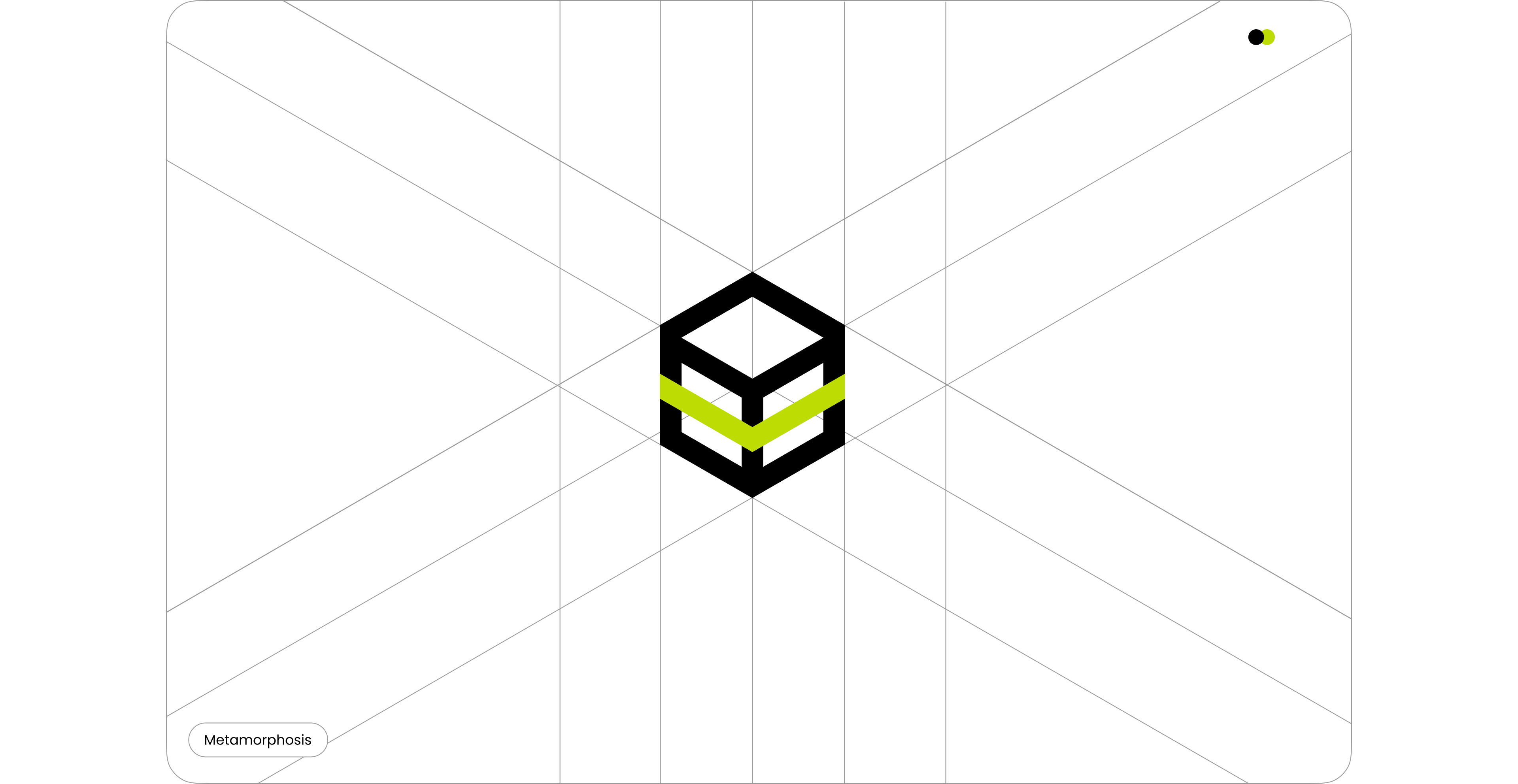
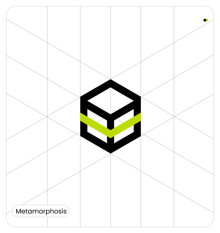
Prime should just correlate with the parent brand. Keep the parent typography, move Onlíner into a basic black and continue it with a simple, compact design that symbolizes packaging and logistics.
Graphic elements
Arrows, boxes and parcels are a boring overused attribute of all types of delivery and logistics services. So, we don’t take it to the logo, but we’re looking for a new form of the graphic language.
Príme in the Catalog
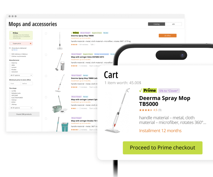
The site is the first point of contact for a customer with Onlíner Prime.
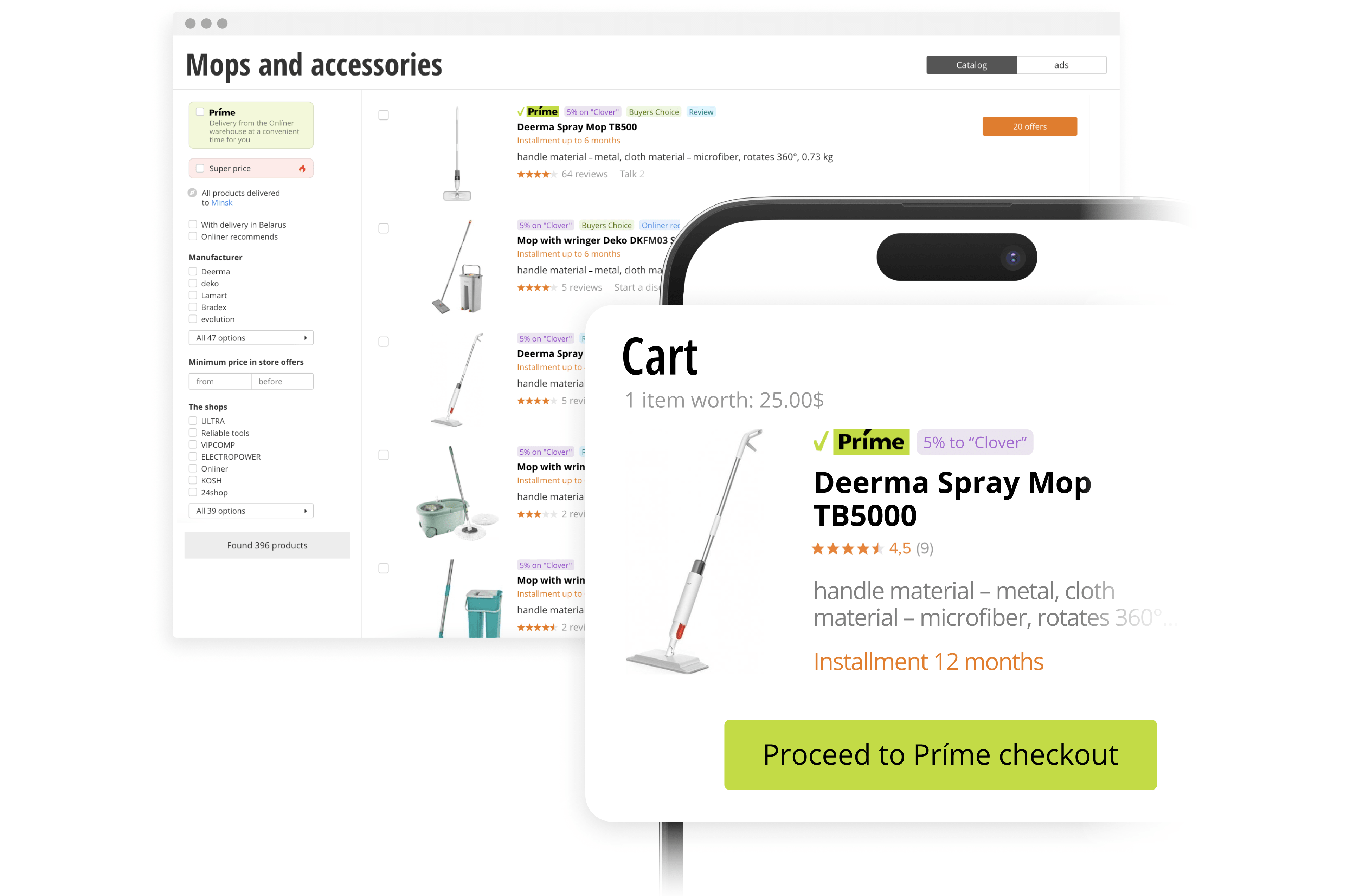
Príme is another feature of the product along with ‘Halva’ installment and Onlíner Clover. If you just integrate Prime in the Catalog, the number of color accents will interfere with perception. We create a space where all will live together: we smoothen flashy accents and simplify the product card.
The laconic corporate identity delicately labels products with a light green sticker and doesn’t dominate the major brand, but complements it and organically coexists with it in the same space.
Enjoy peace and order at home.
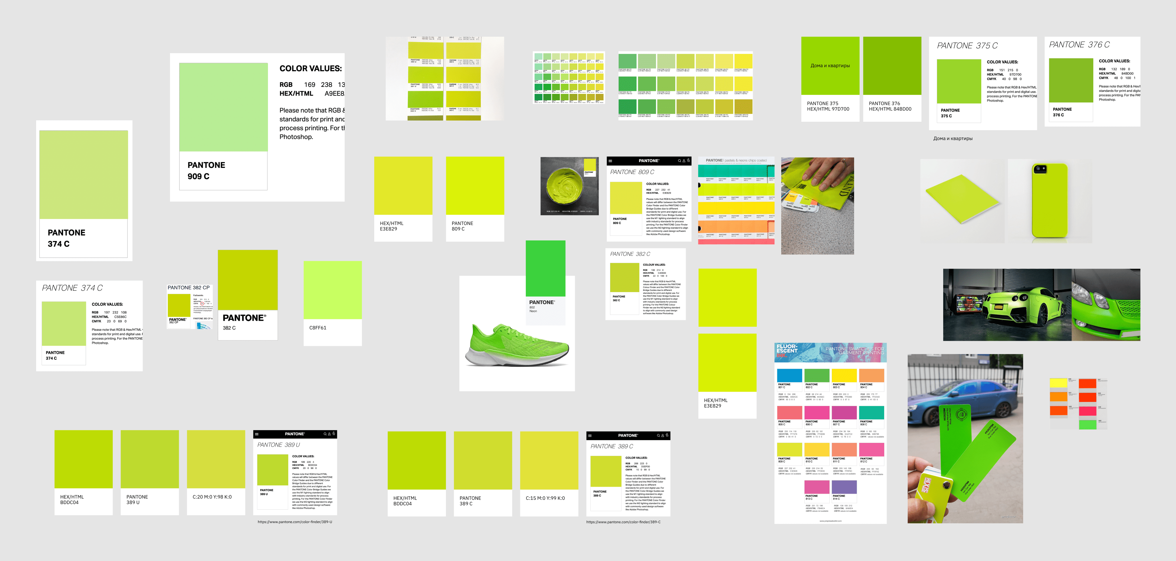
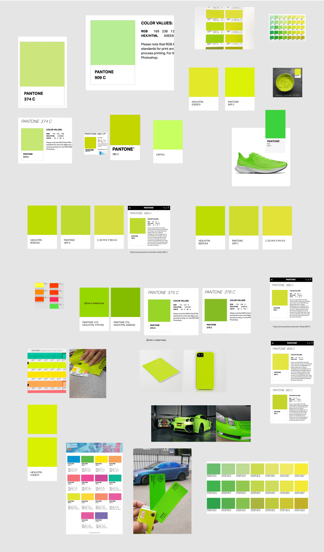
The most neon of all printed
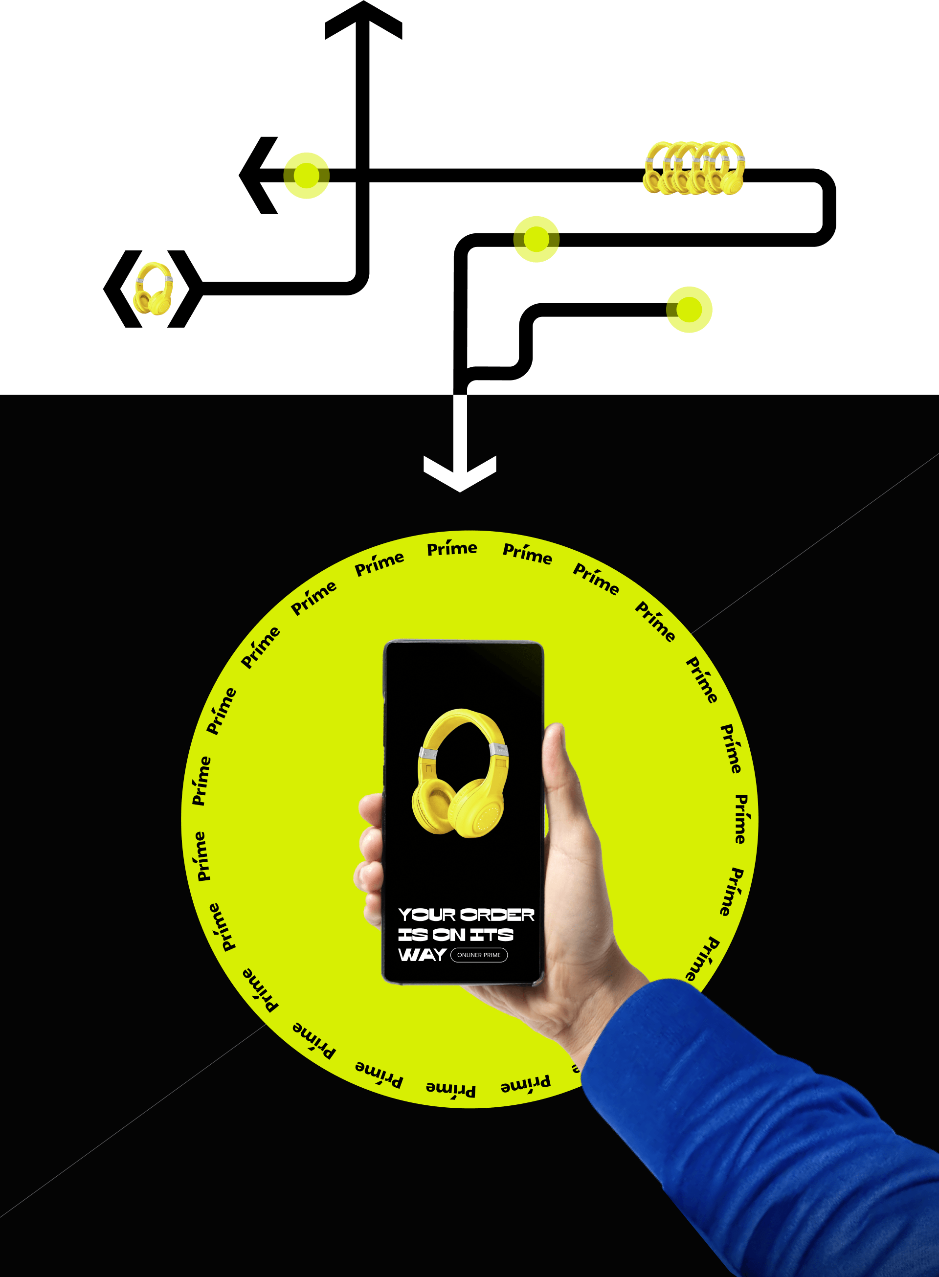
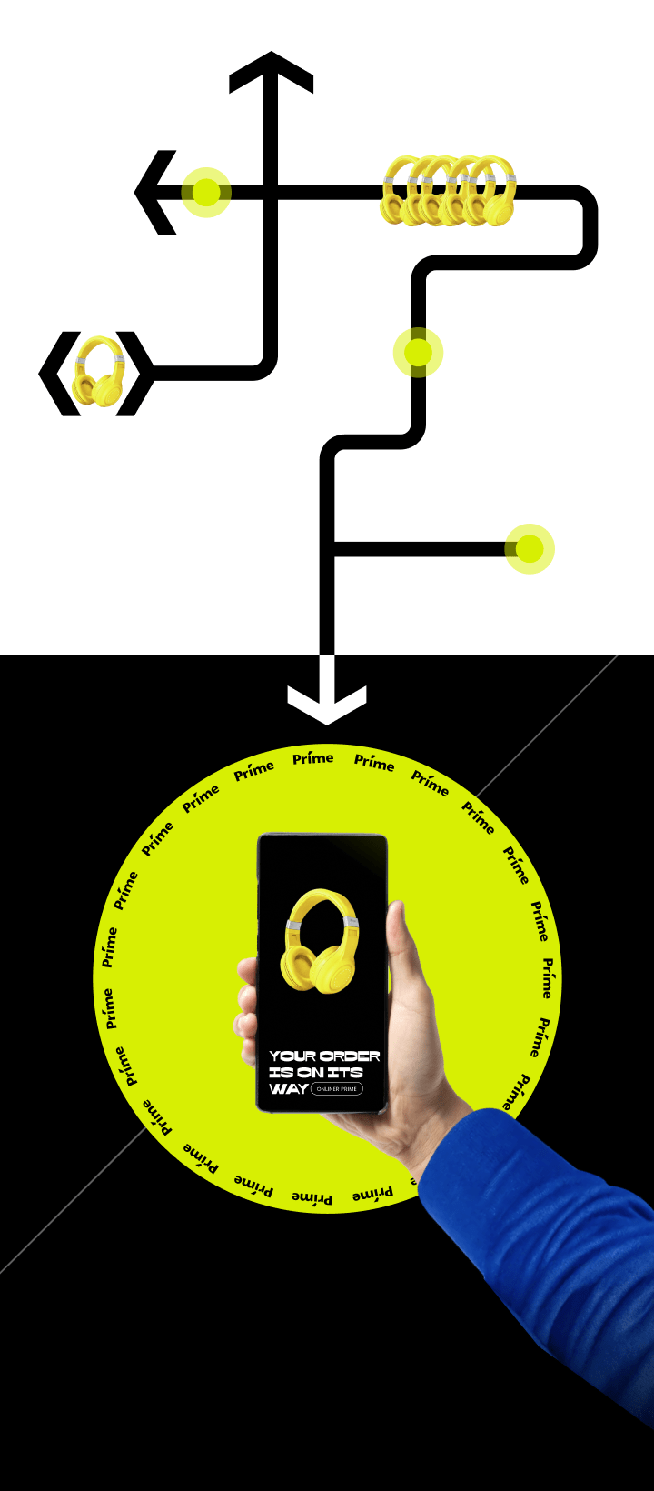
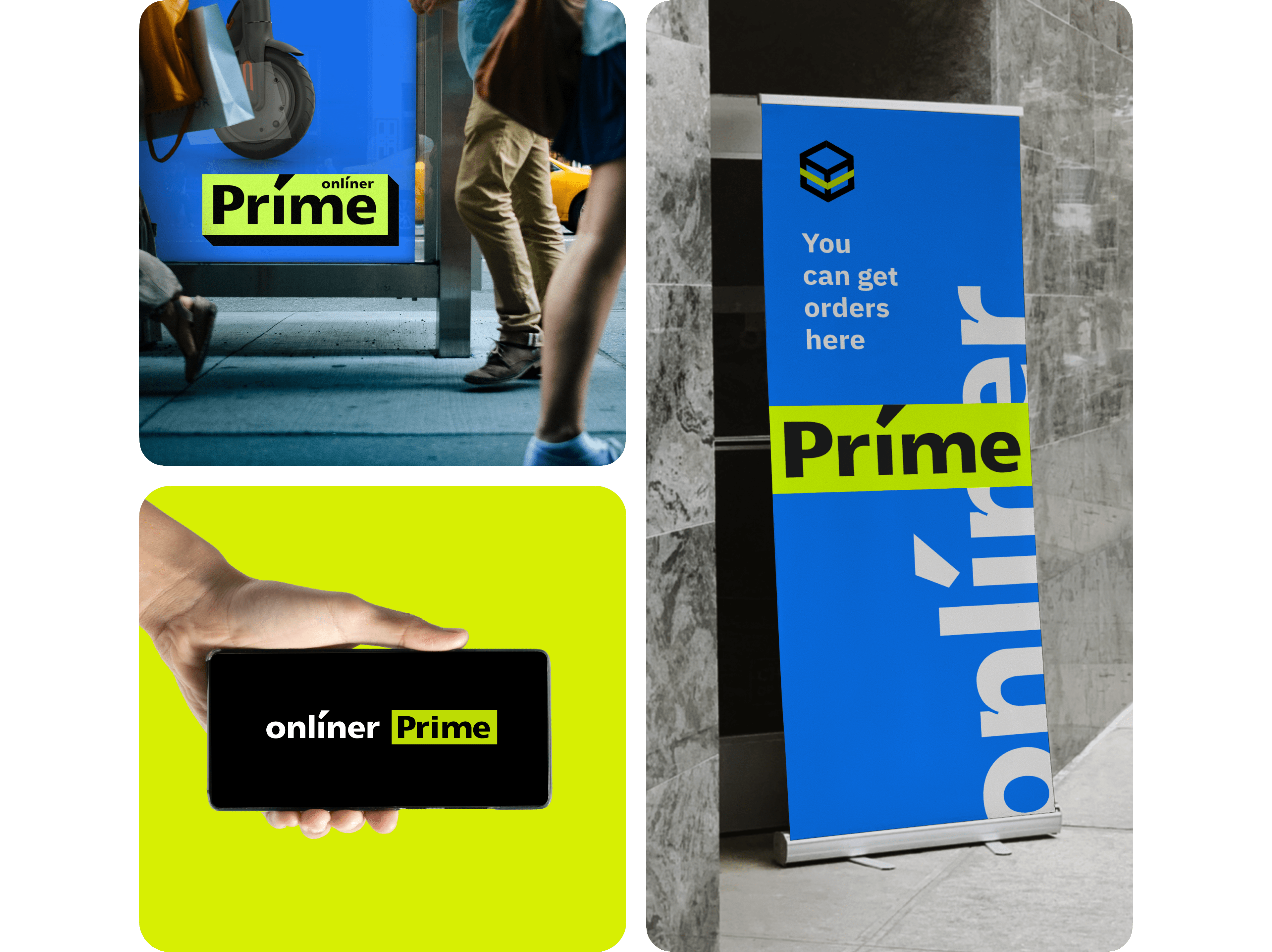
A small plate on the Catalog page is almost the only occurance of Príme in digital. Most often, Onlíner Prime communicates with the user offline: at the points of issue of the order, on street banners, packaging and through a delivery man.
So, we don’t proceed from digital colors, but look for the most intense light green of all possible printed ones.
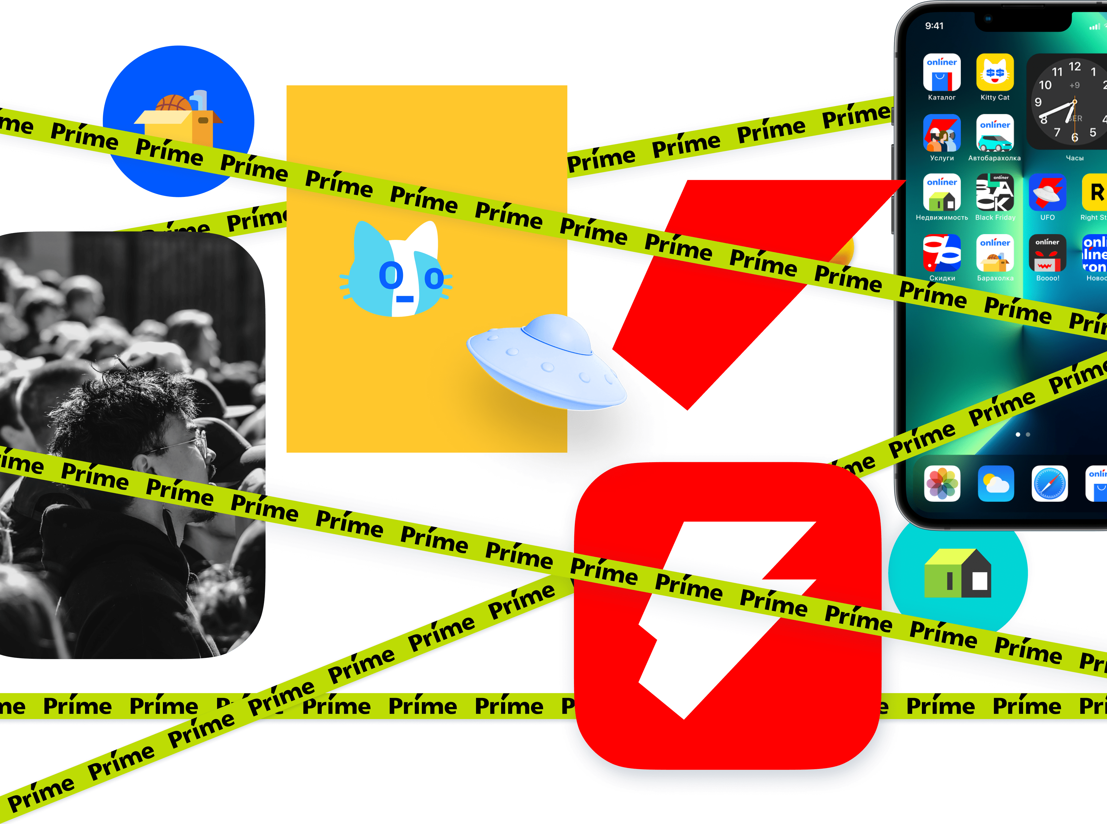
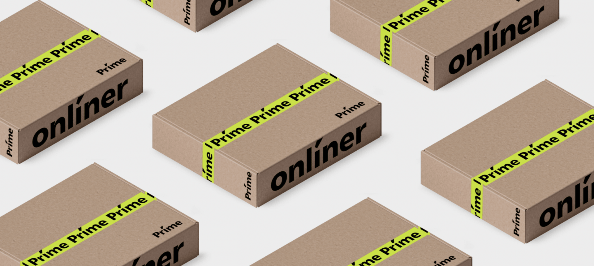
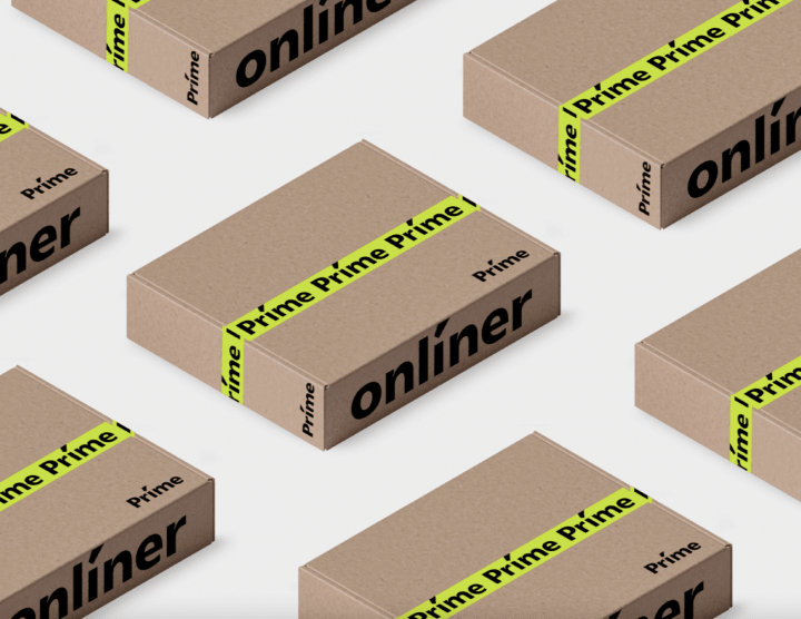
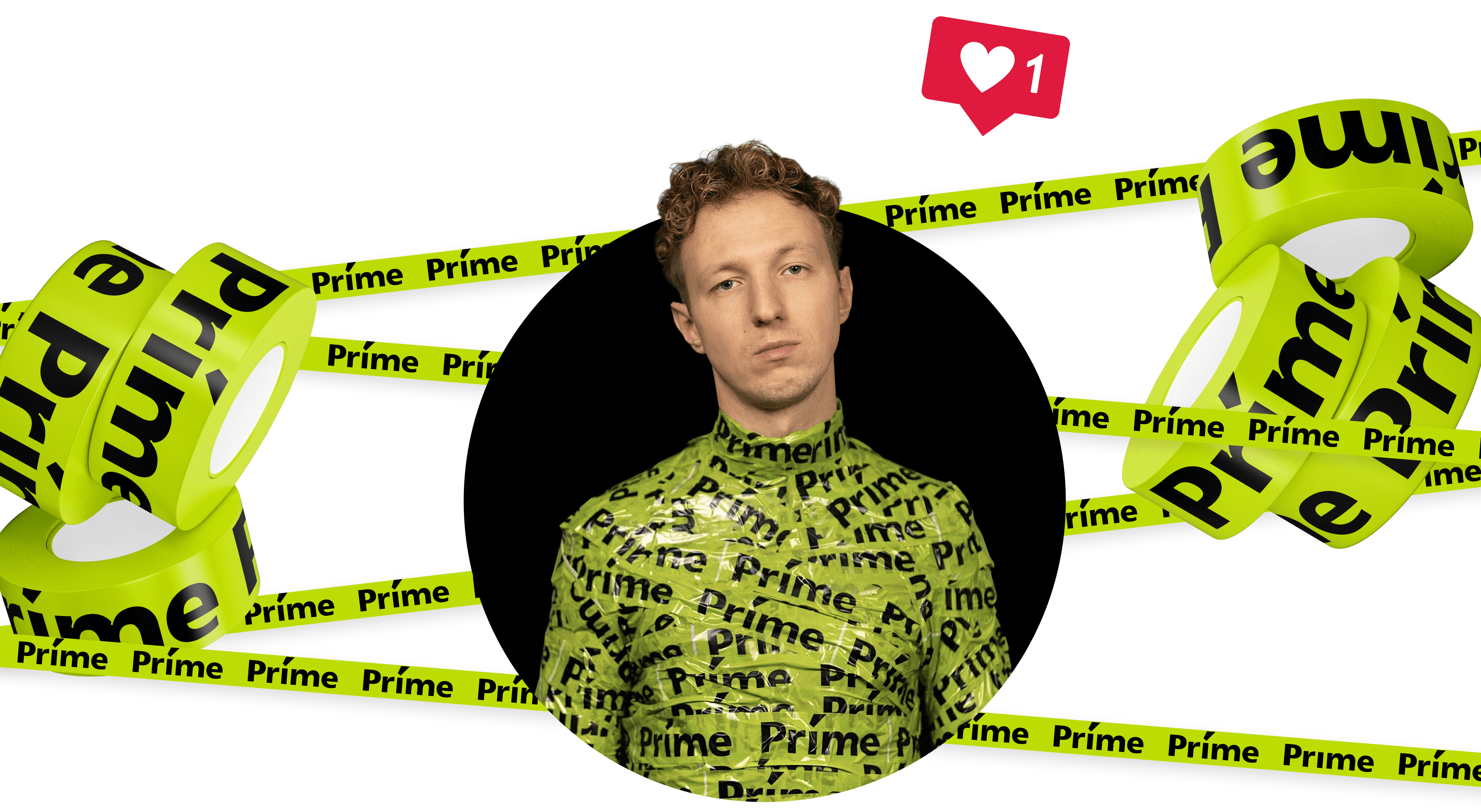
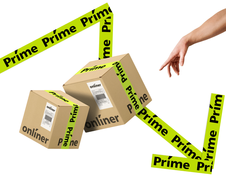
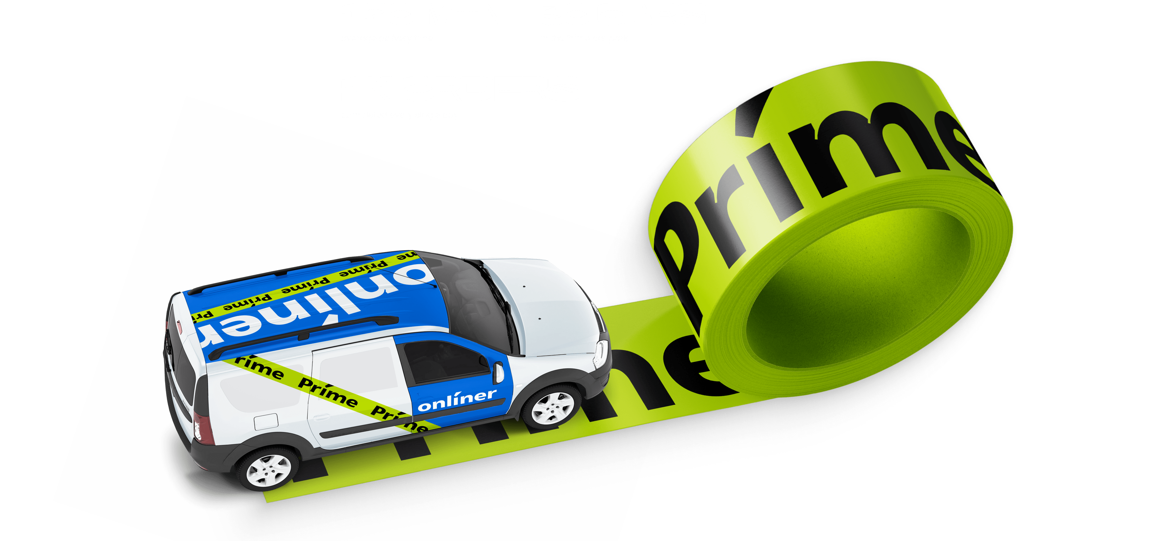
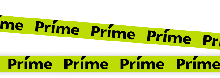
Scotch tape rules!
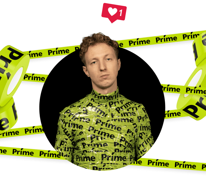
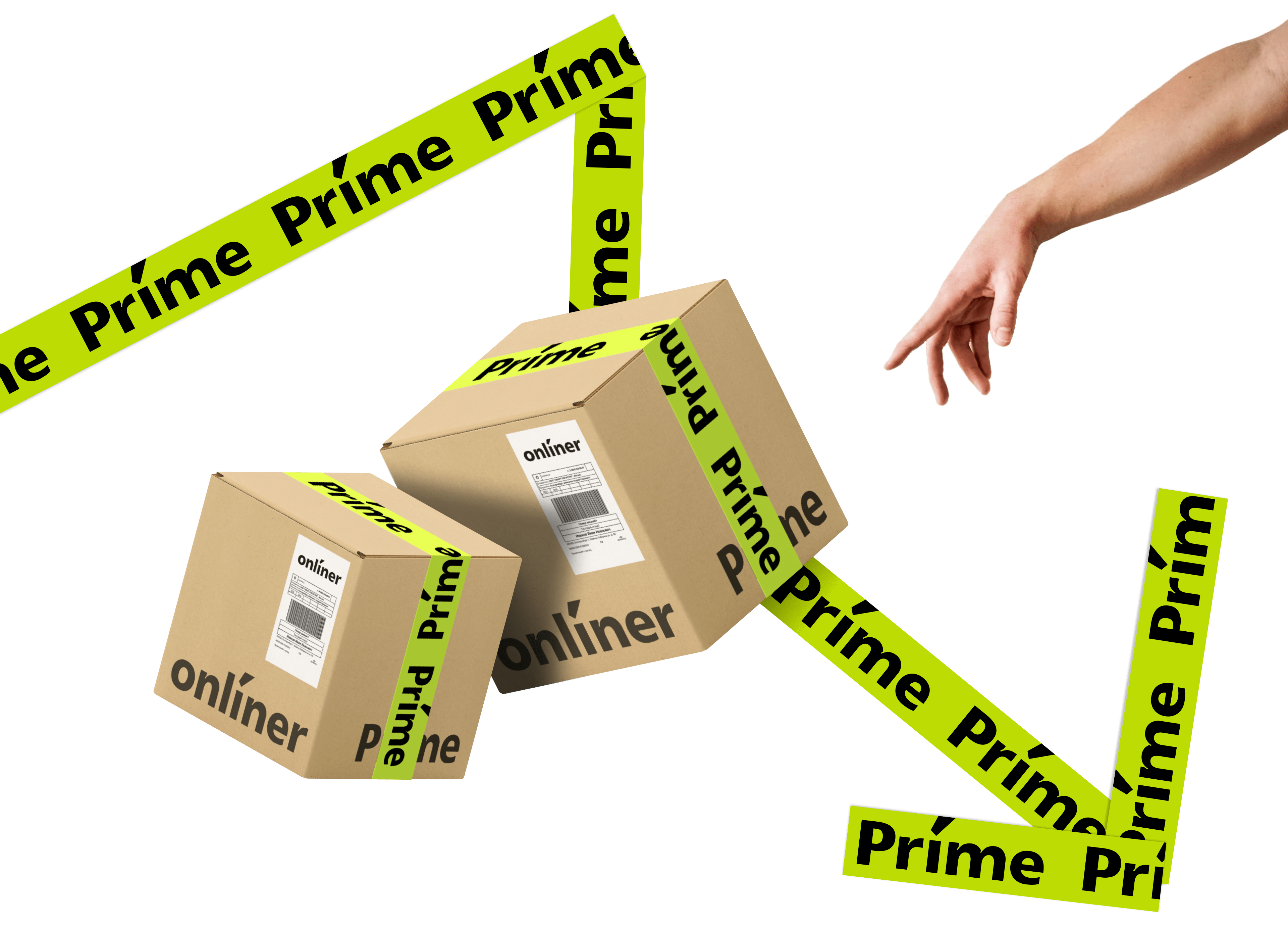
The logo turns into a packing tape just like that. It can be used regarding brand spaces, banners, boxes and art directors.
Appropriate everywhere!
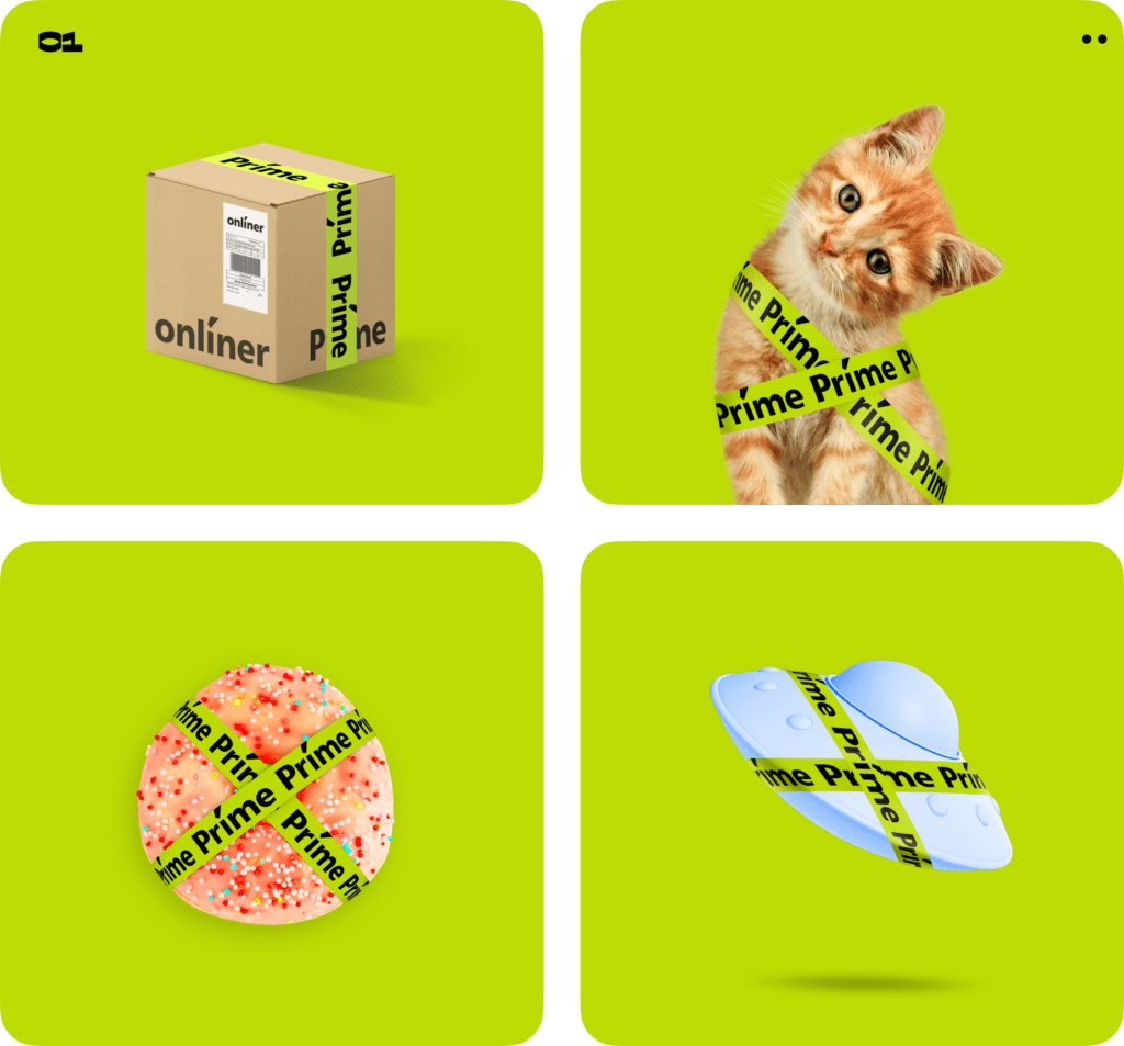
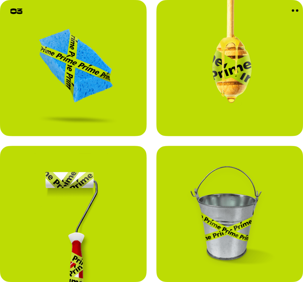
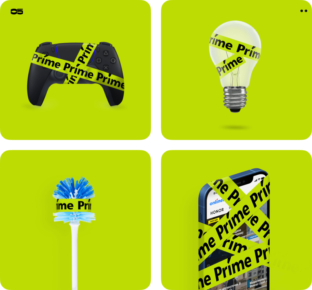
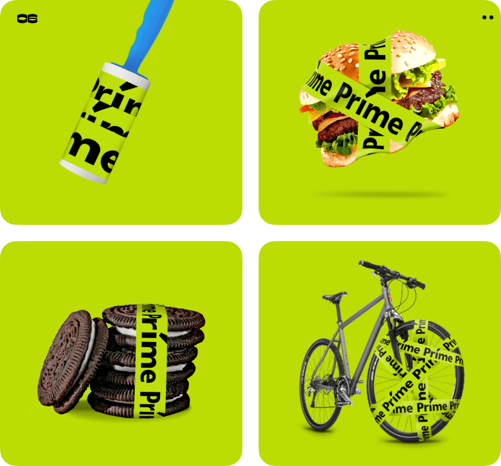
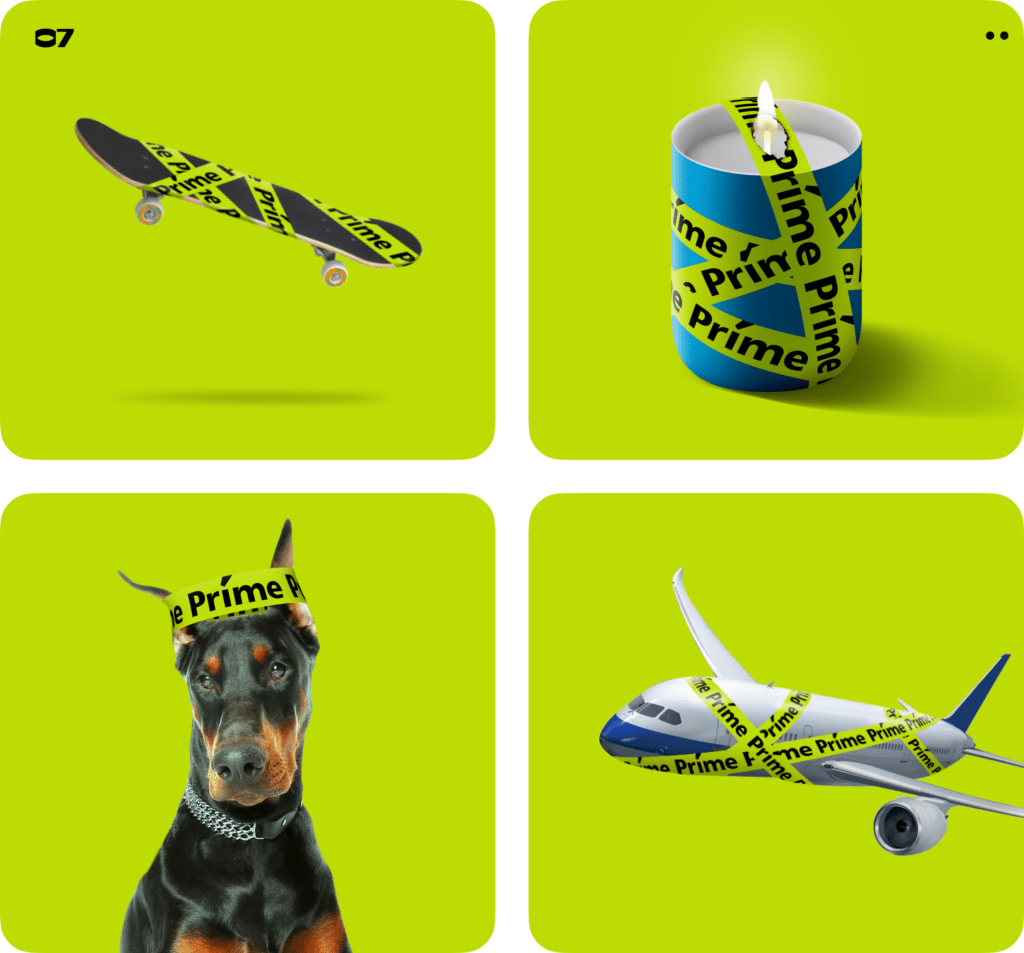
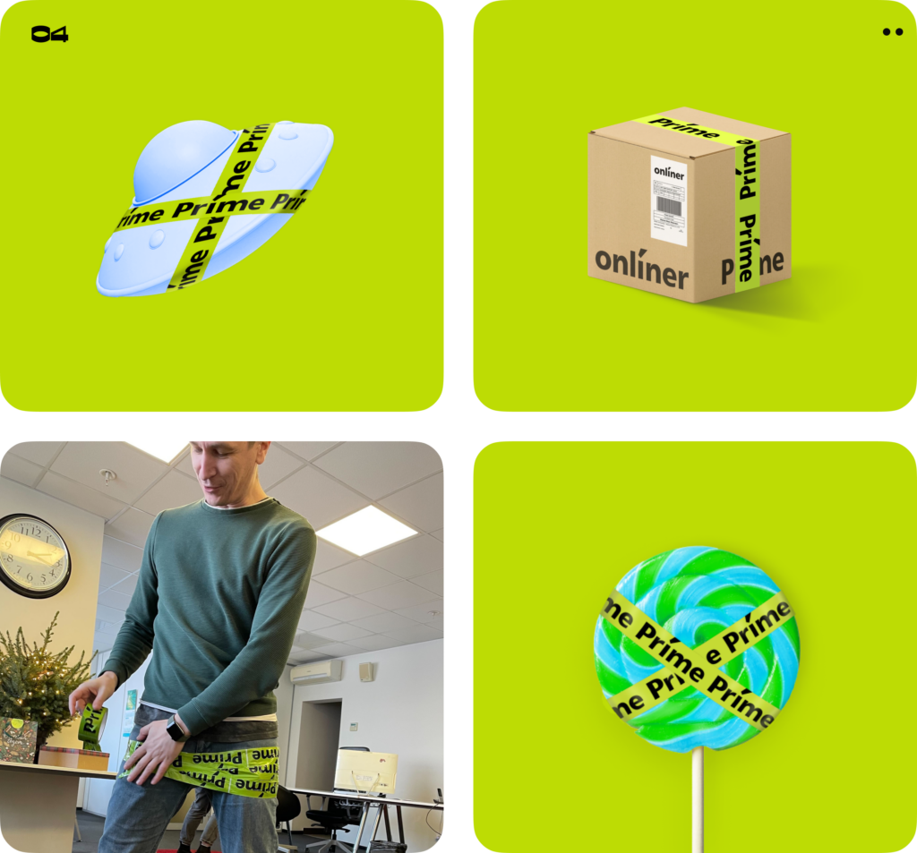
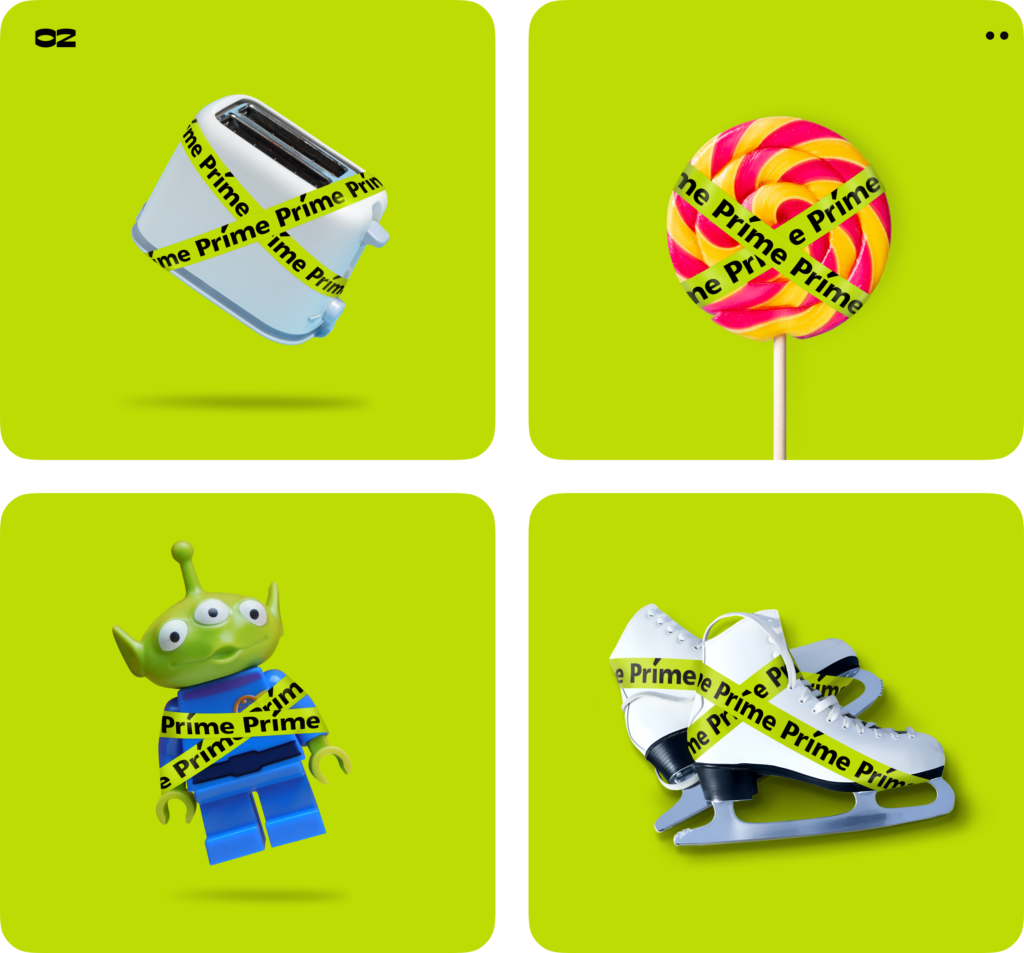
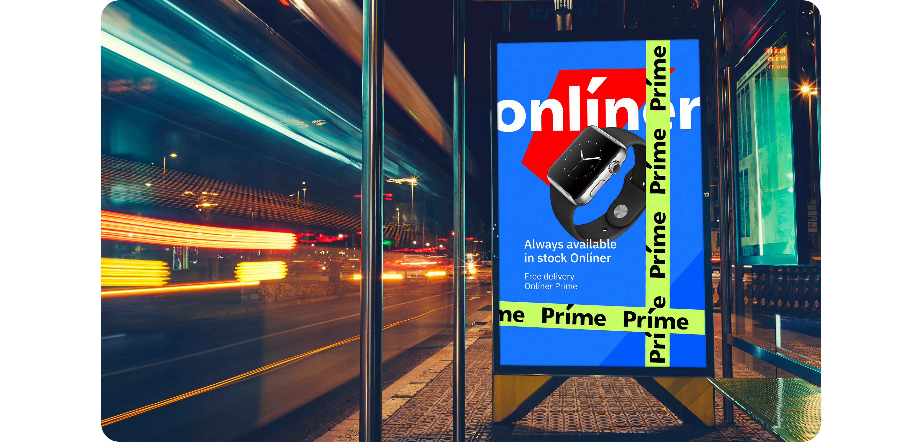
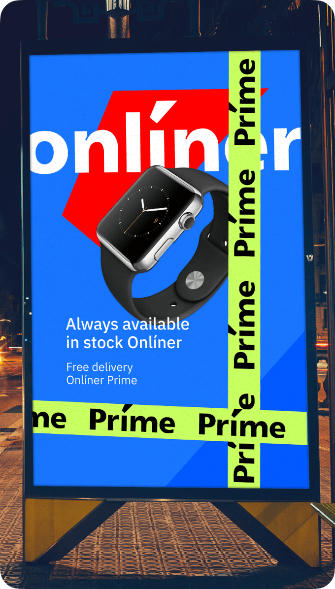
The scotch tape works great even with complex graphic materials: posters, banners, and billboards — it doesn’t overshadow the brand, product, and message, but, on the other hand, upgrades.
— This is the right way
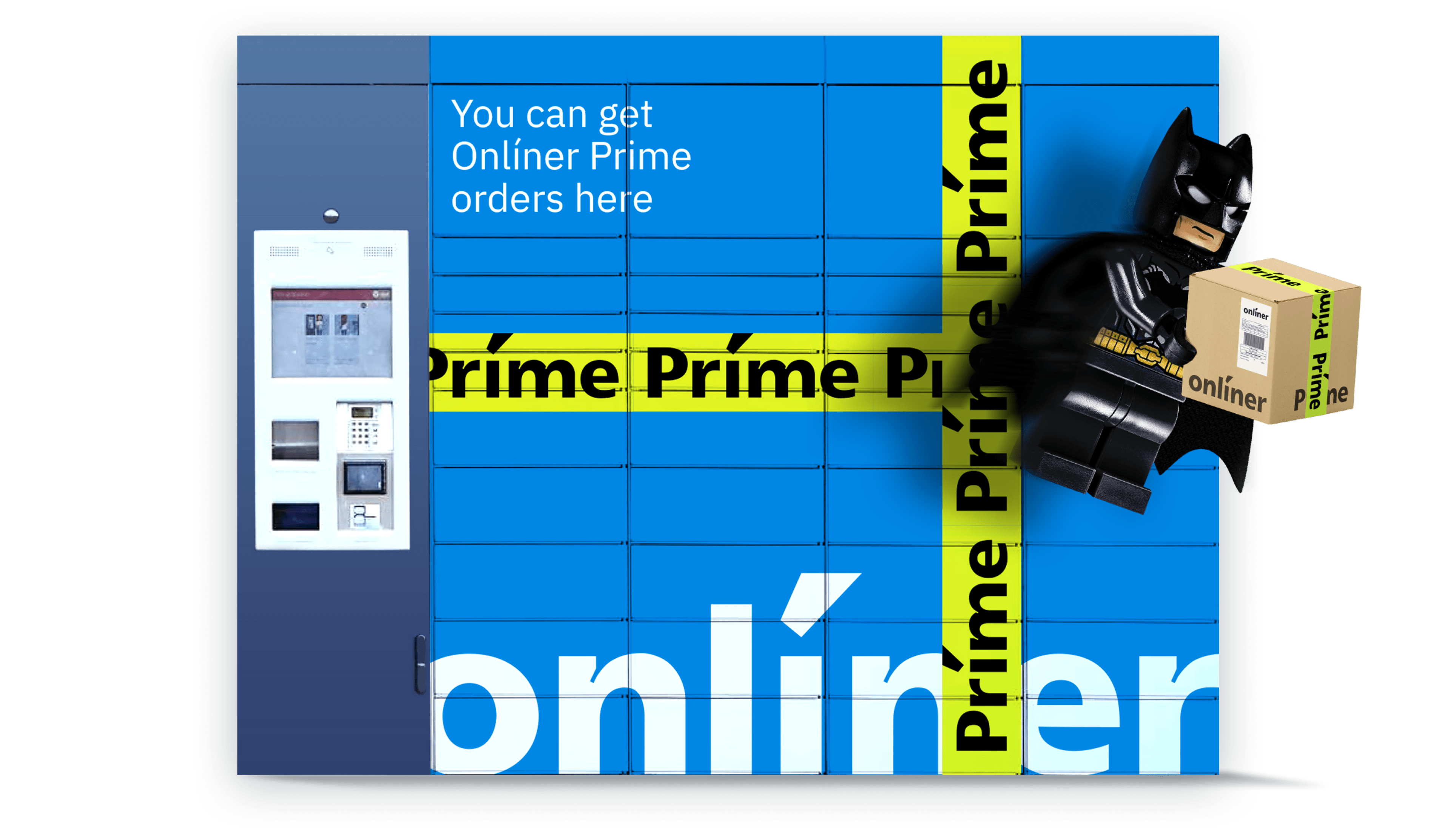
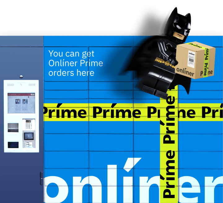
We come up with a navigation-branding system for delivery points and drop services. We are analyzing possible interiors of shopping centers in the capital and small shops in the suburbs. We are amazed by the exteriors and, moreover, we create visuals that will help find a delivery point quickly.
Entry point → signposts → delivery point
Another variant for getting an order is boxes. We brand them with the familiar and reliable Onlíner and enhance them with a light green Prime.
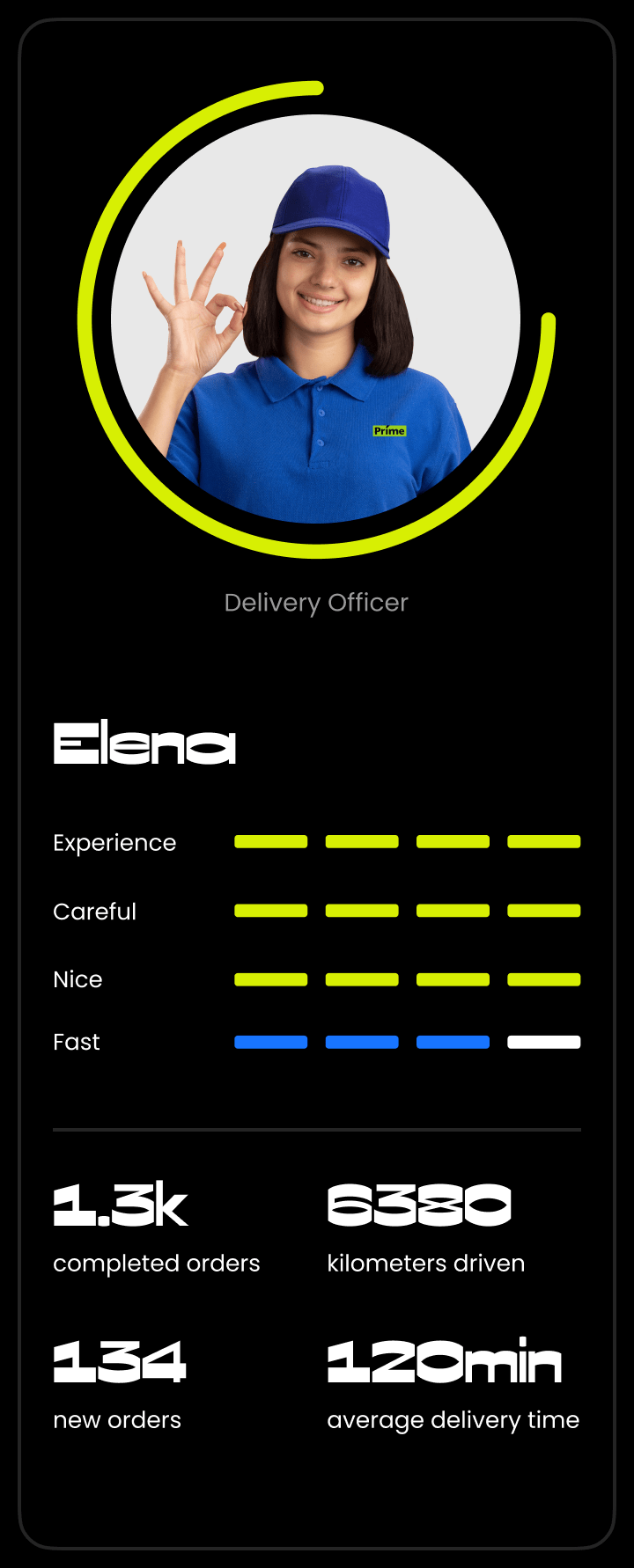
Delivery men are ambassadors of the brand
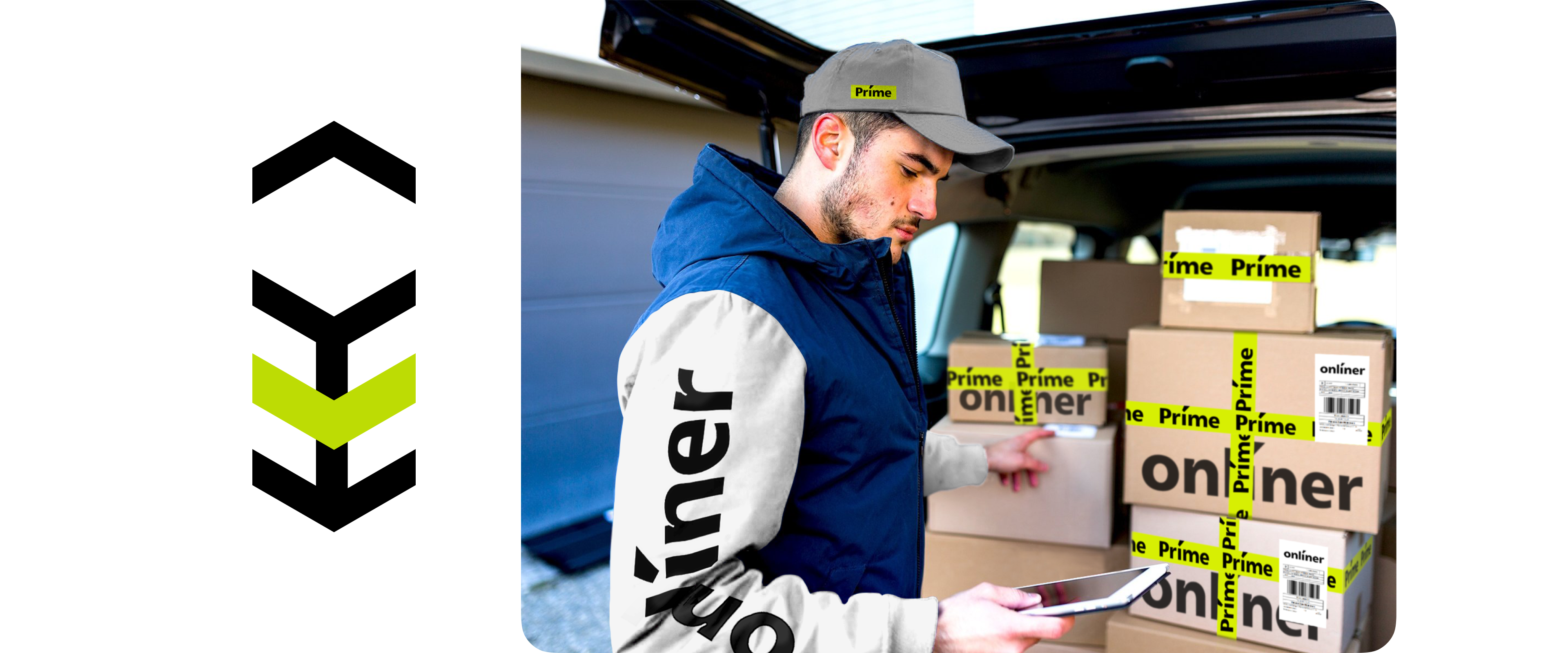
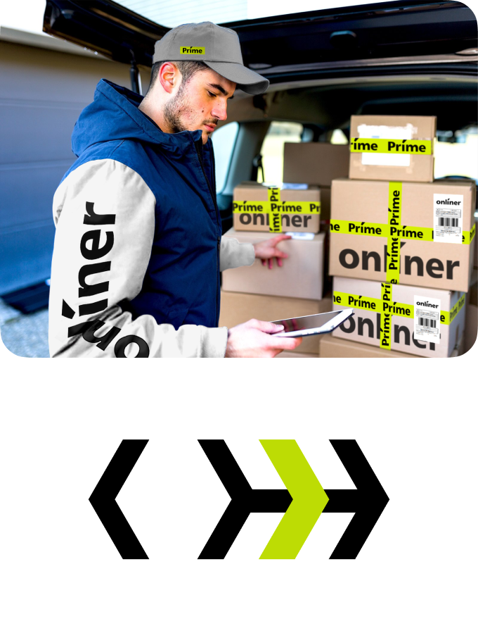
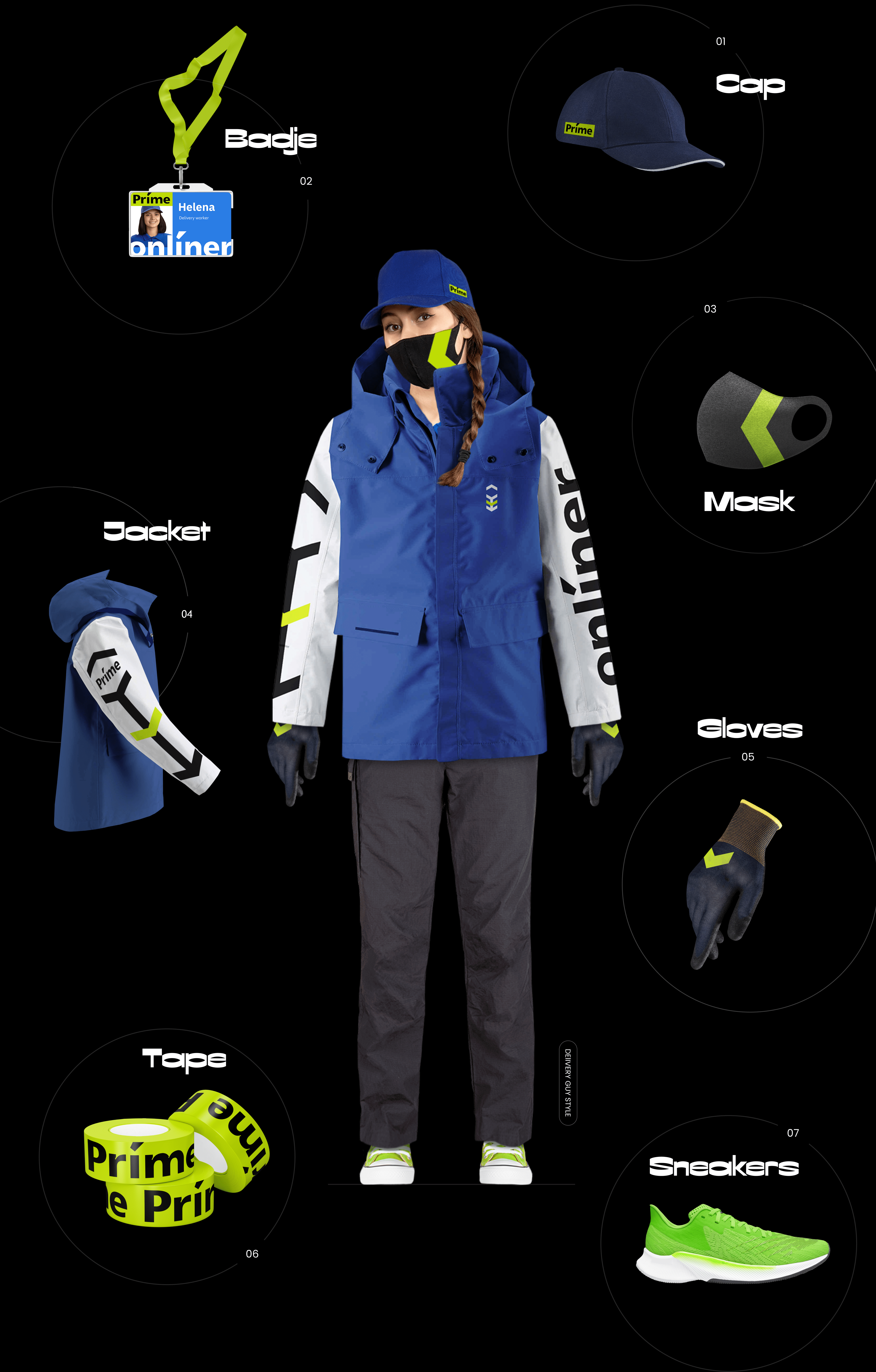
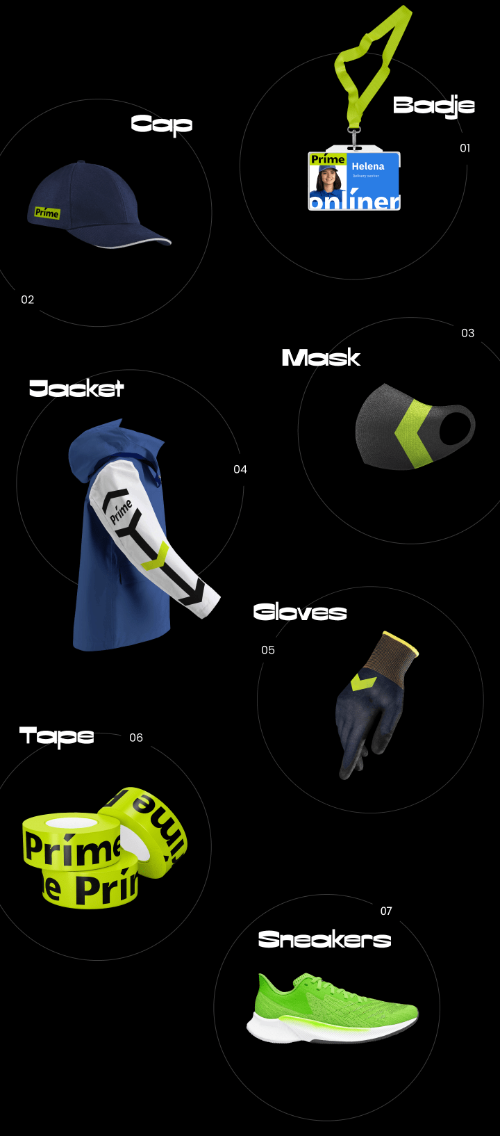
The Onlíner Prime delivery man symbolizes convenience, speed and style. Down with impractical and vulgar luxury, flashy colors and huge ‘houses’ on the backs of poor delivery men! Our choice is high-quality tactical equipment with appropriate accessories.
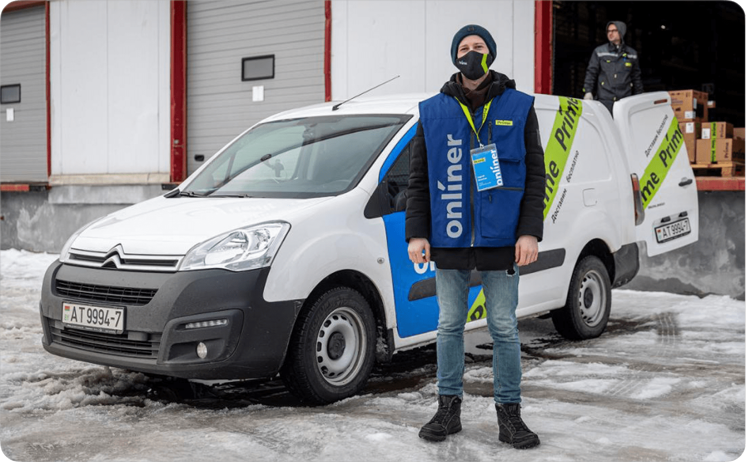
We launch a pilot with a small delivery team and a fleet of vehicles. Preparing light equipment. We make vests with reflective elements and large pockets for the brand, where it’s convenient to put warranty cards and checks. Hands remain free.
Transport
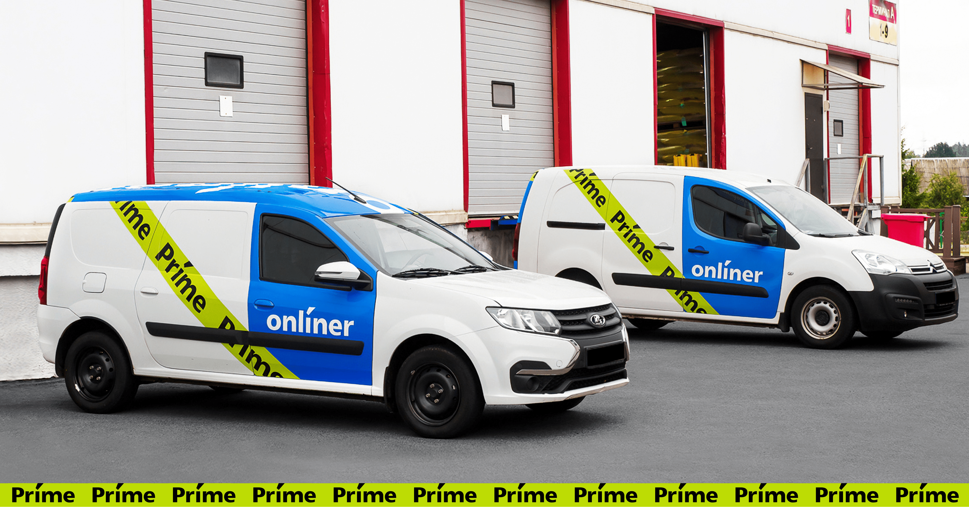
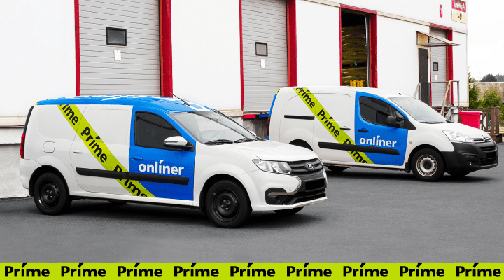
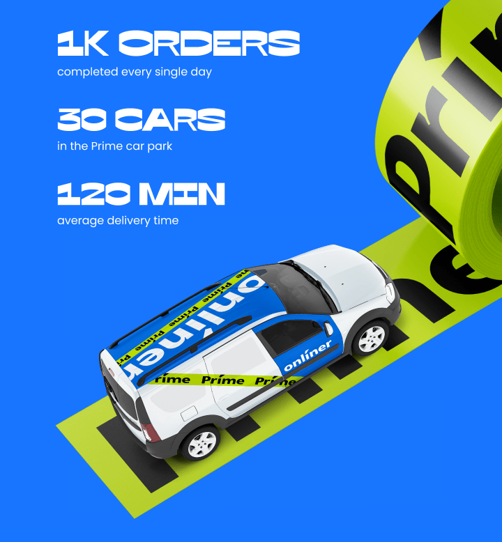
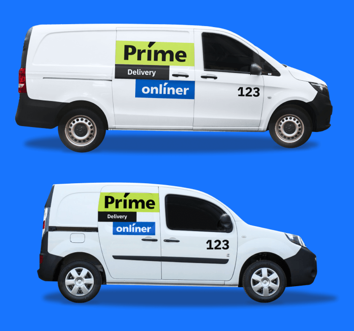
We brand the car, taking fools and roads into account. We don’t place the logo too low so that after the Minsk-Smorgon journey it doesn’t disappear because of a layer of dirt. Afterwards, we add a brand roof.
We’re developing a magnetic Tetris for Onlíner partners, where it’s almost impossible to mess up with car branding. No matter how you stick it, you won’t spoil it. Anyone can do it.
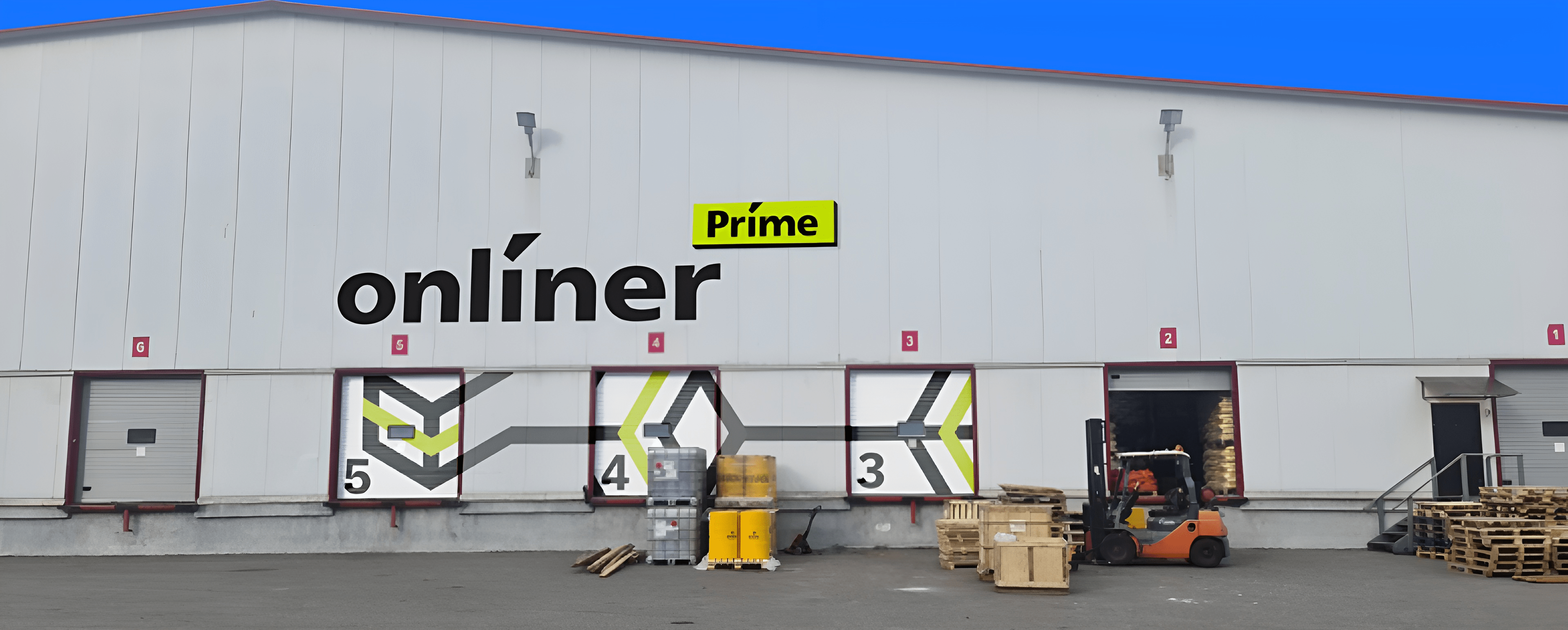
— Chef, drive up to the fifth gate!
The big logo is visible from a far distance, and the large navigation on the gate speeds up the work of drivers and loaders who came to the Onlíner stock for the first time.
