TCS Group
It is an online ecosystem based on financial and lifestyle services. The number of TCS’s customers is 19 million people and the brand’s website is visited more than 35 million times every month.
Aim
To stand out among other banks and create a visual communication style for all products of the ecosystem.

Issue
In 2019, TCS Group had photo shoots with employees and used these photos as product ads — production was slow and expensive.
Other banks also fully exploited the image of a happy customer who was delighted with a salad and a plastic card.
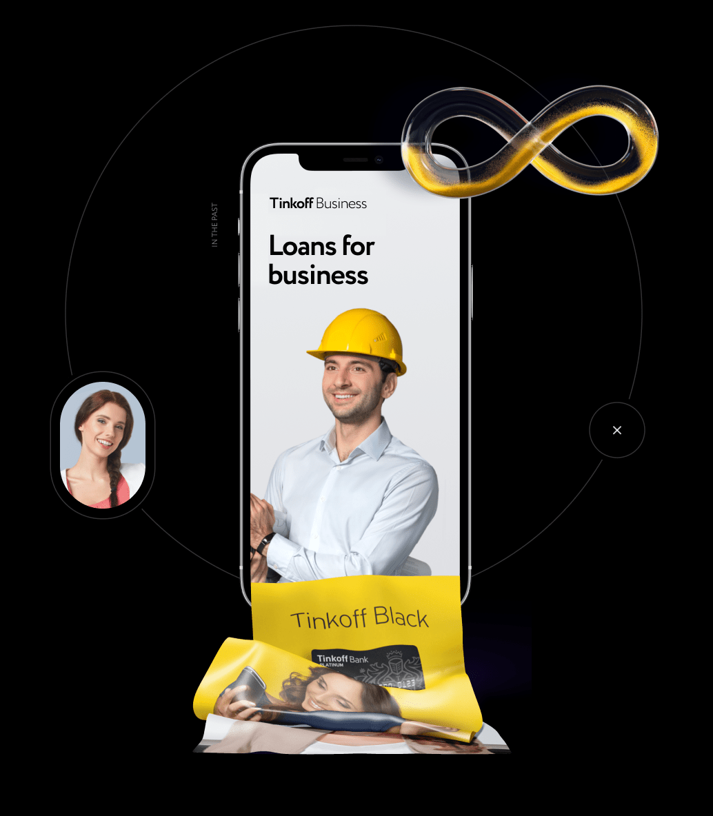
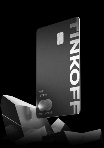
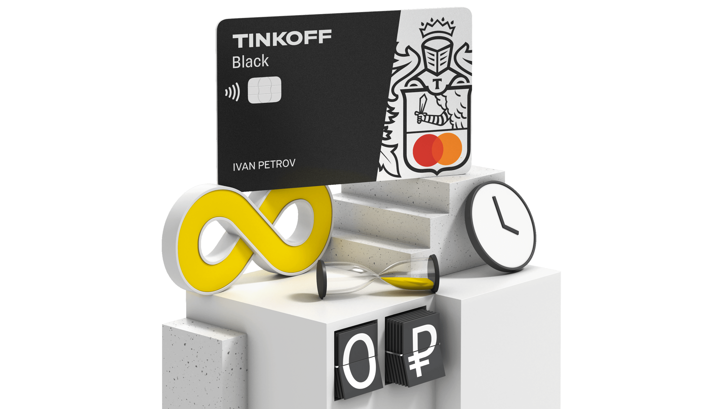
We go off from the strained smiles of stock models and find a solution — 3D. None of the banks in the Commonwealth of Independent States used 3D in their communication in 2019.
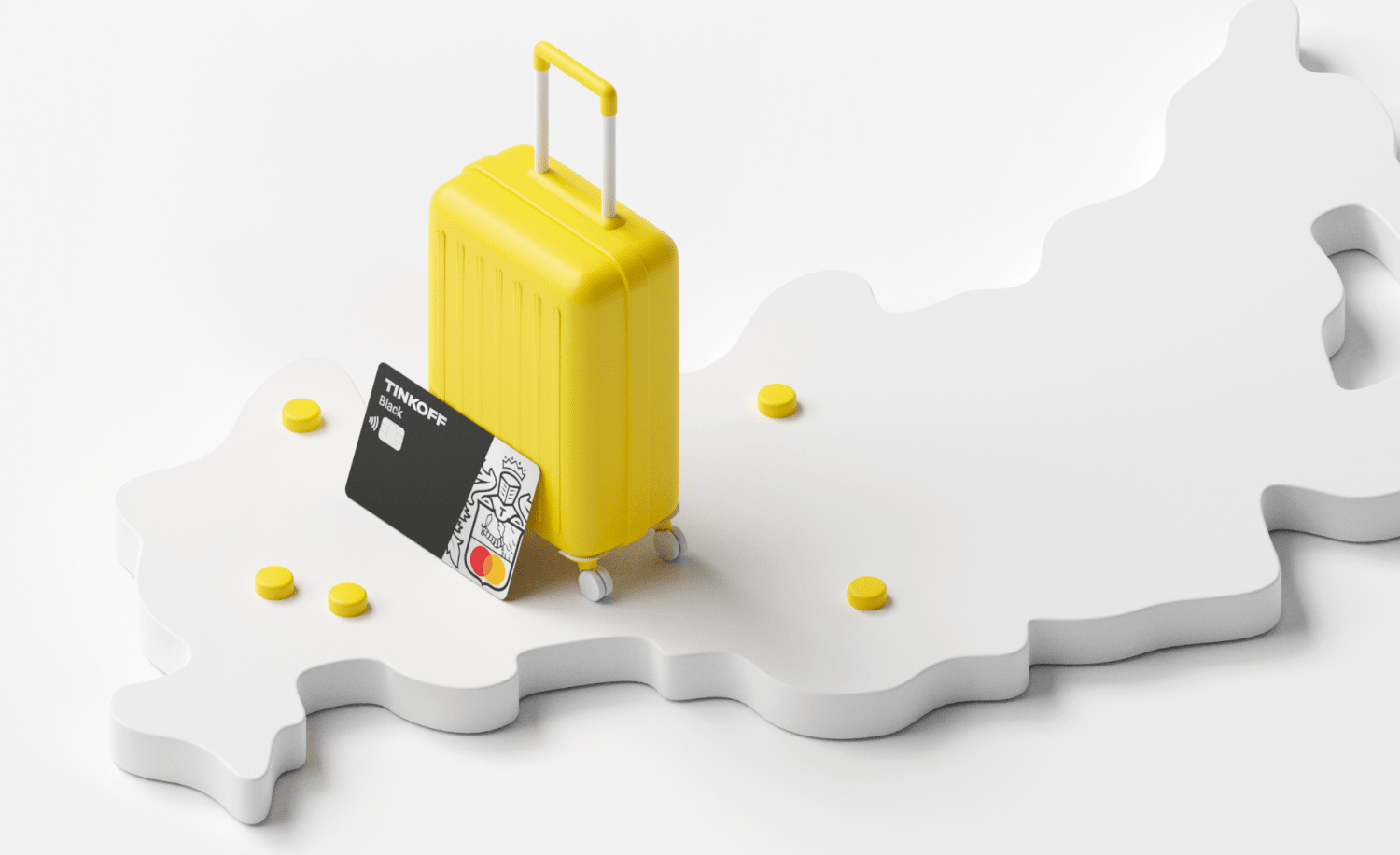
Let’s 3D!
All visuals are divided into 2 types: for both internal and external communication. Each type has its own approach.
#001
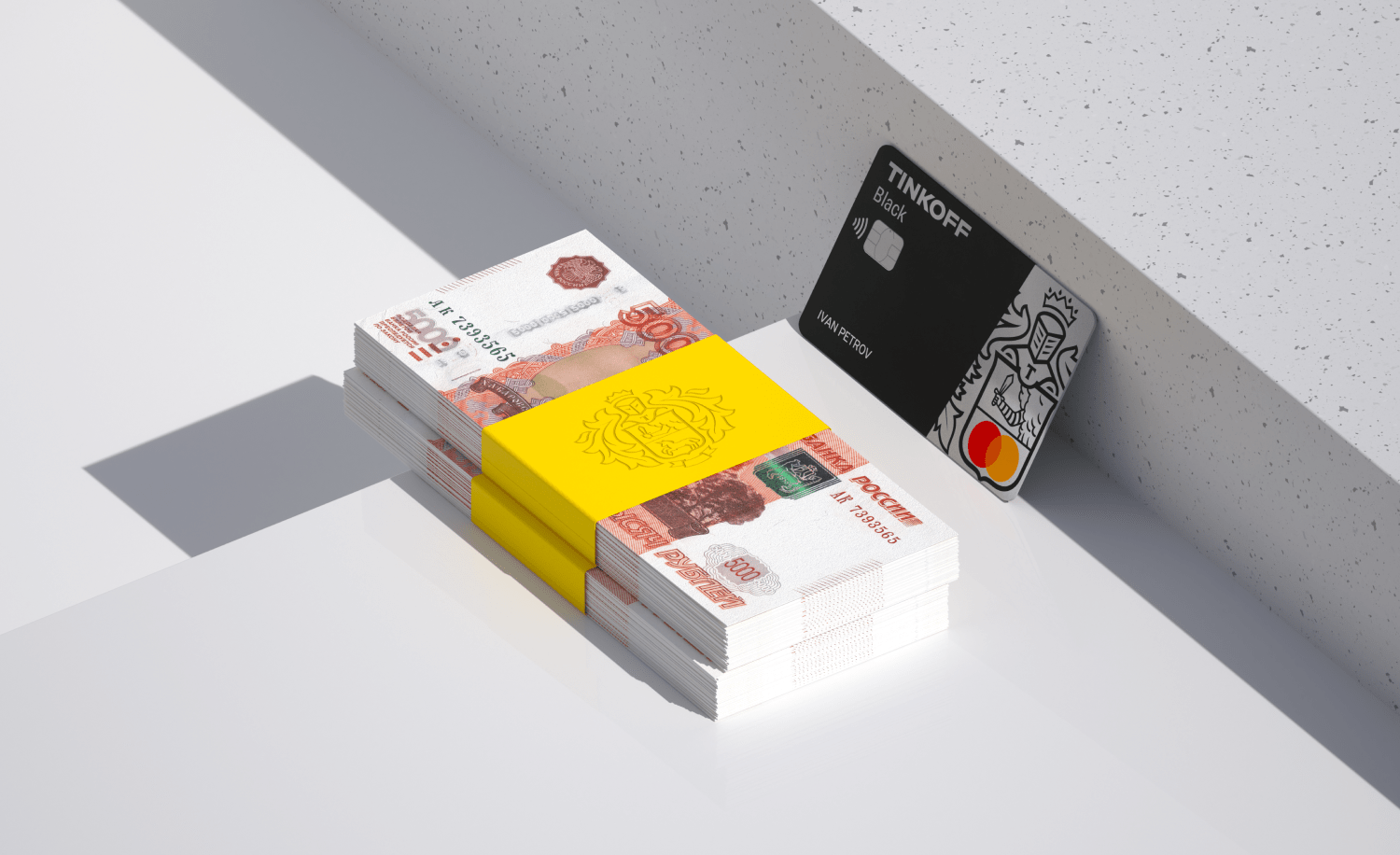
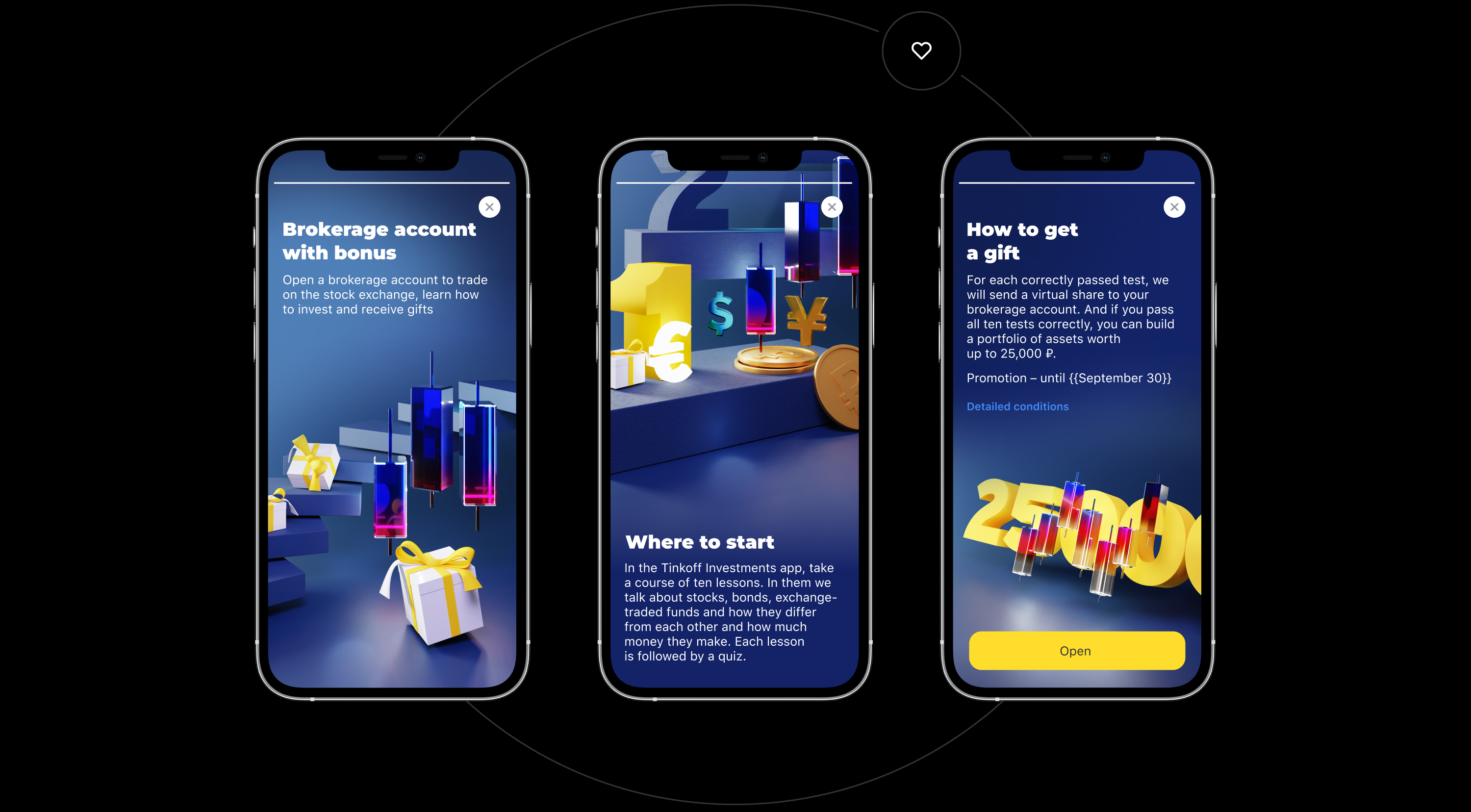
Creative visuals for the site and the mobile app
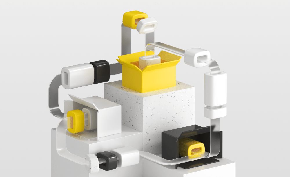
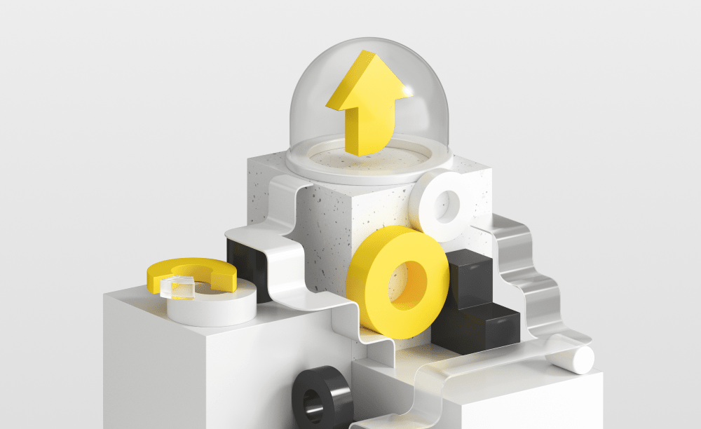
We develop the style: minimalism, the same perspective and the same lighting. TCS’s ecosystem services are differentiated by color.
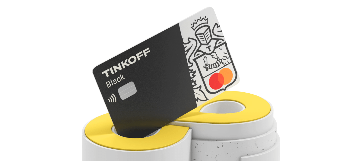
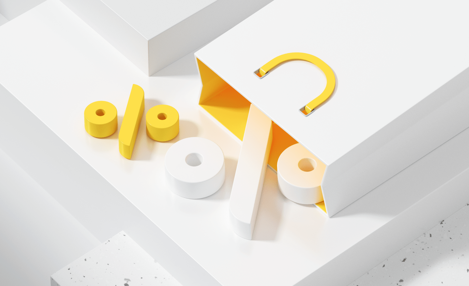
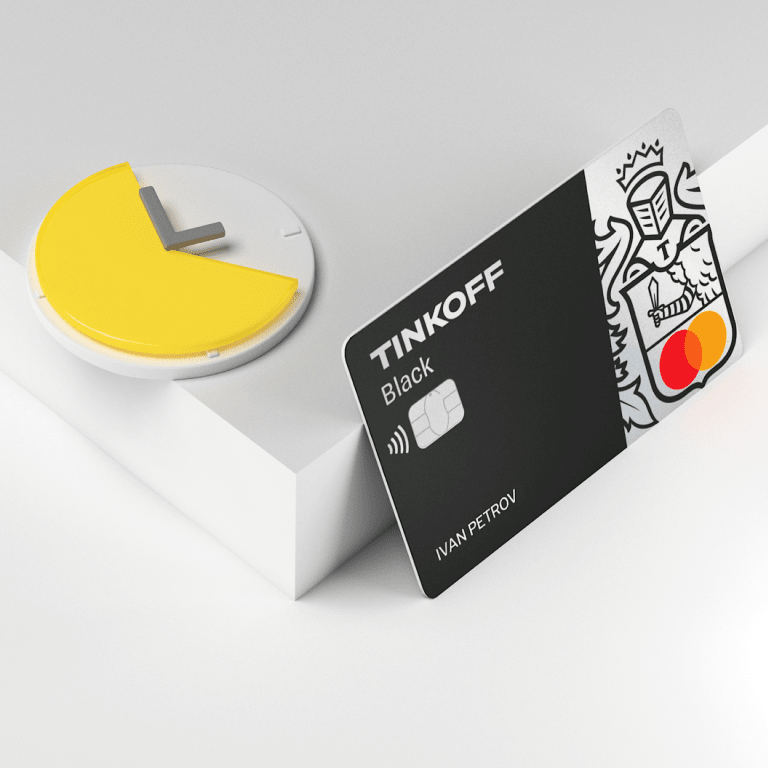
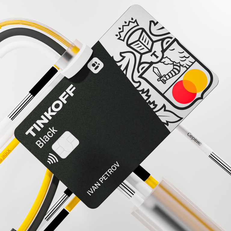
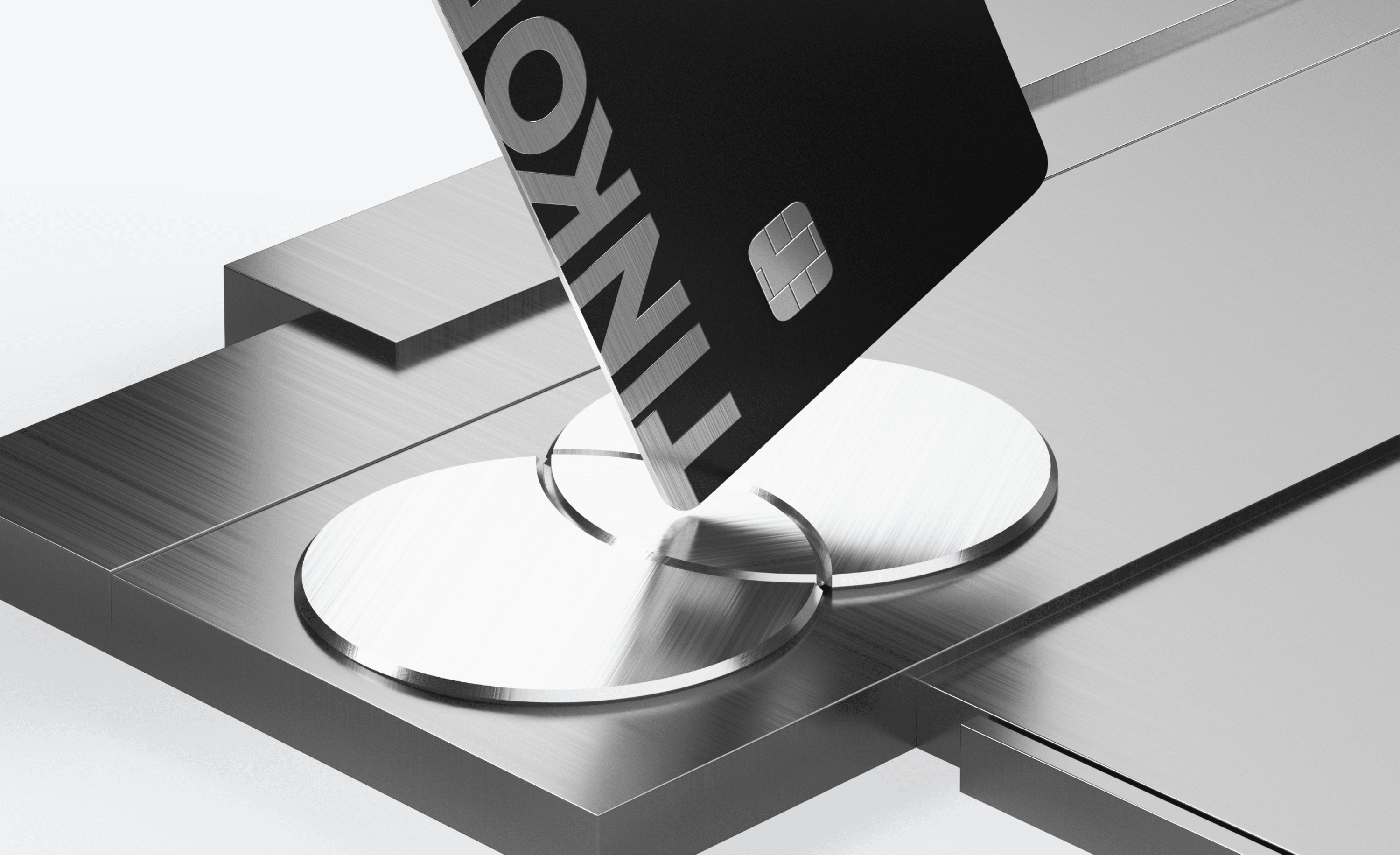
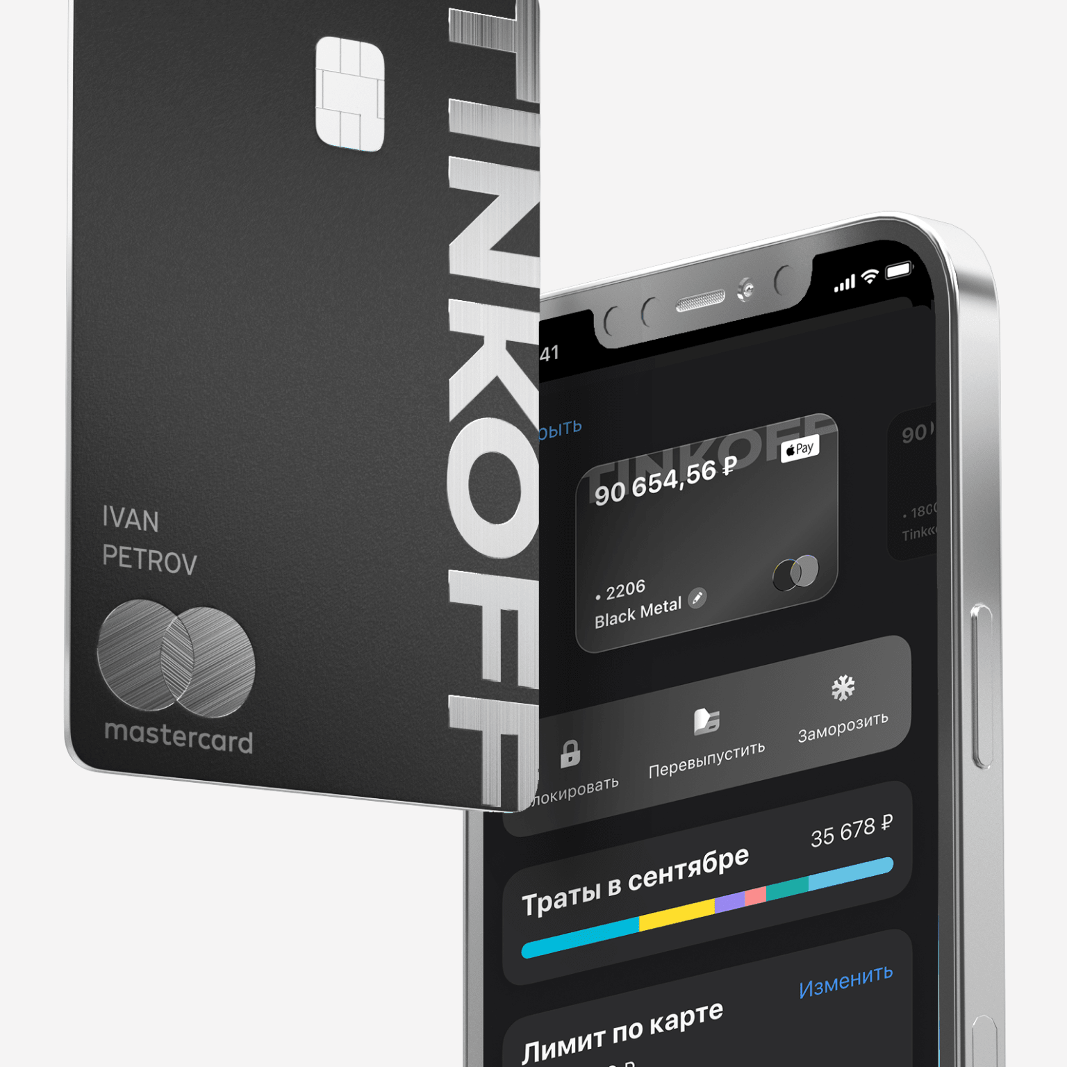
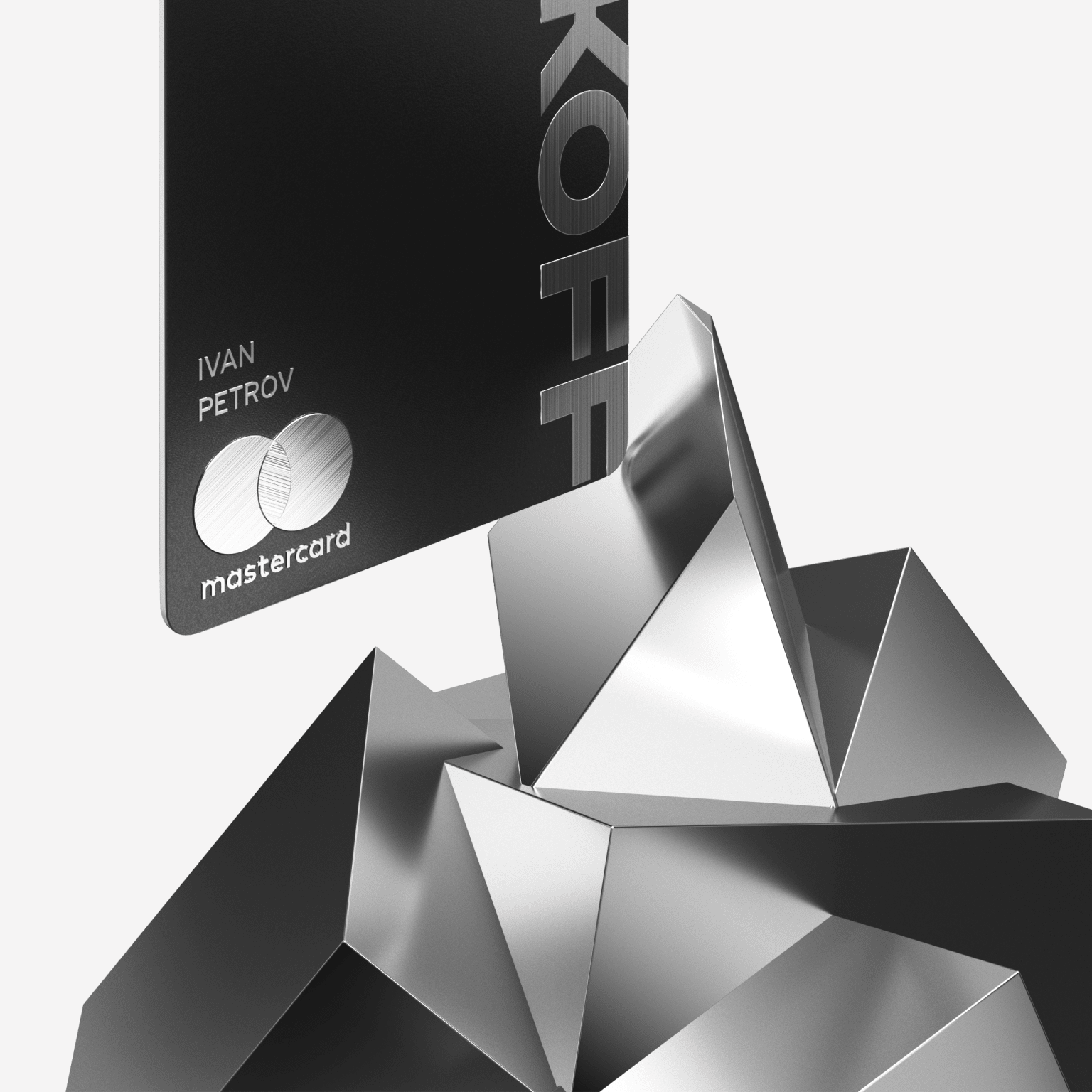

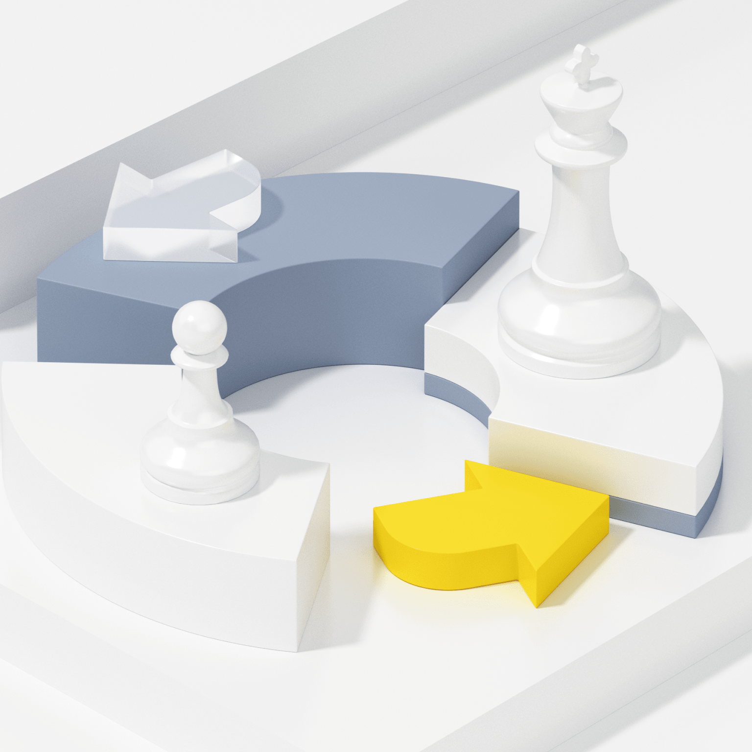
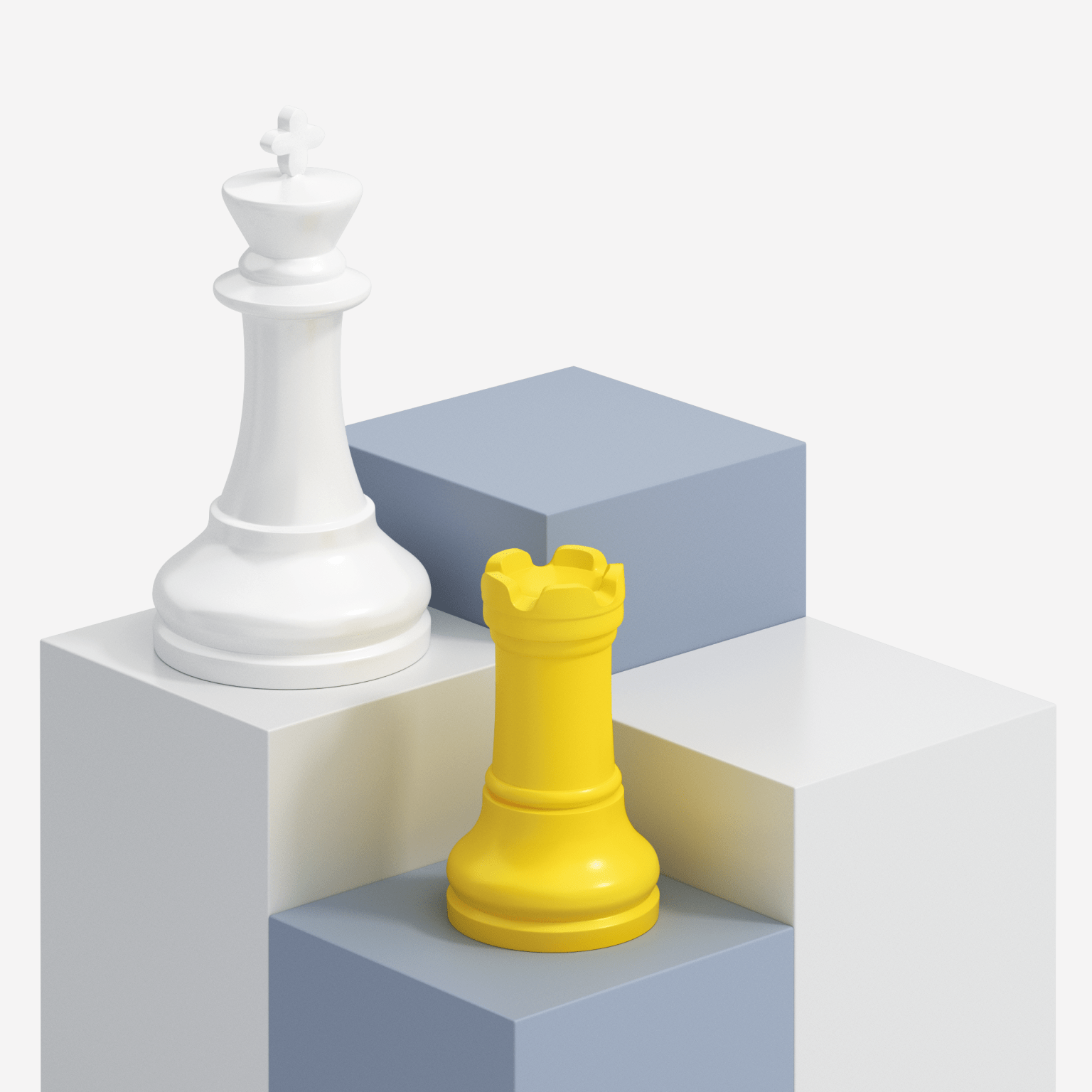
The brand is easily recognizable by visuals, so we don’t put the logo on each image.
#002
Advertisement creative visuals
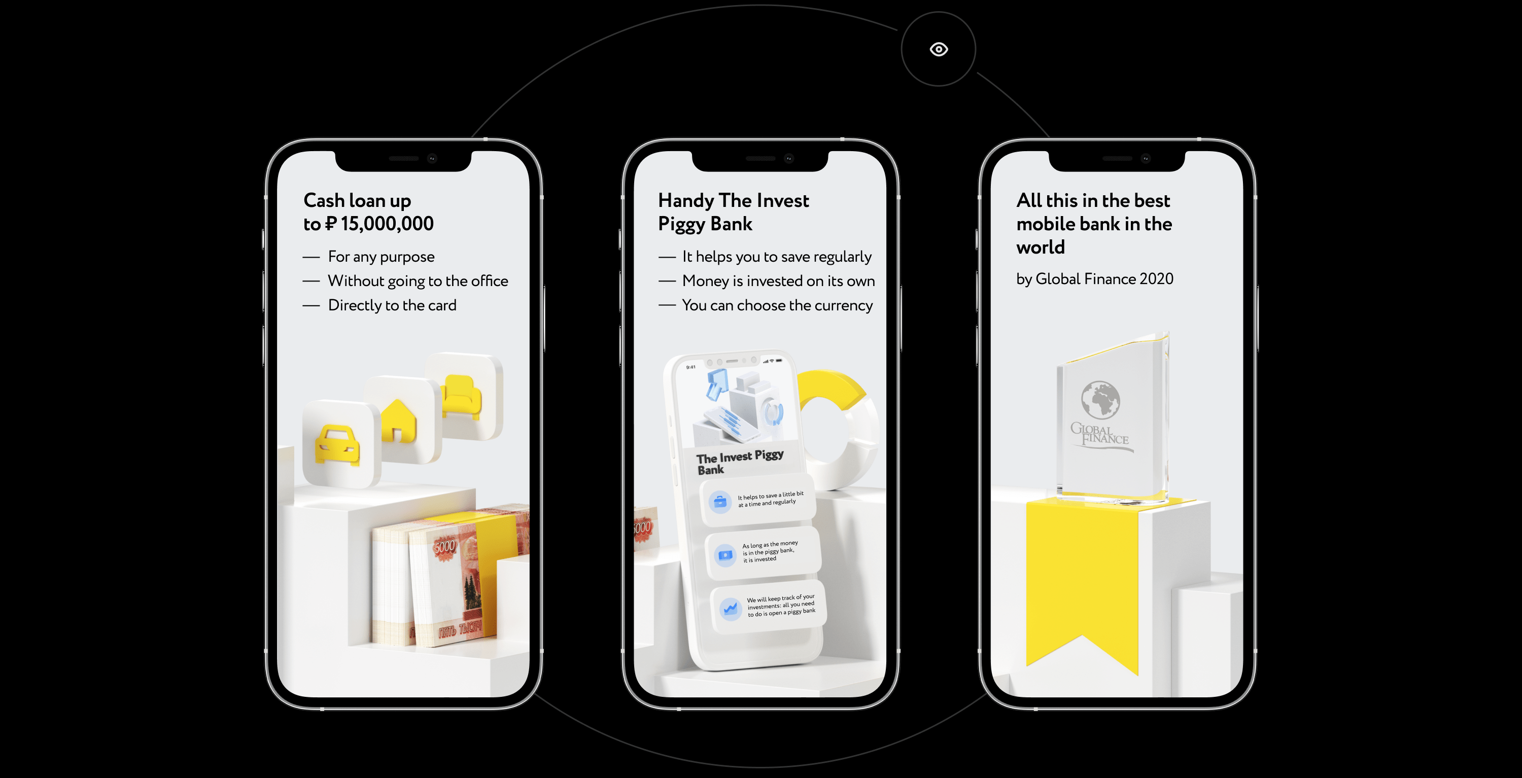
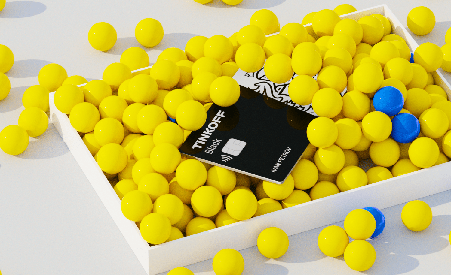
Off with your rules! We create bright and outstanding visuals because the main aim is to stand out in the news feed.

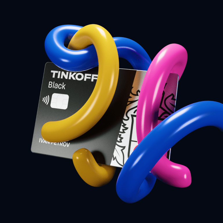
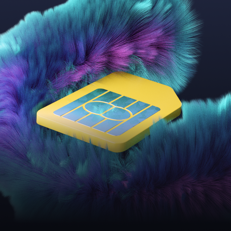

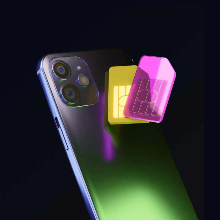
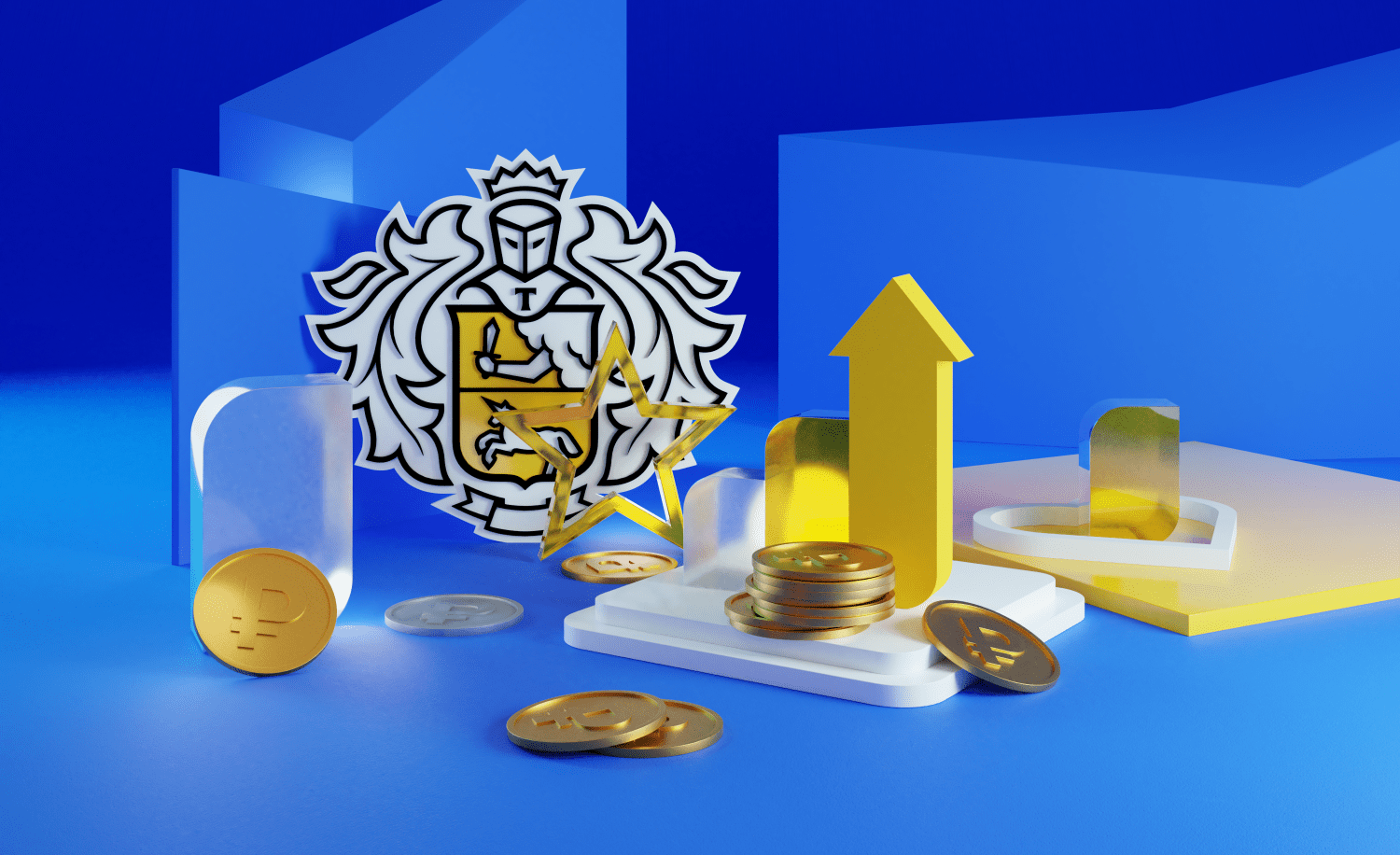

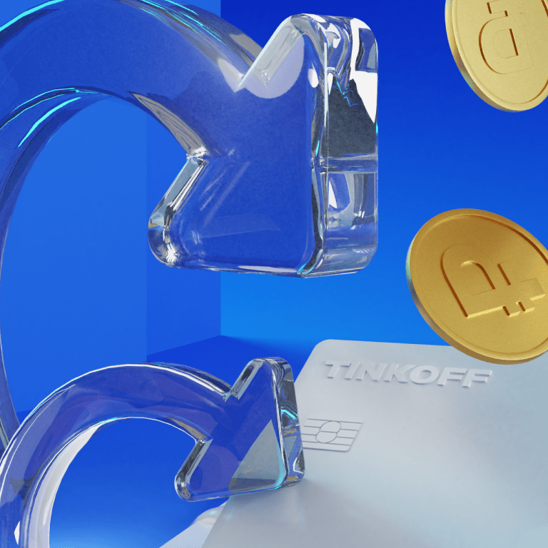
Views count and stories engagement rate are growing — we’re on the right way!
How the style was tempered
The aim was to make TCS Group stand out among other banks, differentiate services among themselves, reduce the cost and boost the production of visuals.

