Payment system and SaaS platform developed by eComСharge. beGateway operates on its own servers and is certified according to the standards of international payment systems: Visa, MasterCard, American Express.
The platform integrates data security technologies, Big Data storage, load balancers, repositories and other tools to ensure fast, secure and reliable payment processing.
Goal
Update the web application interface: create a modern design, fix confusing navigation and provide an opportunity to get overview information about the status of the system and financial flows in one screen.
Goal context
- The interface is used by people with different levels of technical training and knowledge of payment processing.
- The control panel contains hundreds of functions, settings and modules, most of which are rarely used.
- Different composition, intensity and complexity of tasks arise in the interface depending on the business cycle and user role.
- Some of the payment system settings are dangerous to deal with for the nonpros: they directly affect the financial security of transactions.
- If the user does not resolve the incident in the system on their own, the participation of a support employee is required, and this is expensive.
We separate roles and define cases
To understand how to design a platform interface, we dive into the customer’s business: we study the product life cycle from sale to implementation, we deal with the intricate settings, records of platform managers and administrators.
In design we use two approaches (frameworks) — role-based and case-based. They help take into account the interests of all users, quickly implement design solutions, reduce the influence of the human factor and save customer resources on training new support specialists.
Roles
Each user group has its own requests, ideas about convenience, and a set of operations. In the process of audience research, we identify three key roles and one secondary role (below the line):
Cases
A division by role helps to identify typical cases for all user groups. To achieve this, we conduct in-depth interviews, identify frequency operations, detailed daily routines of different users, hidden settings, obstacles and this-is-not-a-bug-it-is-a-feature.
We’ve sorted out the roles, collected several dozen cases — here is the result
Easy refunds
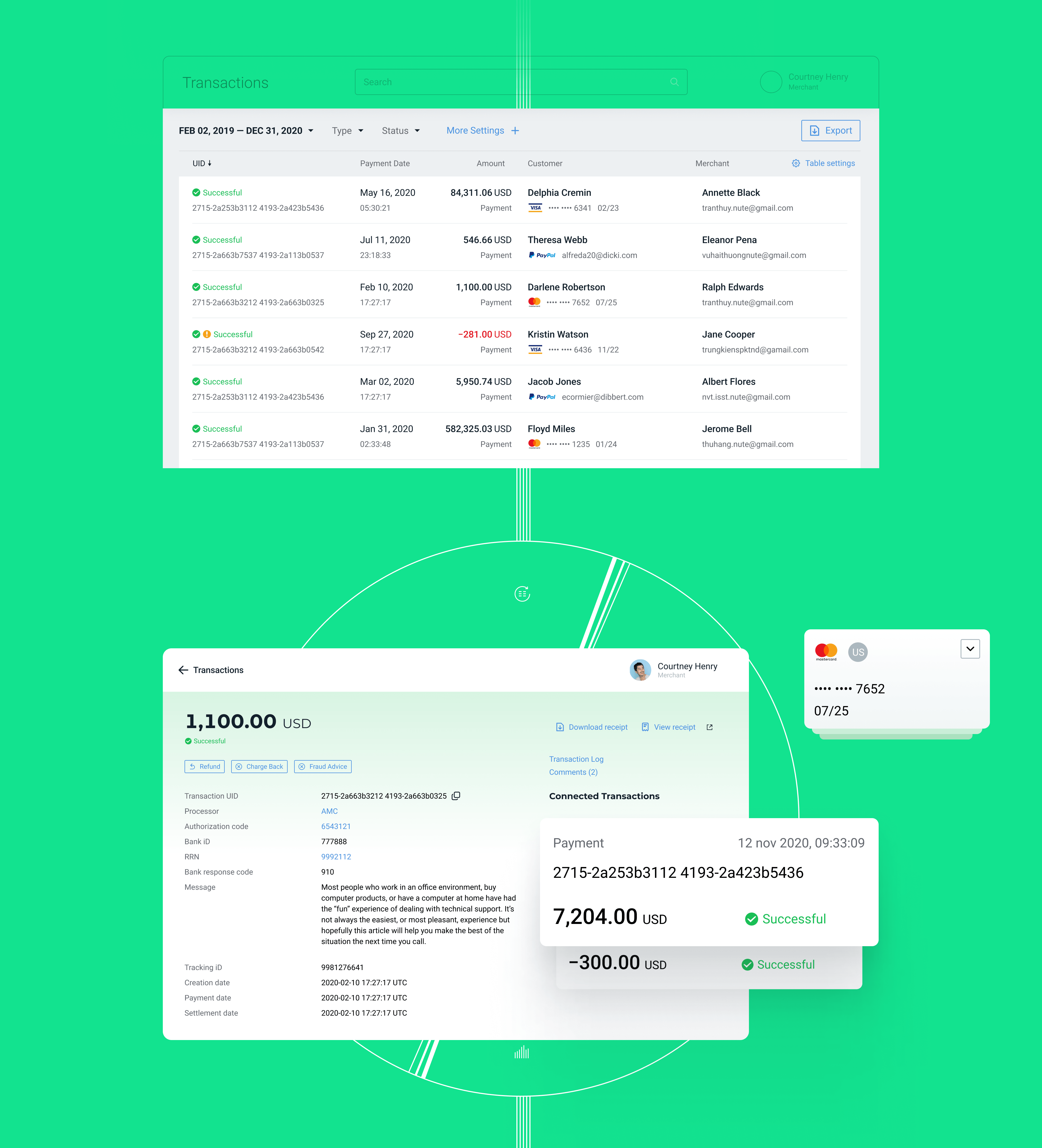
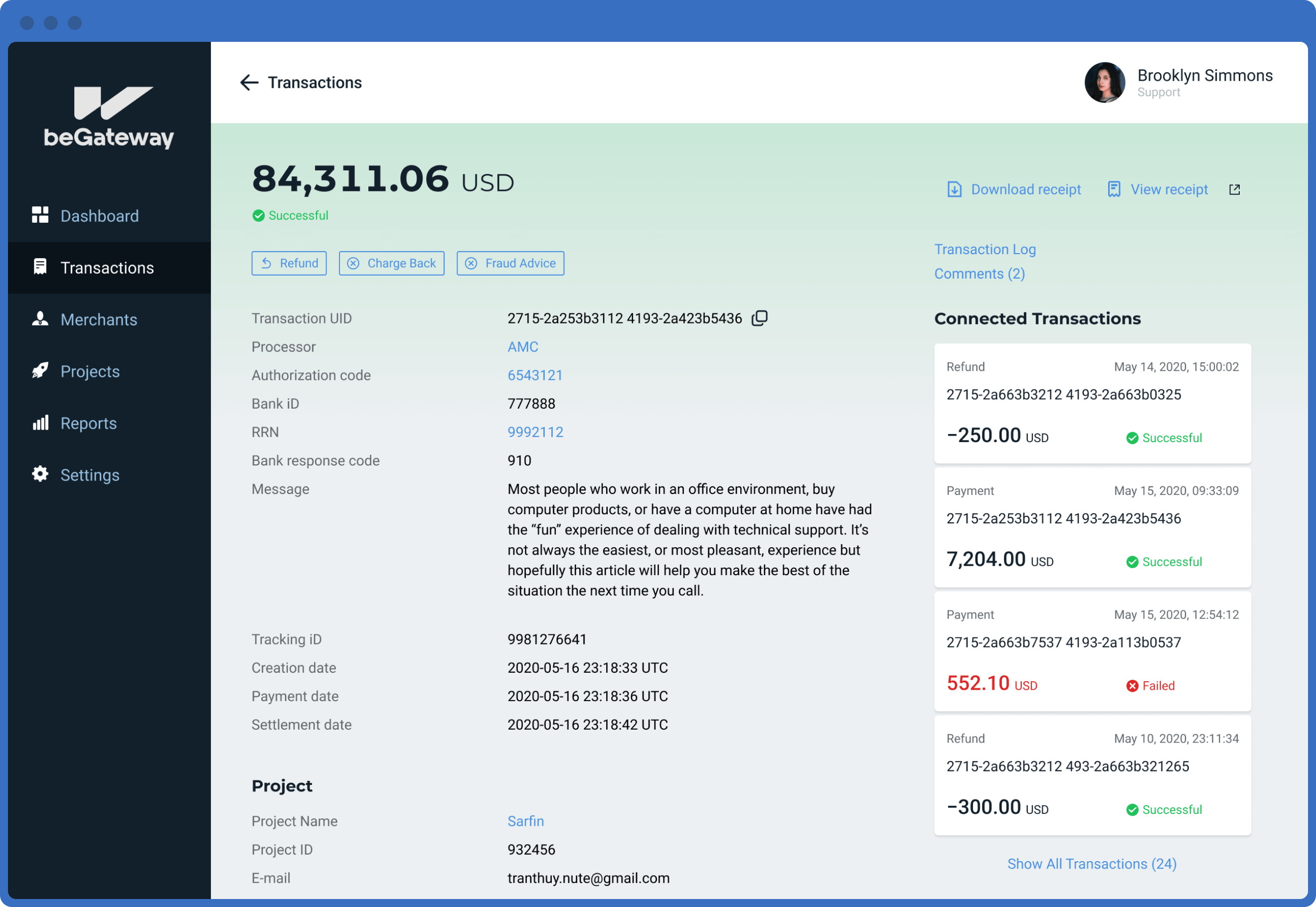
All transaction actions are grouped and are quickly accessible by frequency: return part of the money, recall a payment, or check if there are any fraudulent actions. The merchant doesn’t need to read the manual or remember how to use the panel interface.
Monthly reporting for accountants
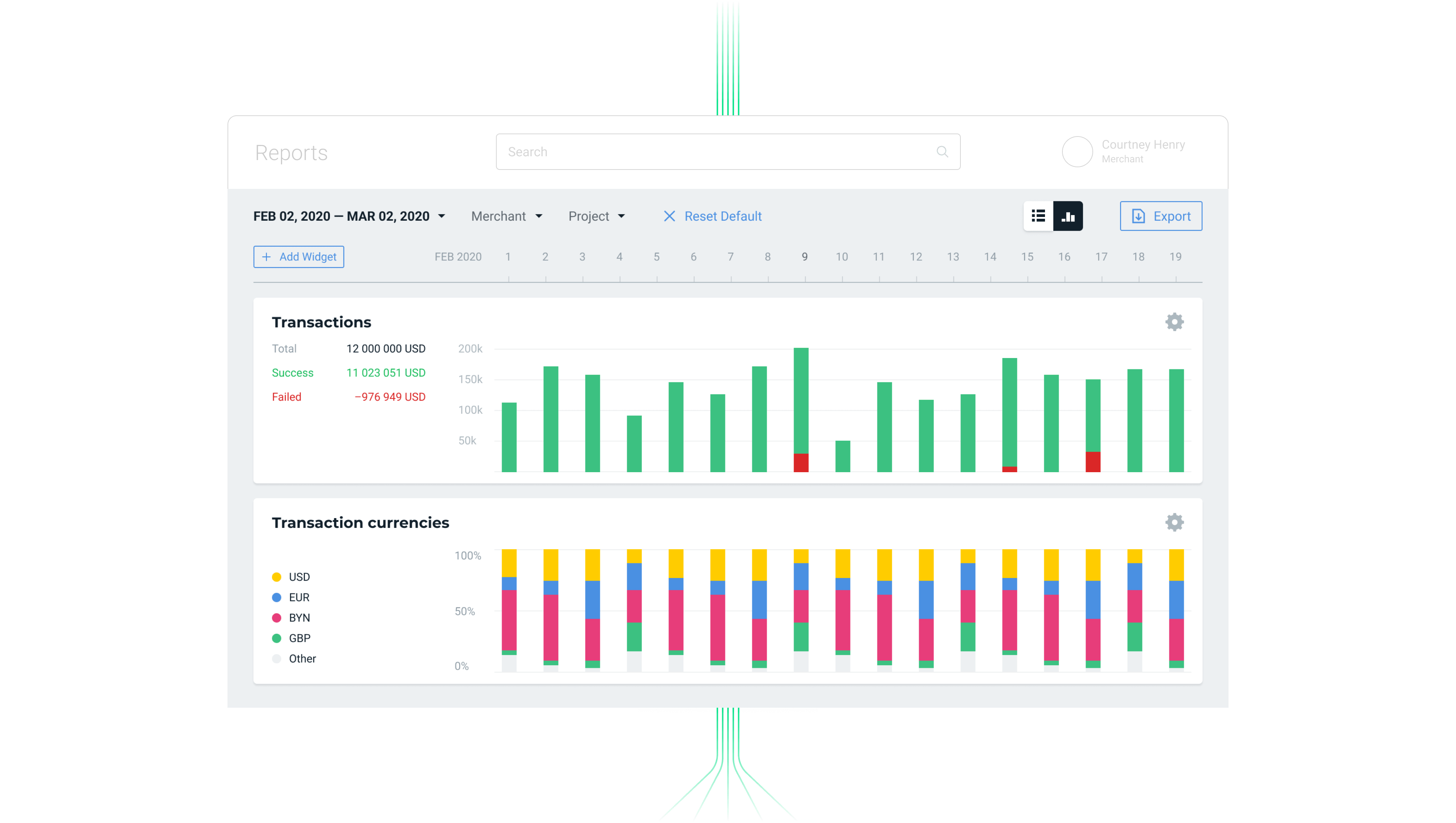
To convey the history of account movements and reconciliations to accountants is enough to look at the reporting section and set up a selection by project, period, or download the entire statement.
In difficult cases, if the merchant can’t deal with the problems of accepting payments (or doesn’t want to), he creates a request — a ticket to the Support Team.
80% of cases of support managers
determine the design and functionality of key interface screens.
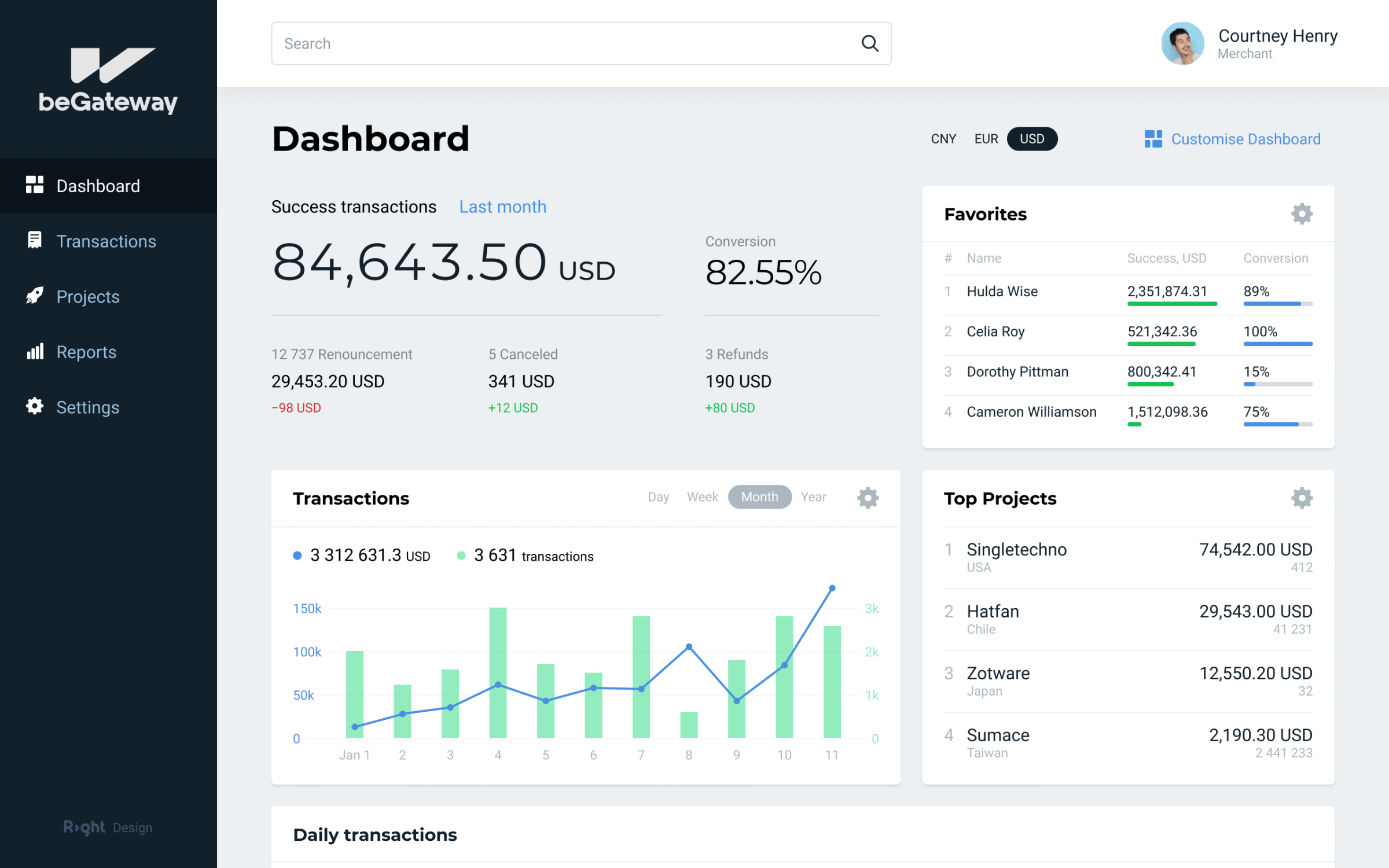
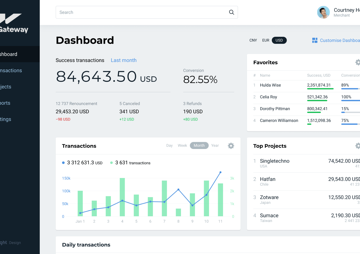
The support manager’s dashboard is more functional than the merchant’s dashboard. With its help, the manager carries out comprehensive monitoring, manages the loyalty of key merchants, quickly reacts and prevents crisis cases — such as a payment gateway failure and non-functional card processing for a large marketplace, which can result in a loss of several millions in revenue.
Merchant and store management
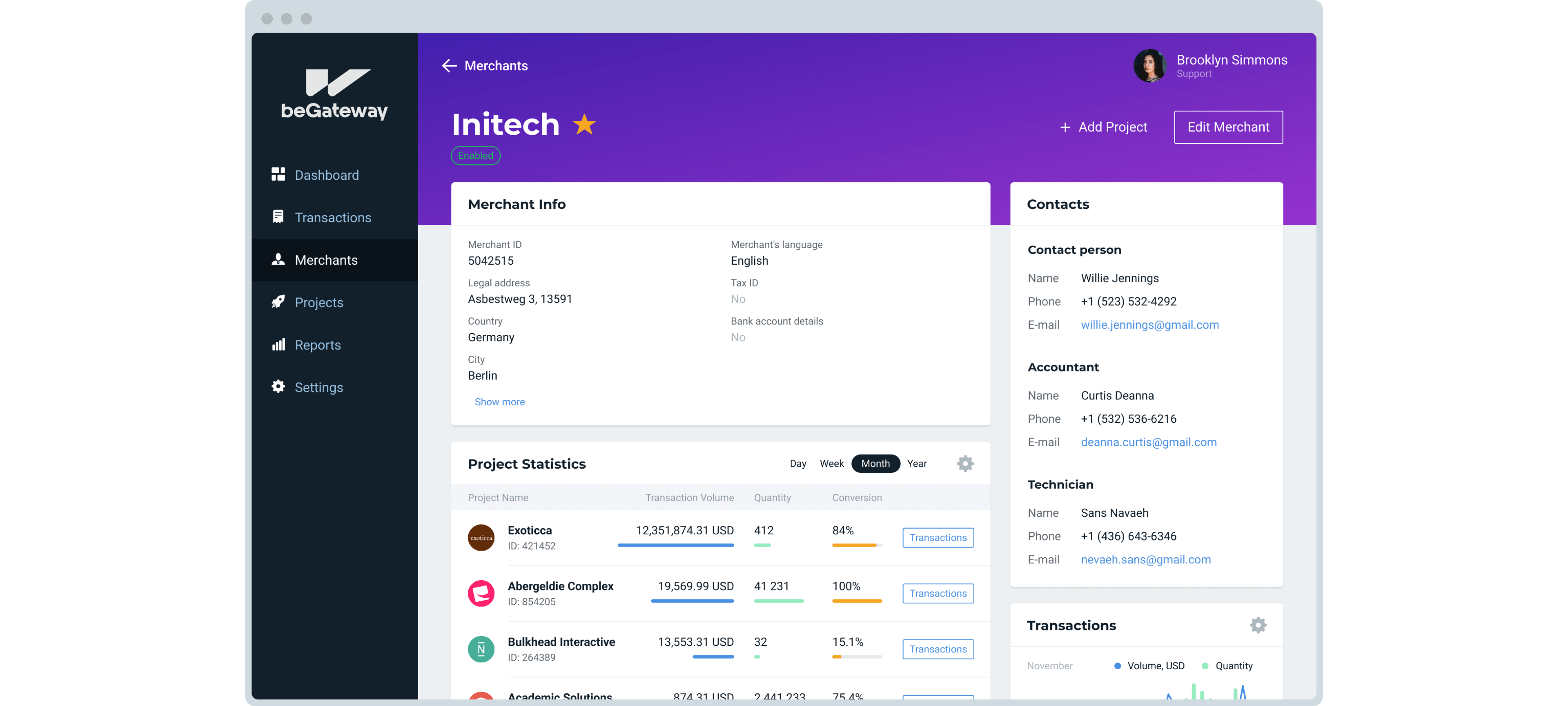
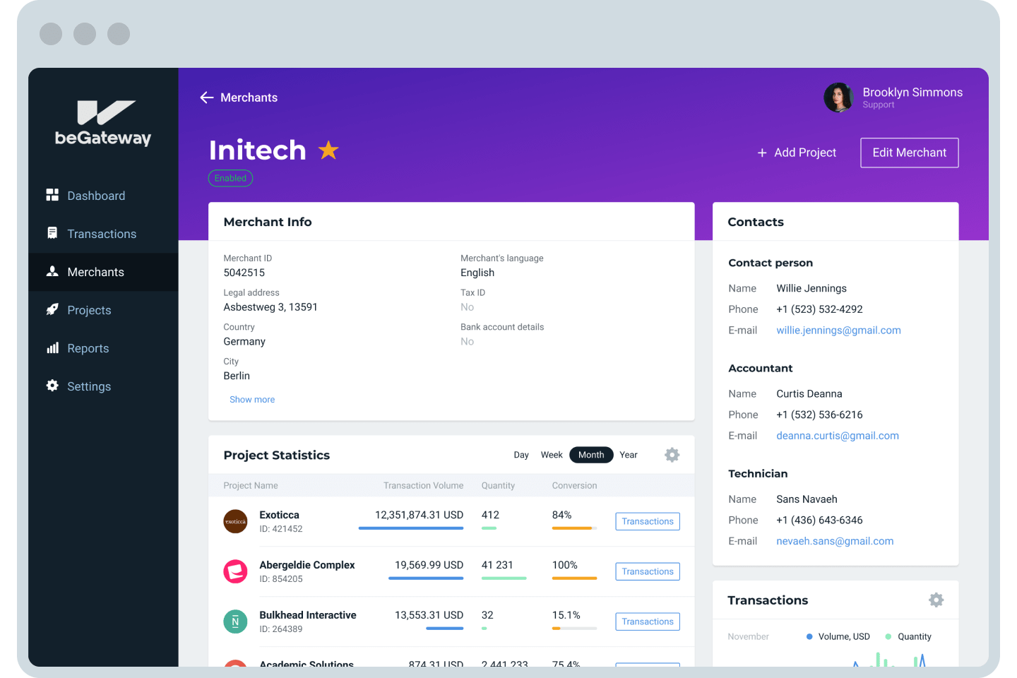
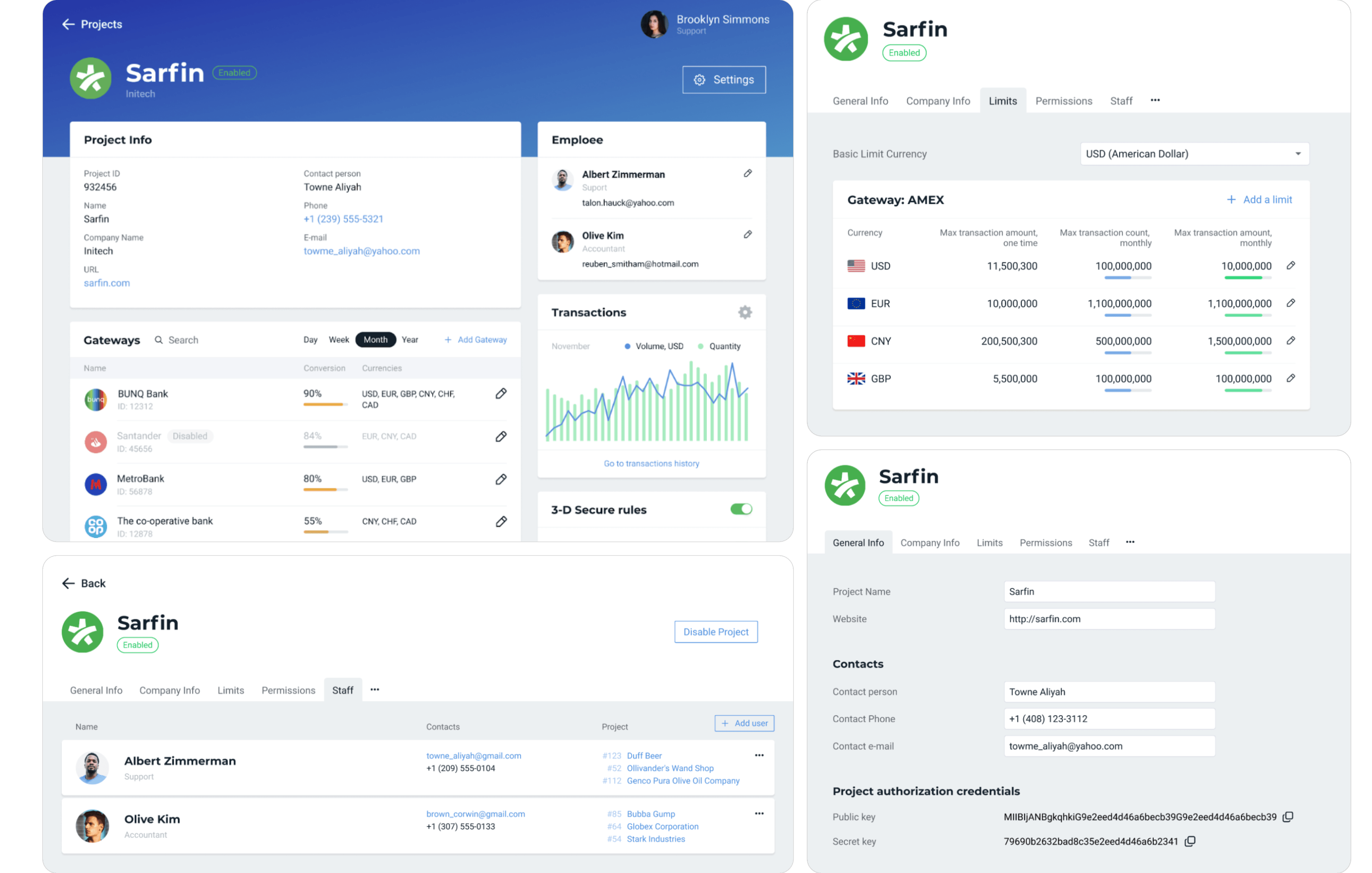
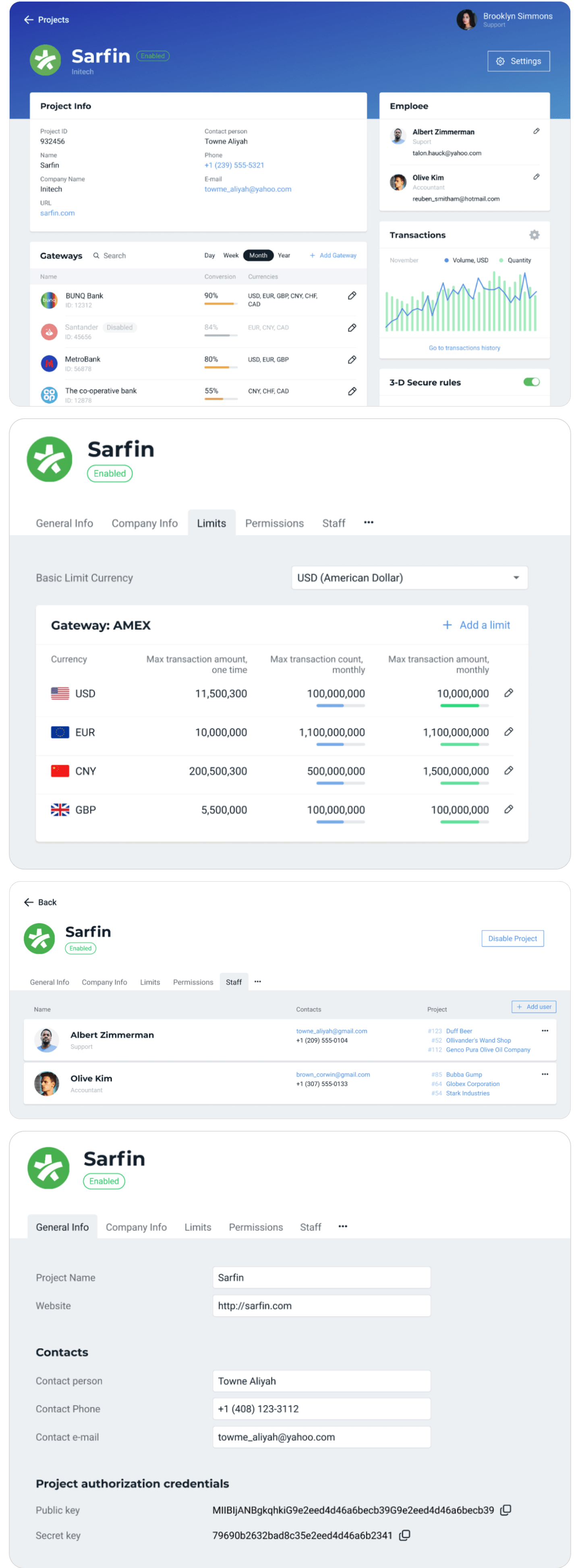
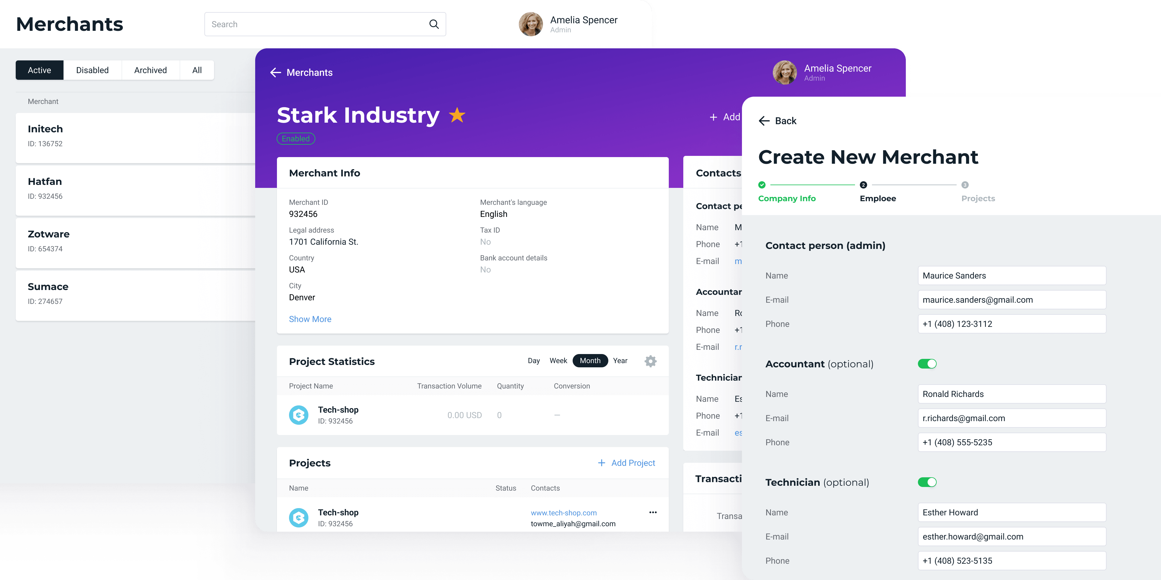
A unified presentation of the store card and project for the merchant and support manager is an important strategic decision. The merchant and the manager see the same interface and composition of information and can solve the problem in the remote communication format ‘Click on the second transaction in the list.’
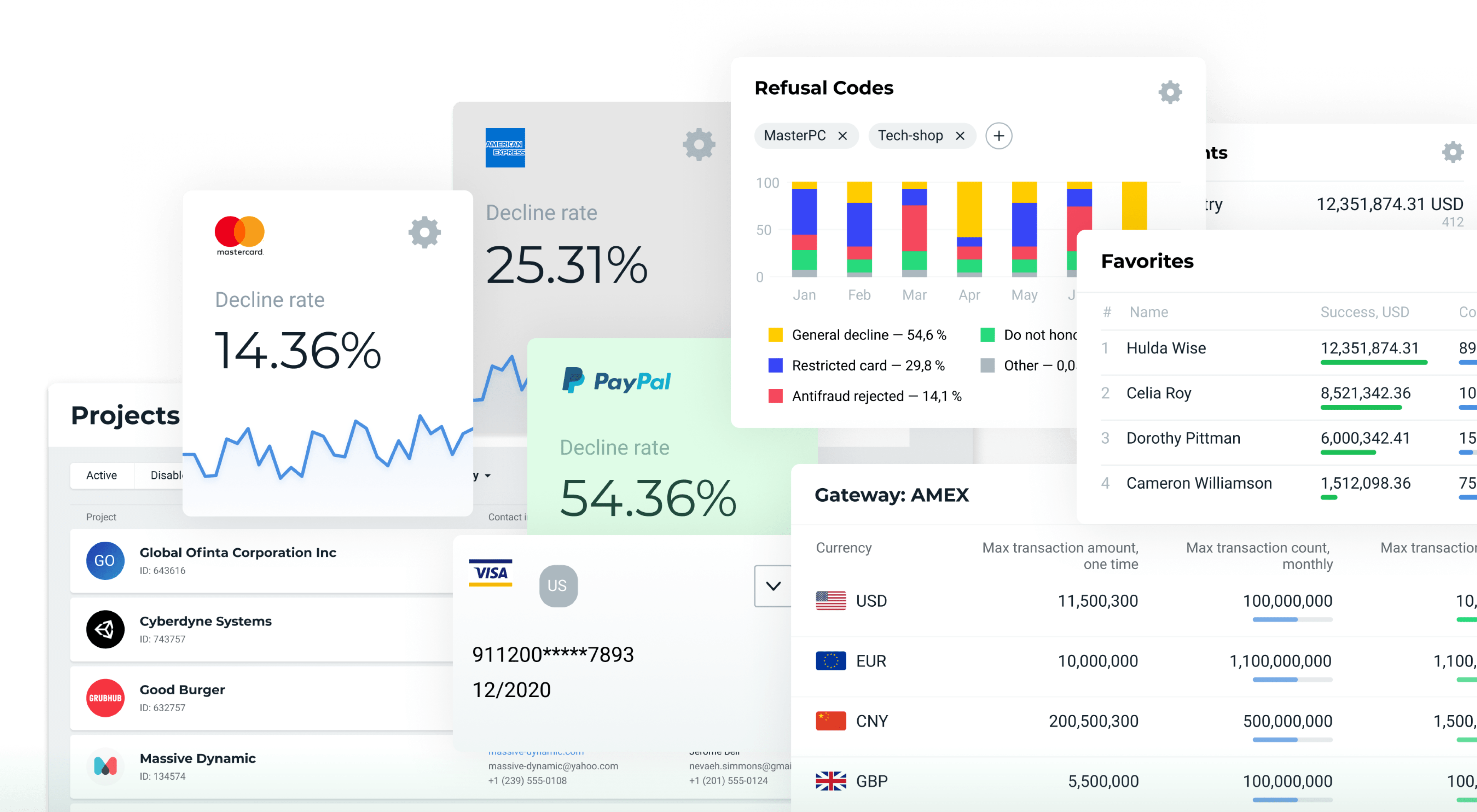
The section contains information about the store, entrepreneur, and company. The dashboard contains the necessary data: contacts, information about employees and their rights in the account, data and analytics on transactions.
Changing store settings or managing user rights aren’t frequent, but periodic cases. Most often, the support service is busy processing problematic payments: a transaction doesn’t go through, double debits occur, recurring payments don’t function. But sometimes the manager also gets specific cases — entire investigations that the store itself couldn’t cope with.
Transaction accounting and returns
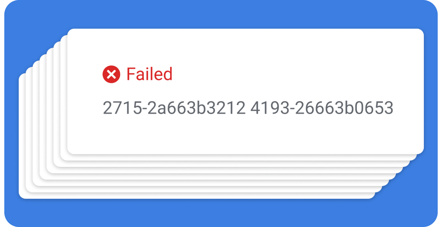
Previously, if a transaction couldn’t be found by time markers or a sum, managers would write transaction codes in a notebook and search on them. It’s easy to make a mistake in this sequence of numbers and letters:
We are correcting the UX process so that the support manager no longer suffers and doesn’t have to waste notebooks. We provide operators with flexible investigative tools.
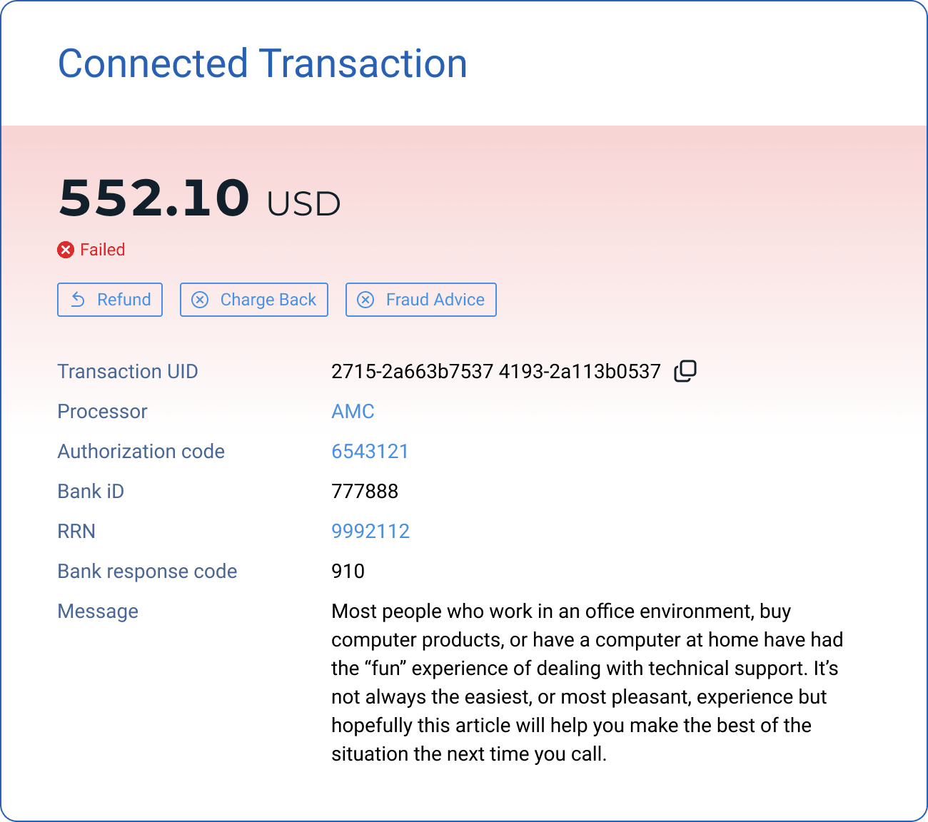
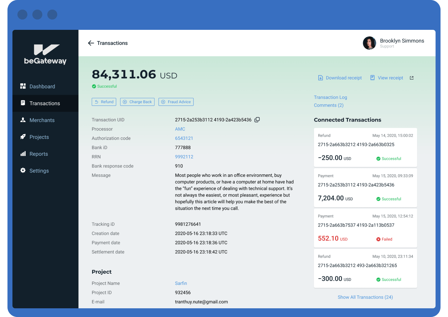
Connected Transactions
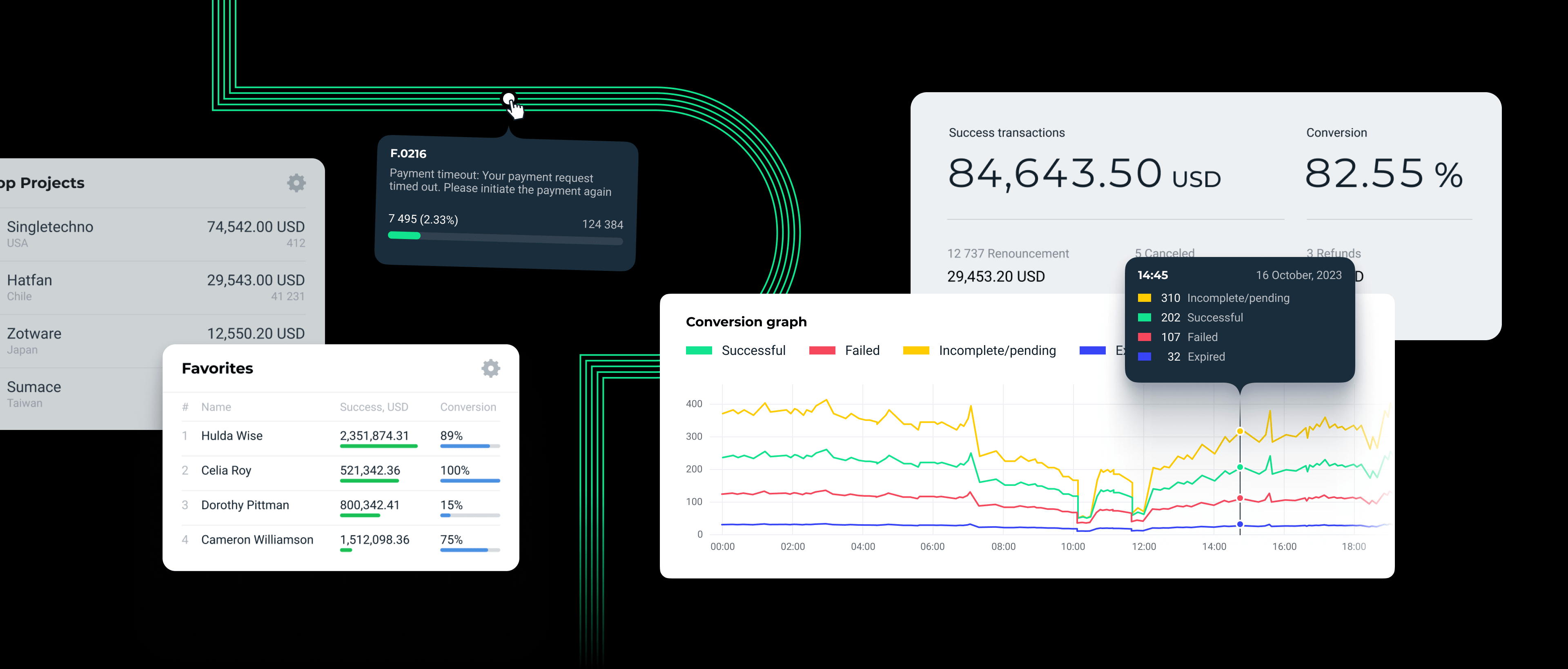
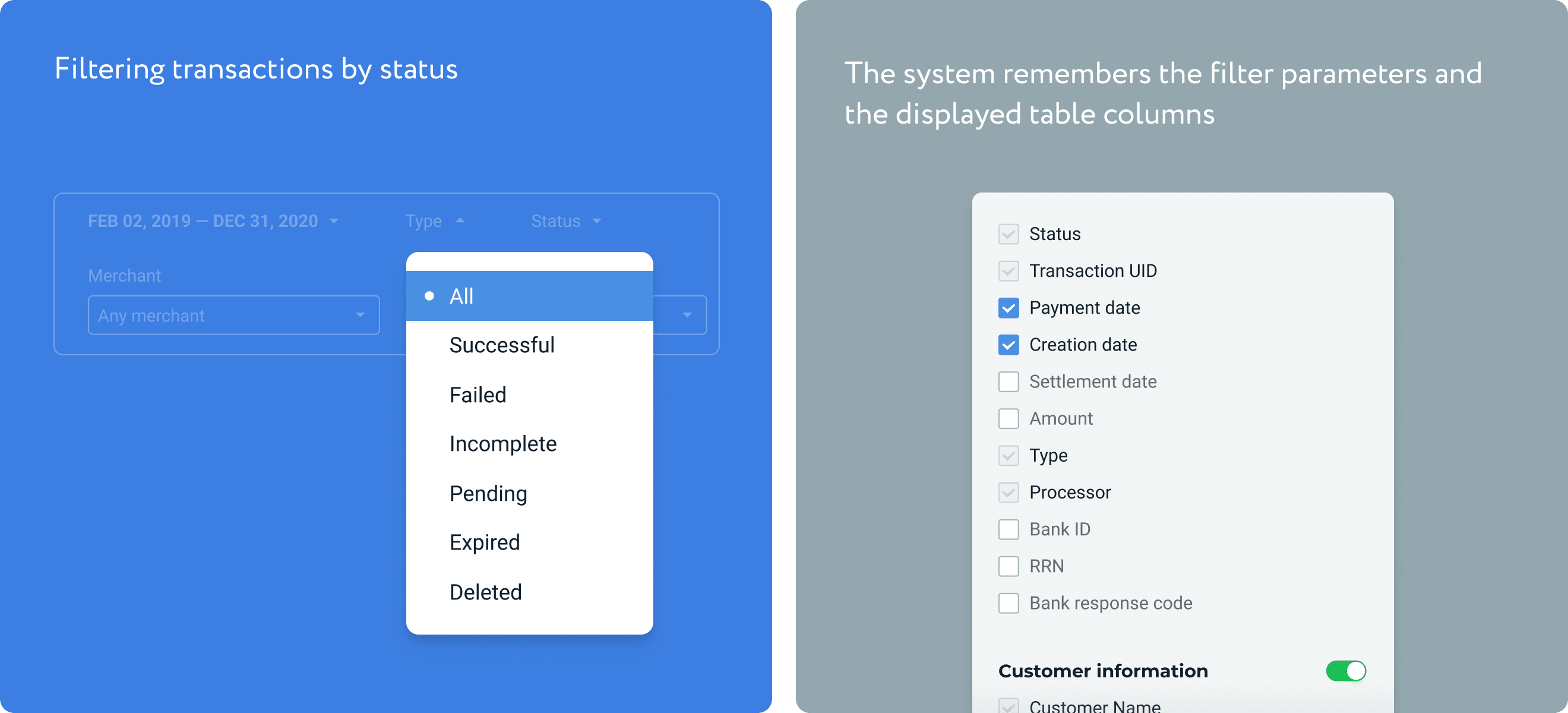
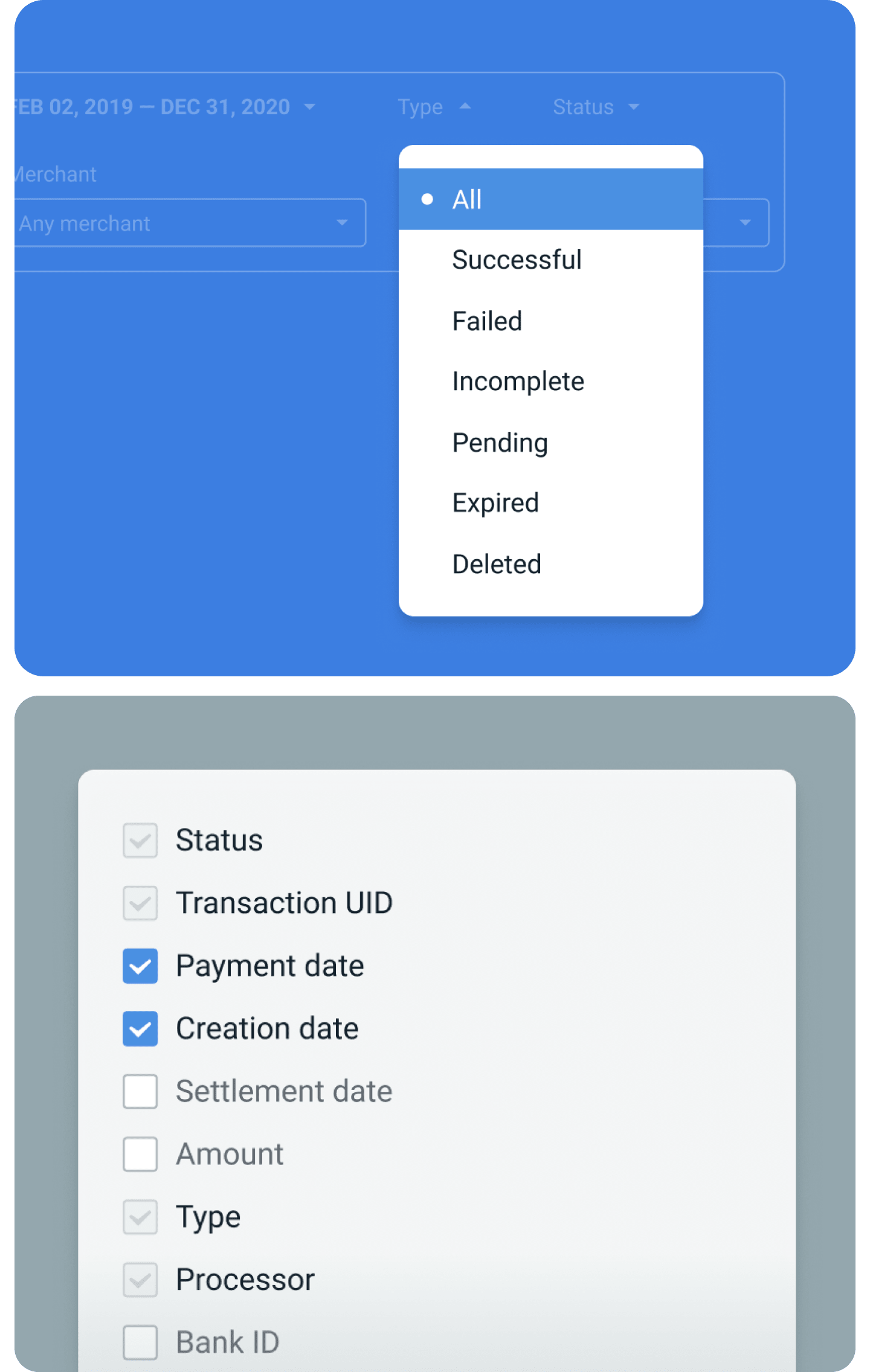
On the transaction page, payments can be filtered by status, see ‘pending’ and thus track the problem at the stage of its occurrence.
Merchant management
The administrator has extended powers. They can even disable payment tools and stores. But of course, they more often add and initially activate new merchants.
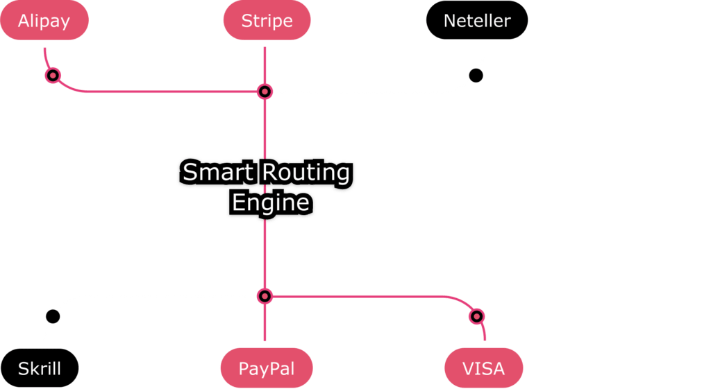
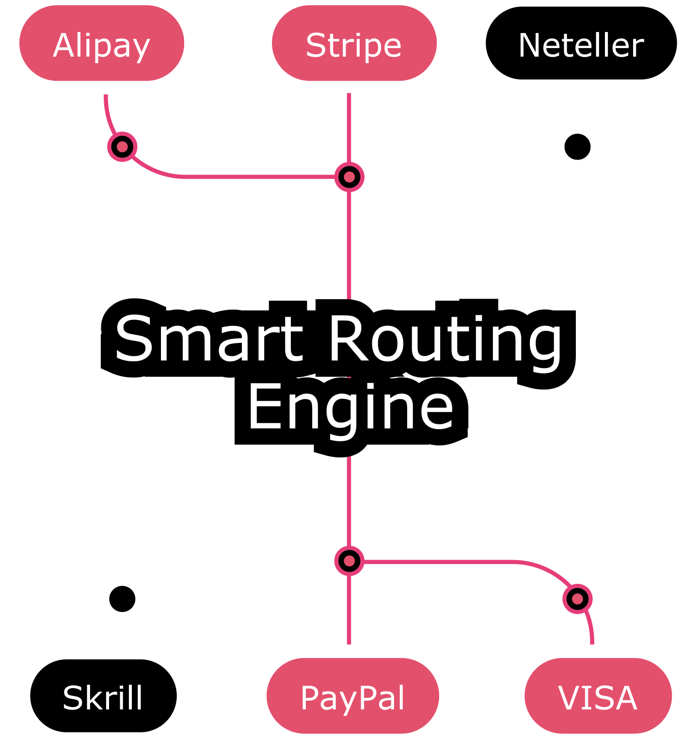
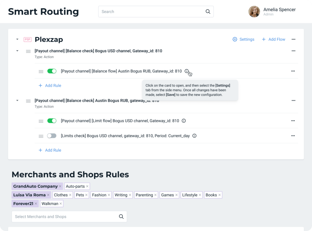
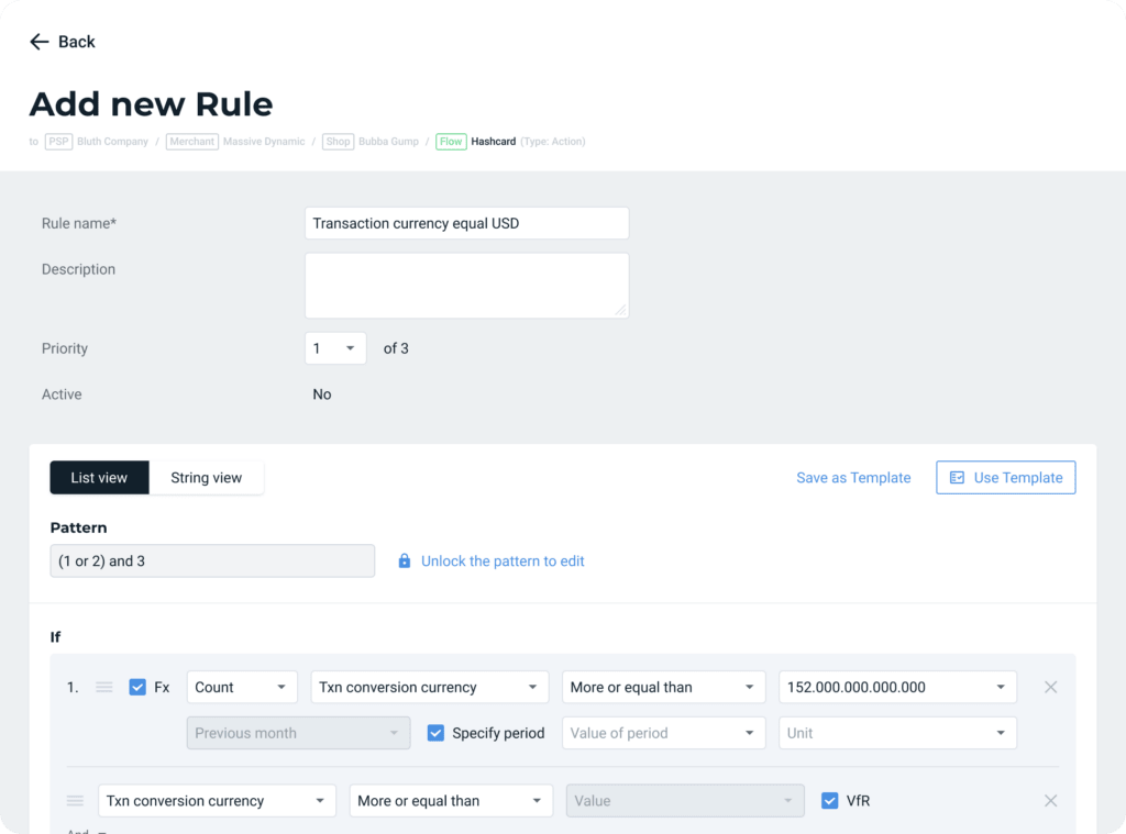
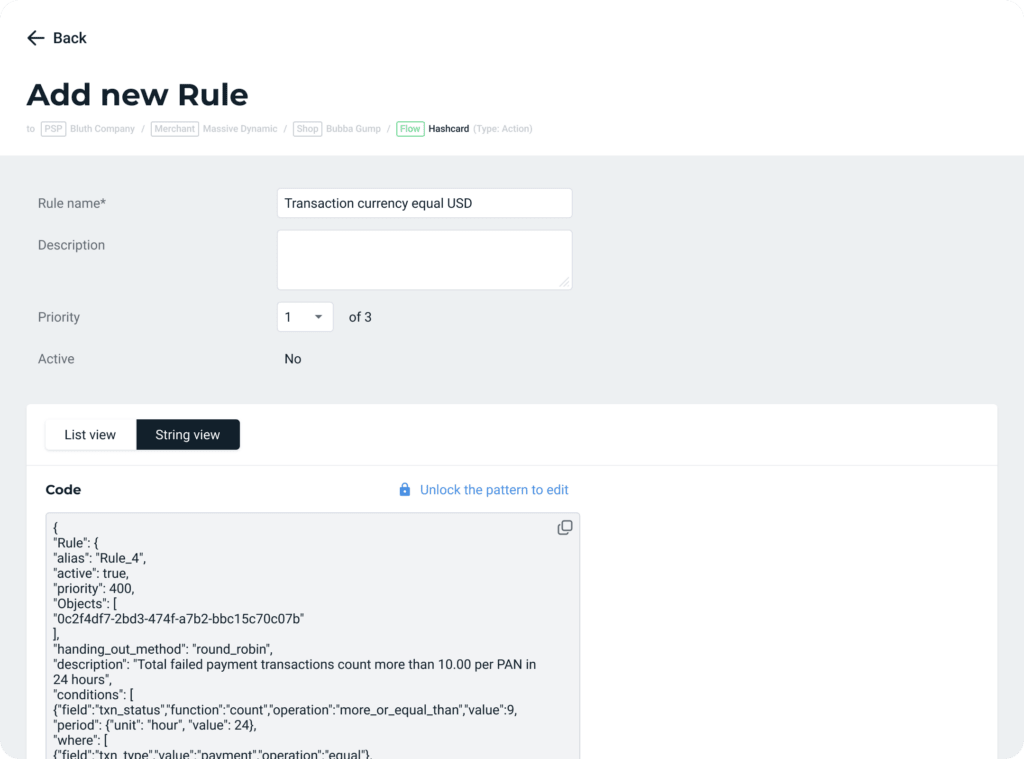
The administrator has many responsibilities and rights in sensitive settings affecting financial performance and risk management. To manage security and optimize business costs, beGateway implements two large and complex modules for managing and processing transactions: Smart Routing and beProtected.
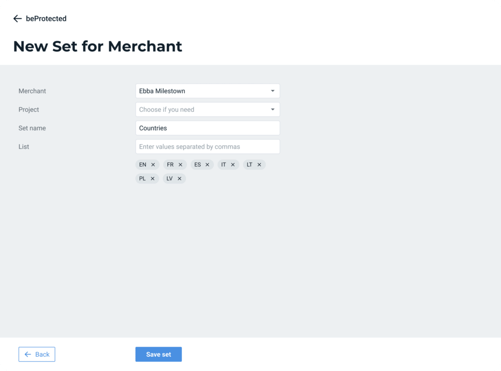
Safe work with high-risk segments
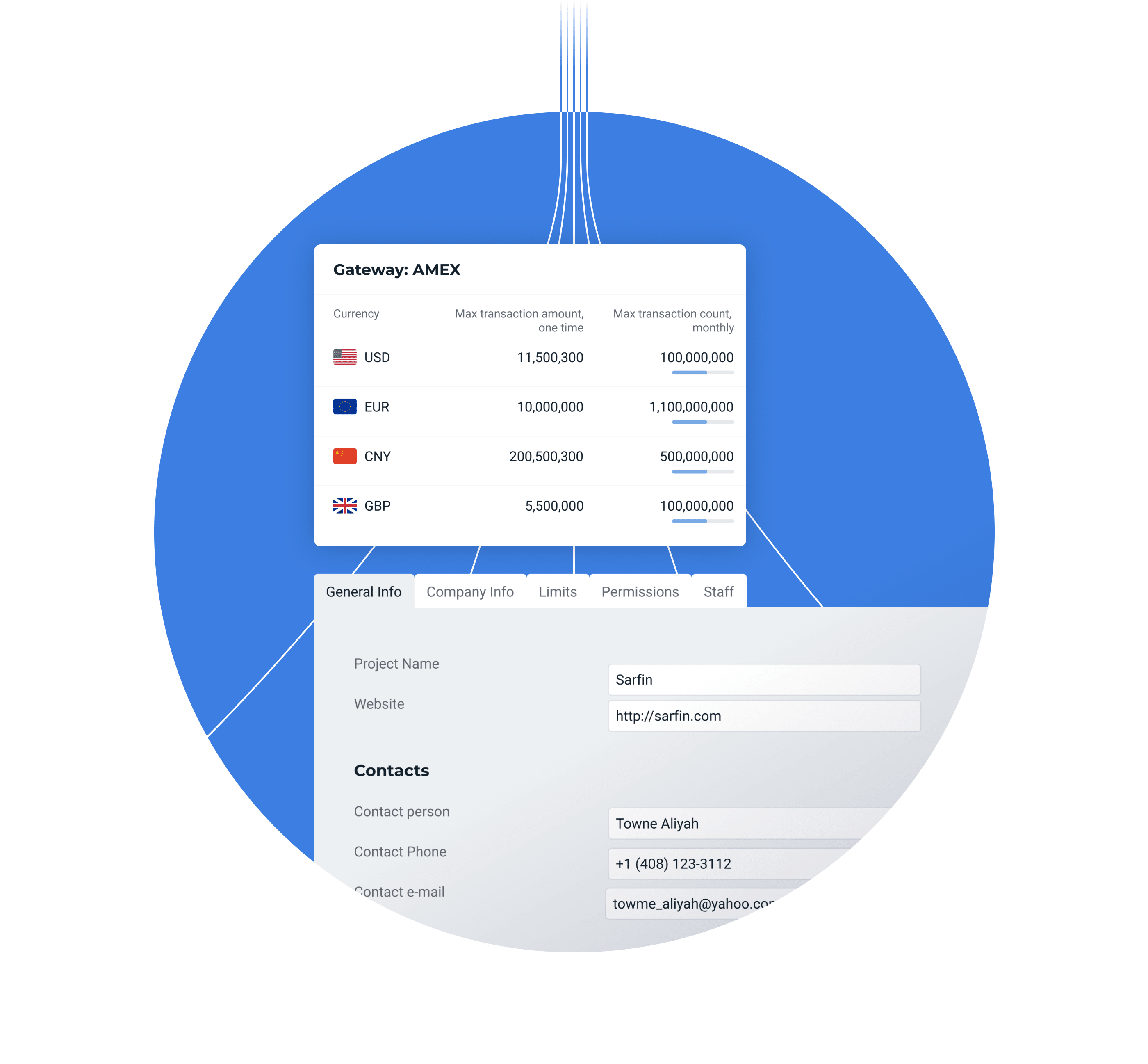
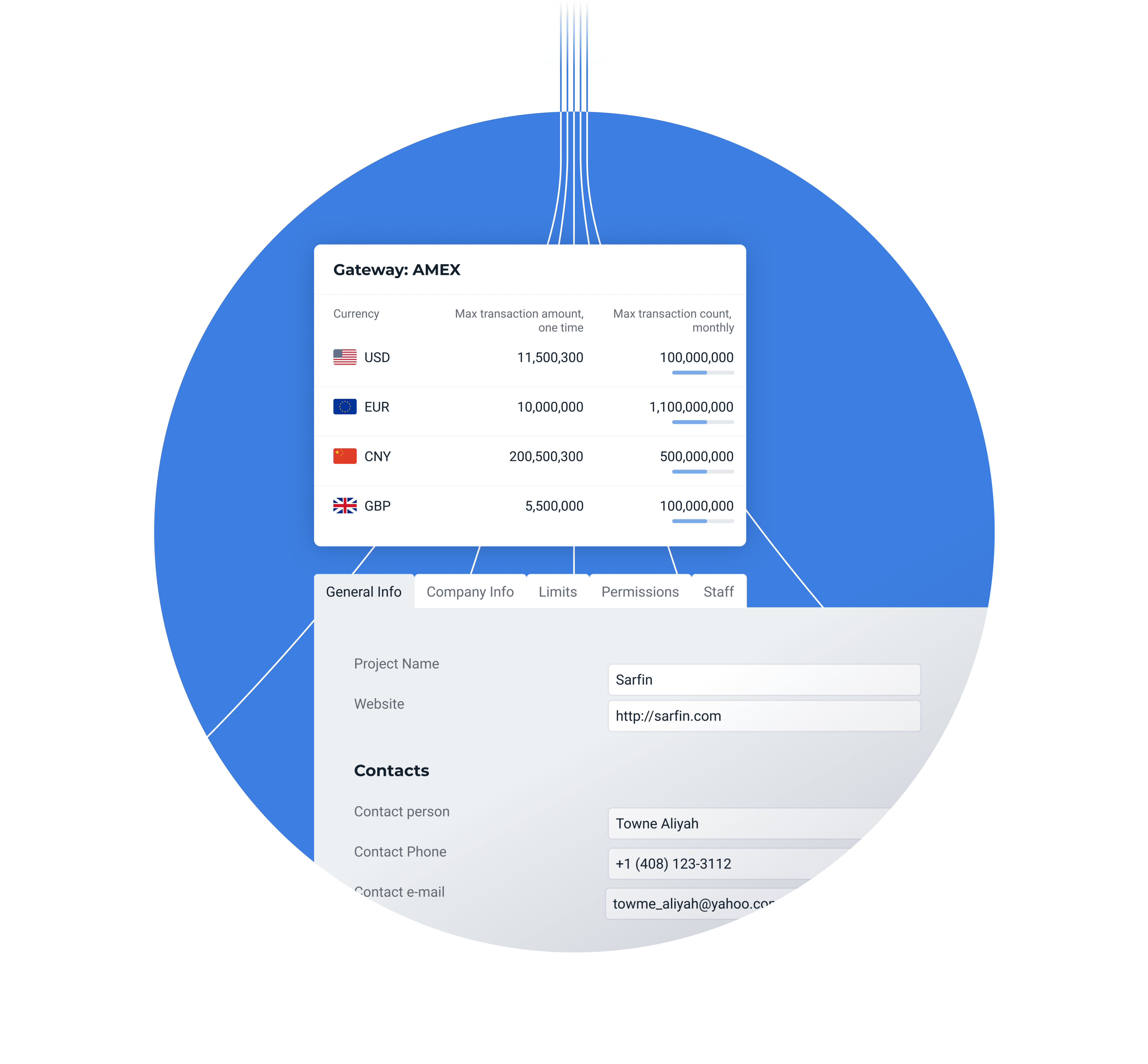
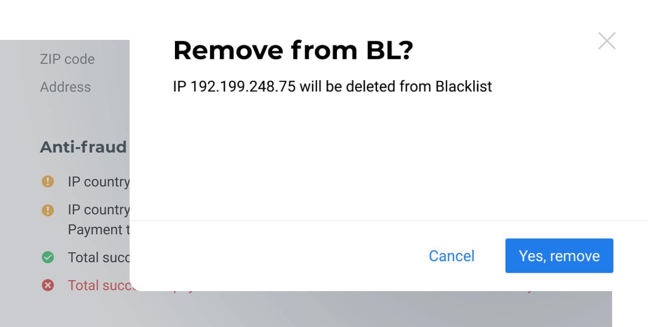
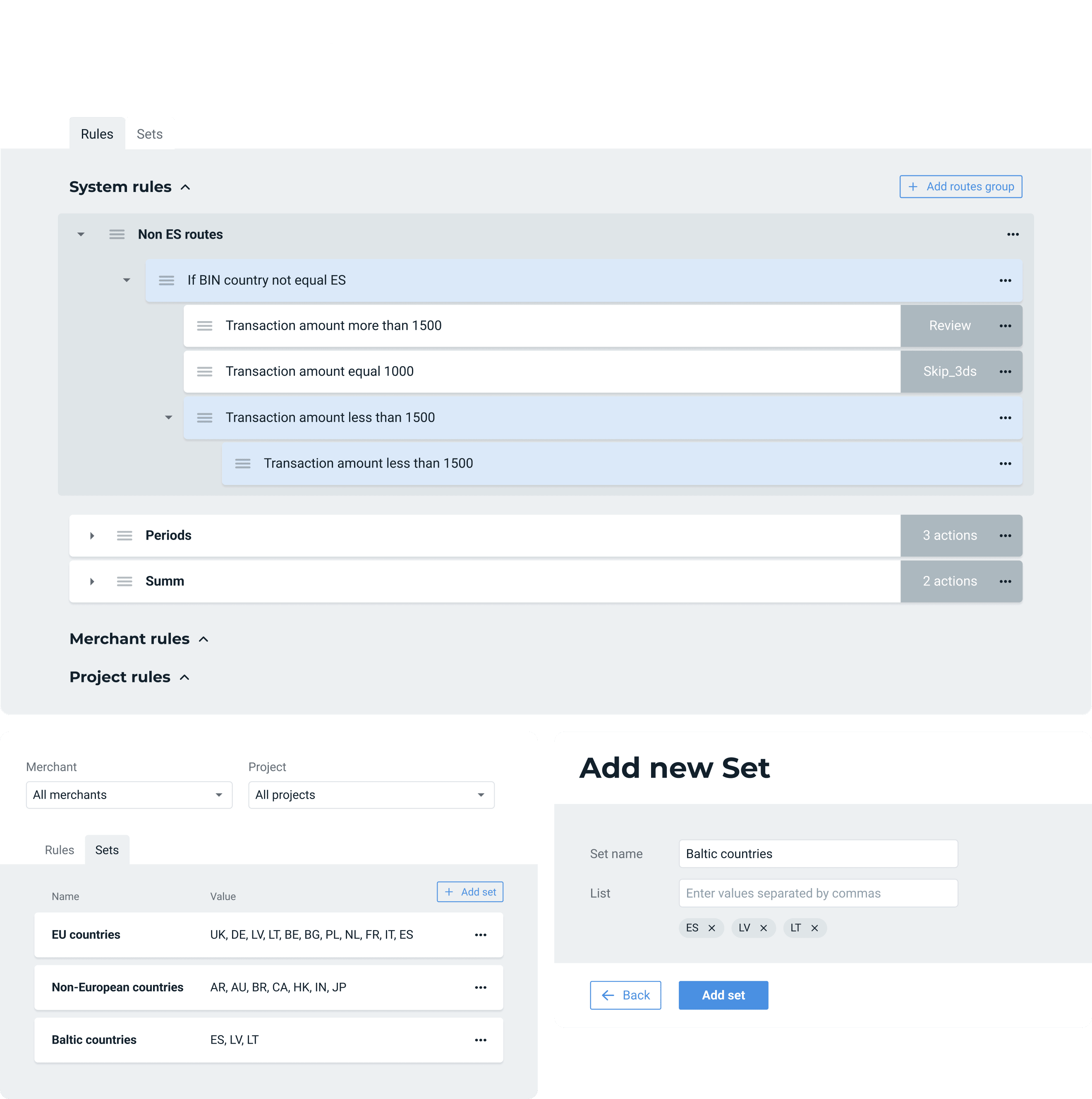
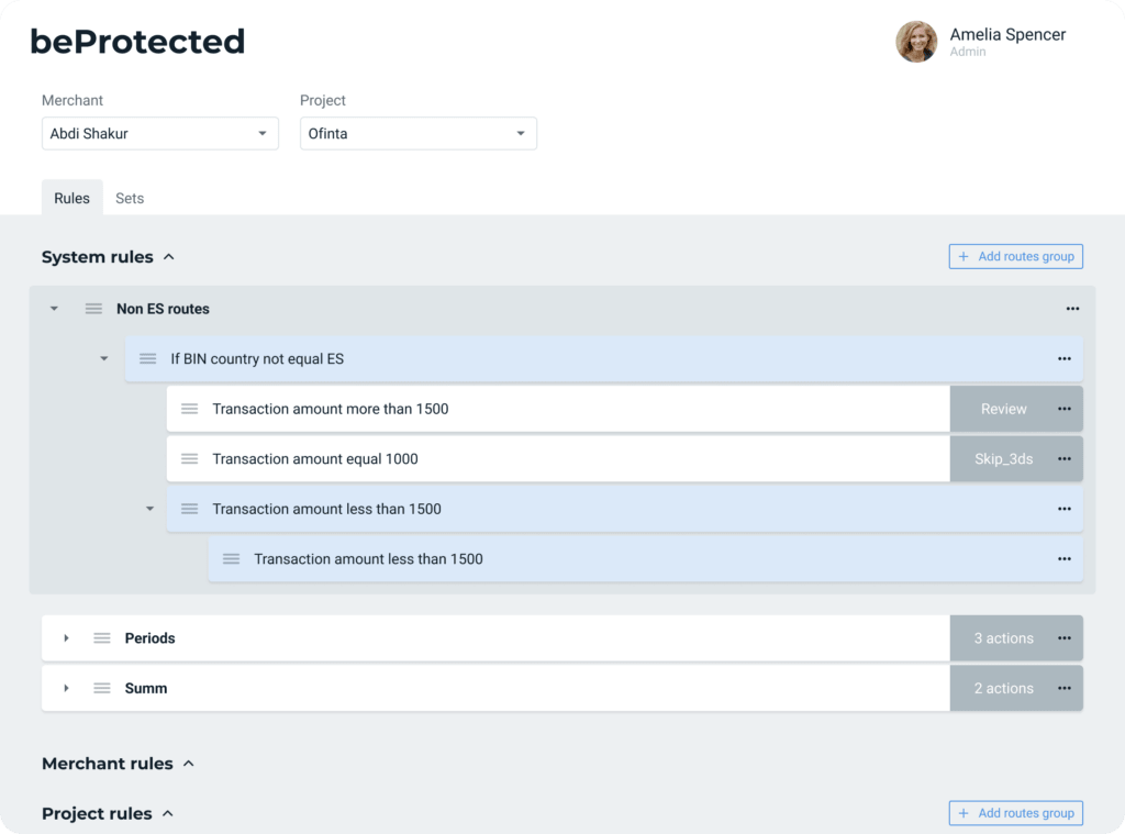
beProtected is a security module that helps monitor unwanted, fraudulent and suspicious transactions; set safe limits on payments; work with ‘black’ and ‘white’ lists of buyers. This allows you to work in high-risk segments, for example, gambling and gaming.
By managing risks, a business reduces its losses. If the rules are set too strictly, payments may not go through even from completely respectable clients. The administrator’s task is to optimize these settings and ensure that transactions move freely or strengthen security if there is an avalanche of fraud.
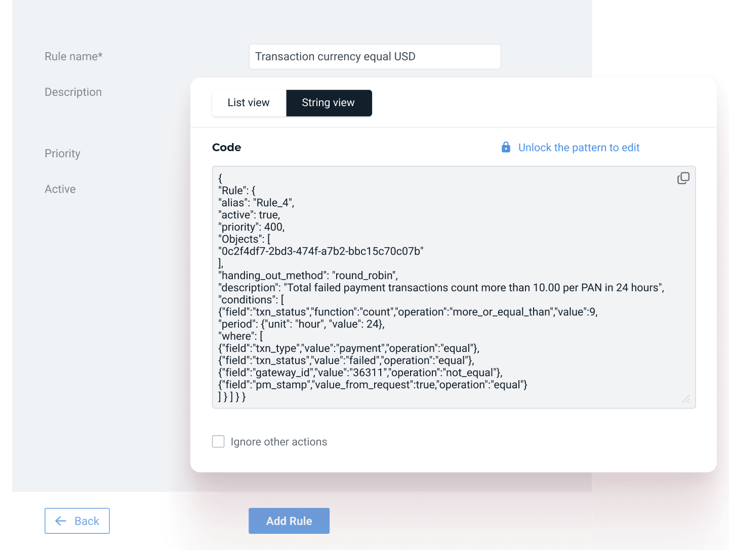
The administrator has access to simplified visual schemes for managing cascade rules and the ability to quickly copy successful settings to another merchant or project.
This sensitive setting protects against accidental modification with additional confirmatory actions, reducing the influence of the human factor.
A design system for the happiness of developers and a basis for the future
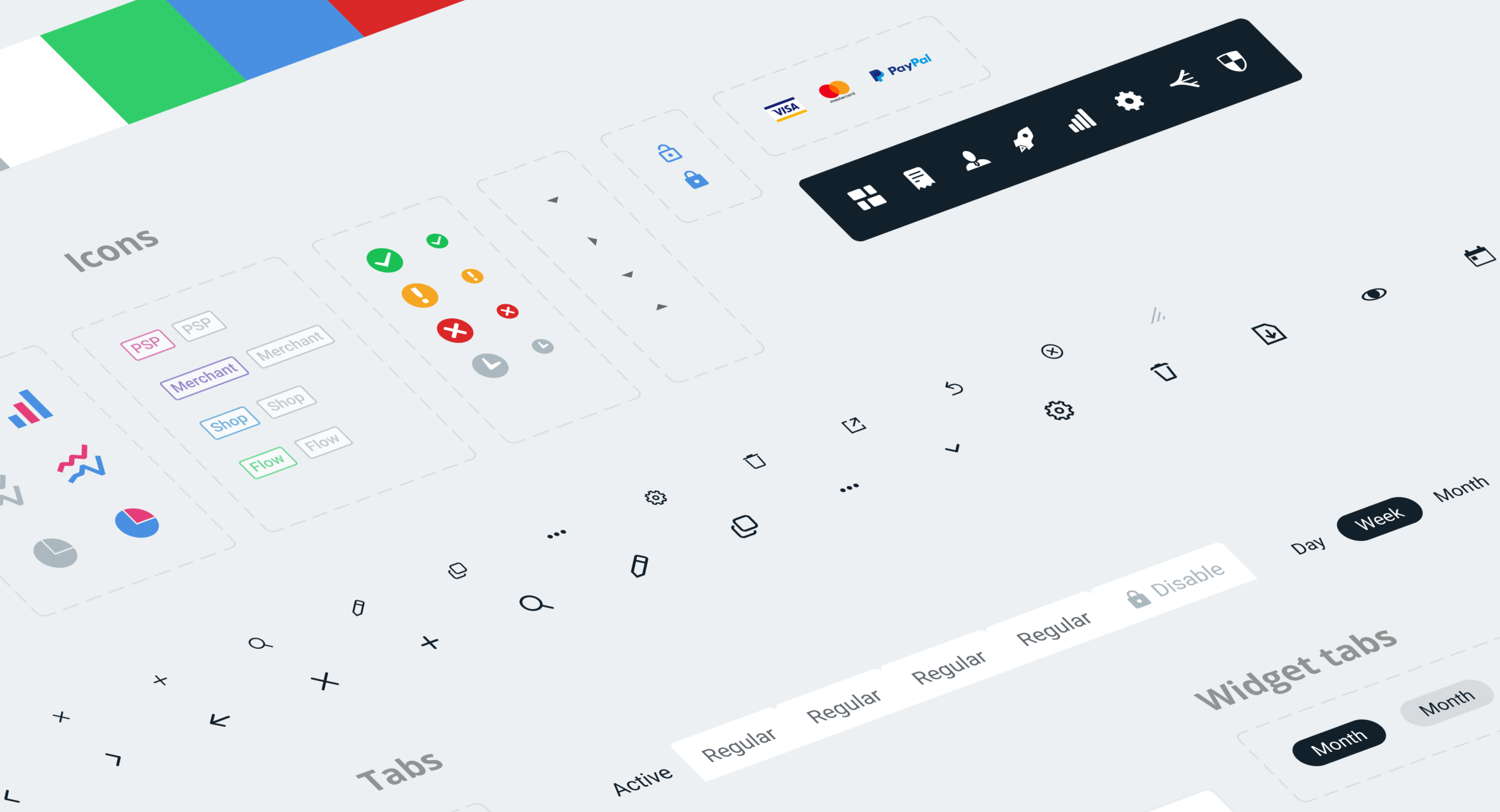
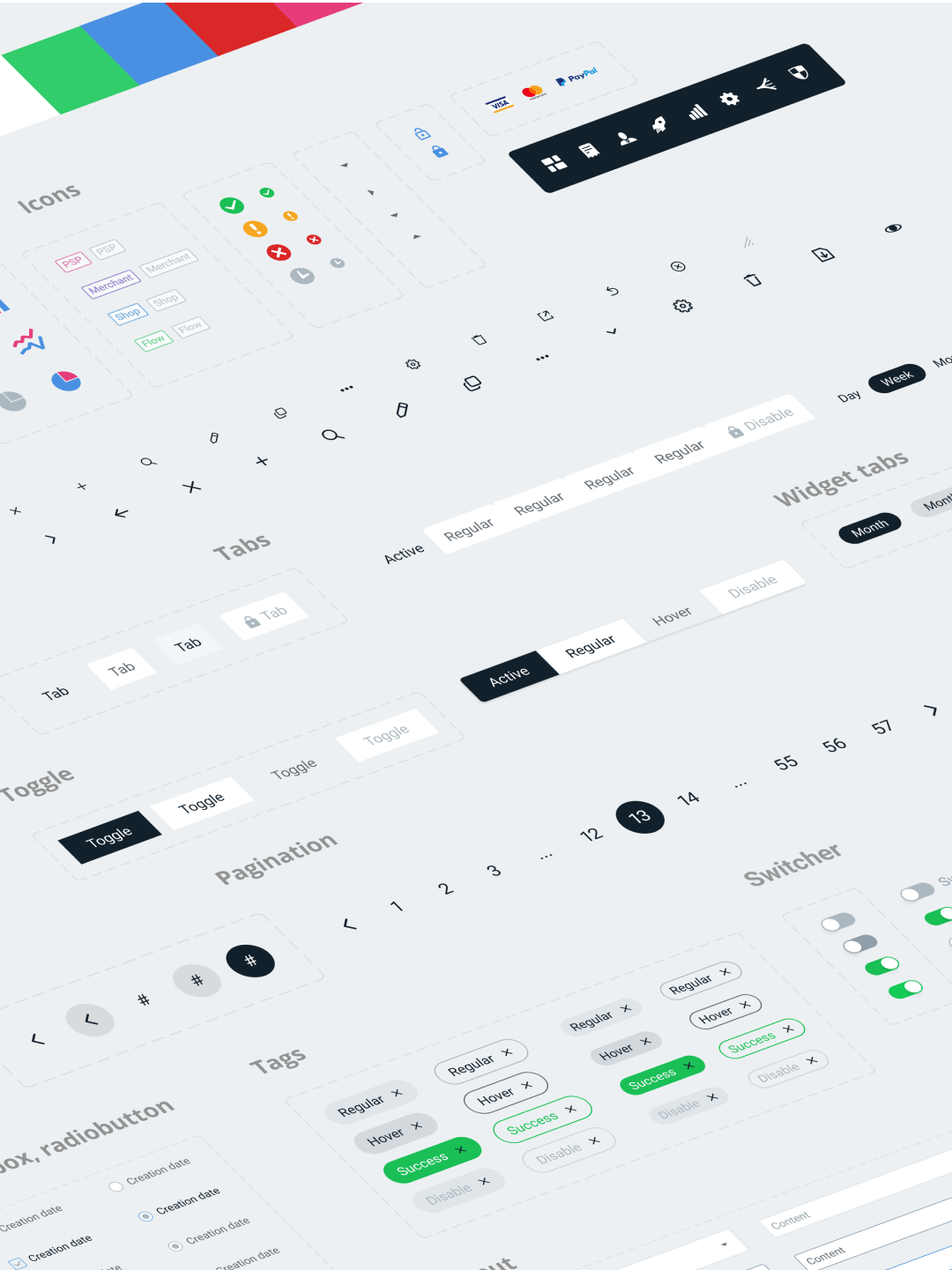
All artifacts created during the work process — from inputs and buttons to huge SmartRouting flows — are carefully collected into the beGateway design system for the systematic and consistent development of the product by the development team.

